
Trace: • VisionX Documentation
Table of Contents
Version: 5.0 / 2022-06-01
Introduction
This VisionX documentation explains all the features of VisionX and its Add ons.
VisionX is the Open Low-code Platform with no limits. We combine No-code, Low-code and Pro-code in one Platform.
VisionX is for businesses users and Citizen Developer to easily build applications themselves with No-code/Low-code and it’s for professional developers to build unlimited complex application extremely fast with No-code/Low-code/Pro-code.
This manual is divided into the following sections:
- Main View / Administration
- Creating And Editing Applications
- Data Model
- User Interface Designer
- Live Preview - Web, Mobile Desktop Apps
- Actions And Events
- User And Role Management
- Menu
- Settings
- Reports
- Style Your Application
- Documentation
- Installation
- Add Ons
More information you find at our VisionX Documentation page
Learning Material
To learn VisionX you have also the following different ways to start with it.
For a quick overview:
- Watch our Explainer videos
- Read the Getting started
More documentaries to dive deeper:
- Do our step by step Tutorials
- Visit our Documentation page
You did not find the right information or you want to talk to us right away:
- Book a demo session, we are happy to help you with the first steps
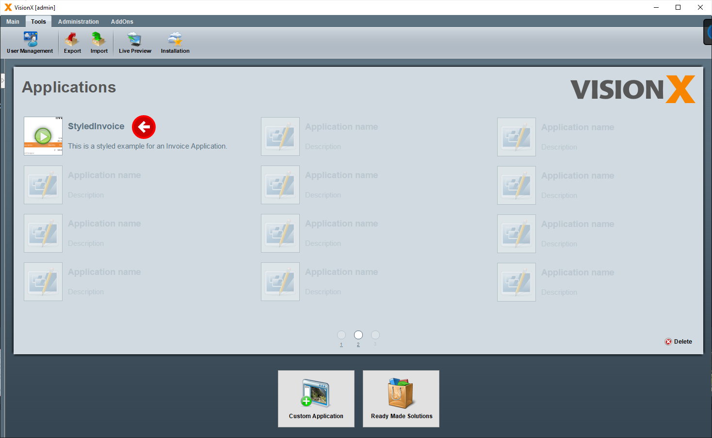
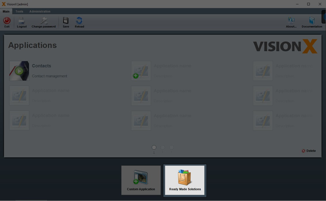
Main View / Administration
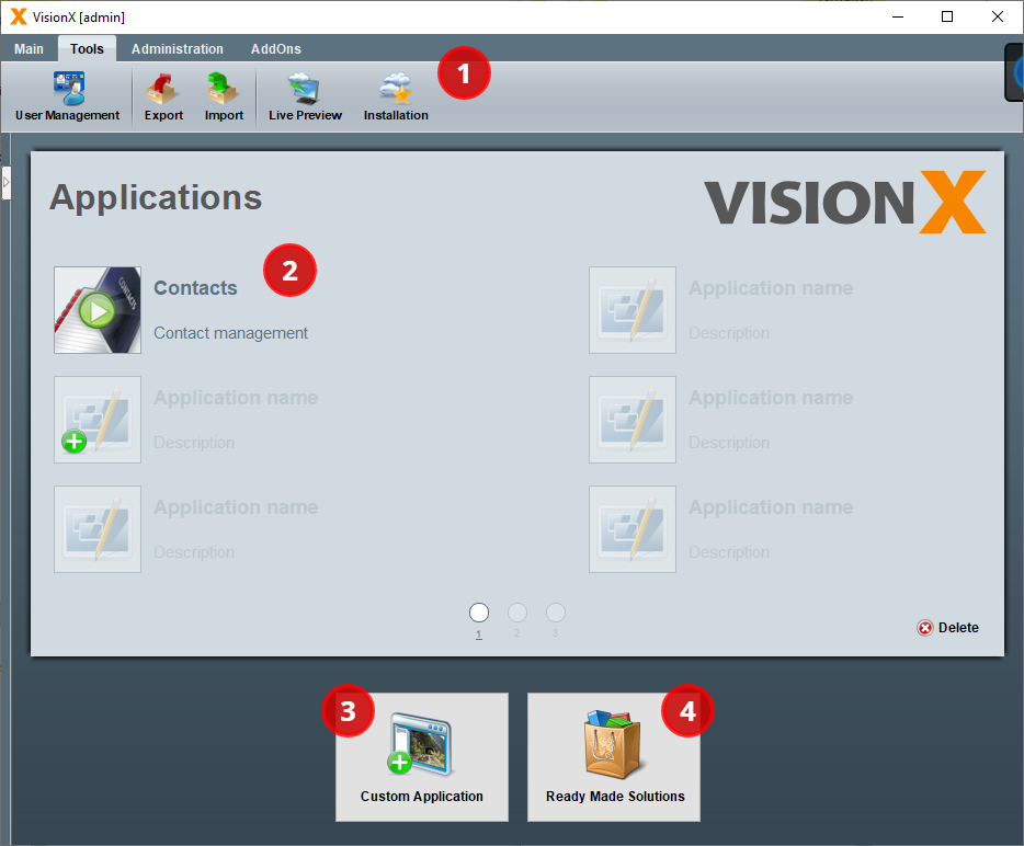
Main View
After starting VisionX you are in the main view.
- The toolbar is located in the upper area. The buttons on the toolbar allow you to import, export or install an application.
- In the middle is the list of existing VisionX applications.
- In the lower area you can create a new application with new 'Custom Application'.
- To the right is the Ready Made Solution Store to install VisionX Add-ons or demo applications.
The first time you start VisionX, you will see several guides that help explain the first steps.
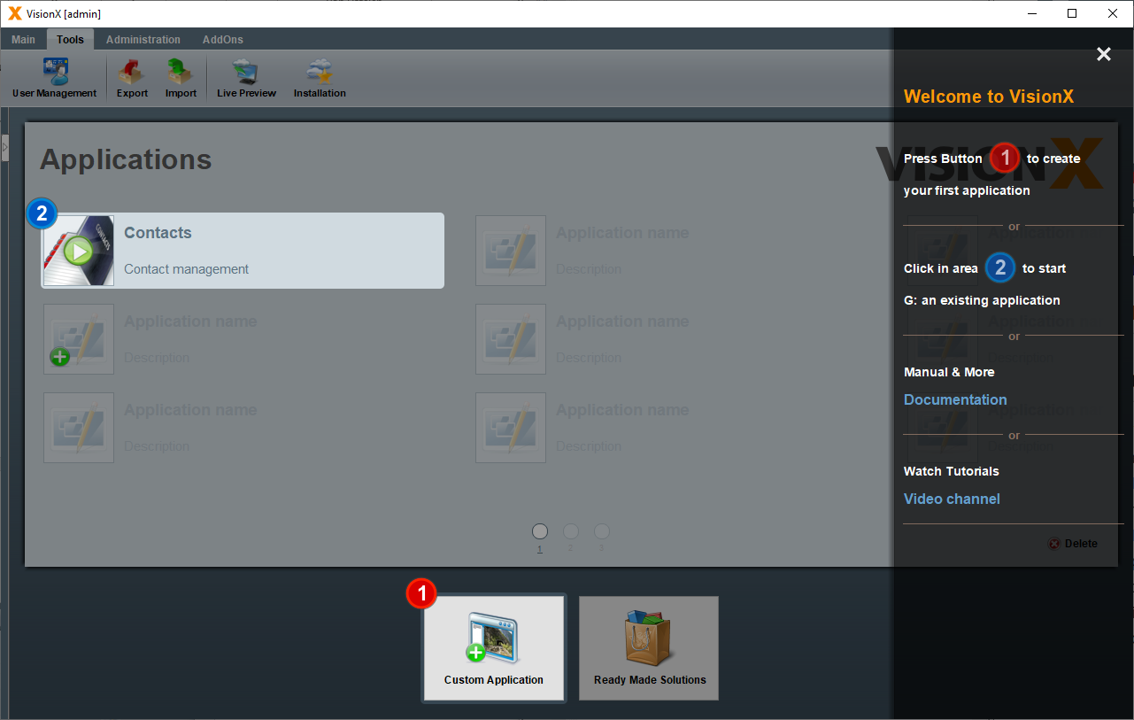
You can show or hide them at any time in the top right corner of the toolbar.

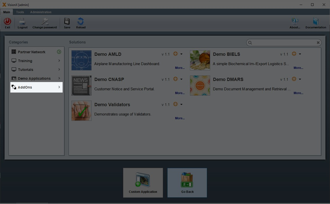
Ready Made Solutions Store
The app store contains various add-ons, demo applications and tutorials that you can use to get to know VisionX or to get a quick start for an application.
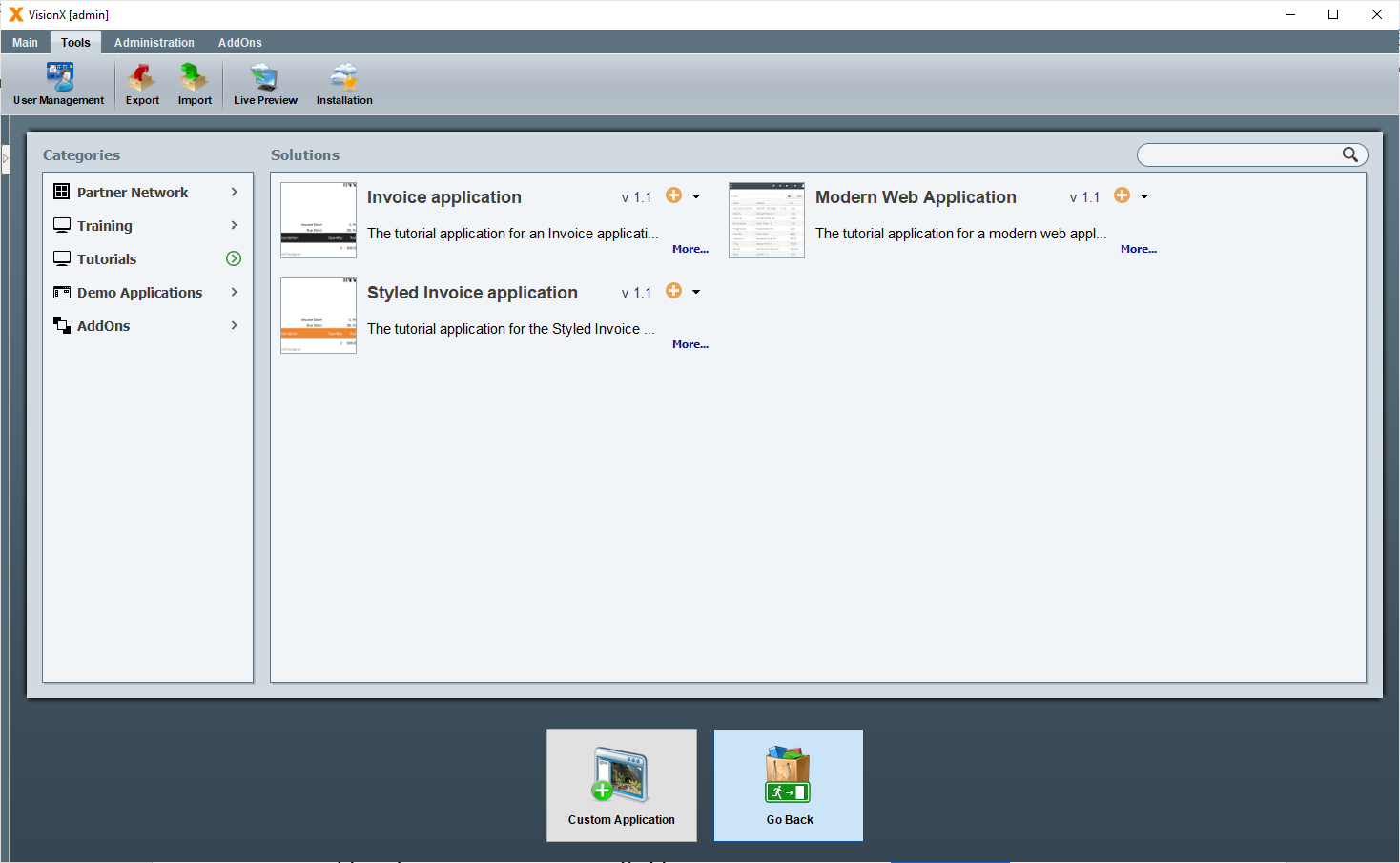
Click on the orange plus icon to install the add-on or demo application. In the installation wizard just click finish.
The 'Go Back' button at the bottom of the screen will take you back to the main view.
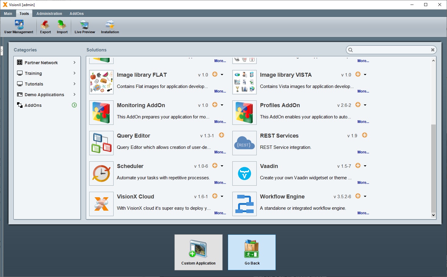
There are a lot of add ons available depending on your license:
- REST
- Workflow
- CSV Import
- Query Editor
- Scheduler
- Audit log
- SSO Windows AD
- Filter and User Profiles
- and many more
Read more about Add Ons
Toolbar
The toolbar is located in the upper area and consists of the following sections:
- Main
- Tools
- Administration
- AddOns
Main
The main toolbar consists of the following menu items:
| Setting | Description |
|---|---|
| Exit | Closes the application |
| Logout | Logged out the current user |
| Change password | Change password of the current user |
| Save | Saves changes |
| Reload | Reloads the application |
| About… | Some information about VisionX, the system, log entries and about your license |
| Documentation | Here you get to the documentation homepage |
Tools
The tools section consists of the following menu items:
| Setting | Description |
|---|---|
| User Management | Manages the VisionX users Read more about the VisionX User Management |
| Export | Exporting an application Read more about Exporting an Application |
| Import | Importing an application Read more about Importing an Application |
| Live Preview | Starts an application as web, desktop or native mobile App Read more about the Live Preview |
| Installation | Installs an application in the VisionX.cloud, on premise or any other cloud Read more about Installation |
Administration
The administration section consists of the following menu items:
| Setting | Description |
|---|---|
| Admin Datasources | Manages the VisionX admin datasources Read more about the Datasources |
| Datasources | Manages the VisionX user datasources Read more about the Datasources |
| Domains | Manages the VisionX Domains Read more about the Domains |
| Add-Ons | Manages the VisionX Add-Ons Read more about the Add-ons |
Add-Ons
In the Add-ons section of the toolbar there are more screens and functions depending on the Add-on. The description can be found in the add-ons section.
Read more about Add Ons
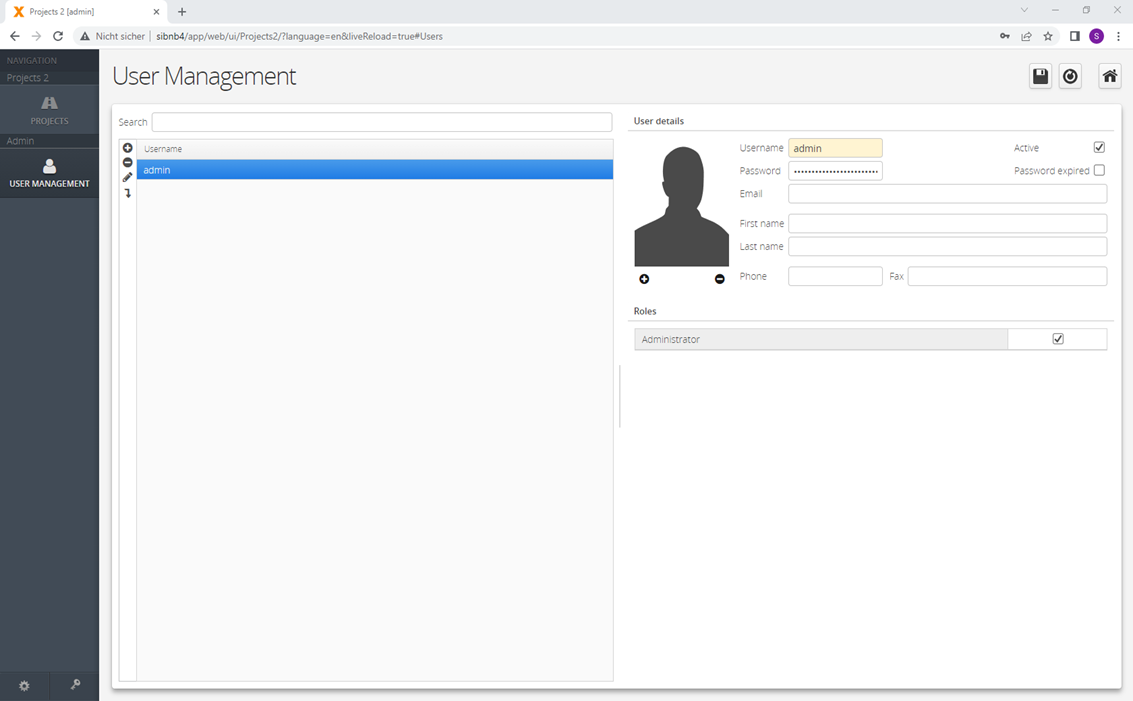
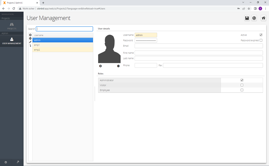
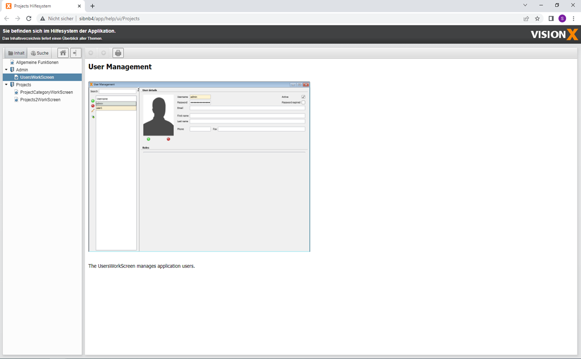
VisionX User Management
The VisionX user management scree can be accessed on the 'Tools' tab.
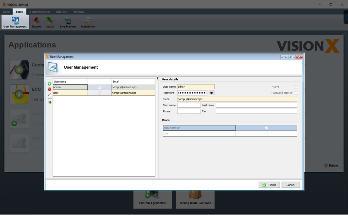
When VisionX is started, the user admin with the password admin is used. If you don't do anything in VisionX for a longer time, VisionX will time out and you will be asked for this password. In this case use admin as password or restart VisionX.
This screen is used to define the Java package structure which is used for Java code generation. If you use firstname.lastname@company.com as e-mail address for the admin user, then the Java source will be generated under com.company.applicationname.
The users shown in this screen are the VisionX users and NOT the users of the individual applications. If you install VisionX locally, the user management has no relevance.
This screen is relevant if you additionally install the VisionX Enterprise / Universal Edition on an application server. In this case VisionX uses a central database to manage the users and the settings of VisionX. The settings include the Admin Datasources, User Datasources. and the Domains. In this case, all VisionX users have to be defined here.
VisionX has 2 roles:
- Administrator: To manage the VisionX users
- User: For the regular use of VisionX
| Setting | Description |
|---|---|
| User Name | Name of the user |
| Active | Sets the user to active or inactive. User cannot be used until activation. |
| Password | Password for the user. |
| Password expired | User will be asked to change his password after the first login. |
| E-Mail of the user. The domain of the e-mail address is used for the naming of the Java packages. Eg. firstname.lastname@company.com → com.company.applicationname | |
| First name | First name of the user |
| Last name | Last name of the user |
| Phone | Phone number of the user |
| Fax | Fax number of the user |
Application Export / Import
Applications can be exported and imported using the 'Export' and 'Import' functions on the 'Tools' tab. This feature is used to create backups of applications, share applications with other users, our consulting or support team. A further use case is to rename an application - during import there is a possibility to change the application name.
Exporting An Application
To export, we need to select the application and export type.
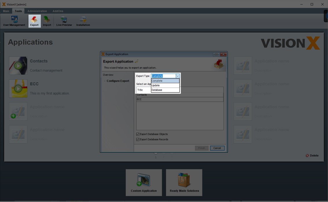
The following options are available:
- Complete: The database and the application, including all libraries, are exported.
- Update: The database and the application without the libraries are exported. The file size is much smaller and can be easily sent by e-mail.
- Database: Only the database is exported.
The option 'Export Database Records' determines whether the tables' data is also exported. The option 'Export Database Objects' determines if the tables and views are exported.
Please note that during the database export, VisionX only exports the tables and views. An accurate export/import of the views is only provided for simple ANSI SQL conform views. Database specific and other objects are not considered during the export/import.
The application export is provided as a .ZIP file.
Importing An Application
To import an application, a valid VisionX export file and an application name are required. Here you can change the application name to rename an application.
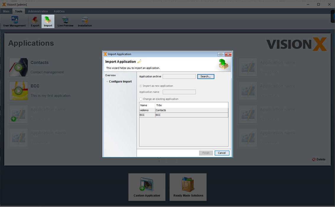
The application can be imported as a new application or over an existing application. The latter option overwrites the existing application!
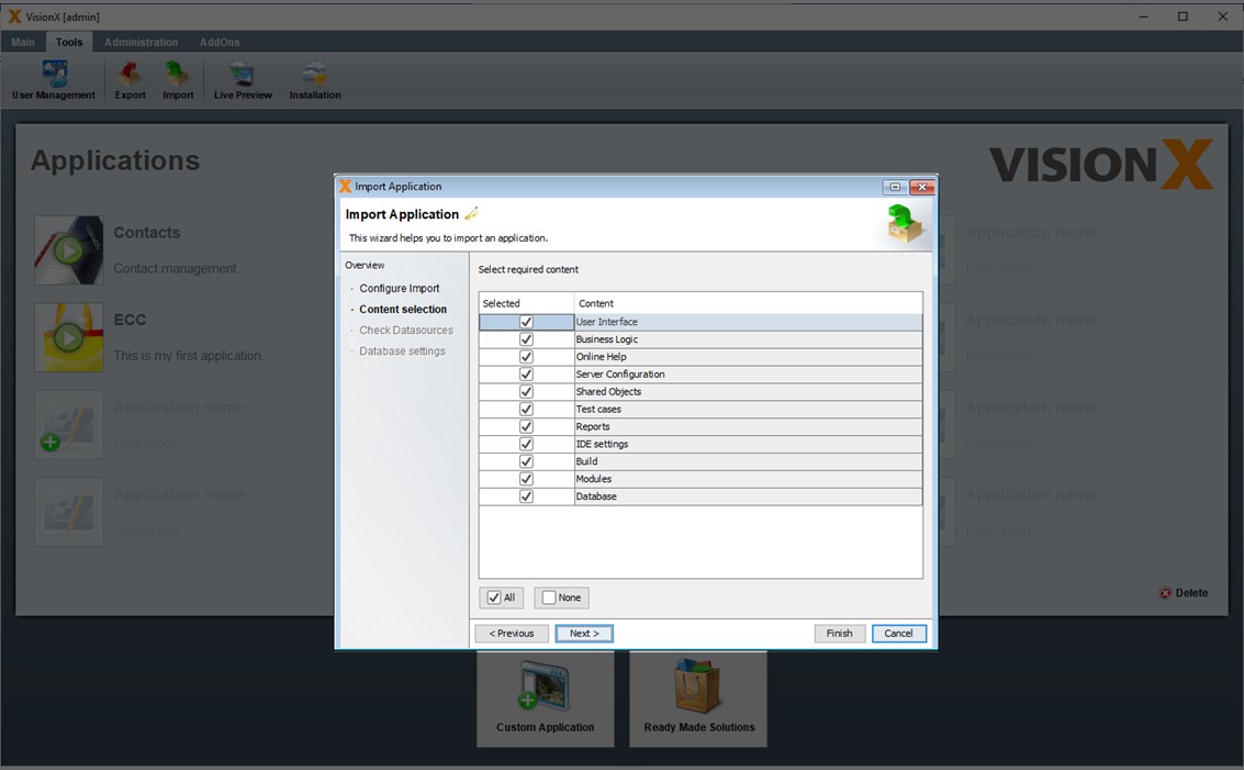
In the second step, we can select which content from the export file is imported. If the 'Database' option is unchecked, the database – if included in the export file – is not imported into VisionX.
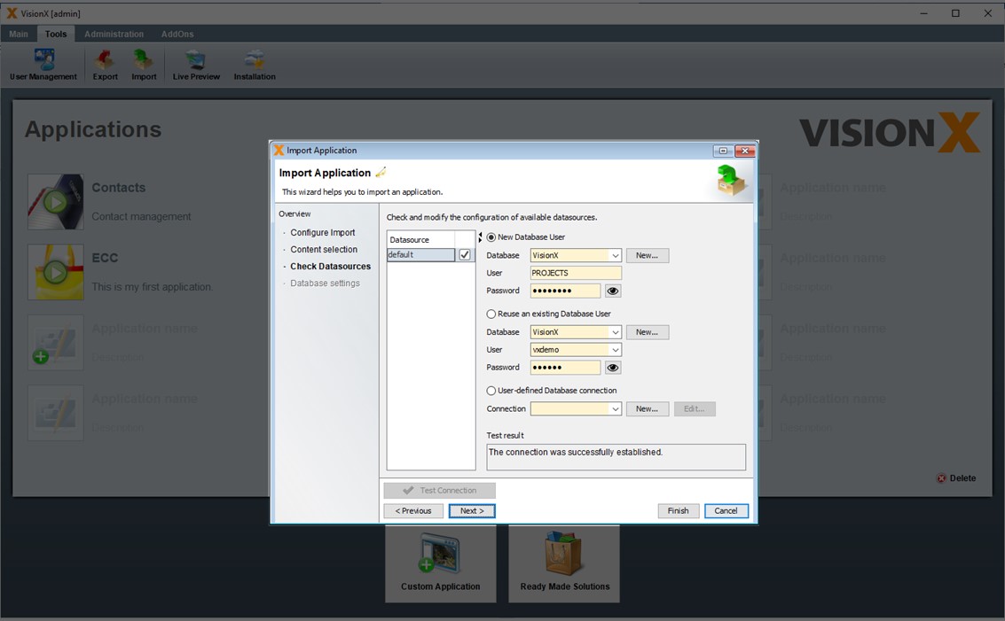
The third step shows the application's data sources based on the information in the export file. They can be edited by the user. Data can be imported for either a new or existing database user.
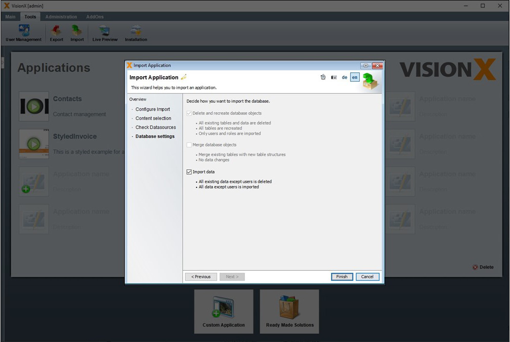
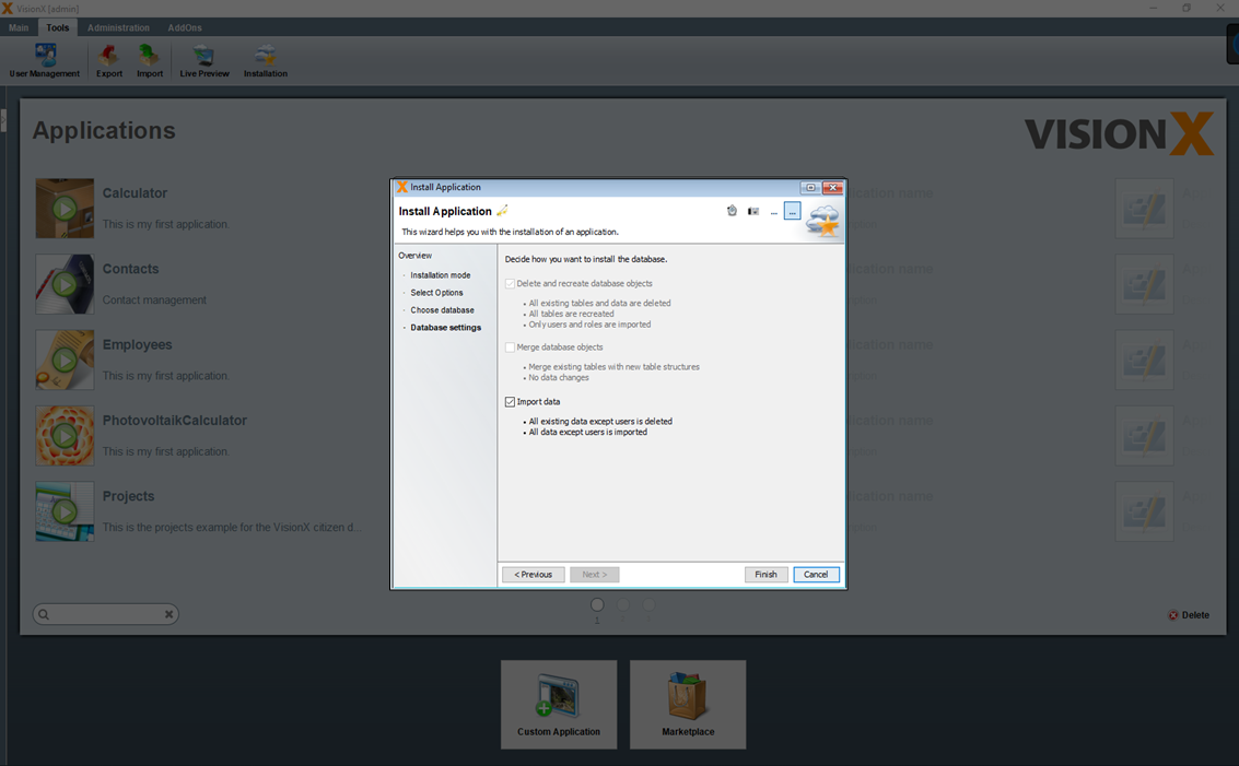
In the 4th step you can specify how the database will be imported.
If you selected an existing database user during import, the following options are available.
The checked 'Delete and recreate database objects' option performs the following steps.
- All existing tables and data are deleted
- All tables are recreated
- Only users and roles are imported
Note - This option is not checked for existing database users and should be checked only if you are sure that you want to delete the existing tables with all their data.
The checked 'Merge database objects' option performs the following steps.
- Merge existing tables with new tables structure
- No data changes are performed in this step
Note - This option merges the table structure from the export with the table structure of the existing data user. Therefore, this is very useful especially when installing/importing a new version of your application.
The checked 'Import data' option performs the following steps.
- All existing data except users is deleted
- All data except users is imported
Note - This option is not checked for existing database users and should be checked only if you are sure that you want to delete all existing data and import then the data from the export.
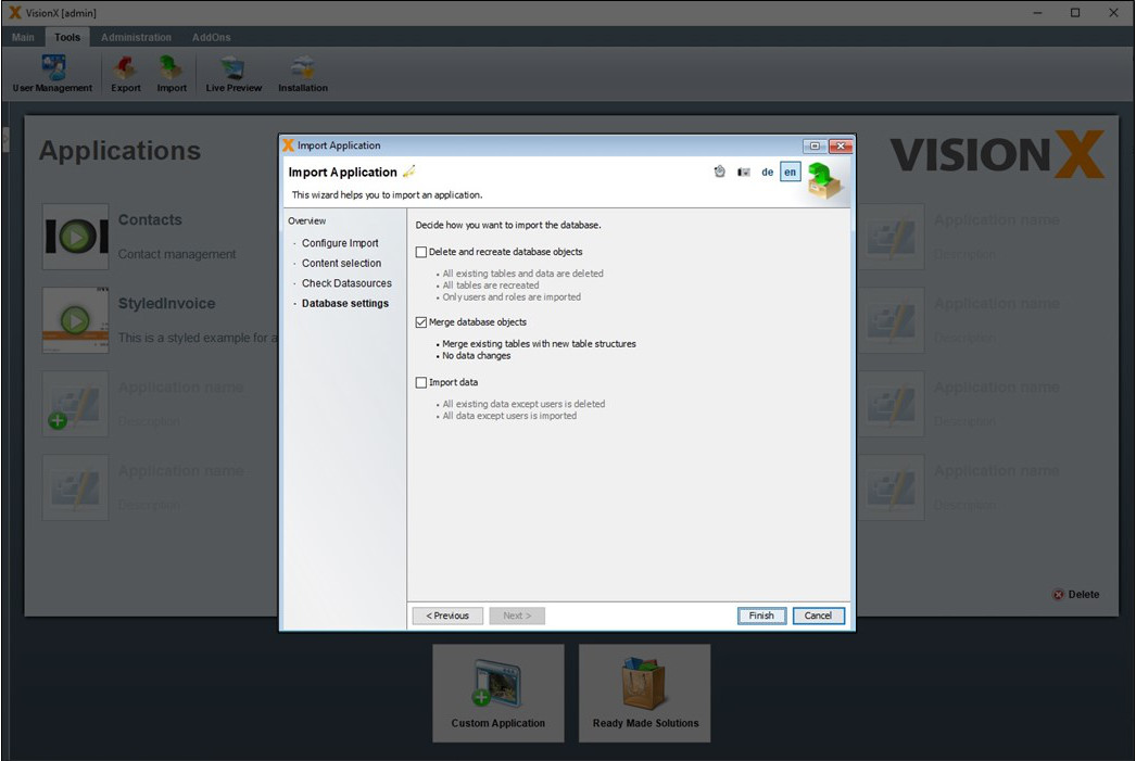
If 'New Database User' was selected during import, then only the option 'Import data' is available, because the database objects are newly created and therefore cannot be merged.
If in this case the option 'Import data' is unchecked, then only the table structures without data will be taken over. In addition, the users and roles are taken over from the export.
Datasources
Data sources are used to connect to databases. Eg. when creating a new application or using existing databases in screens. In the database the data of the application is stored.
For the data sources, VisionX distinguishes between admin data sources and user-defined data sources (menu item 'Datasources').
Admin Datasources are used for creating new database users. This is used, for example, in the 'New Application' wizard to create a new database user for the new application. Another use case is to select an existing database user from the list of all database users of a database. For admin data sources, a database user with administrator rights is required, so that VisionX can create new database users with this user. During the installation of VisionX, one admin data source with the name 'VisionX' is configured. This is the Postgres database supplied with VisionX, which can be used as a database for new applications.
Usually you do not get database administrator rights. In a company only database administrators have these rights. They can create a database user for you, which you can then use for your new application to store data. If you want to be independent of this, you can also simply use our VisionX.cloud, there you can simply create as many databases as you want with VisionX.
User-defined data sources only require the usual database user rights and are used for new applications to store your data. These are creation, modification and deletion of tables and views including data changes. This database user can easily created by the database administrator and provided for you. They are also used to access existing databases in your VisionX screens to show or combine data from existing systems.
Edit Datasources
The admin data sources and user-defined data sources (menu item 'Datasources') for VisionX are managed in the 'Administration' section of the toolbar in the main view.
Both types of datasources can be configured in the same way.
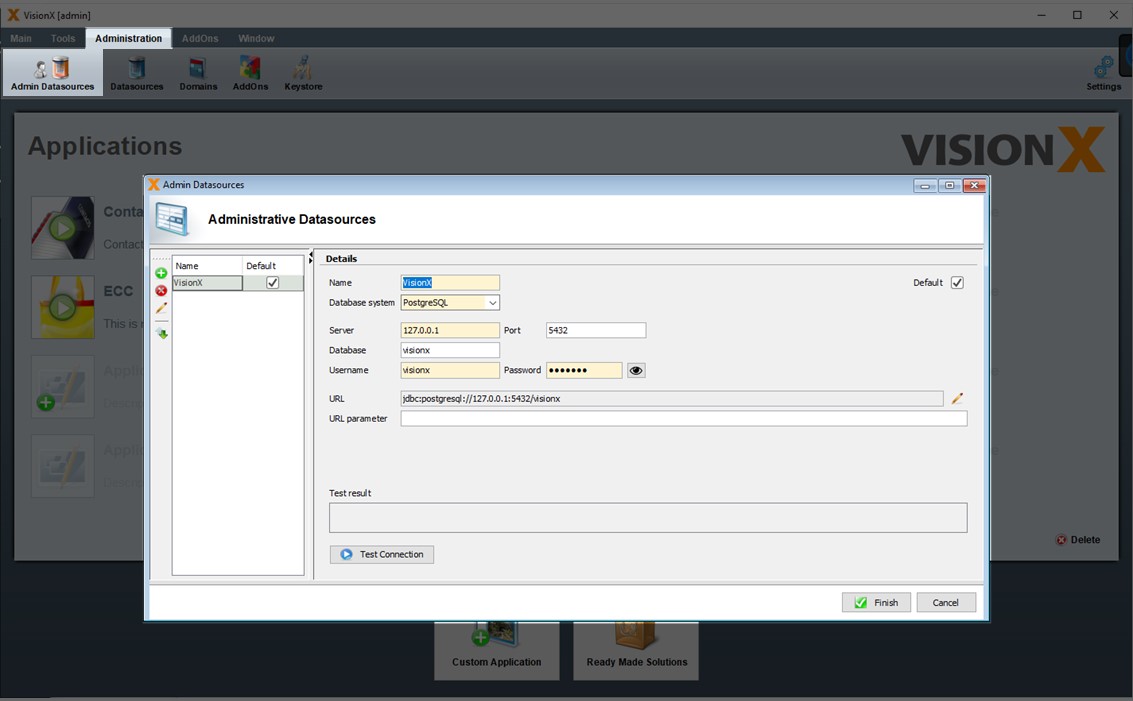
Here the data source name, the desired database (Oracle, Posgres, EnterpirseDB, MS SQL, MySQL, MariaDB, DB2 or Informix), as well as all the relevant database connection parameters are specified. These parameters include the server (name or IP), port, and database name (or SID in Oracle).
In addition, a valid database username and password have to be entered.
The 'Test Connection' button is used to test the connection to the database.
Use Datasources
As mentioned in the chapter Creating an Application, either a new or an existing database user can be selected for a new application. The default setting is the 'VisionX' admin data source. If a new database user is selected, VisionX creates a new user using the selected admin data source. For this reason, only admin data sources can be selected for this option.
Under the second option 'Reuse an existing Database User', a user can be selected from the list of available database users for the chosen admin data source. This user is then utilized for the new application.
Under the third option, a user-defined data source can be selected, which is then used by VisionX for the new application.
New data sources (database connections) can be created using the 'New' button. For options one and two, the admin data source scree is opened, whereas the 'New' button next to the third option opens the scree for user-defined data sources.
When a new screen is created, or when an existing table is add to the screen, a similar screen is available for the selection of a database. It includes the option 'Use Application Database User' to make tables available from the application's database connection. This is the default data source shown under the 'Datasources' tab of the 'Application Settings' menu (see Application Settings).
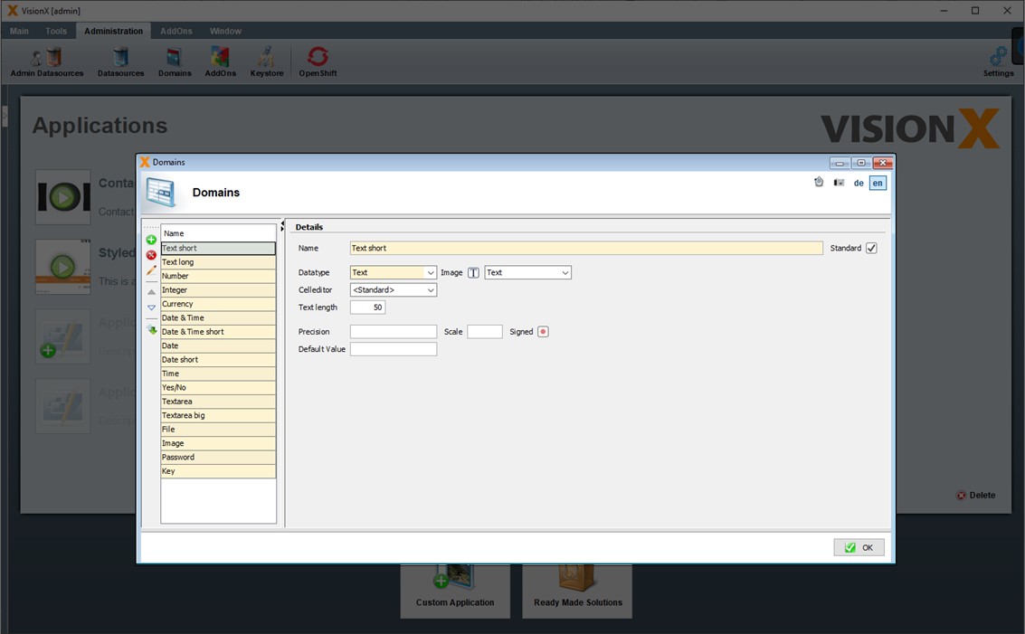
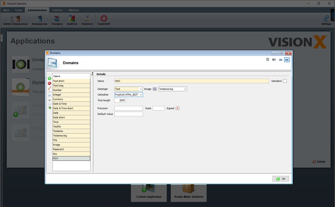
Domains
Domains are used when creating and changing table columns. A domain is a data type and how it can be displayed or edited in a screen.
In this screen you can change existing domains or add new ones.
For example, in VisionX table columns, if the domain 'Text short' is selected, then a column with a text data type of length 50 will be created in the table. If you prefer a length of 60 characters, then simply change this domain to the Text length 60.
| Setting | Description |
|---|---|
| Name | Name of the domain |
| Standard | Indicates if it is a standard domain |
| Datatype | Specifies which data type the table column will get. The choices are - Text, Number, Date/Time, Boolean, Binary. Binary is used for files or images. |
| Image | Image of the domain. Its mandatory! |
| Celleditor | The Celleditor defines how the table column can be displayed or edited in a screen. This is used in tables, editors and all other controls. The following are available: Date & Time, Date & Time short, Date, Date short, Time, Yes/No, Textarea, Password, Image, Currency or 'Standard'. Yes/No - shows a checkbox. Password - shows * (stars) during typing. 'Standard' means VisionX automatically determines the editor based on the default data type to cell editor mappings. |
| Text length | The length of the text for the data type Text. |
| Precision | The length for the data type Number. This includes the pre-comma part and the post-comma part without period. Example: 100.00<html><br></html> If you want to store numbers up to 100 with 2 decimal places, then you need a precision of 5 and scale of 2. |
| Scale | The length of the post-comma part for the data type Number. Example: 100.00<html><br></html> If you want to store numbers up to 100 with 2 decimal places, then you need a precision of 5 and scale of 2. |
| Signed | Indicates whether negative numbers are possible. |
| Default value | Default value of the domain. Eg. 'N' for Checkboxes. That indicates, that the checkbox is not checked. |
Celleditor
You can define your own Celleditors in addition to the predefined ones, or use one of many celleditors from the JVx framework.
Example
Just enter ProjXUtil.HTML_EDITOR as Celleditor and you will get a HTML text editor. That's one of the Celleditors from the JVx framework.
Or you can define your own custom Util class and define a static constant with your celleditor. Make sure this class is add in Eclipse to your VisionX application.
Creating And Editing Applications
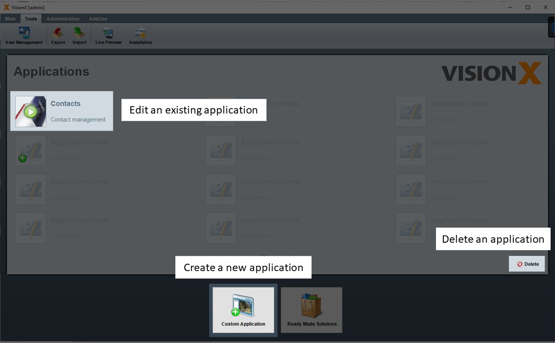
On the VisionX main view, we see a list of all applications. VisionX is installed with a demo application called 'Contacts'.
Clicking the green 'Play' button opens an existing application for editing.
The green '+' button in the application list or the 'Custom Application' button are used to create a new application.
The small red 'Delete' button on the bottom right is used to delete applications.
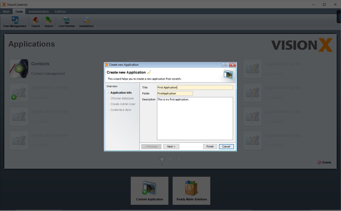
Creating An Application
Clicking on the '+' button will open the new application wizard. In Step 1, the title, folder, and description of the new application are added.
The application description is entered as text in the specification document as well as the Java source code documentation. This is true for all description fields in VisionX. The description fields should therefore be completed carefully, to create adequate documentation for the application and to maintain a specification document. See Documentation for more details on documenting applications.
Note: VisionX offers wizards for several processes, which enable the step-by-step creation of applications, screens, etc. Most wizards can be completed by clicking the 'Finish' button at the first step, in which case the default settings will be used.
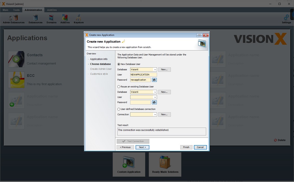
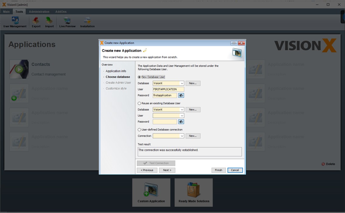
Choose Database
In Step 2, the database user is chosen, which is used for your new application to store tables and data.
New Database User
The default setting is a new database user in the database VisionX. As user and password the application name is used.Note -The VisionX database is a standard Postgres database that is embedded in VisionX so that you can immediately have a database for your applications without any further installation steps.
Reuse an existing Database User
A user can be selected from the list of available database users for the chosen database. This user is then utilized for the new application.User-defined database connection
A user-defined database connection can be selected, which is then used by VisionX for the new application.
New database connections can be created using the 'New' button. We name this database connections data sources. For options one and two, the admin data source screen is opened, whereas the 'New' button next to the third option opens the screen for user-defined data sources.
See Datasources for more details to define new datasources.
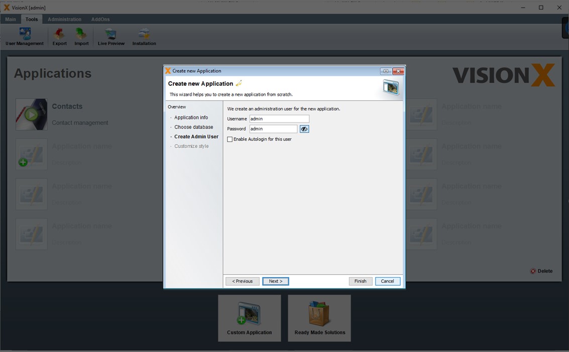
Create Admin User
In Step 3, the administrator user for your application is defined.
Additional users for the application can be created in the user management screen of the application later. Since the administrator user has all rights in the application, a secure password should be selected for this user. The default setting is admin/admin. Please change the password!
Option 'Enable Autologin for this user' can be used to configure that no login is required for the application. In this case, the user specified above and the associated rights are used when you run the application.
See User And Role Management for more details.
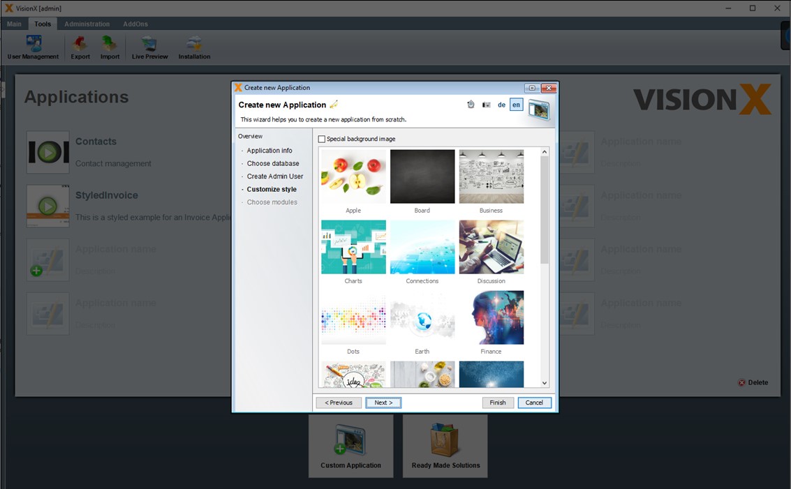
Choose Background Image
Choose a background image or upload your own later.
Choose Modules
Choose the modules you need for your application. Modules are parts of add-ons. You can download new add-ons from Ready Made Solutions Store.
See Ready Made Solutions Store
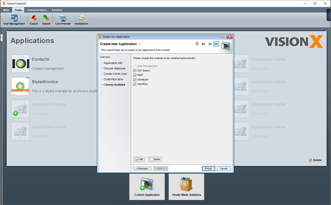
Clicking 'Finish' creates and opens the new application in VisionX for editing.
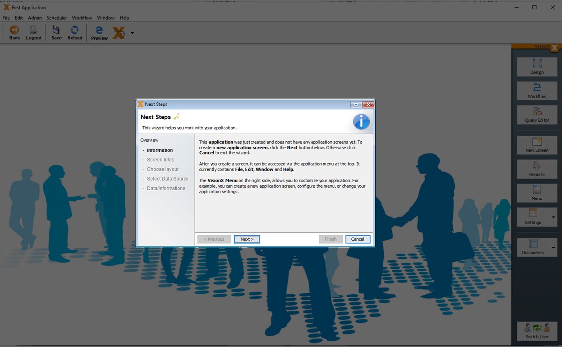
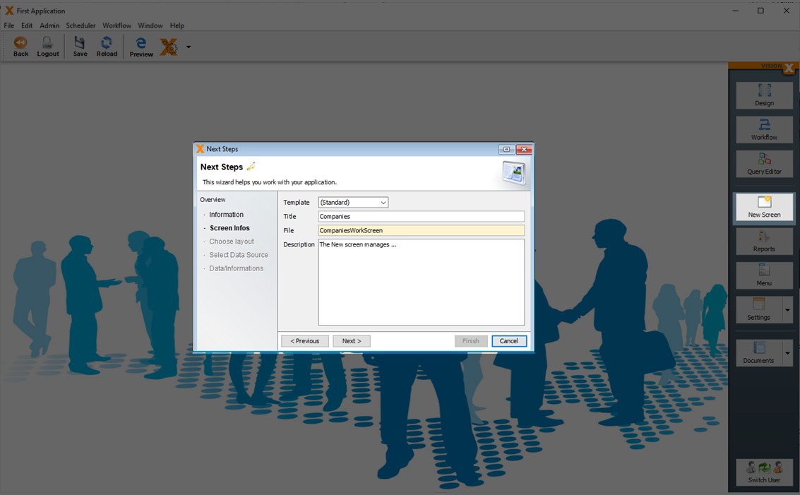
Next Step - Create Your First Screen
The 'Next Steps' wizard opens automatically, which guides you through creating your first screen.
Read more about creating a new screen - Creating Screens
Editing Applications
Let’s editing an existing application. We are going to use the 'Styled Invoice' application that you can download from the solutions store. See Ready Made Solutions Store.
Clicking on the application name will open it in VisionX for editing.
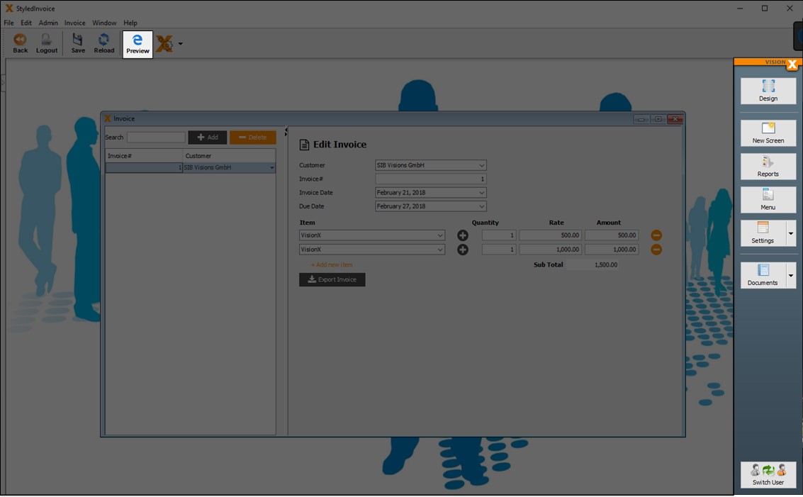
On the right side of the screen, there are a lot of options to edit the application:
| Menu | Description |
|---|---|
| Design | Edit a screen in the VisionX User Interface Designer. More detail see - User Interface Designer |
| New Screen | Create a new screen. More detail see - Creating Screens |
| Report | Create/edit reports. More detail see - Reports |
| Menu | Change the application menus and toolbars. More detail see - Menu |
| Settings | Change application settings for desktop/general, web, mobile and add-ons. More detail see - Settings |
| Documentation | Create application / REST Swagger documentation. More detail see - Documentation |
| Switch User | Change the user to test screens from the perspective of different roles. |
Depending on the installed VisionX add-ons, you will find even more functions here.
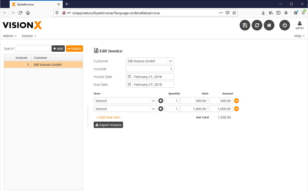
To see a live preview of your application, click the 'Preview' button on the toolbar. The application will open in a browser, where you can log in and test the application (default credentials for the administrator user are username: admin/password: admin).
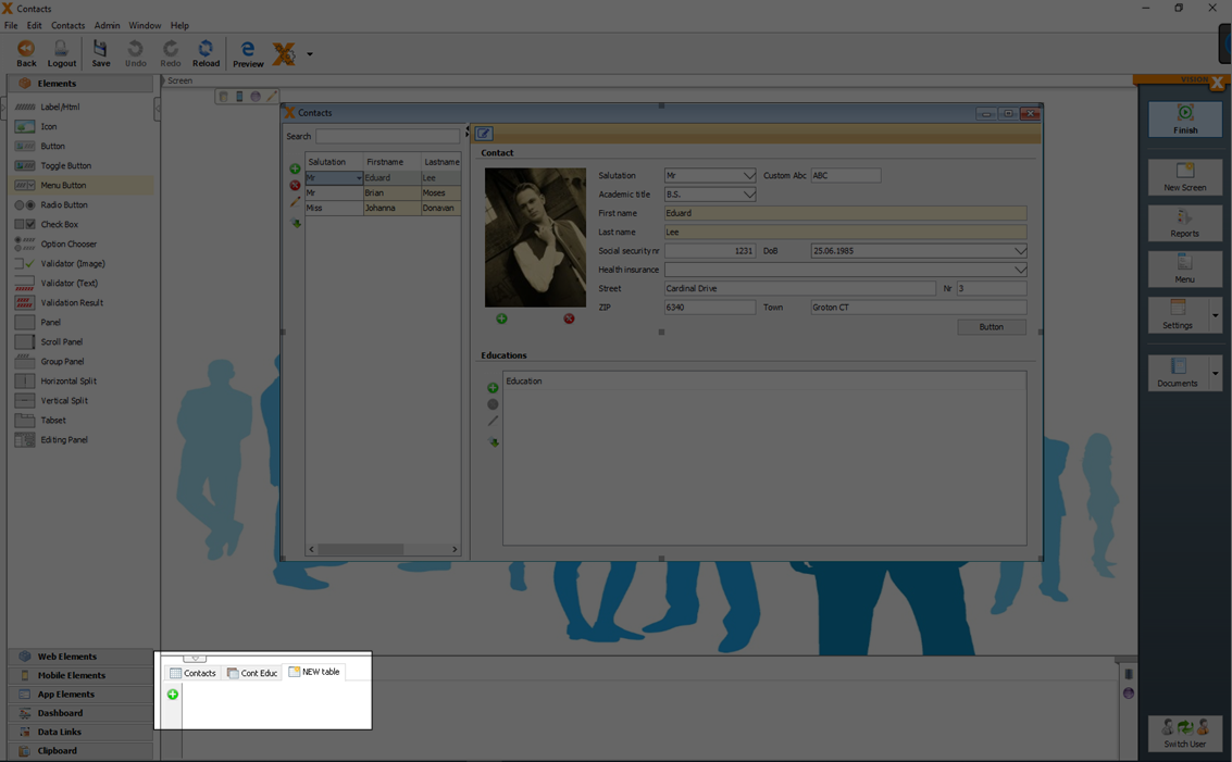
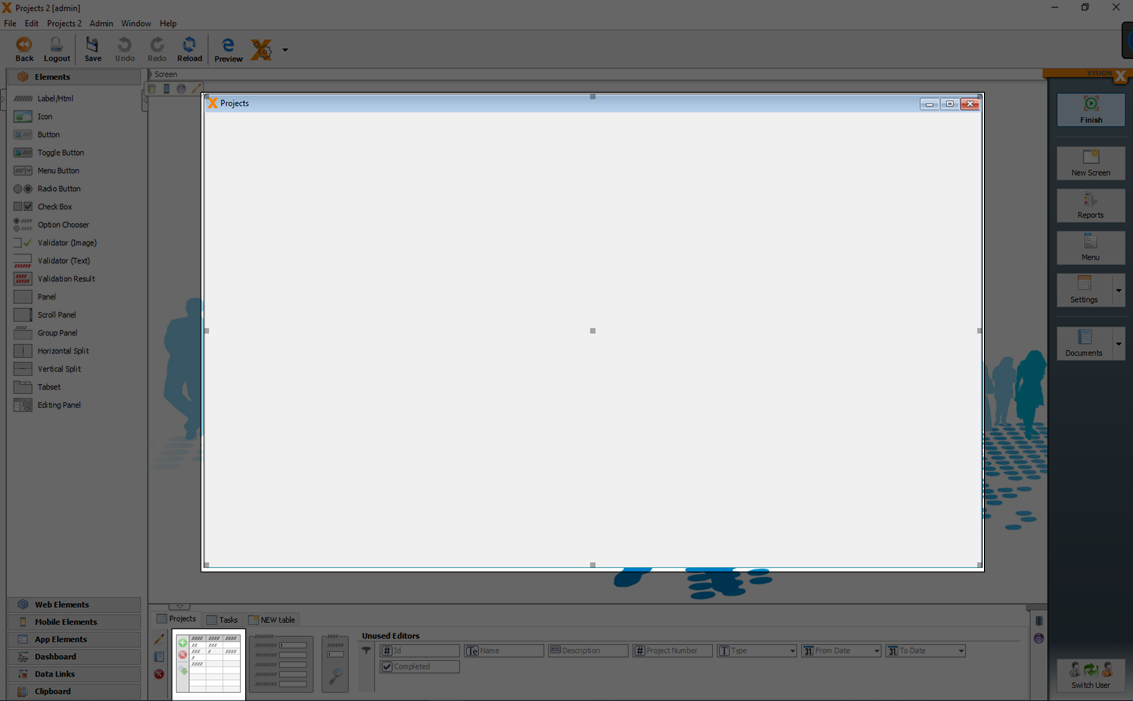
Creating Screens
The 'New Screen' wizard in the application's menu is used to create a new screen.
Screen Infos
In Step 1, the title, file name and description of the screen are entered. Note that the application description is entered as text in the specification document as well as the Java source code documentation. This is true for all description fields in VisionX. The description fields should therefore be completed carefully, to create adequate documentation for the application.
More detail see Documentation.
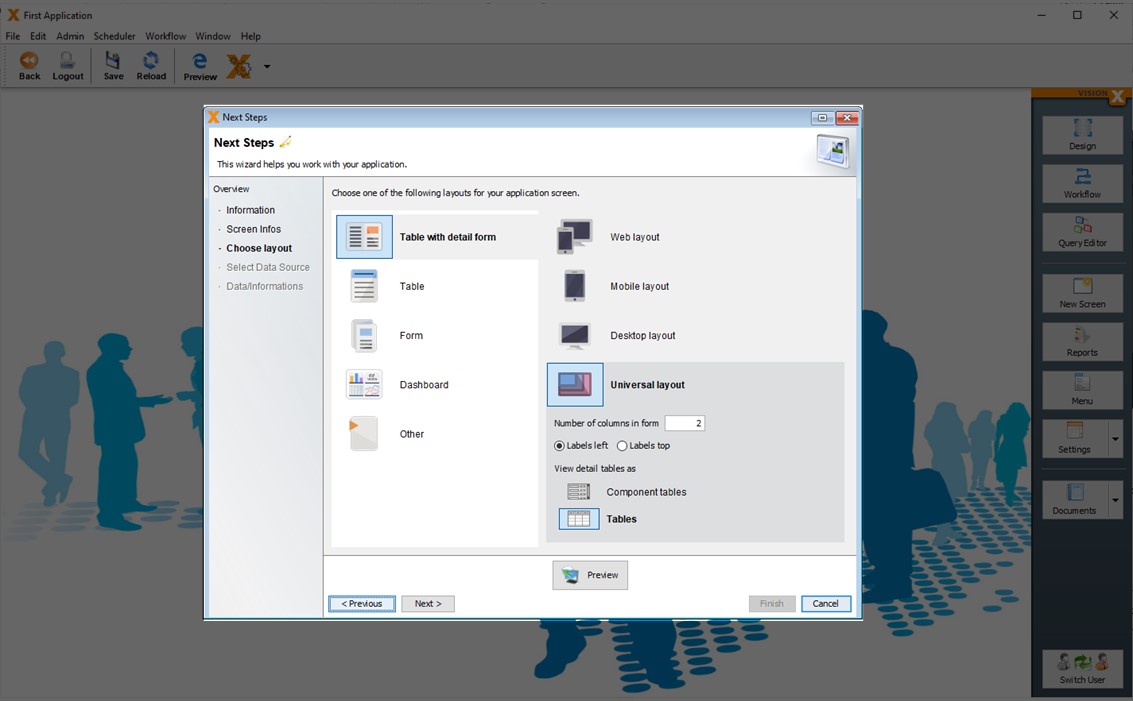
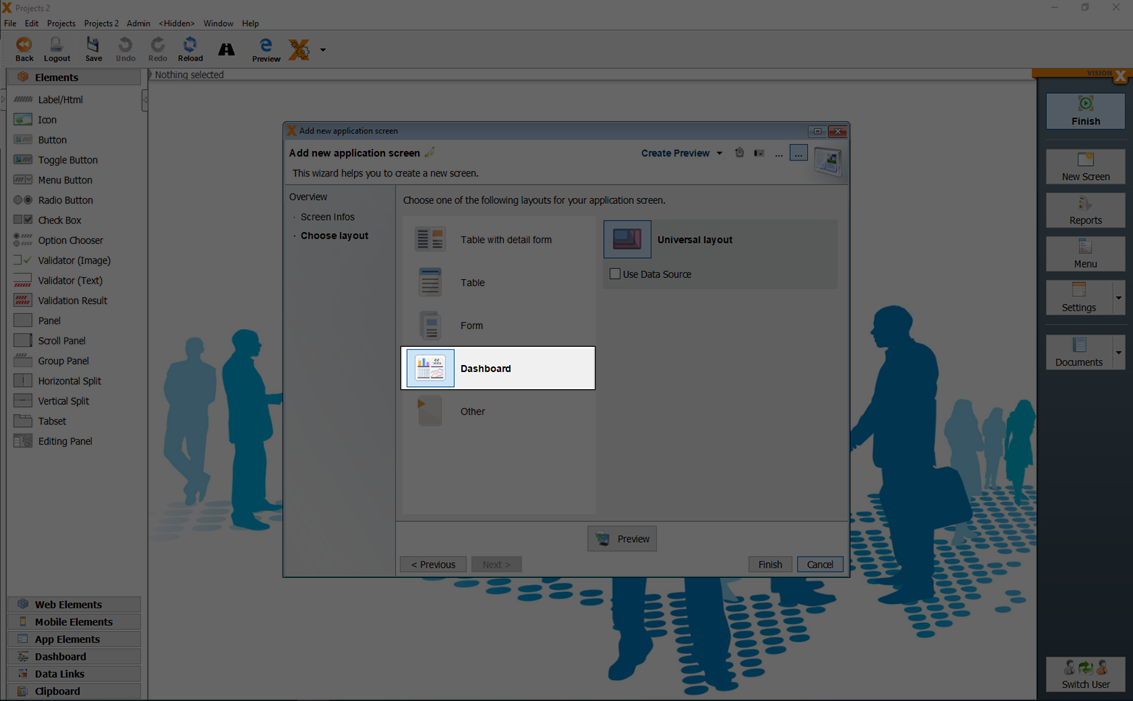
Choose Layout
In Step 2, the screen layout is selected. The following layouts are available:
- Table with detail form (split either horizontally or vertically)
- Table
- Form
- Dashboard
- Other (for an empty screen)
For each of the first three options, we can additionally choose between web, desktop, mobile or universal layouts
Note - Every VisionX application is a native mobile app, a responsive web app or a native desktop app without modification. Regardless of the layout chosen, all screens can be used on all devices - mobile, web, desktop. VisionX with its smart responsive design, transforms all screens automatically depending on the device and size.
For more information see Responsive design.
The difference between the web, desktop, mobile or universal layout is only in the default setting of the screen. This can be changed later in VisionX User Interface Designer at any time.
Depending on the selected layout, the number of columns for the input fields/dropdown lists on the form can be selected. The default setting is two columns of input fields.
The location of the form field labels can also be selected (to the left of the input field or above it).
For the web and mobile layouts, we can choose whether detail tables should be displayed as component tables or as regular tables.
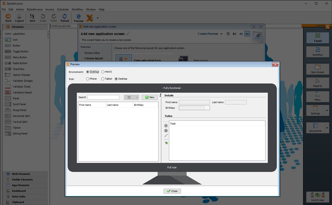
Preview
When you click on the Preview button, the screen with the selected layout is opened in a live preview for viewing. In this live preview you can change the environment and size to test the behavior of the screen.
Note - This preview is fully functional. Therefore you can click buttons, enter, change and delete data.
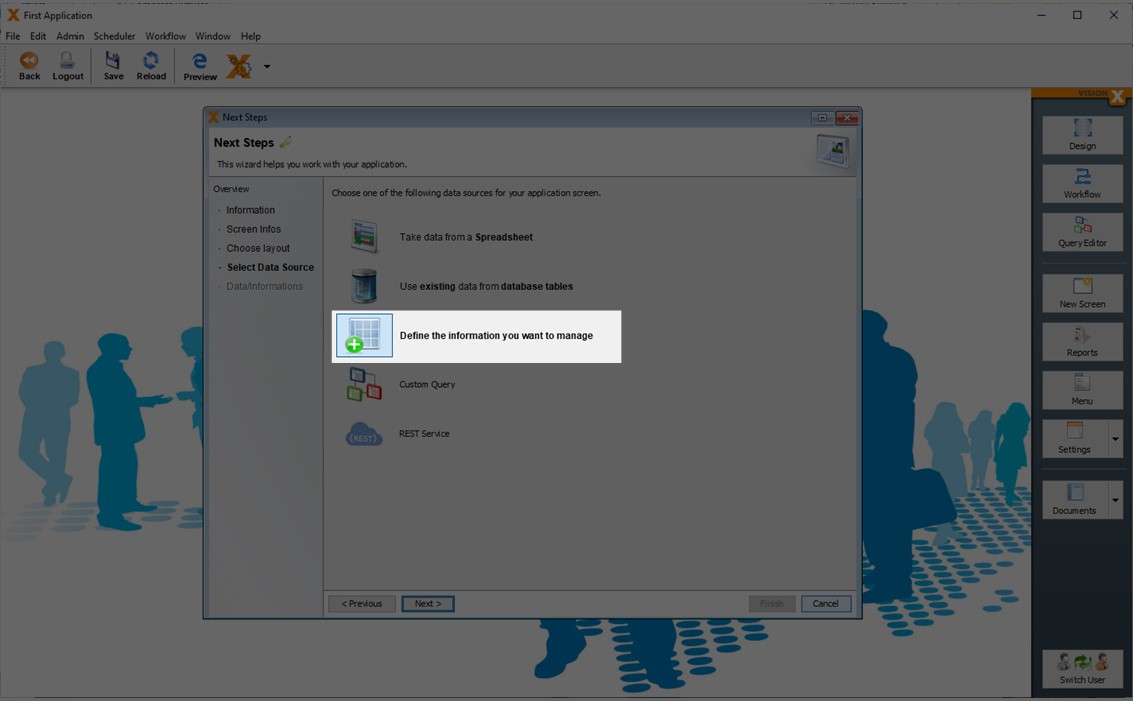
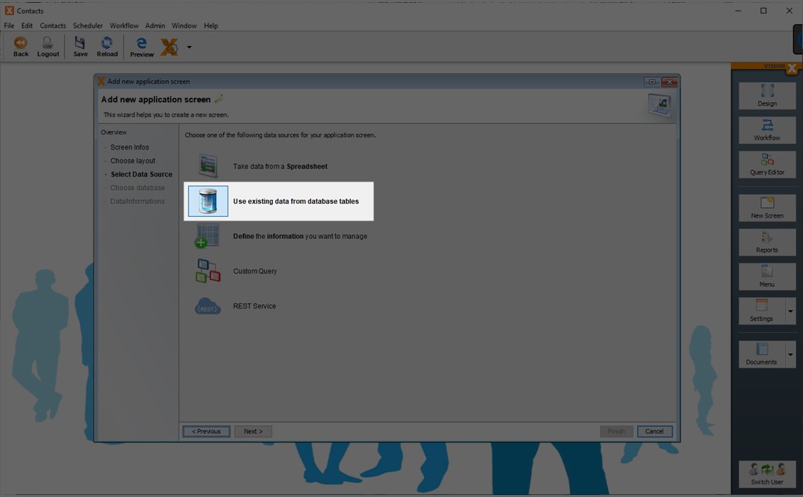
Select Datasource
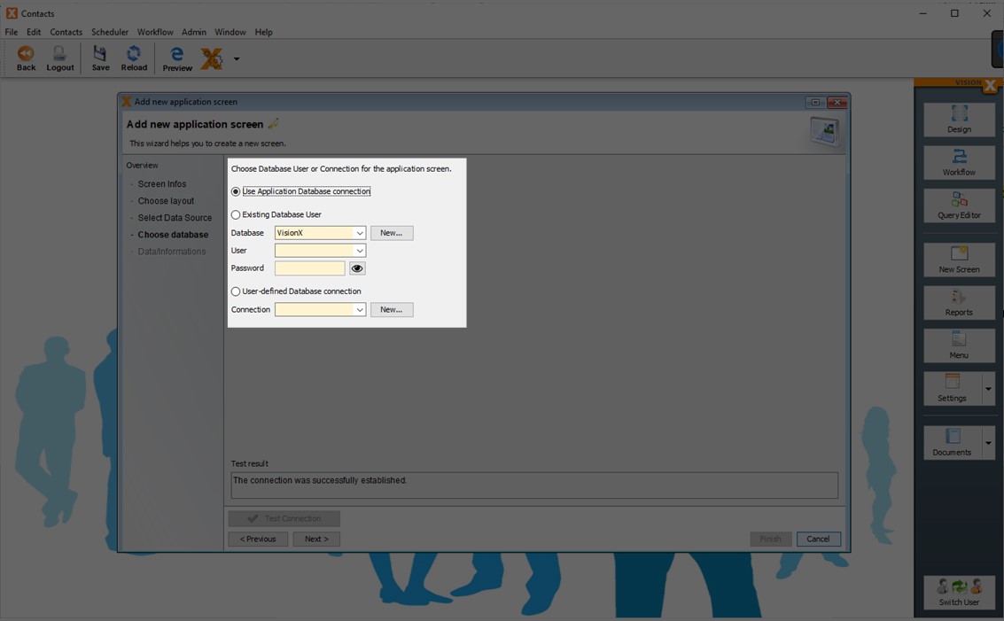
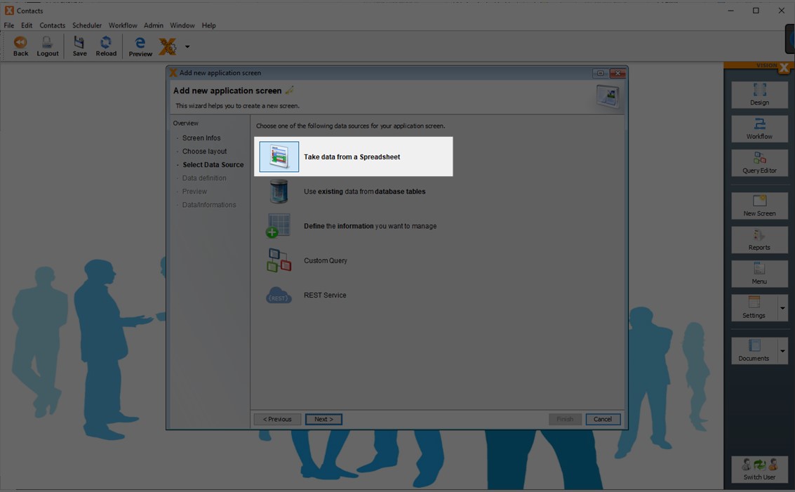
In Step 3, the screen's data source is selected. The following options are available:
- Import an Excel file in database table(s)
- Use existing database table(s)
- Create new database table(s)
- Use a custom query (Query Editor Add-on has to be installed - Query Editor)
- Use a REST service (REST Add-on has to be installed - [REST])
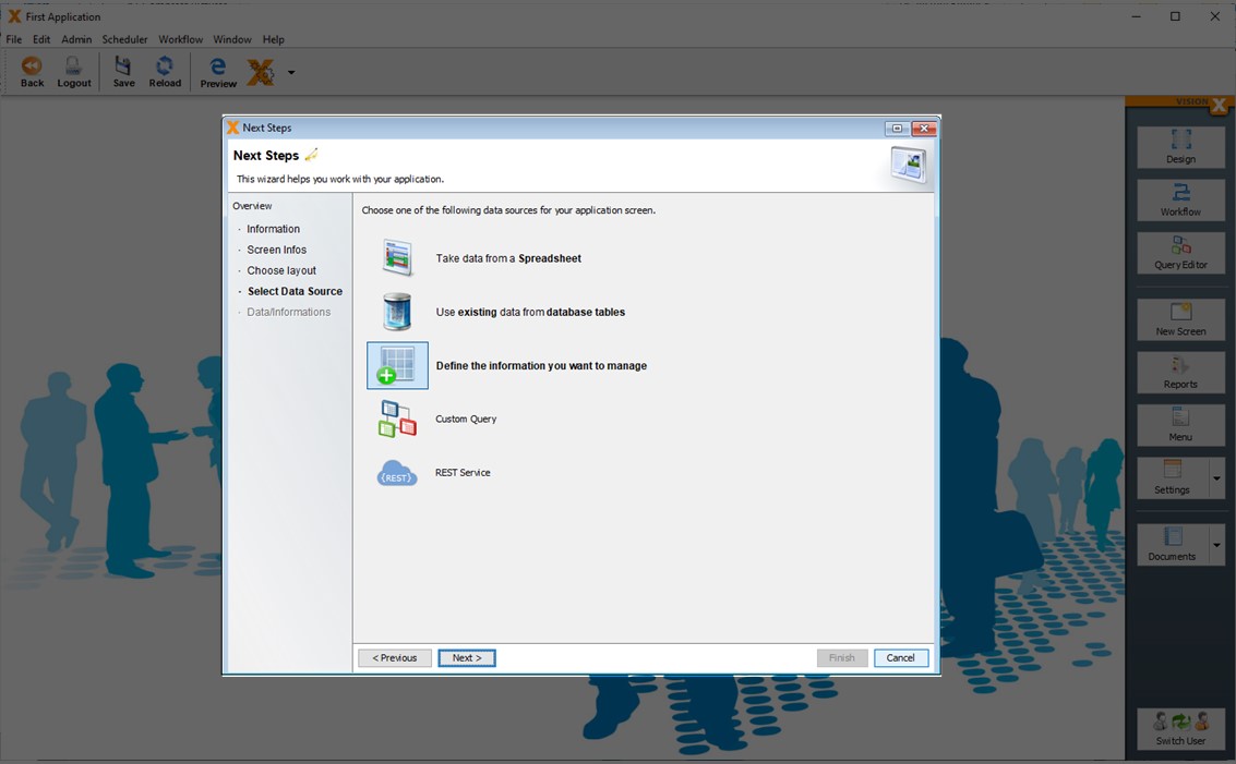
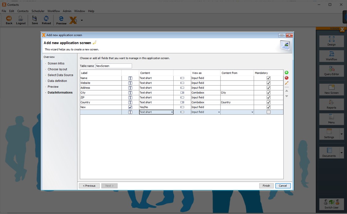
Create New Database Table(s)
New database tables can easily be created at any time. To create a new database table when adding a new screen, select 'Define the information you want to manage'.
In the next wizard step, the table name and structure is defined.
Double-click in the first row on the Label column to change the table name. The default setting is the screen name.
Then simply enter the field names you want to use in the screen into the Label column.
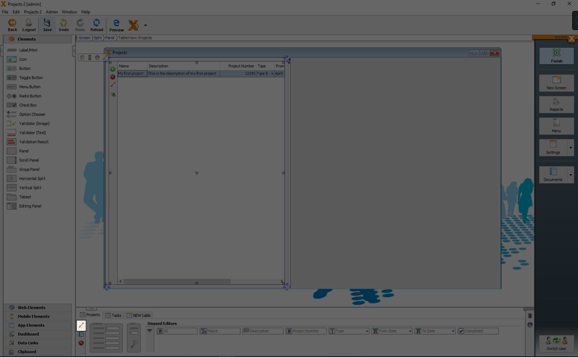
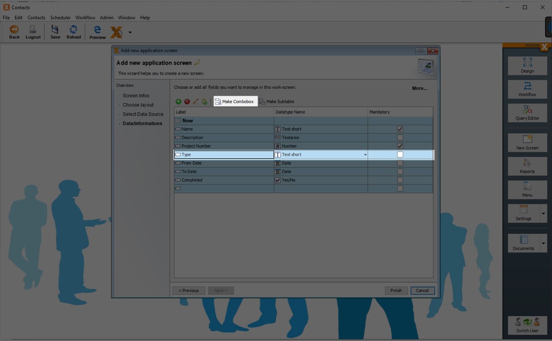
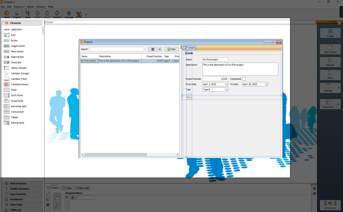
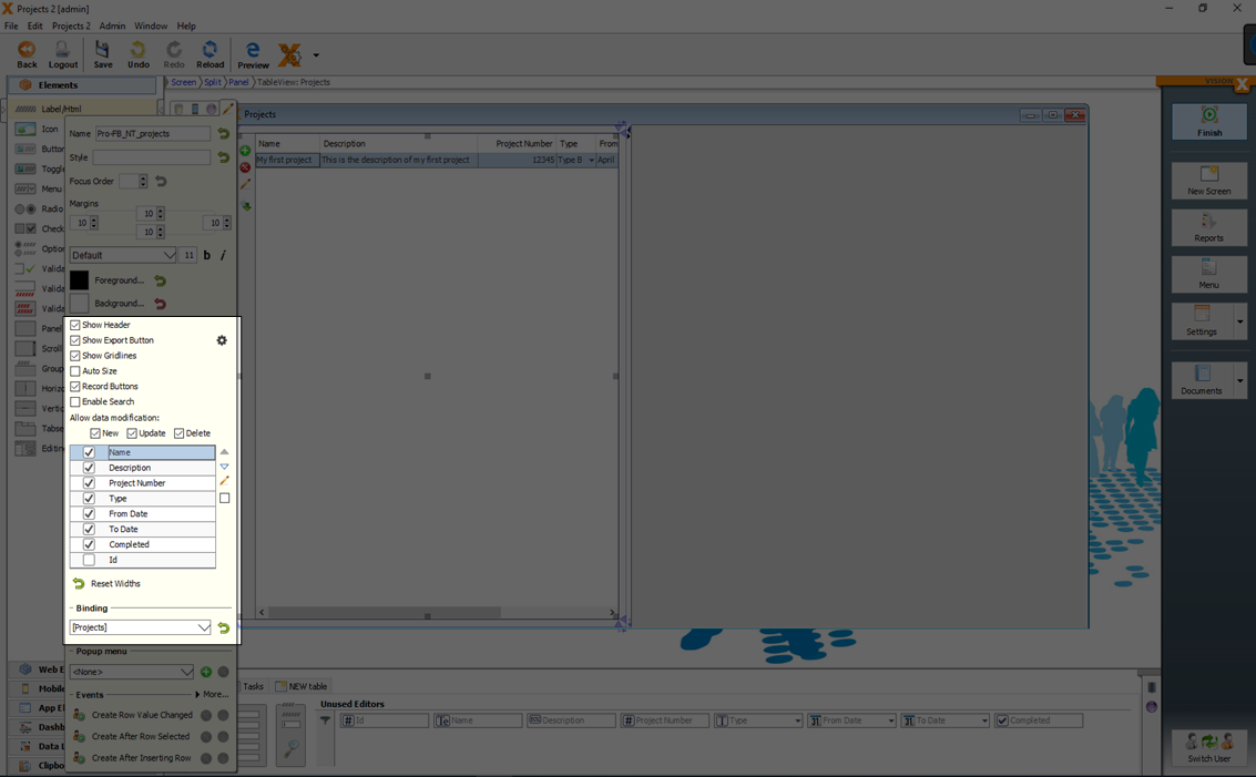
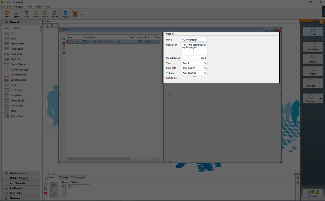
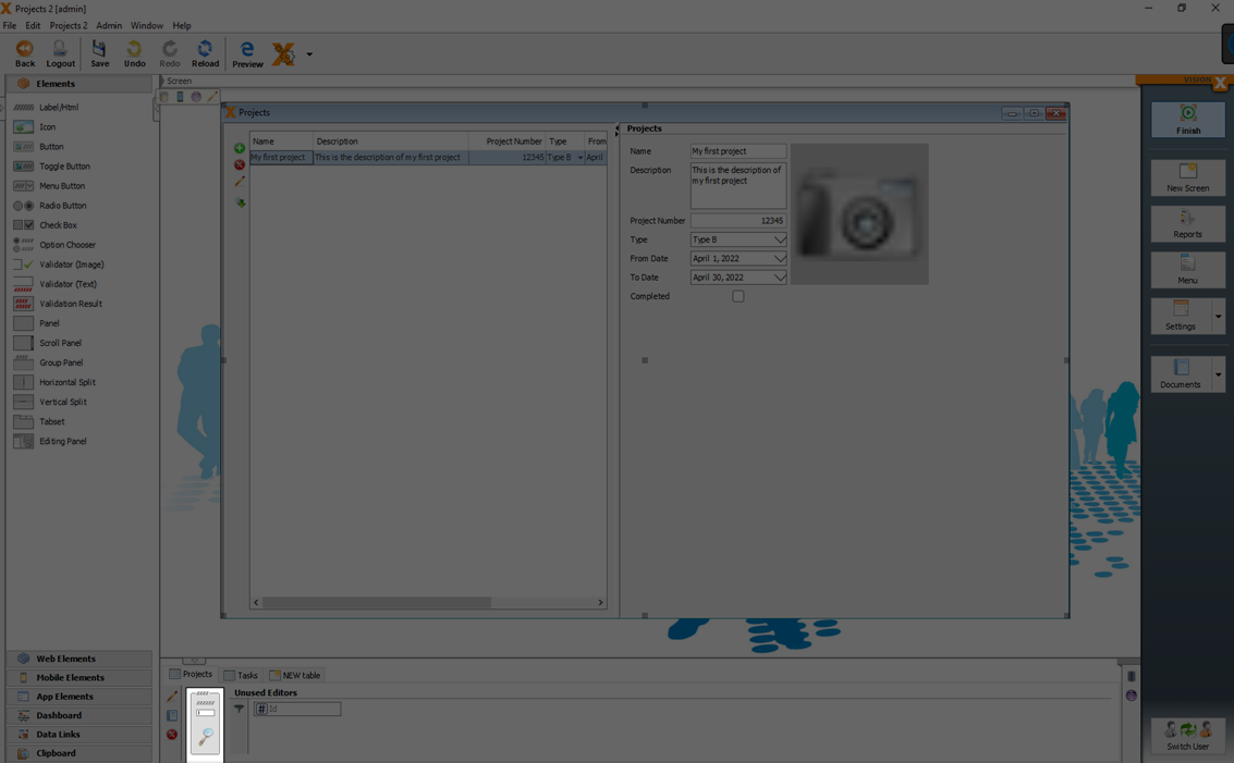
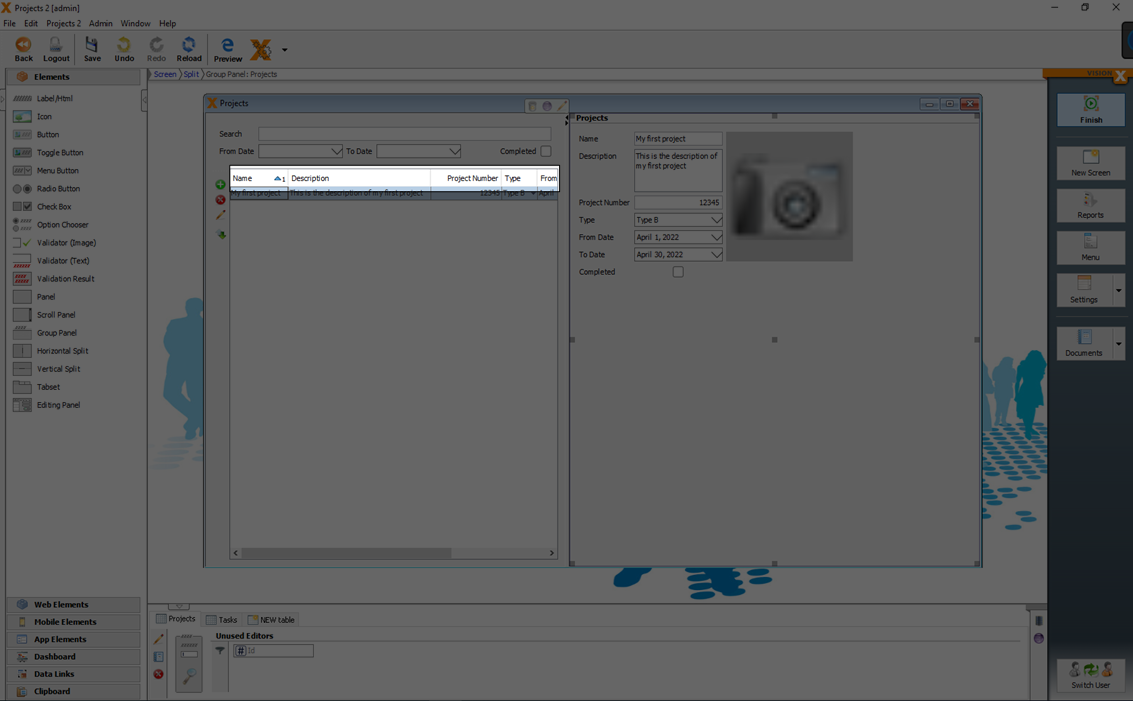
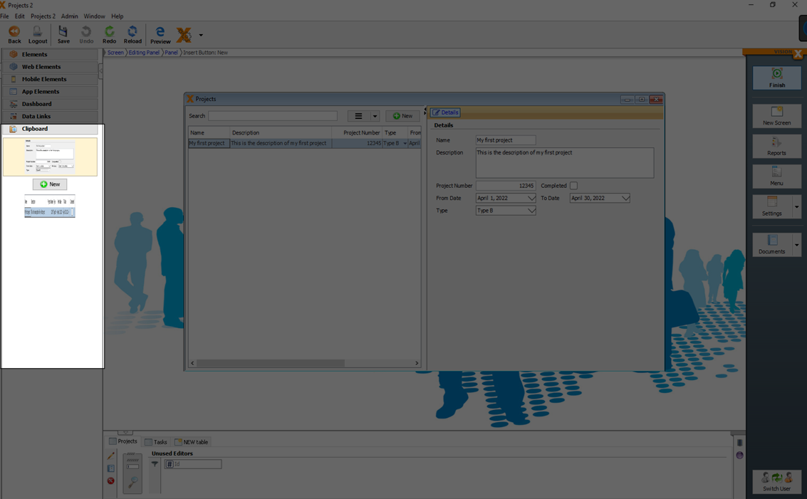
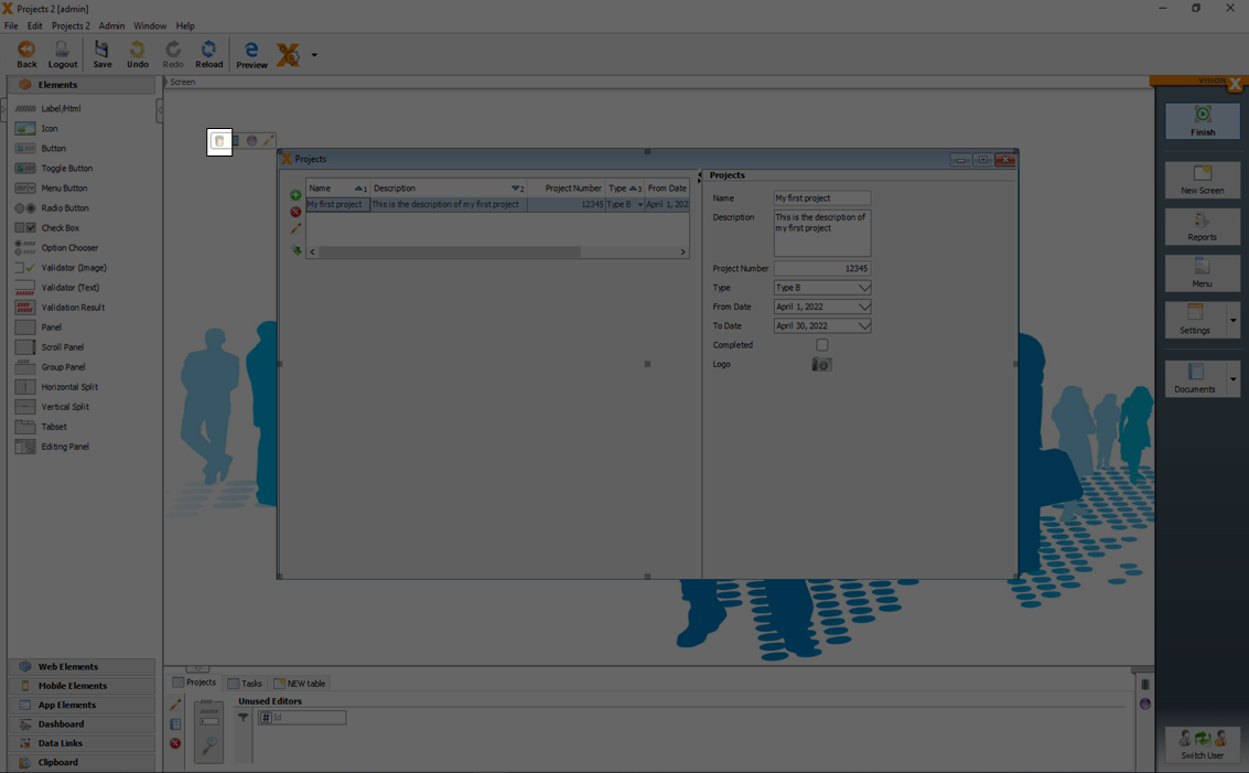
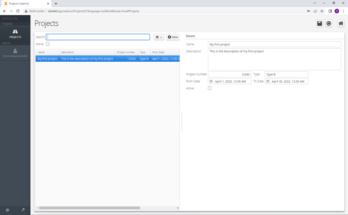
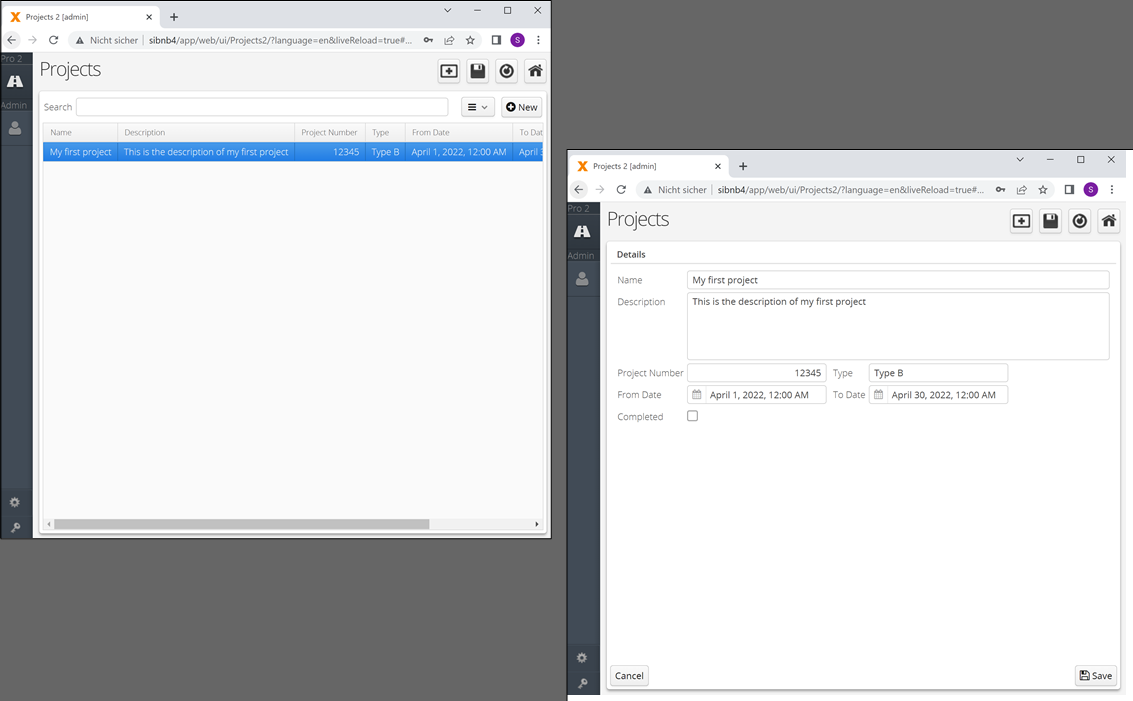
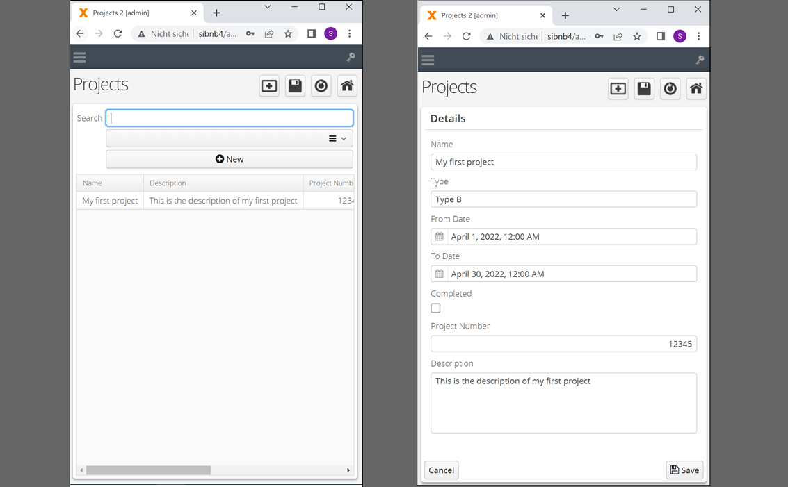
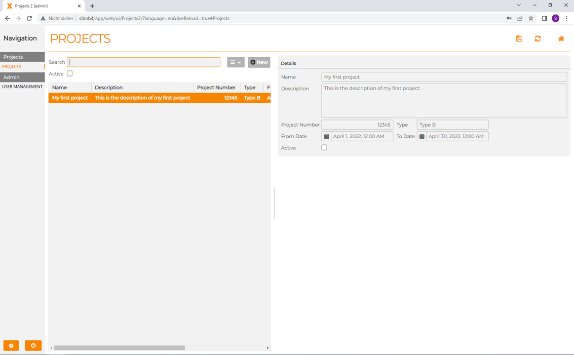
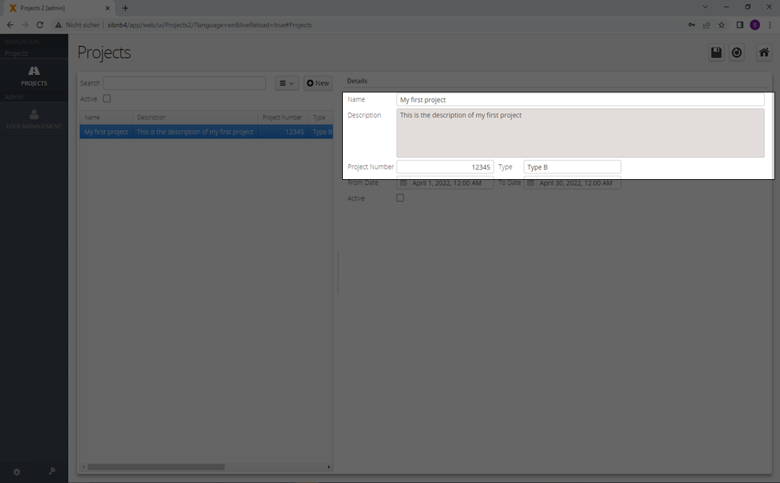
Let’s define a simple table for a project management application as an example, with the following:
- Name
- Description
- Project Number
- Type (Drop-down List)
- From Date
- To Date
- Completed – Yes/No (Checkbox)
- Tasks (Subtable)
The entered labels are used as column names in the database table. Column names are automatically adjusted to database conform column names. (Spaces converted to underscores, special characters removed, reserved key words renamed)
In the generated screen the labels are used for the editor labels and table headers.
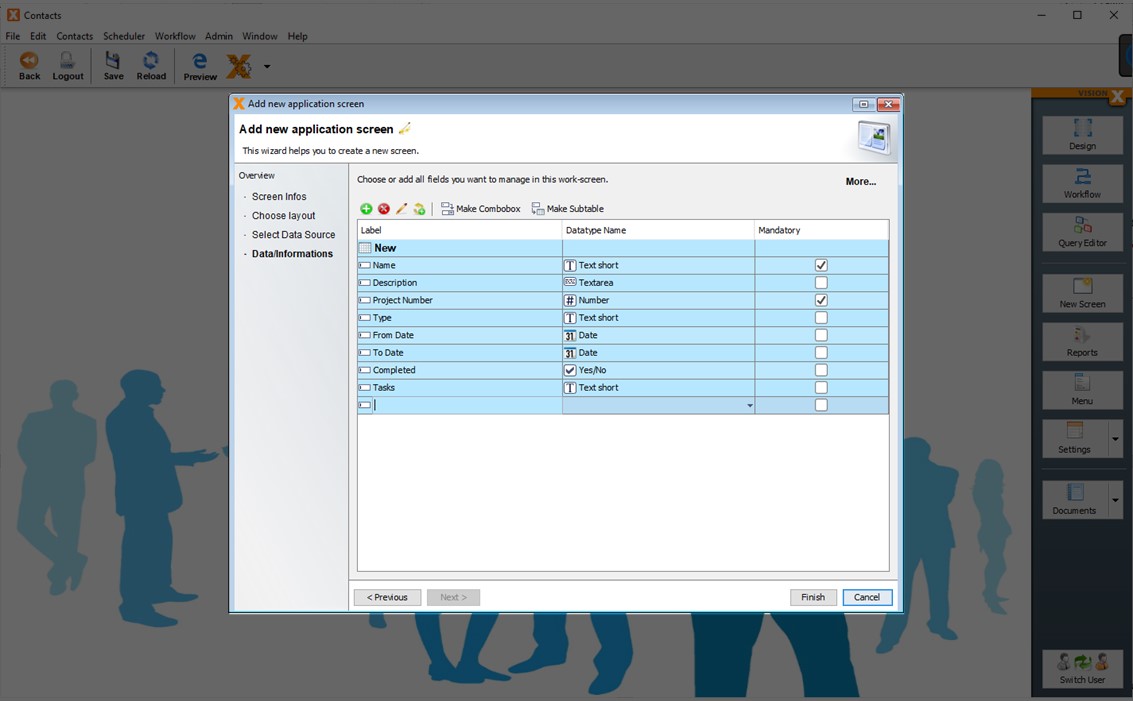
VisionX attempts to determine the data type based on the label. The data type / domain can then be edited in the 'Datatype Name' column if necessary. In this example, we will change the data type for the 'Completed' column to 'Yes/No', which will make the corresponding editor a checkbox editor on the screen.

In the data type column is actually defined, the data type and how it is displayed or edited in the screen. This combination is also named a domain.
The following are available:
| Domain | data type |
|---|---|
| Text short | Text - Length 50 |
| Text long | Text - Length 200 |
| Textarea | Text - Length 2000 |
| Textarea big | Text - Length unlimited |
| Yes/No | Text - Length 1 |
| Password | Text - Length 50 |
| Number | Number - Unlimited precision |
| Integer | Number - Precision 28, Scale 0 |
| Currency | Number - Precision 28, Scale 2 |
| Key | Number - Precision 16, Scale 0 |
| Date & Time | Date/Time |
| Date & Time short | Date/Time |
| Date | Date/Time |
| Date short | Date/Time |
| Time | Date/Time |
| File | Binary |
| Image | Binary |
Precision
The length for the data type Number. This includes the pre-comma part and the post-comma part without period.
Scale
The length of the post-comma part for the data type Number.
Example: 100.00
If you want to store numbers up to 100 with 2 decimal places, then you need a precision of 5 and scale of 2.
More details to add new domains you will find in chapter - Domains.
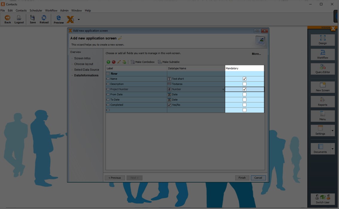
The 'Mandatory' check box defines whether a value is required for the column. For this example, we will make the project name and number mandatory.
After defining the table name and its columns, we can also define comboboxes / drop-down lists and subtables.
How to create such complex related models see:
Import An Excel File In Database Table(s)
VisionX can import Excel sheets, CSV files into new database tables. This is the best option to start when there is already data available in Excel sheets.
Select 'Take data from a Spreadsheet' and click 'Next'.
Click on the 'Load File' button to upload the file.
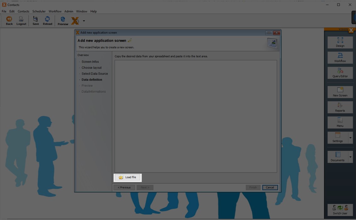
Alternatively, any table from Excel or Word can be copied to the clipboard and then pasted into the wizard's text field.
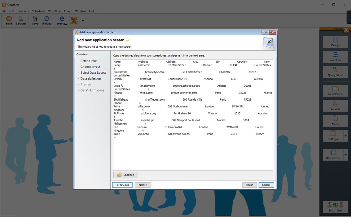
Please note that only structured tables can be imported. Accurate recognition of a collection of data with varying amounts of columns per row cannot be guaranteed. Therefore, every table should consist of a fixed number of columns with appropriate values in every row and column. Columns can also remain empty.
The next step shows a preview of the data import. The following options can be selected.
The 'Yes/No detection' option can be used to attempt to recognize Yes/No fields (checkboxes). If this option is selected, columns containing Yes/No, Y/N or true/false values are created as checkboxes.
The 'Dropdown detection' option is used to define columns as dropdown lists (combo boxes) if they contain multiple entries of the same value (e.g., Mr., Mrs.).
The 'Dropdown value threshold' defines how many times the same value must appear before the column is recognized as a dropdown list. 'Dropdown grouping' attempts to group similar dropdown lists (in the entire Excel/CSV table) into a single list (e.g., if multiple columns contain salutations).
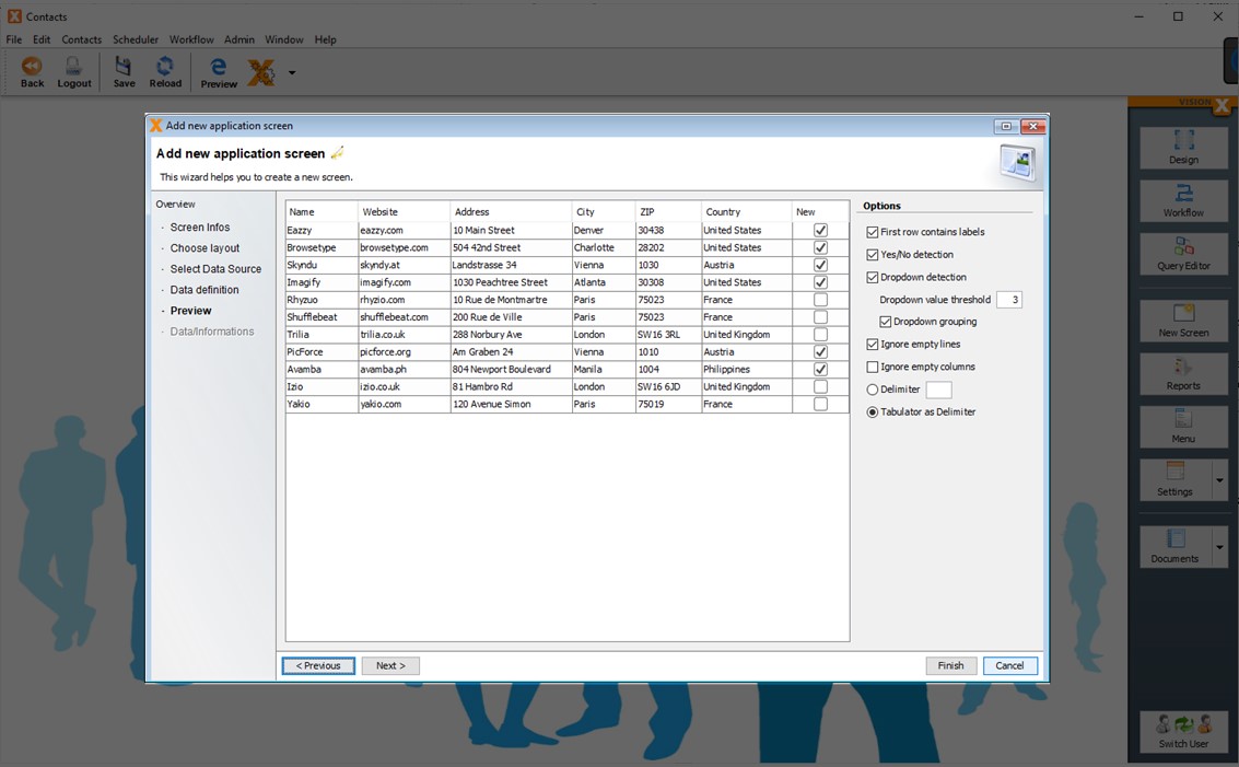
The next step shows the table structure for the database table. On this screen, the description, content, and view can be edited, fields can be added/deleted, and the order of the fields can be changed.
The data format can be chosen for each column, just as it would in the CSV import function in Excel. VisionX attempts to recognize the format automatically as much as possible.
The functionality here is the same as in the section Create New Database Table(s).
Use Existing Database Table(s)
To use an existing database table, select 'Use existing data from database tables'.
The next step is to choose a database.
- Use Application Database connection
The application database connection is selected by default. This is the database connection that was chosen when the application was created. This is the 'default' data source shown under the 'Datasources' tab of the Application Settings menu. - Existing Database User
A database user can be selected from the list of available database users for the chosen database. All tables and views available for this database user can be selected in the next step. - User-defined database connection
A user-defined database connection can be selected. All tables and views available for this database user can be selected in the next step.
New database connections can be created using the 'New' button. We name this database connections data sources. For option 2) the admin data source screen is opened, whereas the 'New' button next to the third option opens the screen for user-defined data sources.
See Datasources for more details to define new datasources.
In the next step, a table can be selected from the dropdown in the 'Label' column.
Double click in the field to open the dropdown!
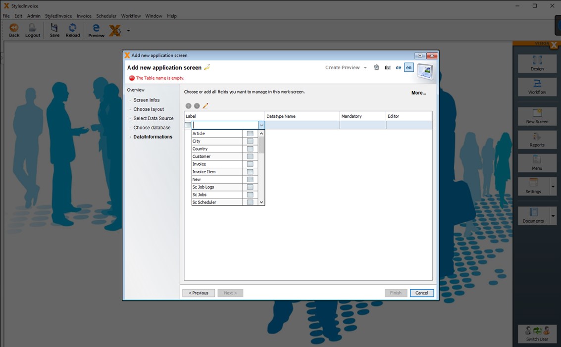
After selecting a table, all columns of the table will be displayed. VisionX determines a suitable label for each column. This field labels for the screen can be edited. Furthermore, the data type / domain, as well as whether the column is mandatory or not is displayed.
In the column 'Editor' you can choose if an editor element will be created when creating a new screen.
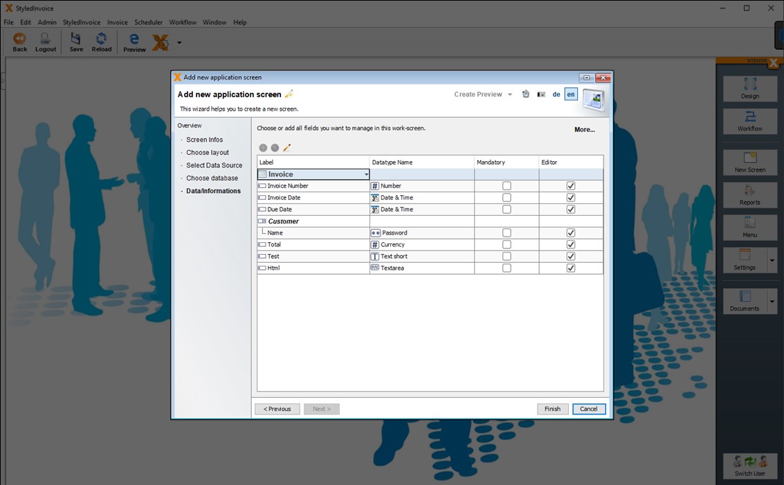
If you click on the 'More' button in the upper right corner, you can see more details about the selected table.
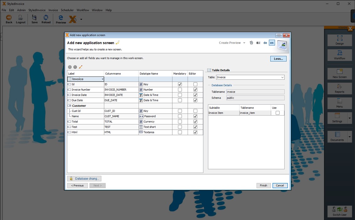
The column names of the table are displayed. E.g.: INVOICE_NUMBER. Furthermore the primary key columns / ID columns are displayed.
In the right area all possible subtables are displayed for the selected table. These are all tables which reference the selected table by foreign key. In our case this is the 'Invoice Item' table.
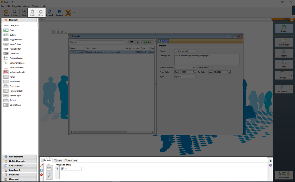
If you click on 'Use', the subtable will be added as detail to the Invoice table. This way all Invoice Items will be displayed for each Invoice. A so called master/detail relation will be added.
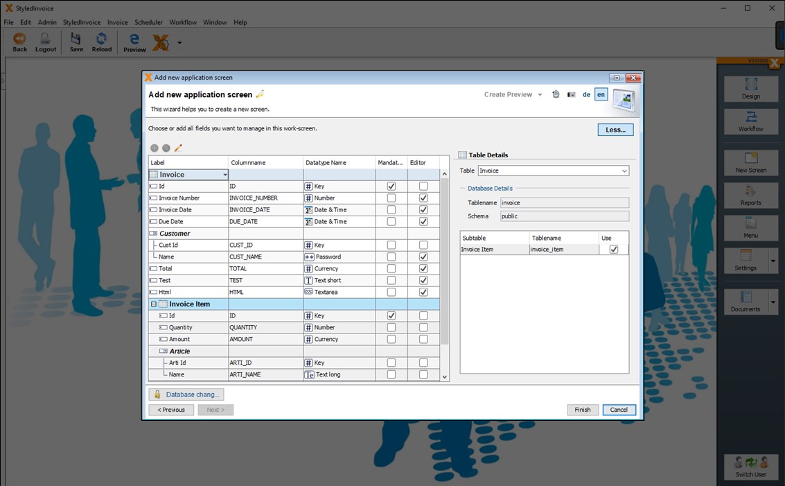
After you click 'Finsh' the screen with the selected tables will be created.
Editing Screens
Click on the 'Design' button on the top right to start editing a screen in the User Interface Designer.
Data Model
A data model is a table with rows and columns to hold the data. Data models can be created or updated any time.
Basics
A basic description how to define a table with columns and different datatypes you will find in Create New Database Table(s).
The definition of a data type and how it can be displayed or edited in screens, can be defined with Domains
Create Data Model
New data models can be created during the generation of a screen (see also Creating Screens) or in the section 'New table' with the green add button during screen design.
See also the following video:
Change Data Model
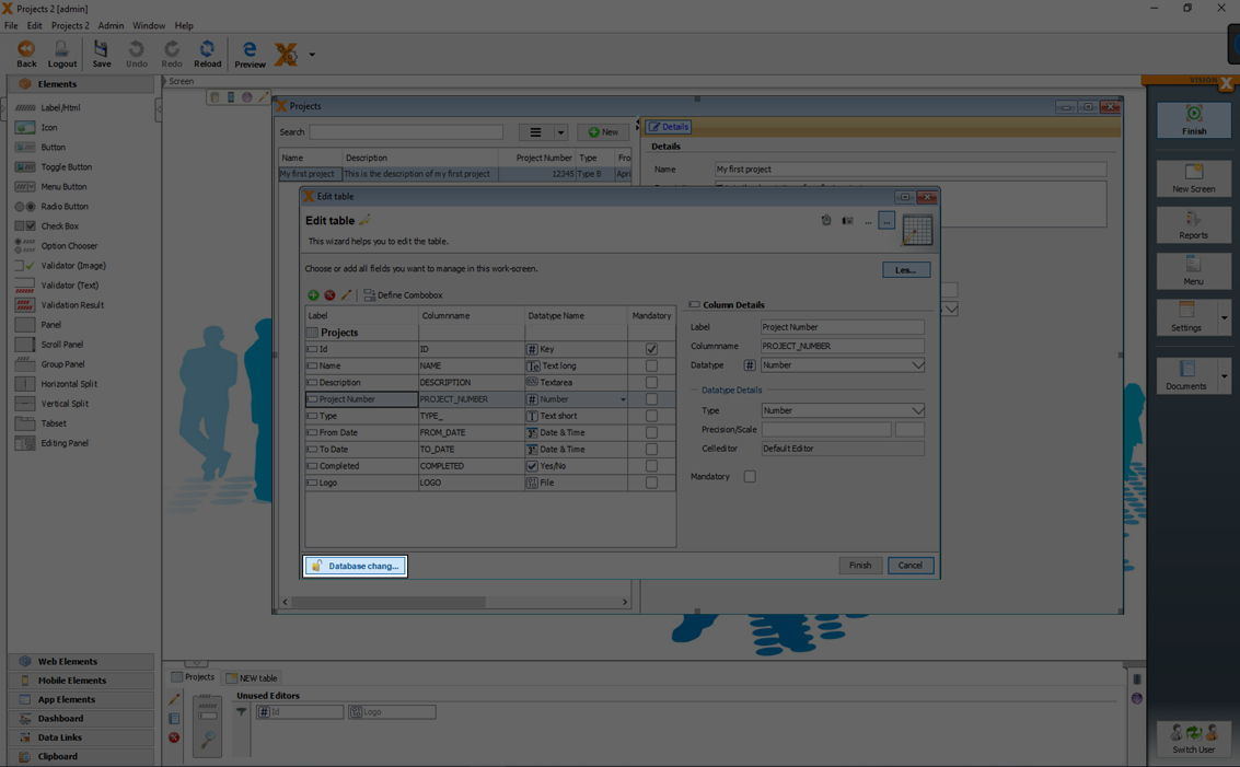
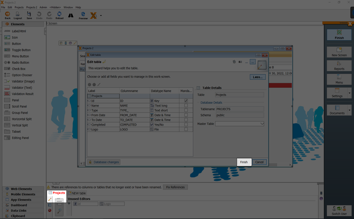
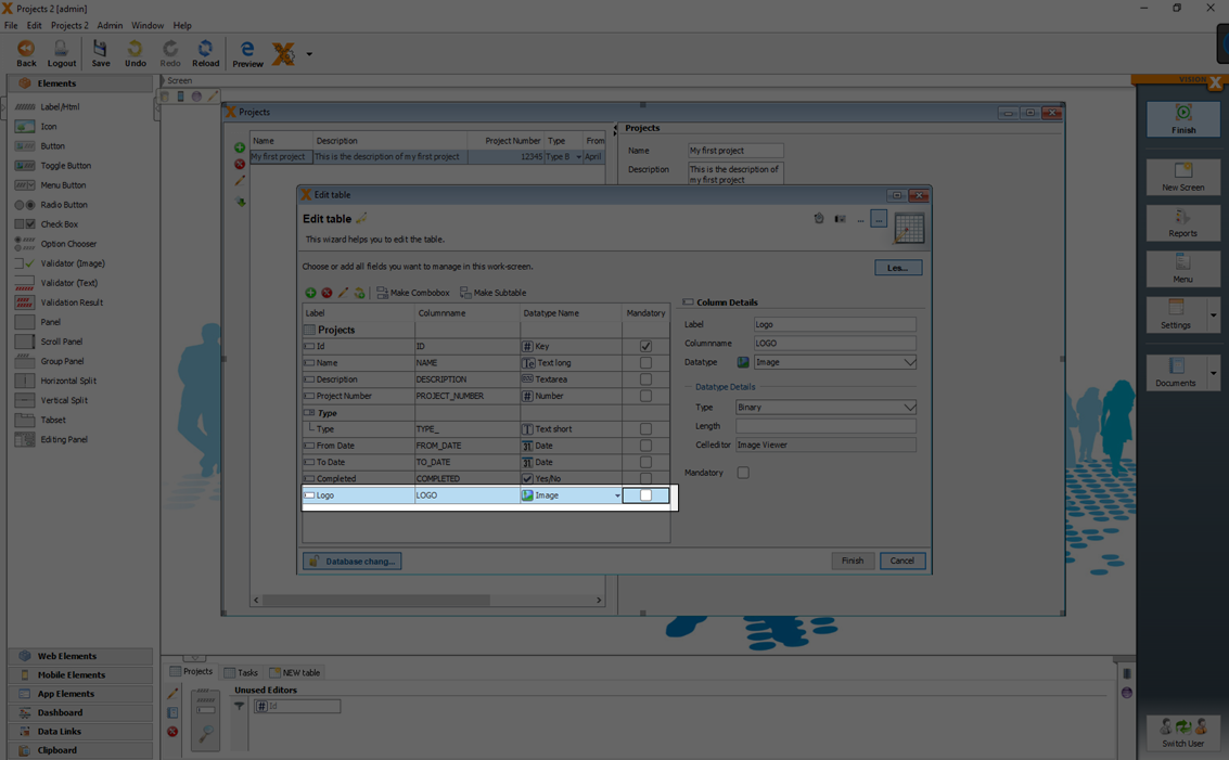
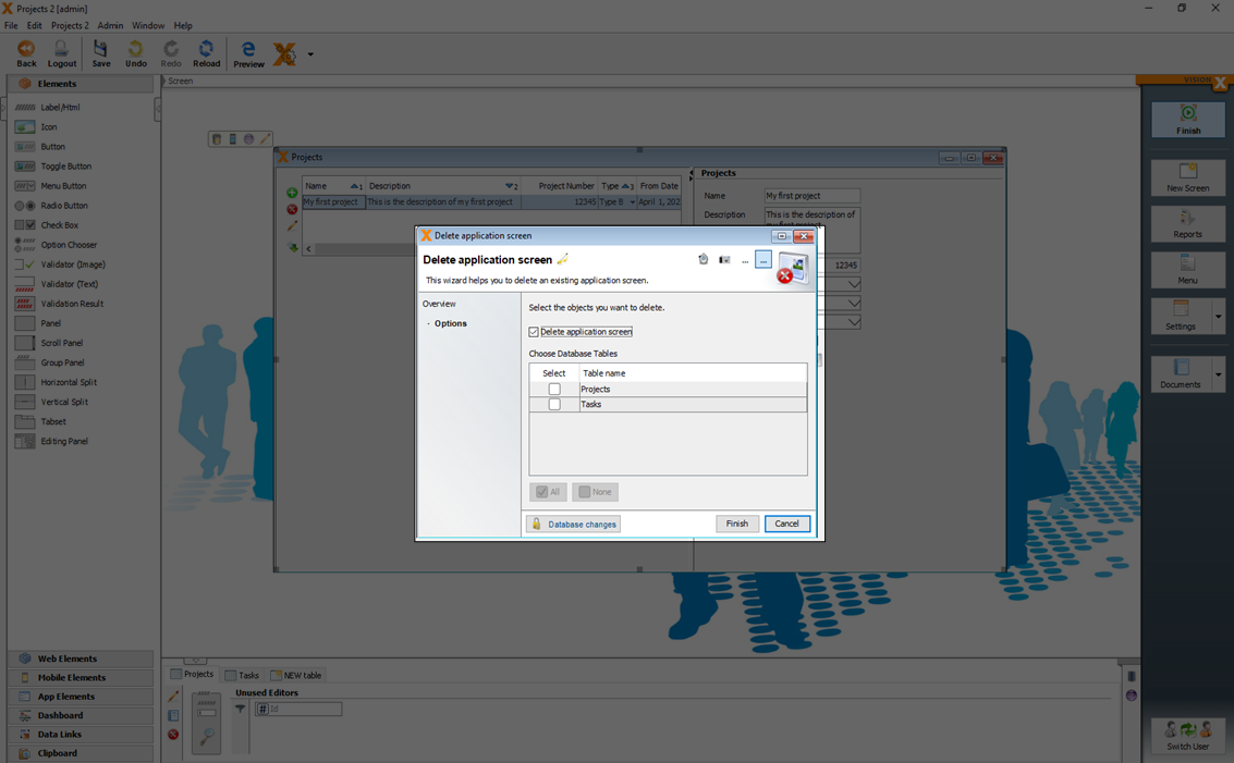
Clicking on the pencil opens the 'Edit Data Object' wizard, which allows us to add, delete, or edit tables/table columns.
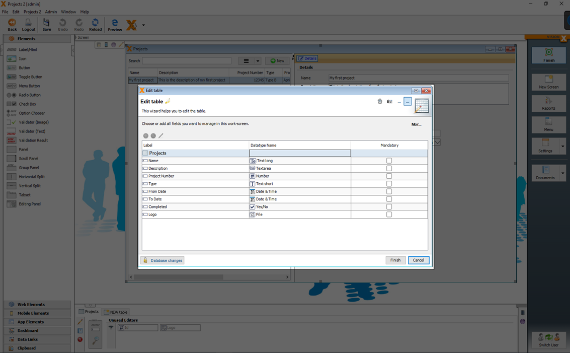
With a click on the 'More' button, table and column details are displayed.
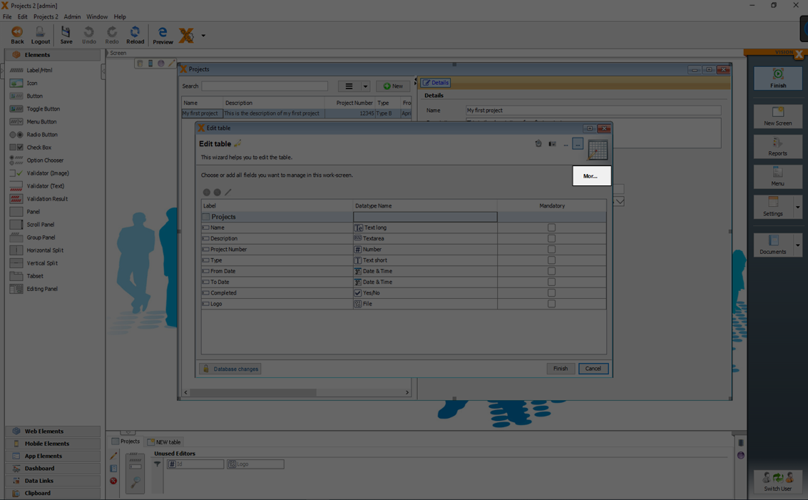
Labels of columns and changes in the 'Datatype Name' can be done without real changes to the database.
For example a change of the datatype 'Date & Time' to a 'Date' is just a change on the UI and not in the database.
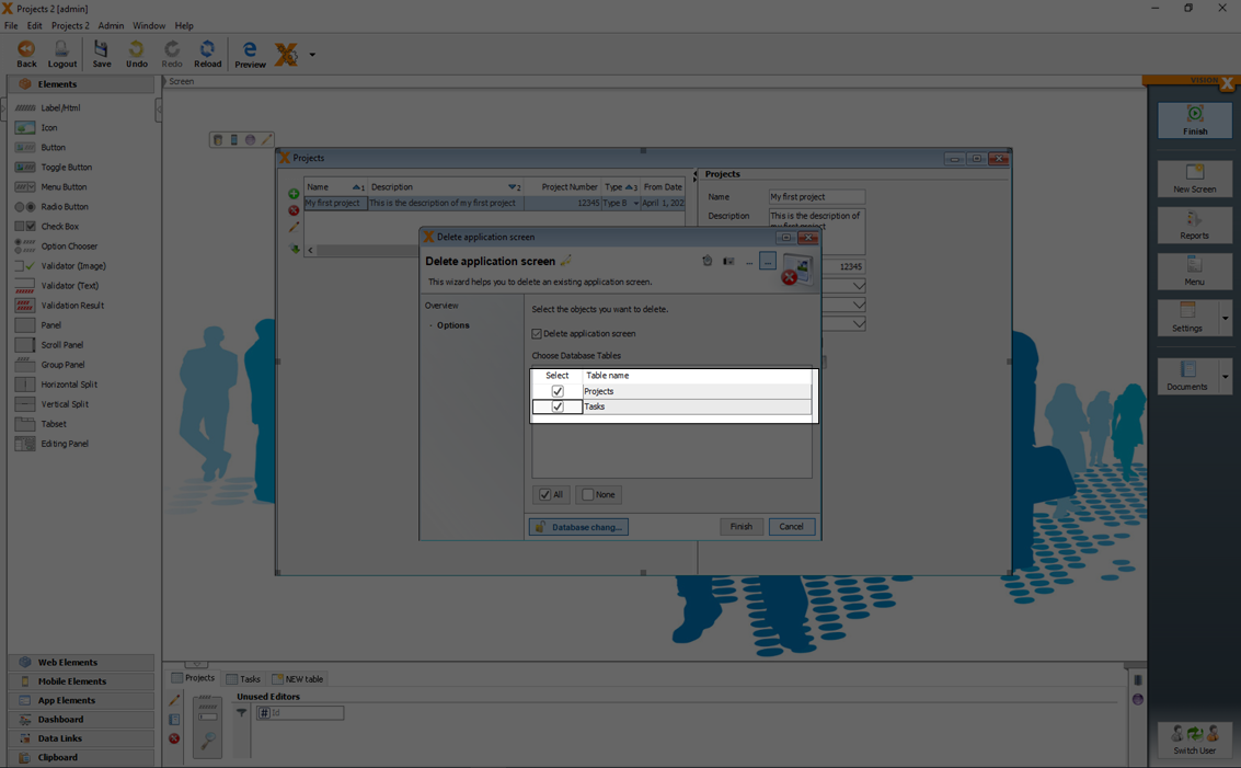
If changes in the database are necessary (like add new columns, change precision/scale, …) you have to click 'Database changes' first.
Now it is possible to edit, add or delete columns. Changes made in this wizard are not effective until the 'Finish' button is clicked and can be discarded using the 'Cancel' button.
New columns can be added or delete with the add or delete button.
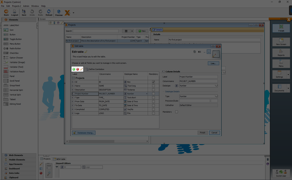
Deleting a table or table column means that the data in the table or column is also deleted!
When columns are added, all existing records are populated with blank values.
Therefore, a newly added column can initially not be a required field. The column can be changed to a required field only after values are added in the column for all rows.
You can change for each column:
| Setting | Description |
|---|---|
| Label | The label of the column which is displayed in the UI. |
| Column Name | The name of the column in the database table. |
| Datatype Name | The datatype of the column. For more details see Domains |
| Mandatory | If the column is a mandatory field. |
| Datatype Details: Type | The datat type in the database. For more details see Domains |
| Datatype Details: Length | The possible character length. For more details see Domains |
| Datatype Details: Precision/Scale | For number data types a precision and scale can be set. For more details see Domains |
All changes to the data model and related data base table are made step by step. In case a database change is not possible, the remaining changes are not made. The original data is not deleted until all steps are successfully completed.
Used references (like a used UI element in the screen) of changed columns are corrected automatically. For example if you delete a column from a table also the used UI editor in the screen is deleted. If the table is also used in other screens, you will have to do the correction manually. The tables with reference errors are marked with a red title in the data model section.
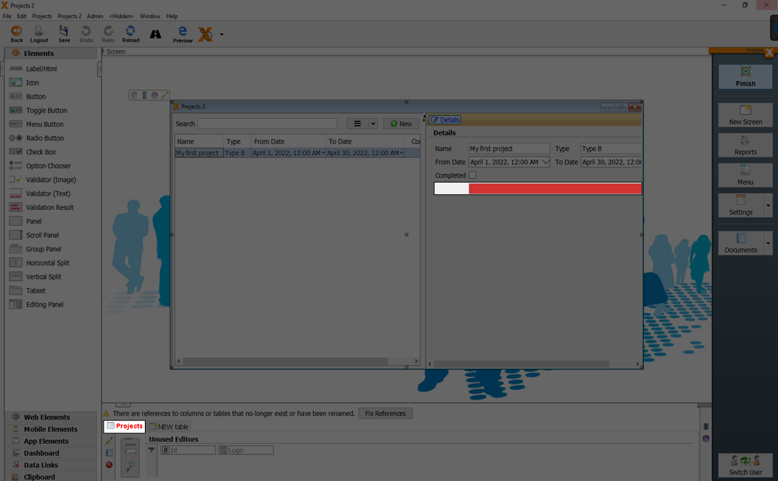
If you open the respective table in the edit mode and if you click 'Finish', it tries to delete these references to maintain an error-free screen.
See also the following videos:
Complex Data Models
n:1 Relationship: Combobox/Drop-down List
To select values from a list, a combo box or drop-down list is needed.
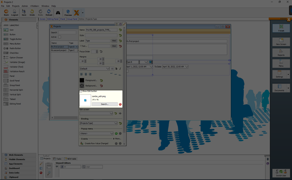
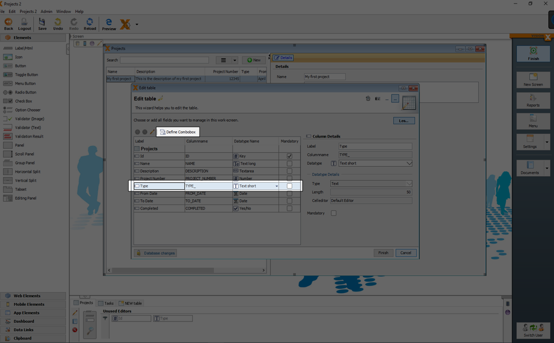
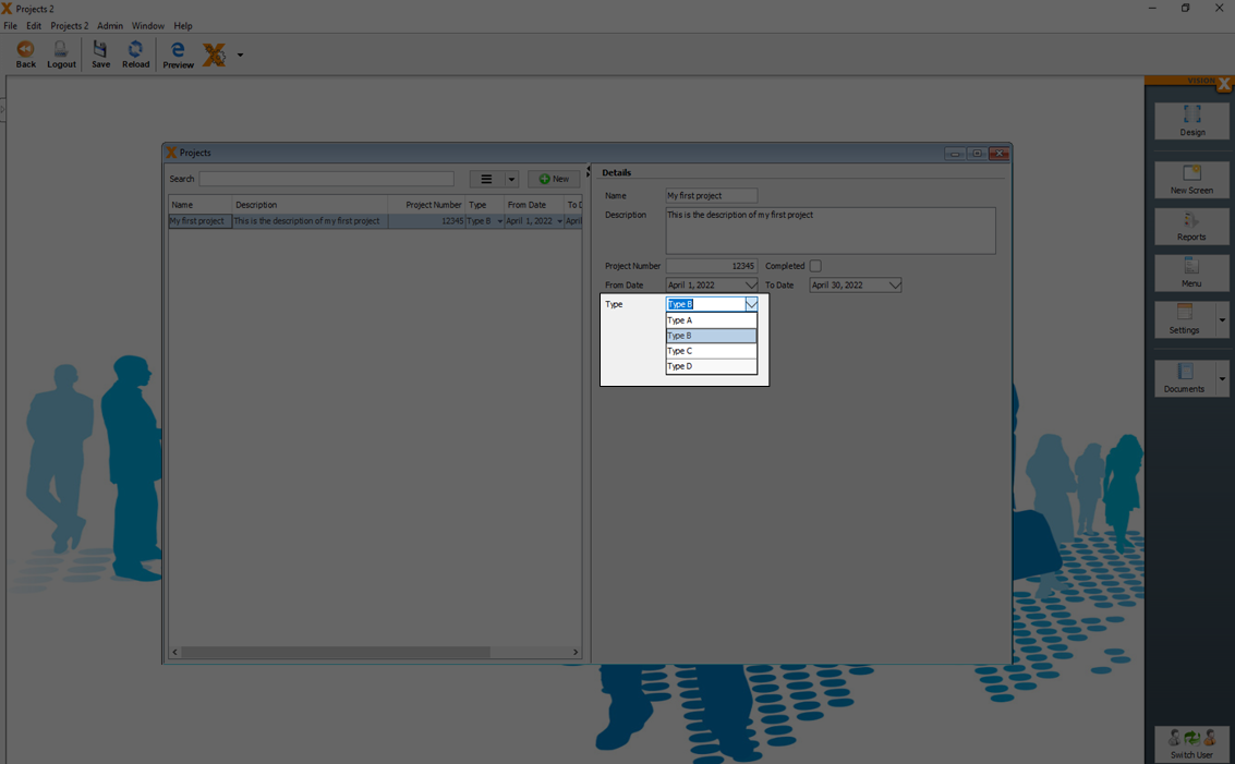
To create a combo box, select the field you want to change and click on the 'Make Combobox' button. We will do this for the 'Type' column in our example, so that the user can select from a list of project types.
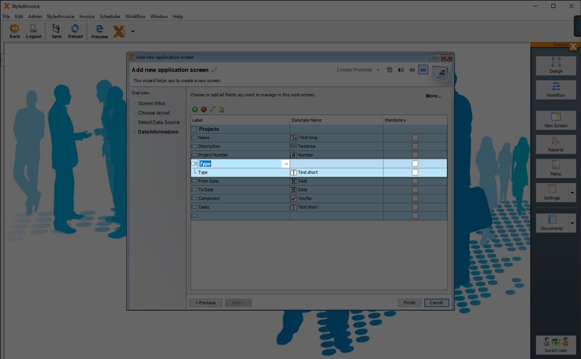
VisionX always creates / uses a master data table for comboboxes. When you click 'Make Combobox', VisionX uses the column name as the table name for the newly created master data table. In addition, VisionX also creates a Foreign Key column and a Foreign Key in the current table. In our example we will create a master data table 'Types' with a text column 'Type' and an 'ID'. In the 'Projects' table just a reference column 'TYPE_ID' (= Foreign Key) will be created.
If you double-click in the label column of a combo box, you can also use any other existing table as a master data table from the selection list instead of a new master data table. In this case VisionX creates only one Foreign Key column and one Foreign Key in the current table.
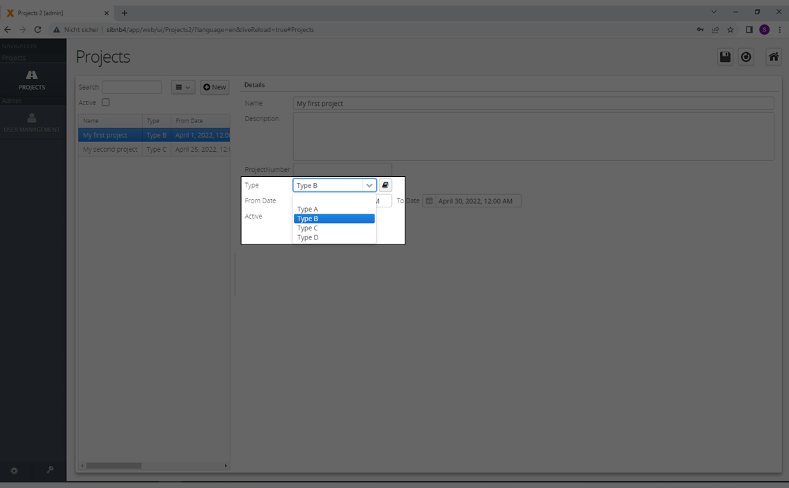
After you click 'Finish' you can see the result of the combobox in the web preview.
You can add new values to the master data table in the combo box, when you click the 'Edit Button'.
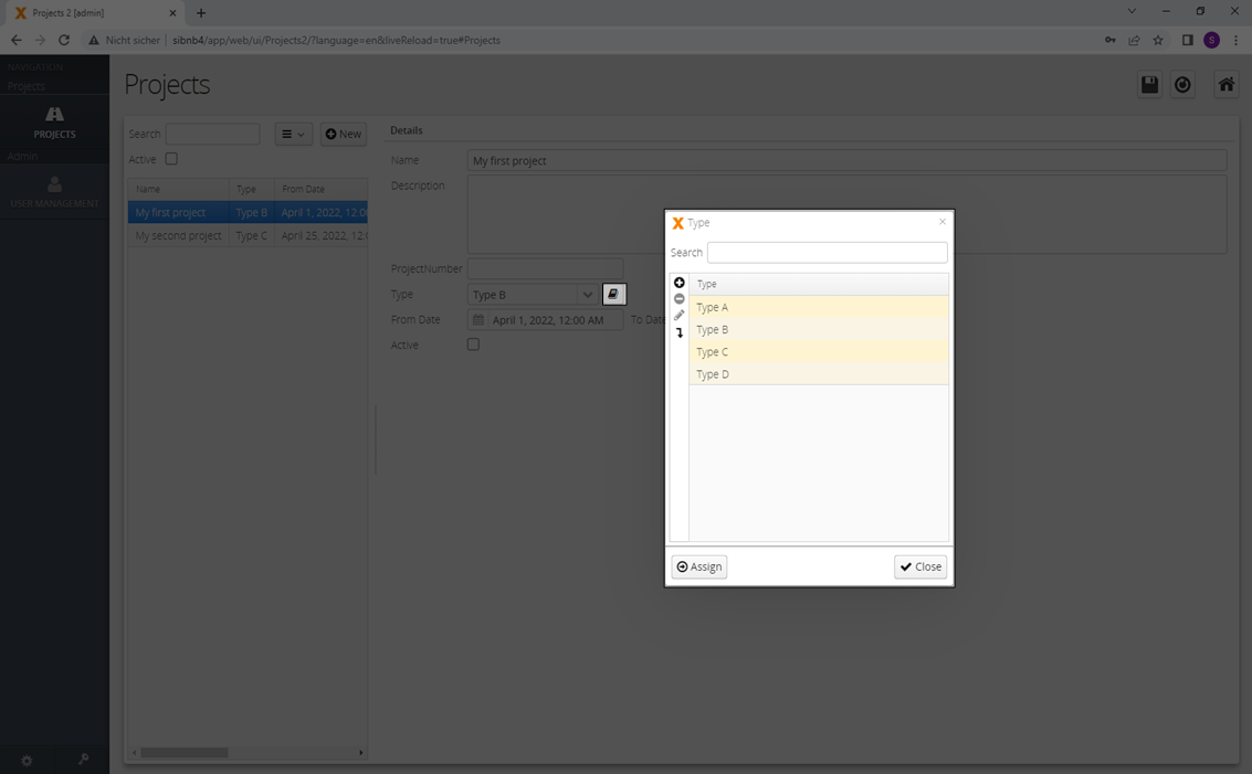
You can activate or deactivate the 'Edit Button' in the edit dialog of the combobox.
See also the following video:
Manual Combobox
If you do not have a reference in your table (foreign key) you can join the needed data over a 'Manual Combobox'.
In the following example we have a table 'Projects' with a text column 'Type' (Not a foreign key!).
With a click on the button 'Define Combobox' you can select the table which should be joined and displayed as a combobox.
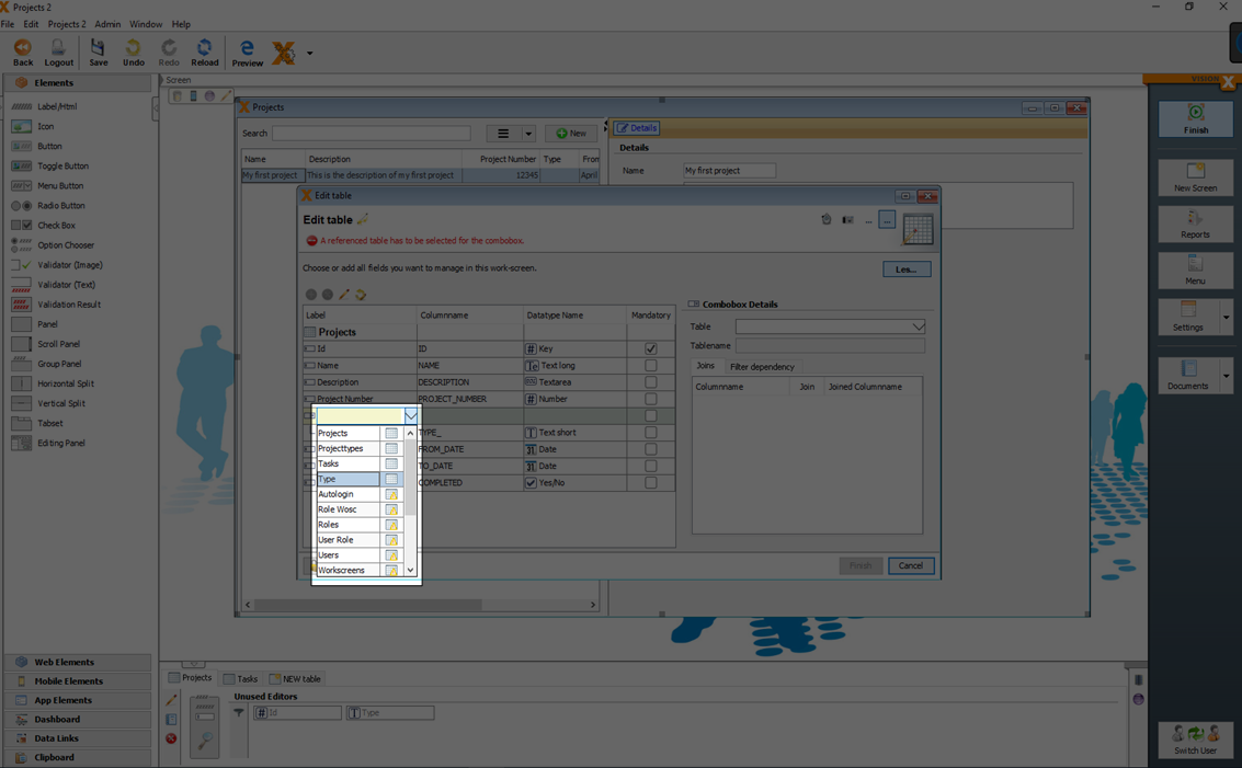
Don't click 'Database changes' because otherwise it would create a reference in the table.
The data can be now selected from a combobox, to fill the text column 'type'.
1:n Relationship: Sub - Table
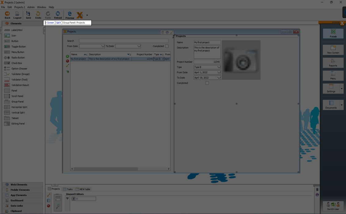
A 'sub table' maps a master detail relationship. For example if one project has multiple tasks assigned, the 'Tasks' table is a 'sub table' of the 'Projects' table.
Using the 'Make subtable' button, a detail table is created instead of a column. In this detail table, any number of detail records can be stored for each record in the master table. E.g., a list of task items for each project.
Let’s create a subtable for the 'Tasks' column, so that the user can add multiple tasks for each project:
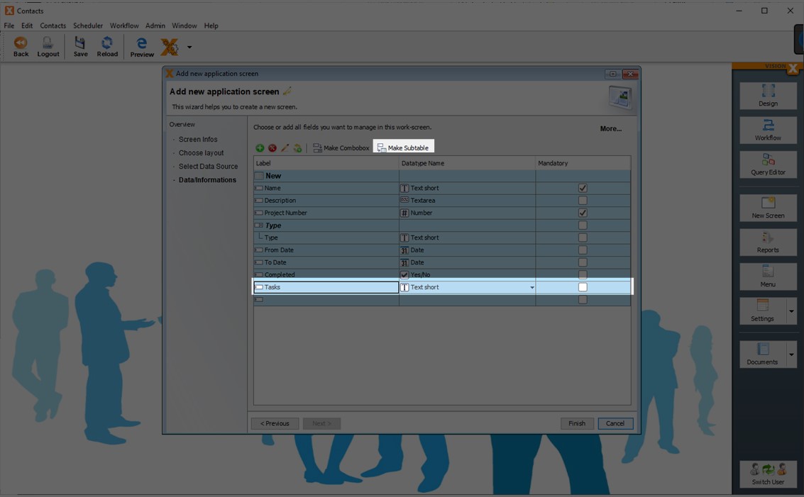
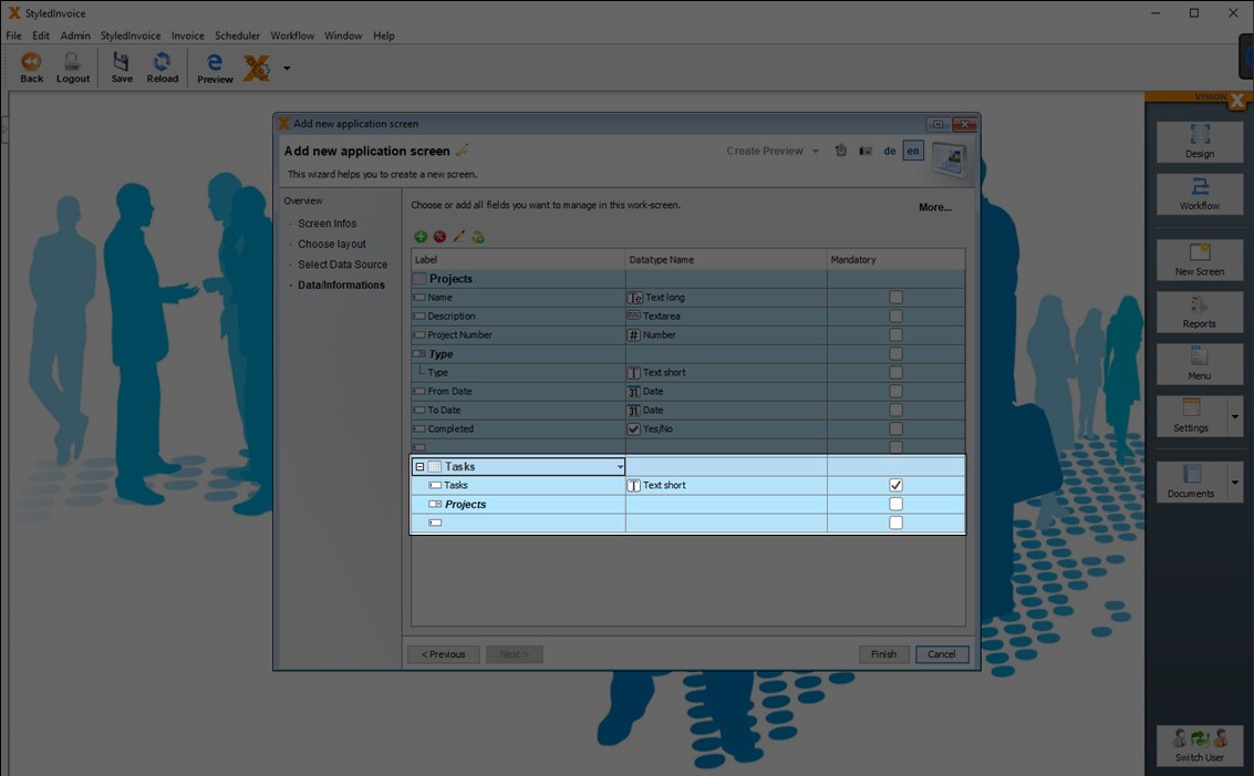
Additional columns can be added to the detail table. They are shown indented below the detail table name.
From a technical perspective, a foreign key and a foreign key table column are added to the detail table with reference to the master table.
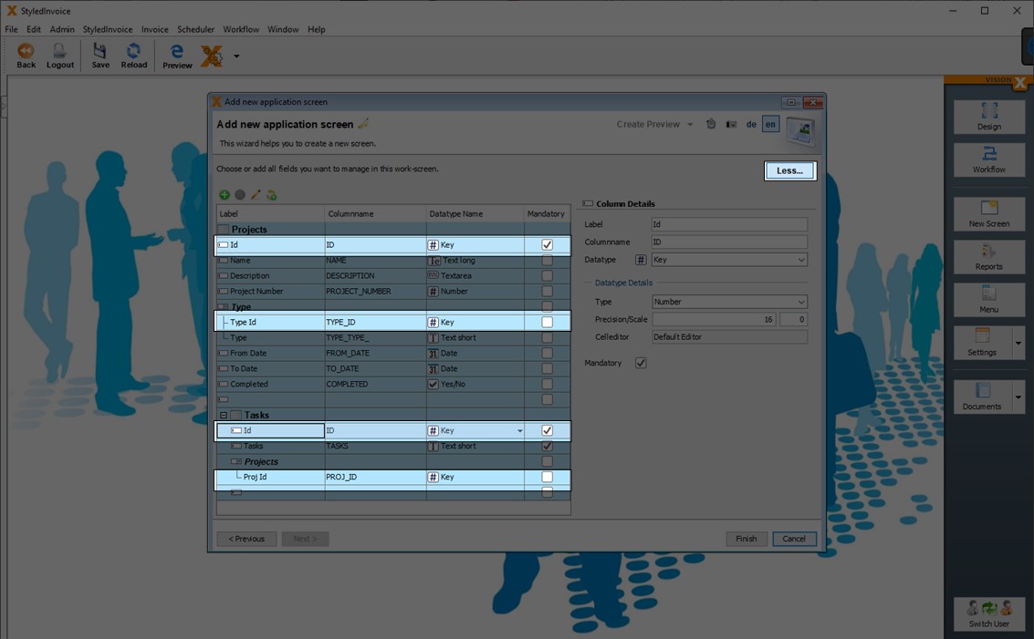
If you click on the 'More' button in the upper right corner, you can see more details about the table structure.
In general all tables gets also a primary key and primary key column with the name 'ID'.
Foreign Key columns are named with the first 4 characters of the referencing table followed by _ID. In our case this is PROJ_ID. The Task table has a foreign key to the Projects table, so the first digits of the referring Projects table are used.
To keep VisionX simple, 'ID' and '*_ID' are not shown on the screens per default. In the VisioX User interface designer you can show this columns any time.
Click 'Finish' to finalize creating the screen.
See also the following video:
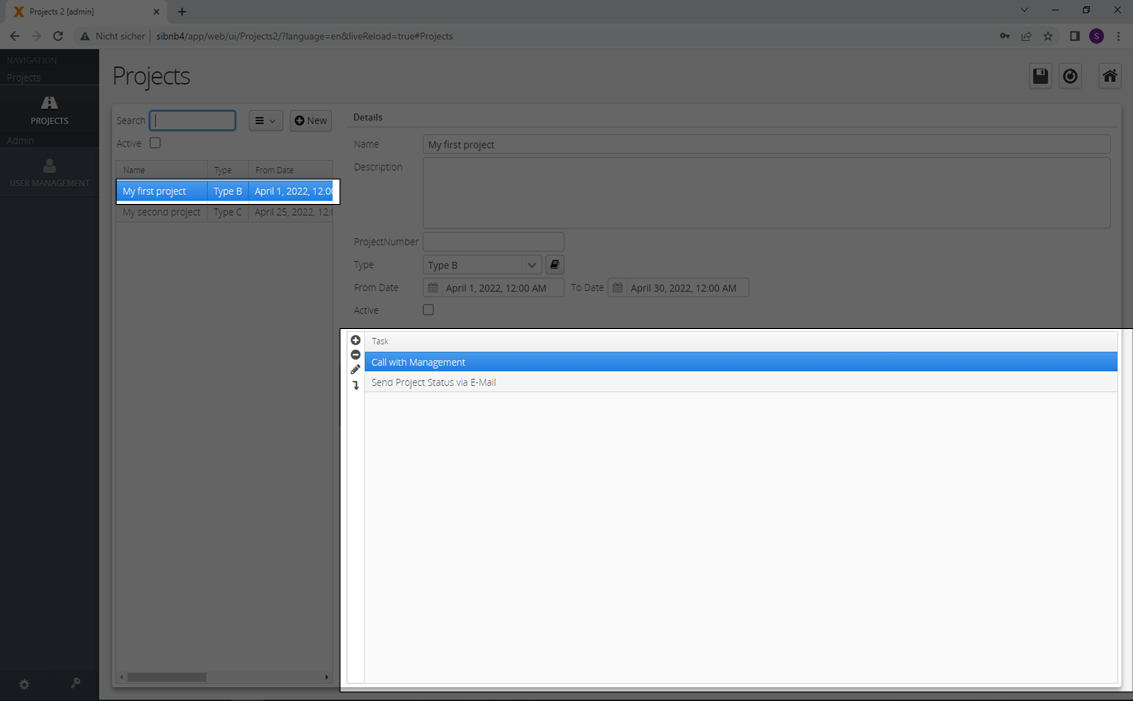
Master - Detail Relationship
To show just the items of the selected master row, we have to set a 'Master - Detail Relationship' between the master table (in our case 'Projects') and the sub table (in our case 'Tasks').
Master detail relationships between two tables can be set in the edit dialog of the details table.
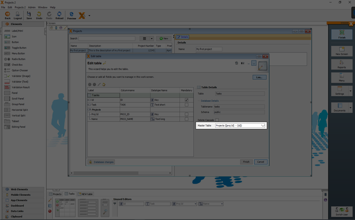
This example will show all 'Tasks' which have the same project id in the column 'proj_id' as the selected project.
You can add now the sub - table 'Tasks' via drag and drop to the screen and display the result in the web preview.
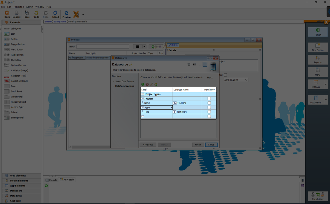
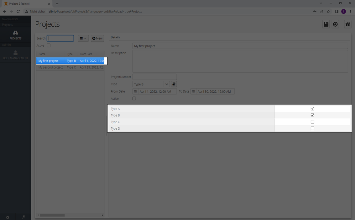
n:m Relationship: Intermediate - Table
An intermediate table is needed to cover n:m relationships. Let's create an intermediate table 'ProjectTypes' to be able to assign multiple 'Types' to a 'Project'.
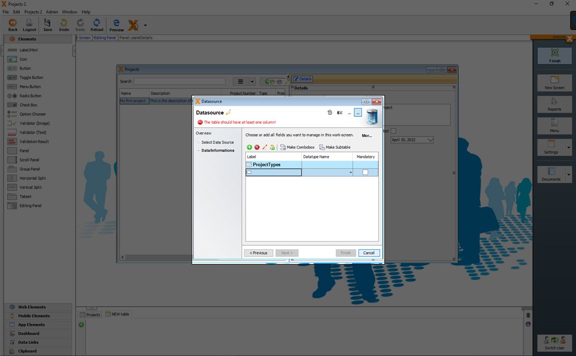
The table 'ProjectTypes' needs a foreign key reference to the table 'Type' and 'Projects'.
This needed references can be created with a n:1 relation ship (see: n:1 Relationship: Combobox/Drop-down List) to the table 'Projects' and 'Types'.
To get just the 'Types' to a selected 'Project' you have to set additionally the 'Projects' table as 'Master table' in the editing screen of the 'ProjectTypes' table.
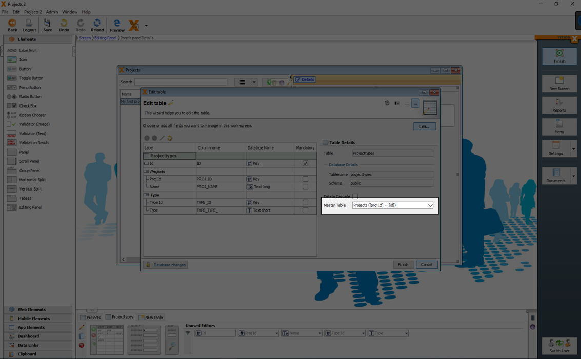
The best UI element to allow such assignments, is a 'Assignment Table' (see UI Elements). Add an 'Assignment Table' via drag and drop to the screen, bind the table 'ProjectTypes' and display the result in the web preview.
See also the following video:
EXCEL Import
Data models can also be created on the base of existing CSV files (Import an Excel file in database table(s)).
See also the following videos:
VisionX has also a specific CSV import Add On: CSV Import
Existing Database Tables
If you want to add existing database tables as models to your screen see: Use Existing Database Table(s)
User Interface Designer
To create and manipulate UI designs of screens you have to activate the design mode with a click on the button 'Design' and deactivated using the 'Finish' button in the application's menu.
The first step in the design mode is to open an existing screen or to create a new one (see Creating Screens).
In design mode, all open screens can be edited. If no screen is displayed, you can select one of the already created screens or just click 'Create a new Application Screen' to open the wizard.
For more details see the video:
Overview
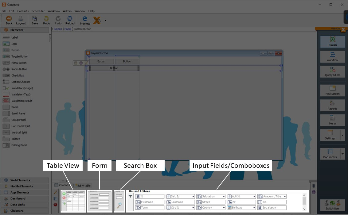
The important sections in the design mode are the 'Elements' section in the left and the 'Data Model' section in the bottom.
UI elements can be moved onto the screen from the panel on the left side of the screen via drag and drop. Every actions can be reversed and redone using the 'Undo' and 'Redo' buttons on the toolbar. Changes in the UI designer are always saved immediately and are executed after the 'Finish' button is clicked in a wizard.
The lower panel shows the data model that is currently used. It includes all tables that are used in the screen. This panel is used to create or integrate additional tables, edit existing tables, and to move data related elements, such as input fields, dropdown lists, tables or data filter elements onto the screen via drag and drop.
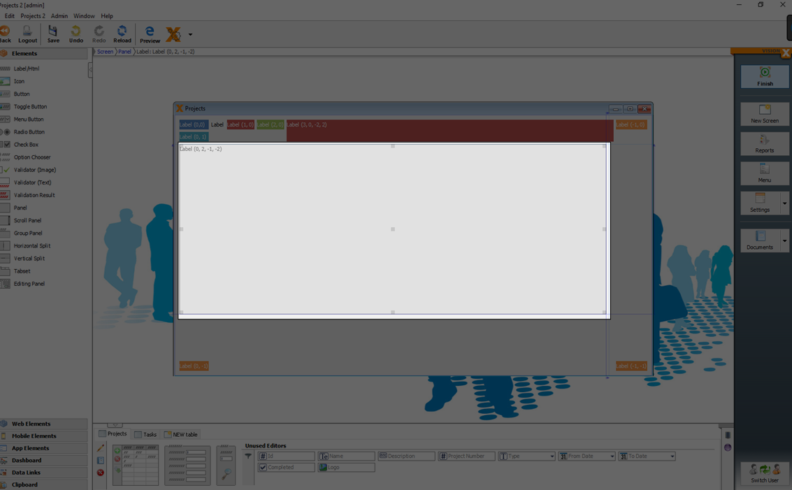
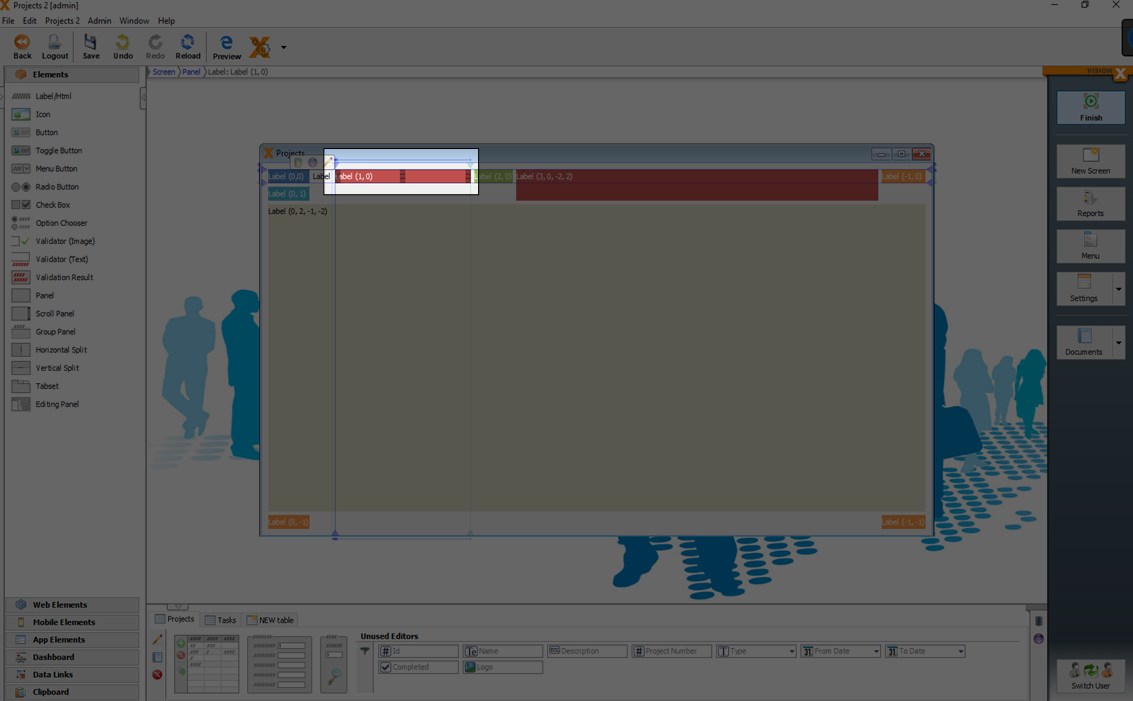
The center panel is used to edit the layout of the screen. Elements can be moved via drag and drop or adjusted in size.
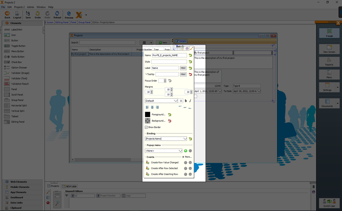
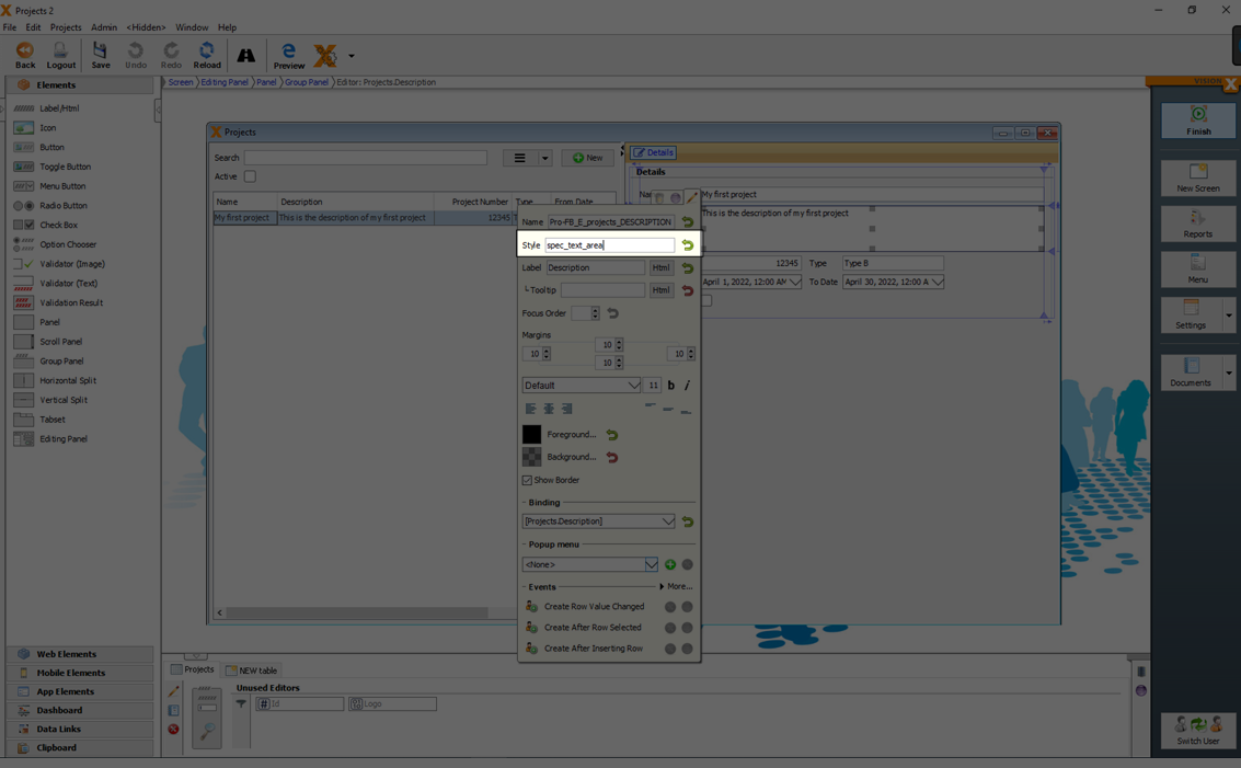
When a UI element is selected, three small icons appear on the upper left corner of the element. The first is a trash icon to delete the element, the second takes us to the element’s source code in Eclipse (if the Eclipse plug-in has been activated for the project), and the third is a pencil to edit the element. Depending on the UI element type, various properties can be edited (e.g., font, color, orientation, picture, table column labels (F2/Pencil), etc). See UI Elements for more details.
In addition, depending on the UI Element, several events can be activated. For more details see Actions And Events.
When an element is selected, its name, type, and position in the GUI element hierarchy are displayed above the screen. The element path shows the hierarchy of the currently selected element.
UI Elements
UI elements can be moved via drag and drop to a screen.
For a detailed description of all available elements see: UI Elements
For more details see the videos:
Data Model UI Elements
The lower section shows all the tables that are used in the screen.
In this data model section you find all UI elements directly related to the model like tables, data editors and filters.
This elements can be easily added via drag and drop to a screen.
For more details see the video:
Tables
You can drag the whole table from the data model section to the screen.
Properties to a table (like visible columns, column order, column labels, …) can be set in the editing window from the table.
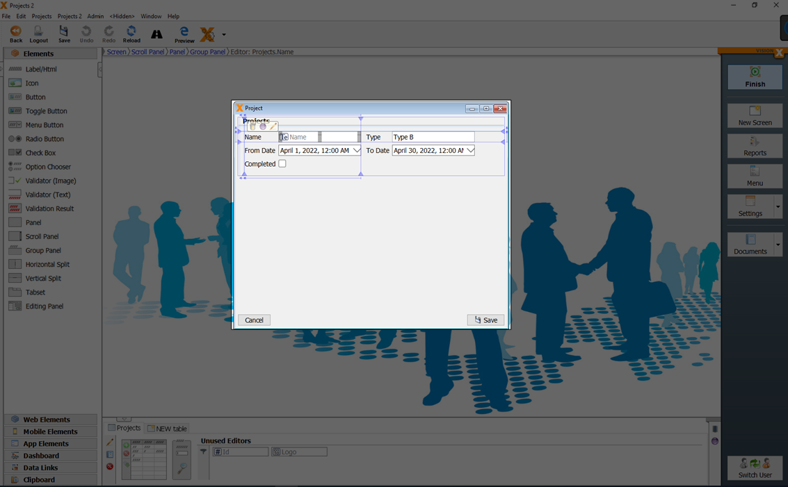
Detail Forms
To add all possible editors of a table together, you can drag and drop the form to a screen.
All editors are added to the screen in a group panel.
You can also move the UI editors and labels separately via drag and drop to the screen.
For more details see the video:
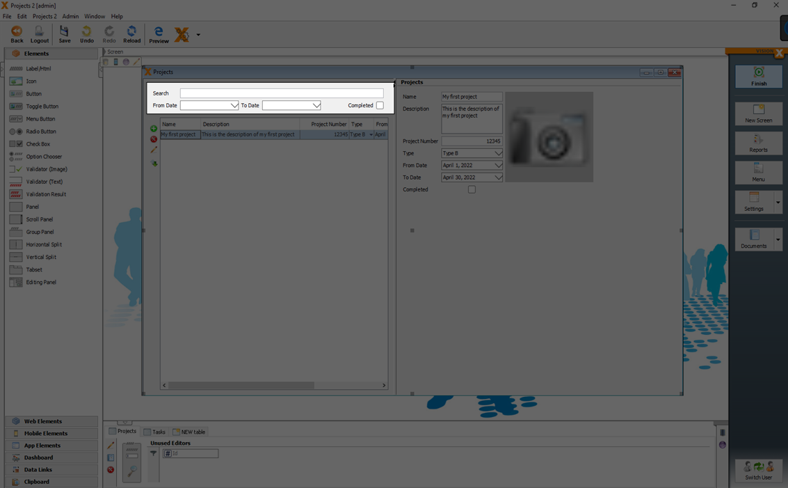
Filter
To add filters (like searchbars) to a screen, you can drag and drop the search element from the data model section in the bottom.
In default the search element is a full text searchbar over all visible columns of the data model.
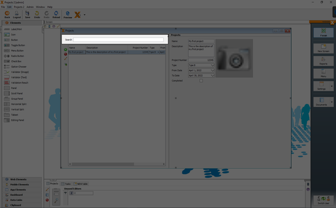
You can add additional search elements and define the search behavior for each element separately.
The search criteria (Full text search, Like, Equals, Less, Less Equals, Greater, …) and the referred column can be changed in the edit window of the search element.
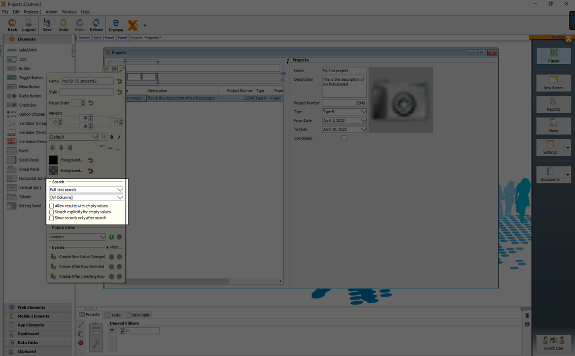
The following search criteria can be selected:
| Setting | Description |
|---|---|
| Full text search | A case insensitive full text search over all visible columns with the search term. |
| Like | A case insensitive search over the defined column. Wildcards like '*' or '?' can be used. |
| Equals | If the value is equals the search term. |
| Less | If the value is less than the search term. |
| Less Equals | If the value is less or equals than the search term. |
| Greater | If the value is greater than the search term. |
| Greater Equals | If the value is greater or equals than the search term. |
| Contains | If the value contains the search term (case insensitive). |
| Starts with | If the value starts with the search term (case insensitive). |
Additionally you can set the following properties:
| Setting | Description |
|---|---|
| Allow results with empty values | If you want to allow results with empty values. |
| Search explicitly for empty values | If you want to search explicitly for empty values. |
| Show records only after search | If you want to show records only after search. |
For more details see the videos:
Sort
With clicks on the columns in the header of a table, you can define the sort criteria and sort direction.
With 'Ctrl' + mouse click it is possible to define a sort criteria over multiple columns.

For more details see the video:
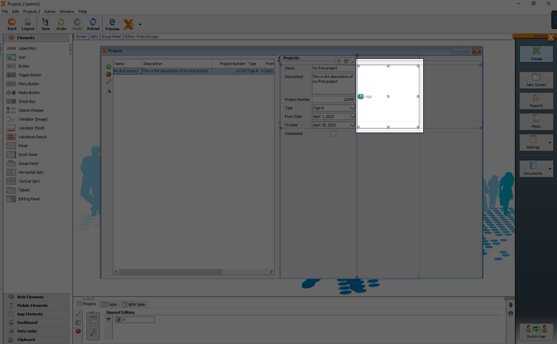
Images
Images related to a data set can be defined as separate column in the model.
The image can be moved via drag and drop from the data model section in the bottom to the screen.
For more details see the video:
Layouting
Layouts are used to position UI elements on a screen. Depending on the layout, the UI elements can be arranged differently.
We support in VisionX three different layout types.
- Form Layout
- Grid Layout
- Border Layout
For more details see the video:
Form Layout
A form layout is the most powerful layout in VisionX to define screen layouts. All elements are positioned on a grid of rows and columns similar to an excel raster.
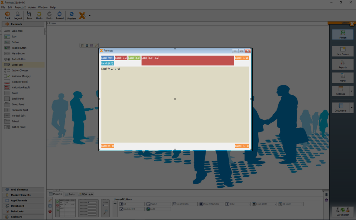
A form layout is very flexible and the UI elements can be attached in any position or to the top, bottom, left and right margins.
For more details see the video:
Insert And Stretch Elements
Elements can be moved via drag and drop between or beside already inserted elements.
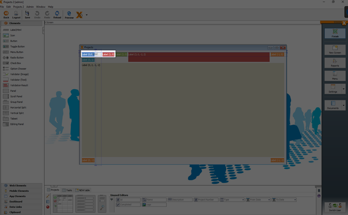
An element does not have to be placed exactly in a row or column. It can also stretch across multiple rows, columns, or both. This is done by selecting the element and pulling one of the edges until it is close to the next anchor line. After the element is released, it is spread across two or more columns.
In addition, GUI elements can be attached to the edges of the screen by pulling the selected edge of the element close to the end of the screen and releasing. As a result, these elements are automatically resized when the screen size is increased or decreased. This layout mechanism ensures that screens are adjusted to the client's resolution, which is extremely beneficial in the case of differing screen resolutions or GUI technologies (web, mobile, desktop).
Set Gap And Size Of Elements
If you drag the left or top triangle of a selected element the distance between the elements increases. The triangle then becomes turquoise. This means that it is no longer default, but has been changed manually. A double click on the anchor sets the default gap.
If the right or bottom triangle is drawn, the element in the columng changes its size. The triangle then becomes turquoise again. A double click on the anchor sets the default width.
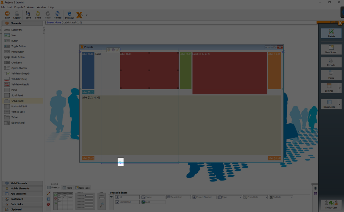
Grid Layout
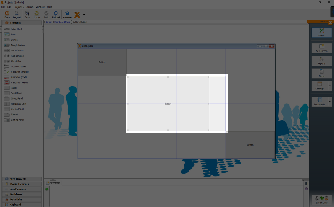
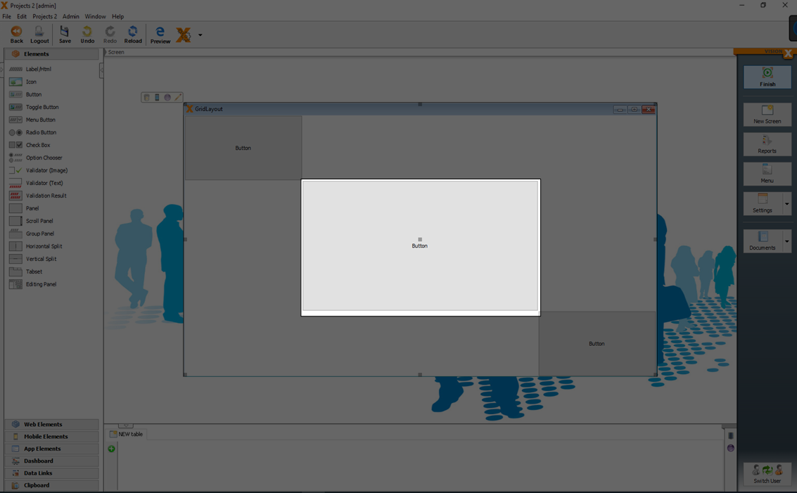
A GridLayout divides the area into equal sized columns and rows.
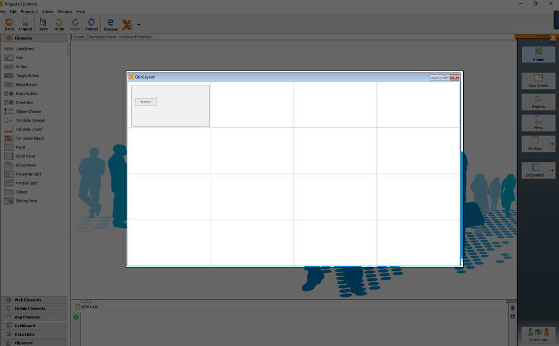
You can configure the number of columns and rows of the grid layout in the edit window of the selected panel.
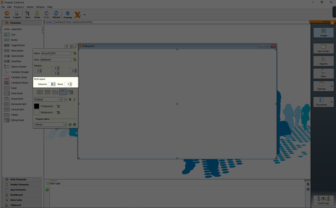
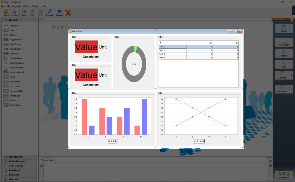
GridLayouts are often used in dashboards. You can create a 'Dashboard' screen easily in the 'New Screen Wizard' (see Creating Screens) when you select the 'Dashboard' as layout.
Insert And Stretch Elements
Elements can be added via drag and drop to the right row and column of the grid layout.
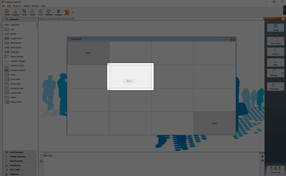
With the black indvaders of an element it can be horizontally or vertically stretched to a specific column or row in the layout.
Border Layout
A BorderLayout is a very simple layout and the base of every screen and panel. A BorderLayout has the areas North, West, South, East and Center.
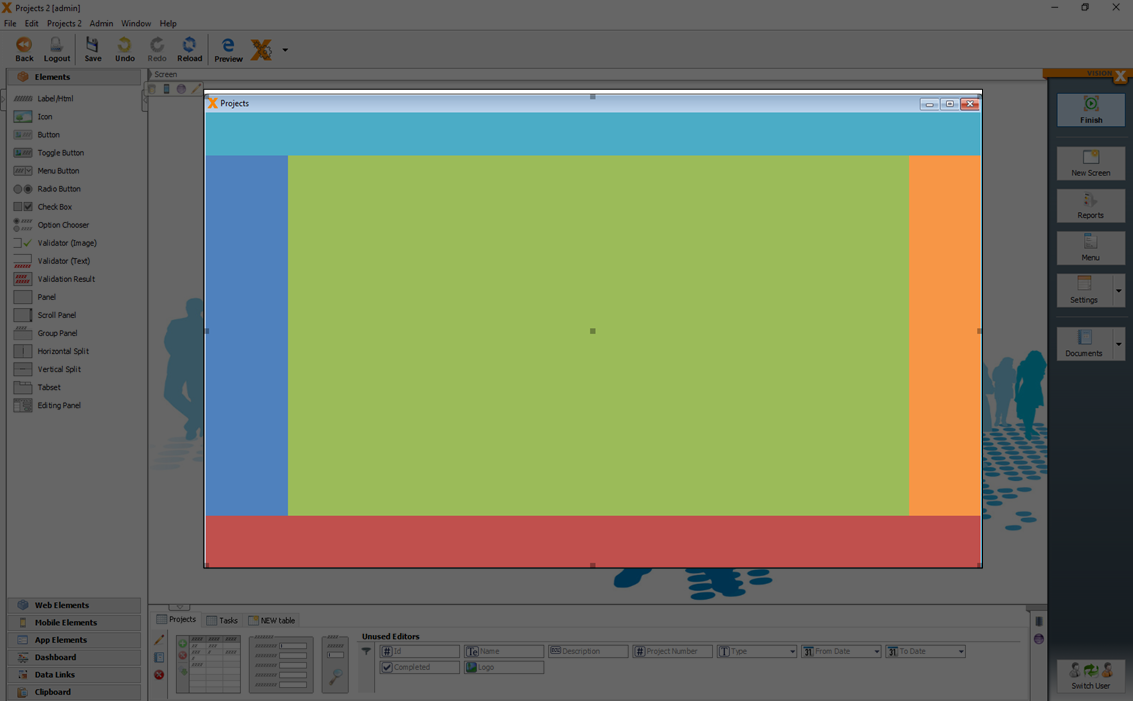
The advantage of a BorderLayout is that:
- Everything is adjusted to the current size in the center.
- You can simply add a search above, in the north, for example, or display a summary or total in the south.
The size of the elements (north, south, west and east) depends on the preferred size of the element.
With VisionX, the preferred size can be changed manually. Select the element. A number of black invaders appear. The invader down/center can now be dragged as the panel is in the north. (In the south, the attacker is the top/middle, the West right/middle and the East left/middle).
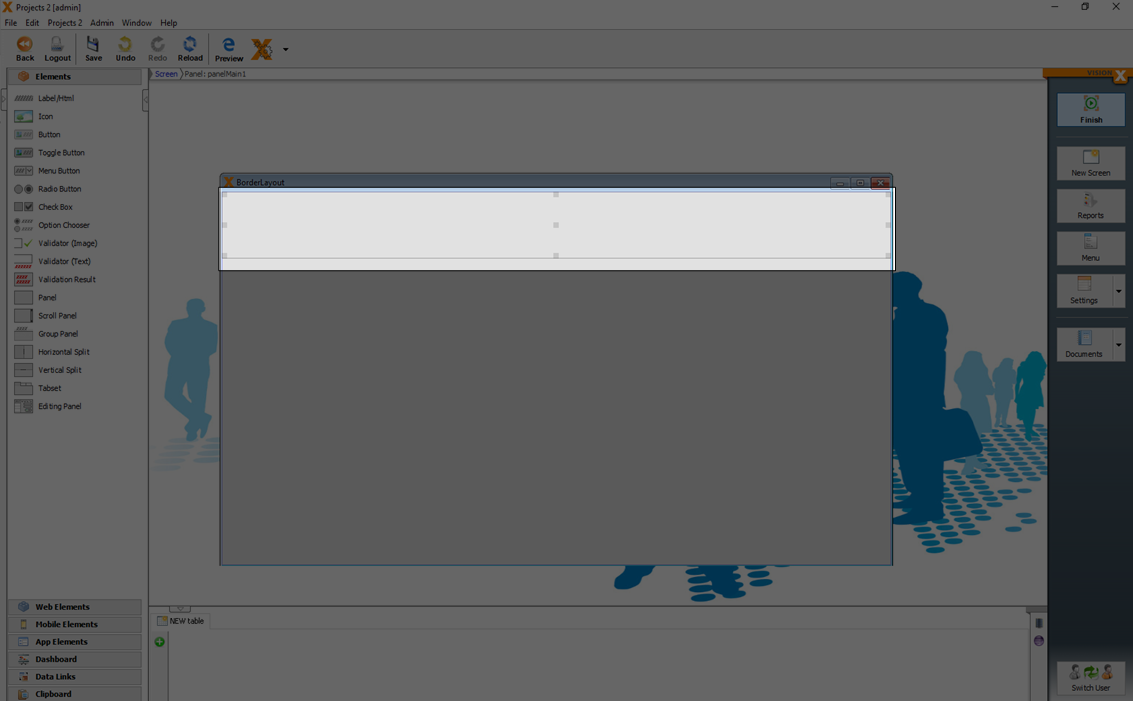
A double-click on the respective invader deletes this manual preferred size and this will automatically be calculated again.
For more details see the video:
Clipboard
A clipboard is located in the lower left corner of the screen.
The clipboard can be used to cache UI elements. This is useful when you have to redesign a screen or if you want to move already designed elements to an other screen. For example, in the first step all elements are deleted panel by panel to create space. Then the new group elements (e.g., tab sets) are placed on the screen, and the original panels are replaced step by step.
All elements which are deleted in a screen are automatically moved to the clipboard.
It is also possible to move elements (with all child elements) via drag and drop to the clipboard.
Responsive Layout
Based on the current browser or device size the position of the elements and menu is dynamically changed.
For more details see Responsive Design.
It is possible to deactivate the 'Responsive Layout' for each panel separately in the edit window of the panel.
The default setting for the 'Responsive Layout' is active.
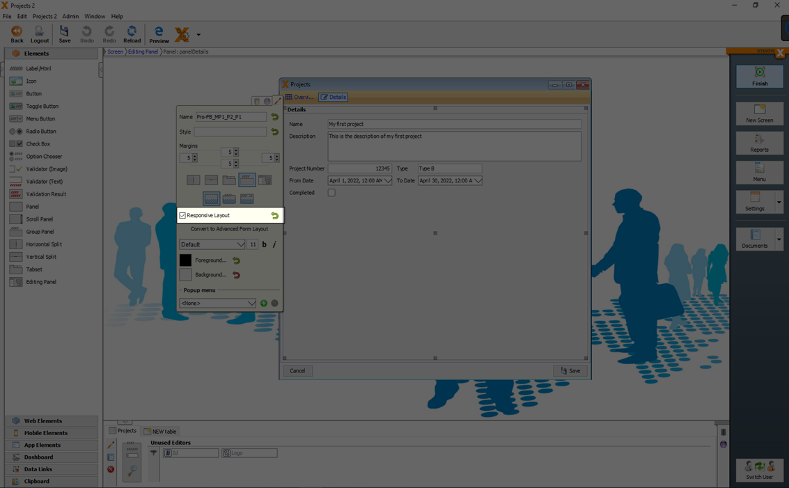
If 'Responsive Layout' is activated, the elements switch to a single column view when a defined screen size is reached.
| Responsive Layout activated | Responsive Layout deactivated |
|---|---|
 ?nolink ?nolink | 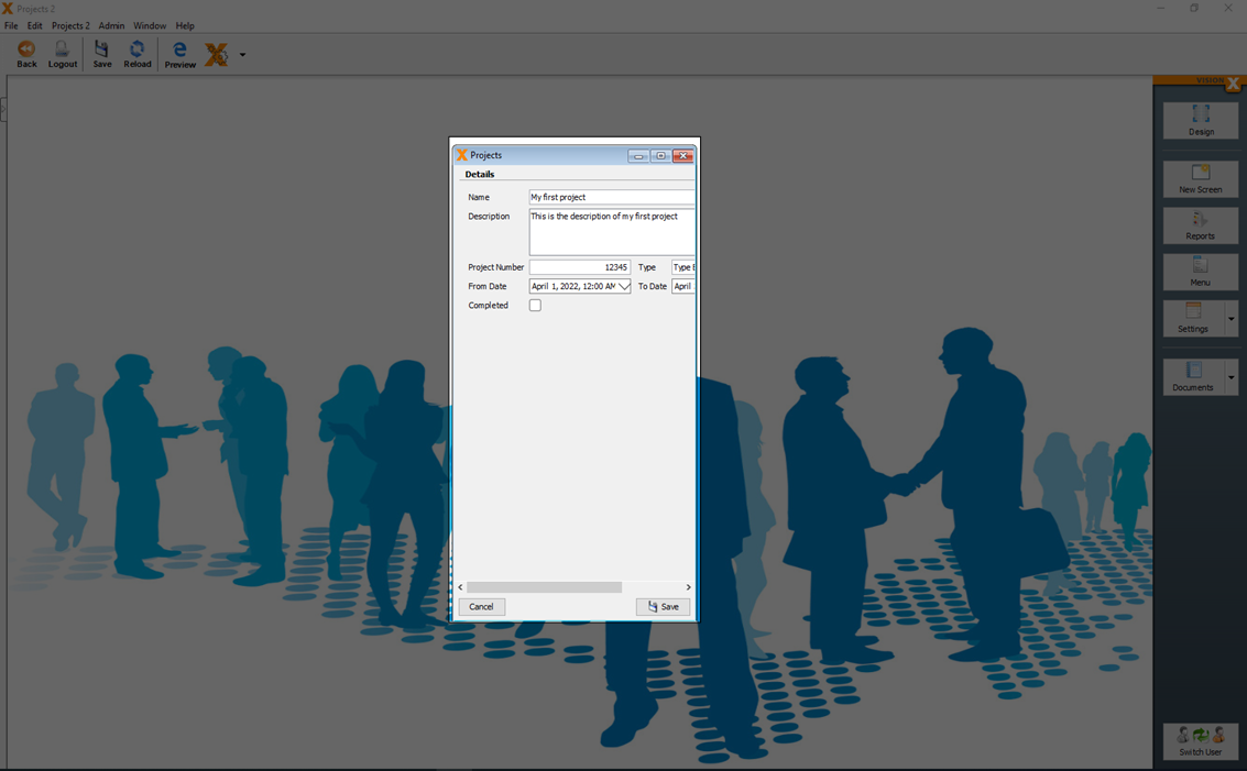 |
Screen properties
Screen properties can be set when you select the window and click the edit button.
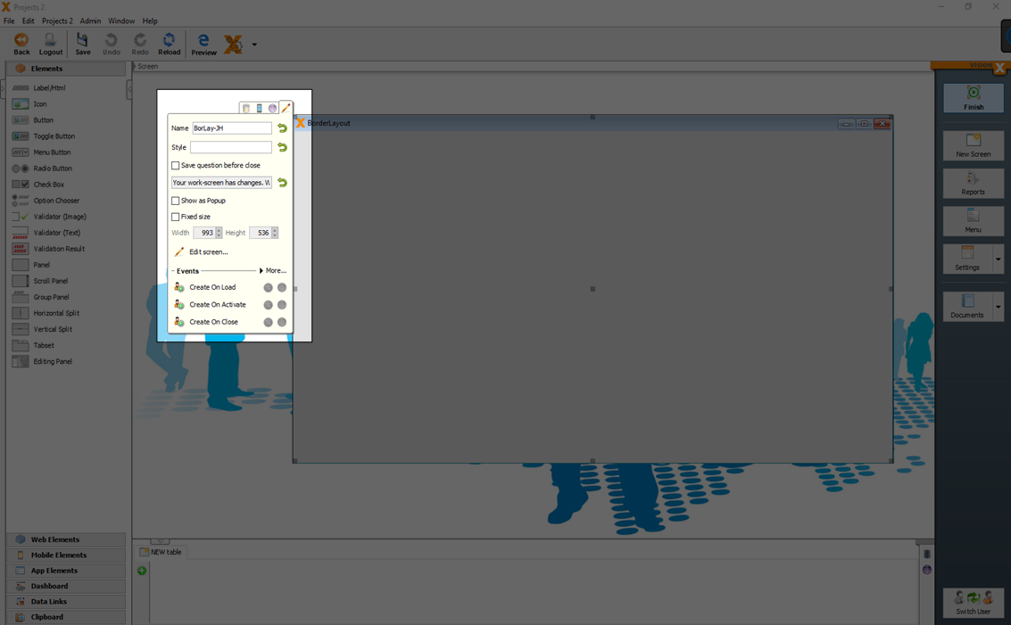
| Setting | Description |
|---|---|
| Save question before close | A question dialog 'Your work-screen has changes. Would you save all changes' will be displayed, if the screen with data changes is closed. |
| Show as Popup | Screen is opened as popup window. |
| Fixed size | A fixed window size can be set over Width and Height. |
| Width and Height | The window size if you set the 'fixed size' property. |
| Edit screen | Here you can set the title, file name and description of the screen. 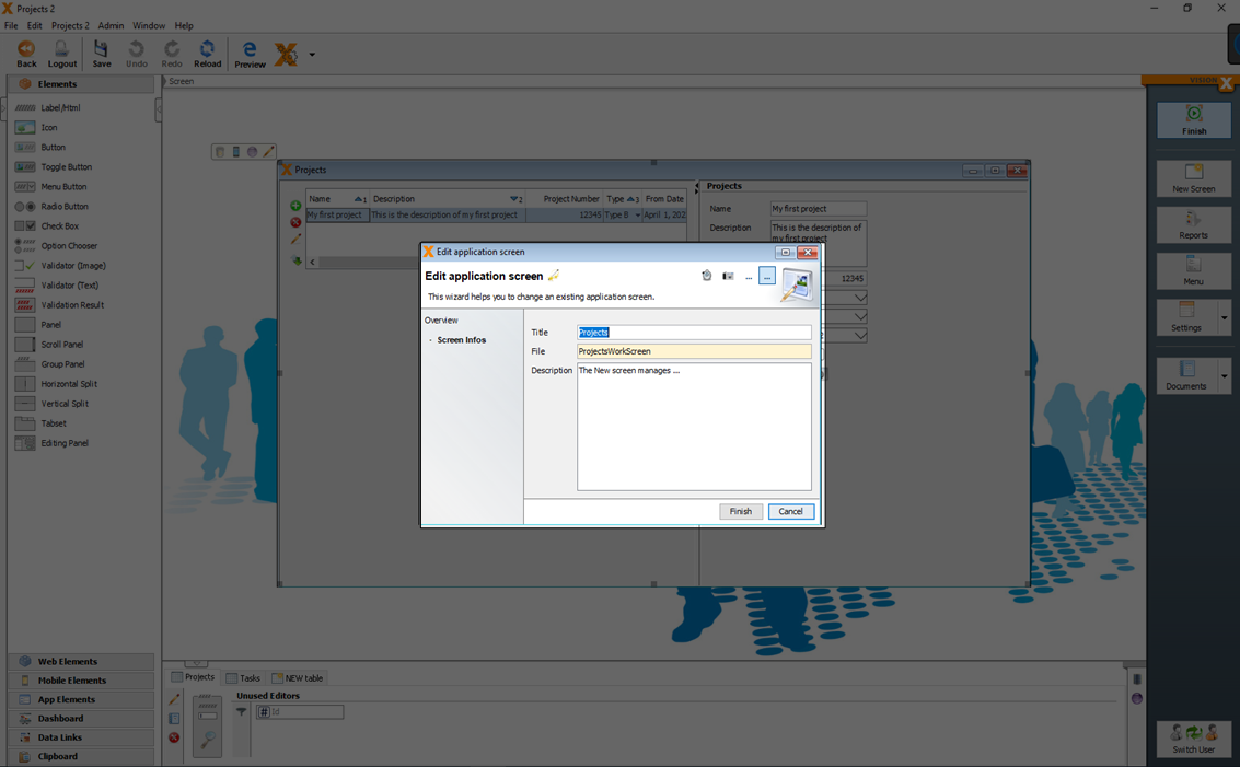 |
Delete A Screen
You can delete a screen when you select the window and click the delete icon.
Just the screen or the screen with database tables can be selected to delete.
If you want to delete also the database tables, you have to click the button 'Database changes' before you select the tables you want to delete.
For more details see the video:
More
Copy An Element
If you need a copy of your already added UI element (editor, panel, label,…) you can click 'Ctrl' + 'Drag the UI element'.
Live Preview - Web, Mobile Desktop Apps
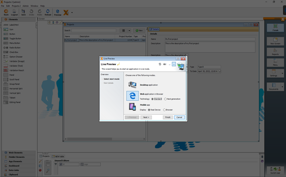
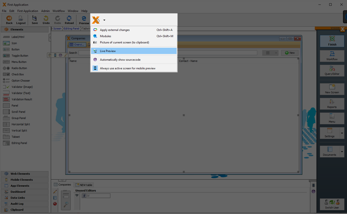
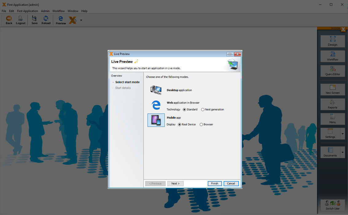
VisionX applications run on all devices and UI platforms (Desktop, Web, Mobile). Therefore, you can easily launch your first app as web or a native mobile app without any changes. To do this, click on the Preview button in the VisionX menu in the toolbar.
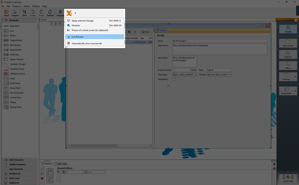
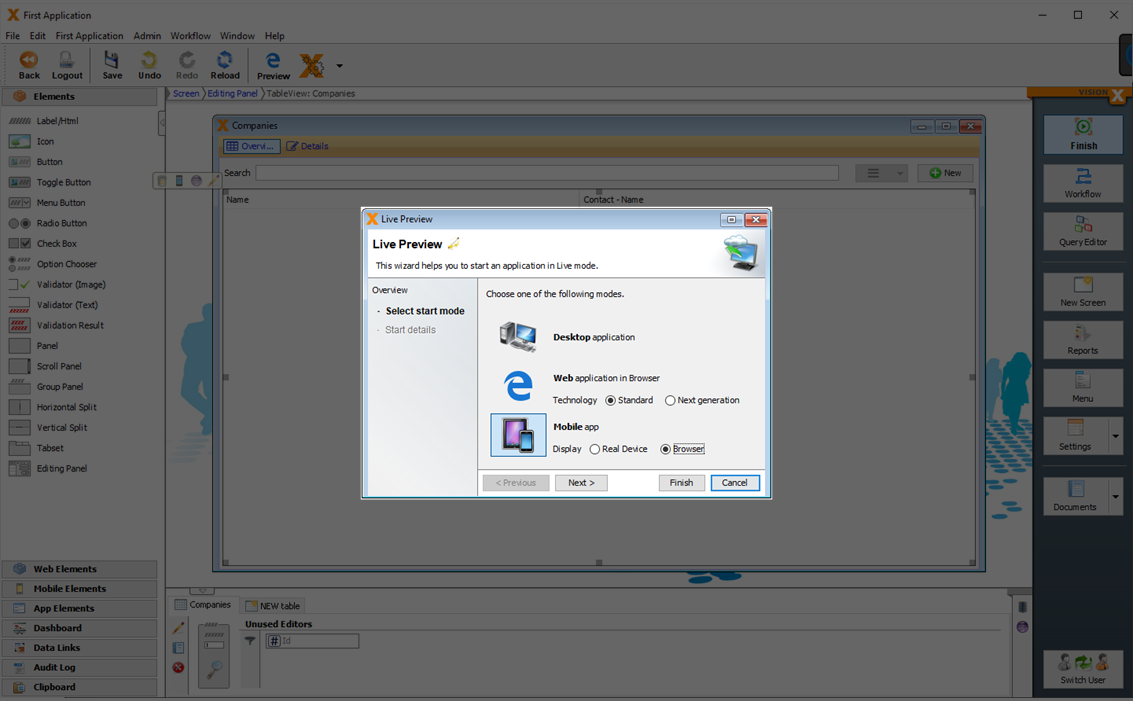
You can choose now between a live preview as 'Desktop application', 'Web application' or 'Mobile App'.
One App For All
It is not necessary to create for each technology (Desktop, Web or Mobile) different applications. You can use one application with different technologies.
See also the video:
Desktop
To preview the application as 'Desktop' you have to select 'Desktop application' and click 'Finish'.
The UI technology behind a 'Desktop' application is 'Swing (Java)'
Web
If you start the preview as 'Web application in Browser' you can choose between 'Standard' and 'Next generation'.
Standard
A preview as 'Web application in Browser' in the standard technology (Vaadin) will start the application in the browser.
Next Generation
A preview as 'Web application in Browser' in the next generation technology (React) will start the application in the browser.
Mobile
VisionX applications run on all devices and UI platforms. Therefore, you can easily launch your app as a native mobile app without any changes.
You can open the app for a app simulation in the browser or on a real mobile device as native app.
Browser
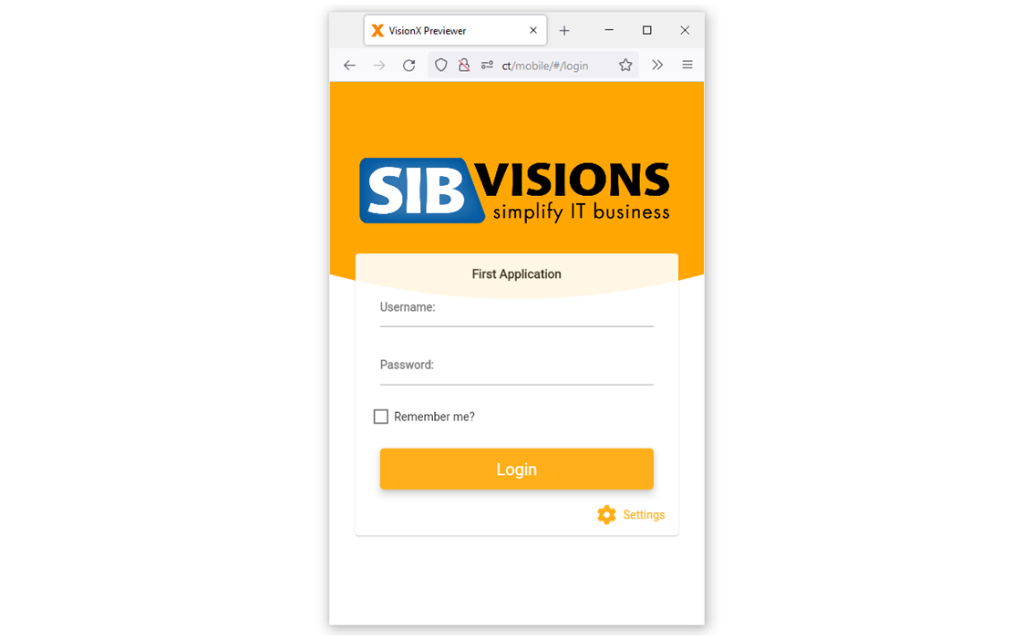
To open the app in the browser, click on the Preview button in the VisionX menu in the toolbar.
Then select Mobile App in the browser. This is our mobile app previewer in the browser. This is the easiest way to view and test the app.
After the browser window opens, resize to the size of a smartphone.
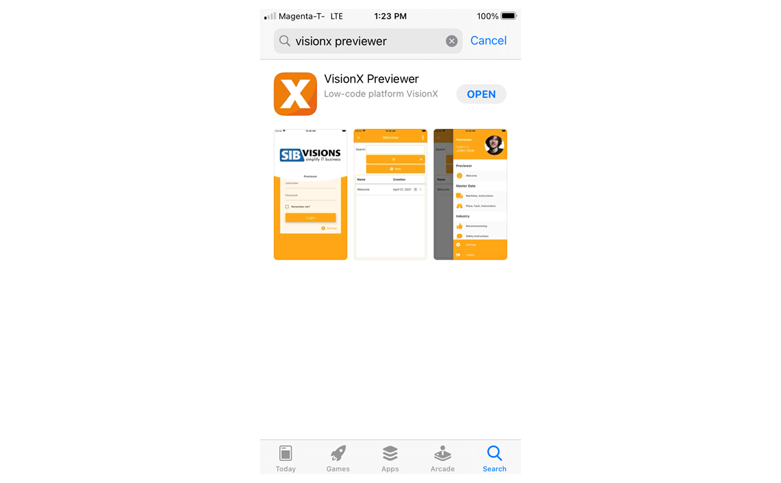
Real Device (Native Mobile App)
Alternatively, you can also start the app in the VisionX Previewer app. To do this, search for VisionX Previewer App in the App Store on your smartphone and install it.
Note - Make sure that your PC is in the same wireless network (WLAN) as your smartphone.
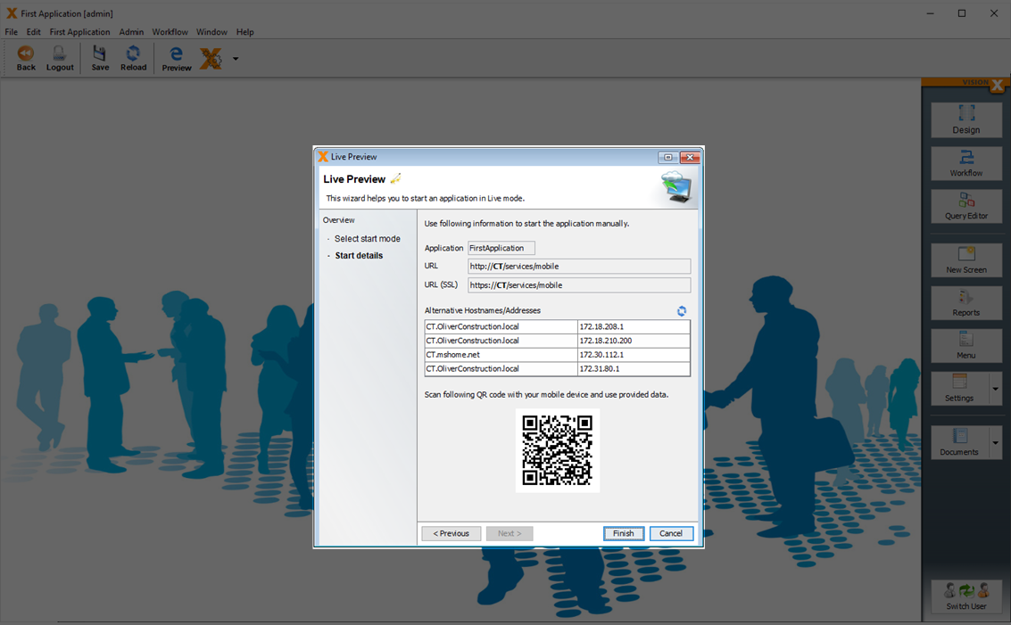
This time, select the 'Real Device' option for the mobile preview and click 'Next'.
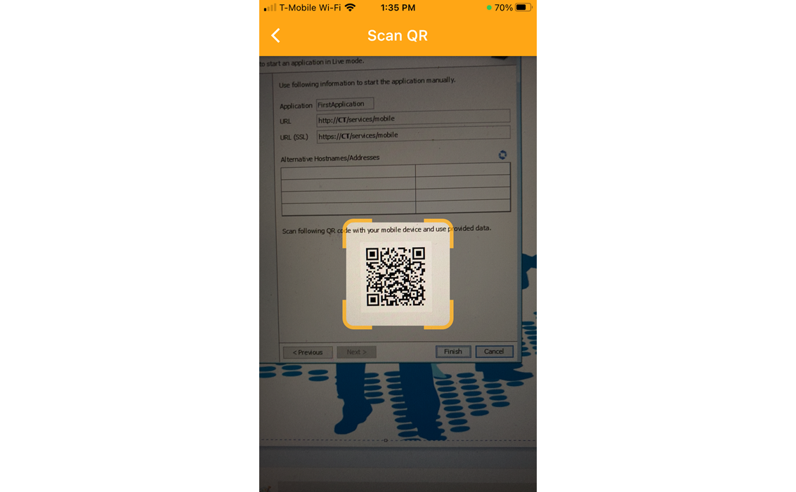
Then open the VisionX Preview app on your smartphone click on 'Settings'.
Click on the QR code scan button at the bottom of the screen.
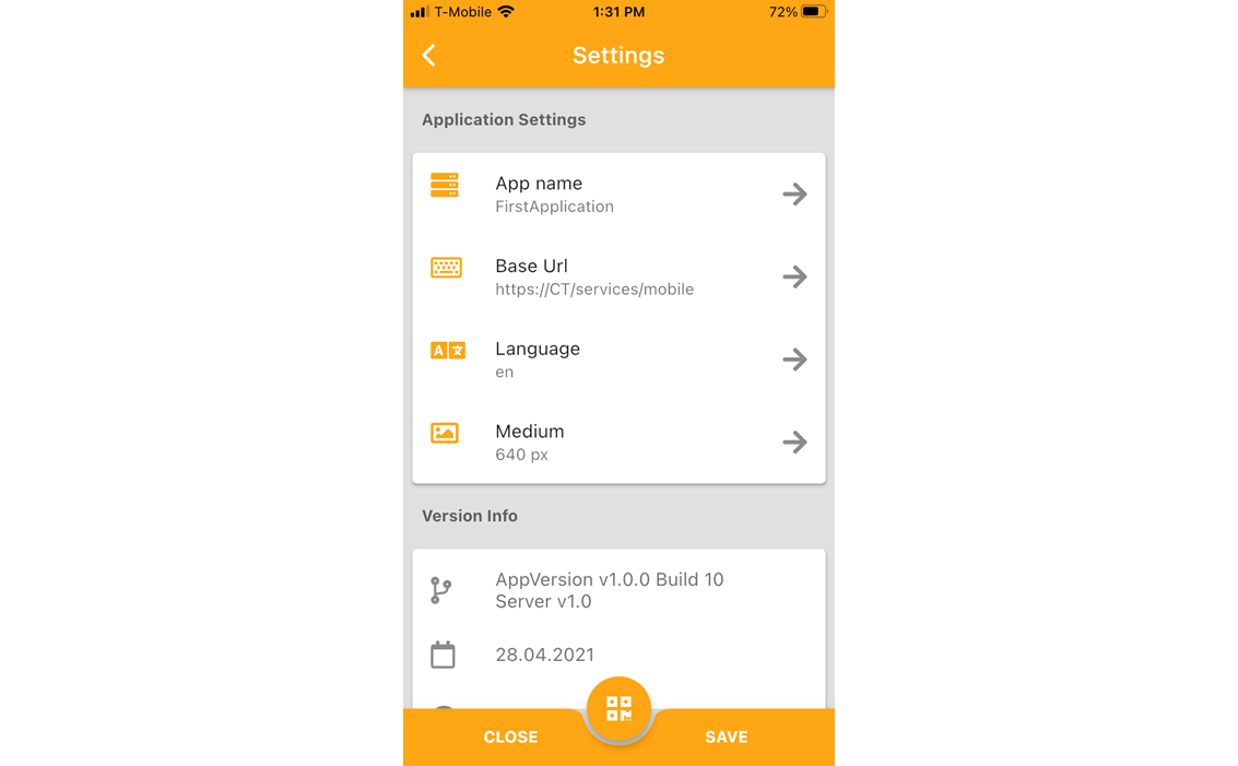
And scan the QR code in the VisionX Live Preview start screen.
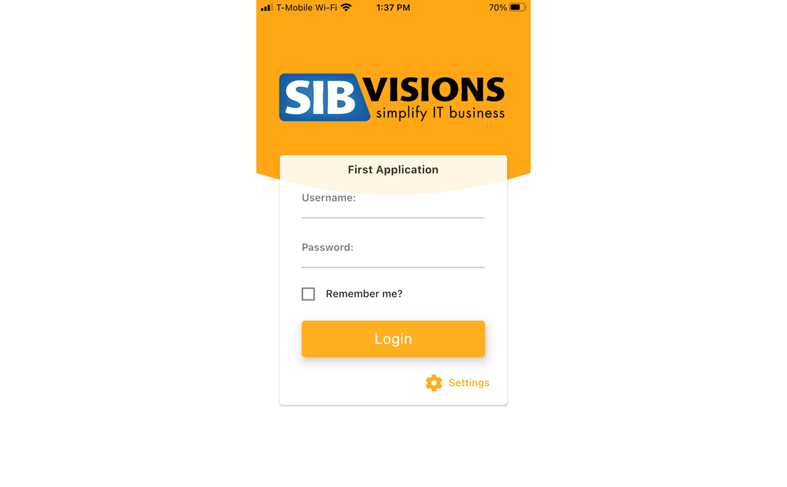
Click 'Save' to return to the login screen and log in to the app using the 'admin'/'admin' credentials.
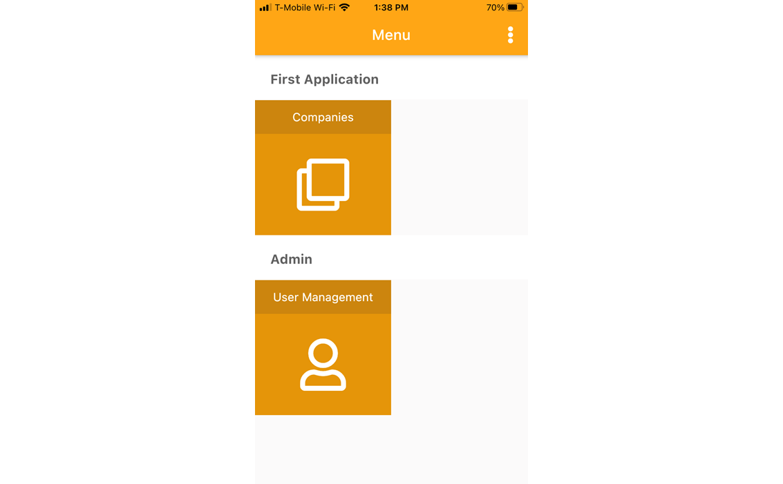
And open the 'Companies' screen.
Responsive Design
A responsive design is needed to create just one application for different screen sizes.
The editing panel (see Responsive Layout helps to create responsive screen designs.
Depending on the used UI elements, layouts and settings an application updates the size and positioning of the UI elements automatically.
See the following example:
Because of the used 'Editing Panel' with the display mode 'Horizontal Split' and the sufficient size of the screen, it is shown with a split panel.
Depending on the responsive web setting (see Web Application Settings), the size of the menu and the display mode changed automatically.
Small screen sizes have the effect that the layout changed to a one column view and all UI elements are displayed from top to down in one column.
Actions And Events
This chapter is about adding functionality and features to a screen.
For example, open a document on button click or calculate values after user input.
VisionX allows this very easily via Events And Actions.
Action Examples
User And Role Management
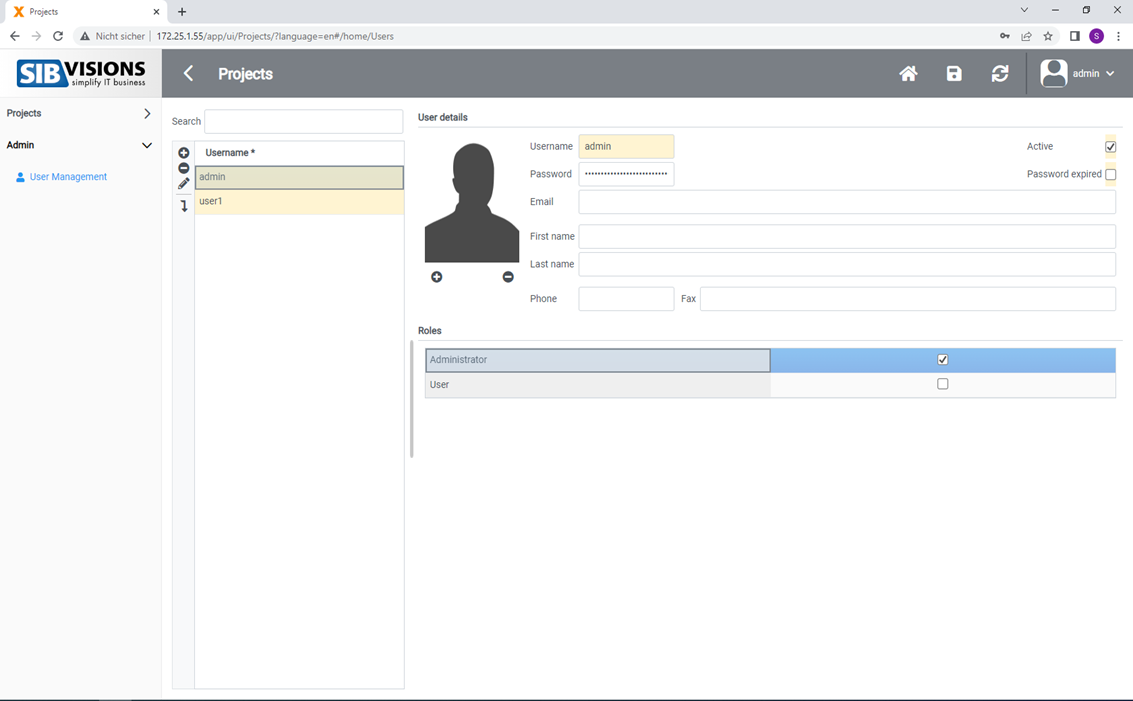
Every application created with VisionX comes with a standard user management tool, which can be edited using the VisionX functions to meet specific requirements. It can also be used to manage the application's users. The user management tool is part of the application and can be used without VisionX.
By default, the user management tool is located in the 'Admin' menu.
In addition to user name and password, additional information can be recorded for each user. The 'Active' checkbox determines whether the user is currently active and is able to log in to the application. Checking the box 'Password expired' forces the user to change passwords at the next login.
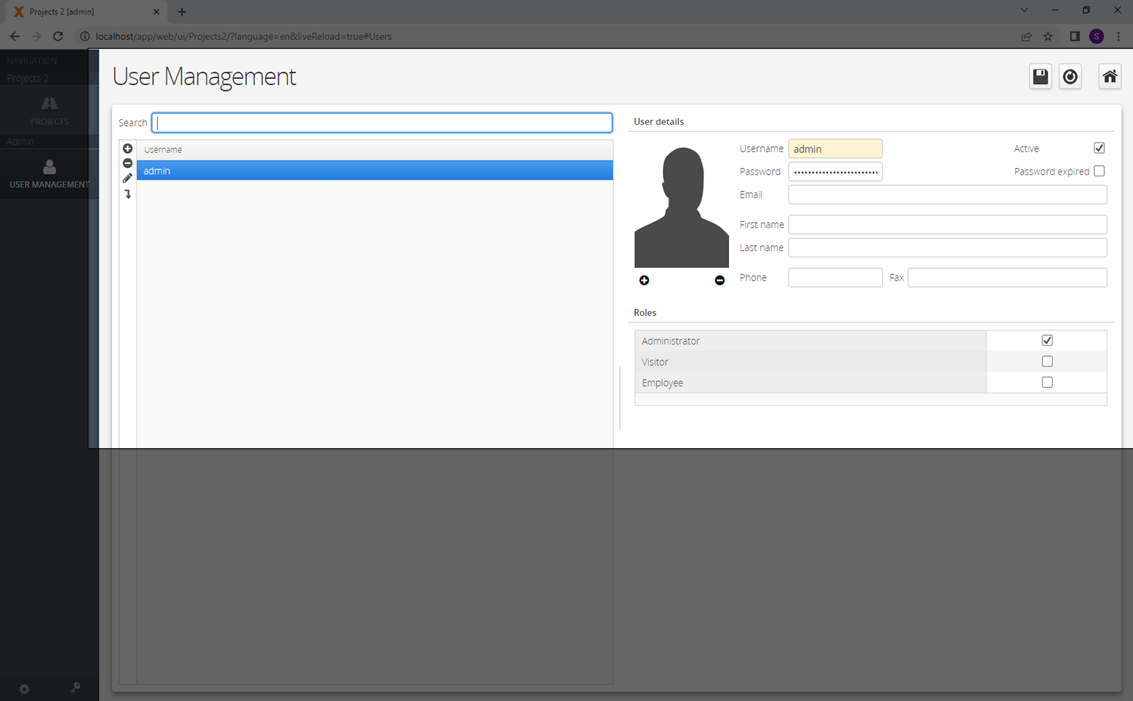
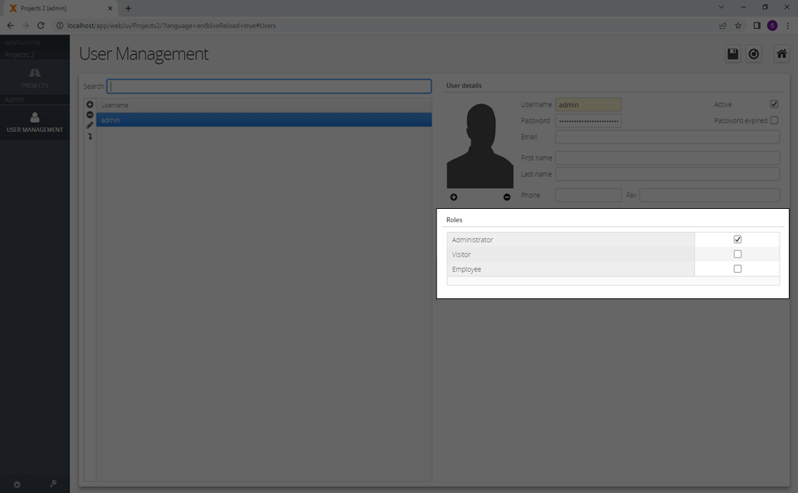
Roles can be defined for each user by checking the respective boxes in the 'Roles' table. The roles itself are managed using the application's menu. (See tab roles in Application Settings)
For more details see the video:
Change The User Management Screen
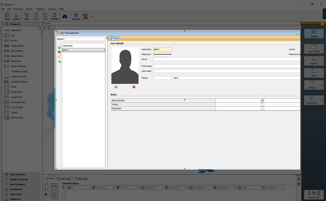
The 'User Management' screen is a standard VisionX screen and can be changed in the design mode of VisionX like a normal screen.
For more details see the video:
Hide/Show Elements Regading The Role
In the event and action configuration (see Actions and Events) of a screen, you can add role specific conditions ('Has role assigned' or 'Not has role assigned') and actions ('Hide element', 'Set column read only', …).
For more details see the video:
Hide Data For Curtain Roles
If you want to hide data for curtain roles, you have to use filters (see Filter) and set the search value for the filters depending on the role.
For more details see the video:
Menu
The 'Menu Management' dialog is used to manage the application’s menu. You can open it by clicking on the 'Menu' button.
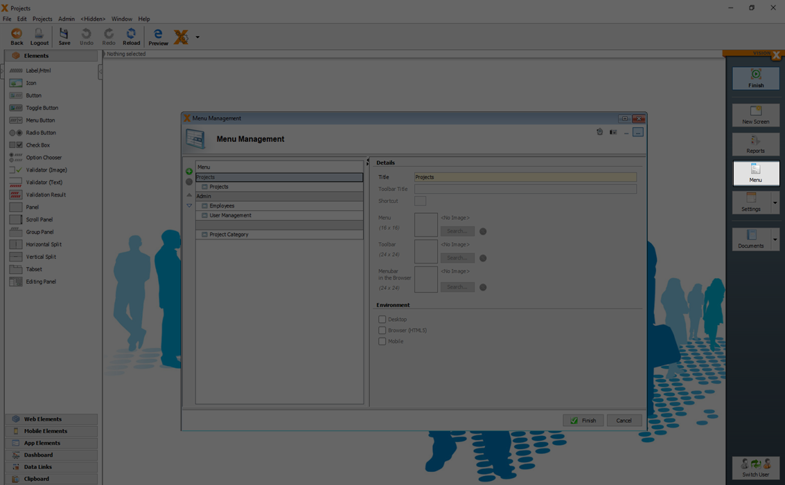
The menu management dialog is used to create new menus or sub menus and to edit existing menus. Menu entries (screens) can be sorted or moved to different menus using the arrow buttons.
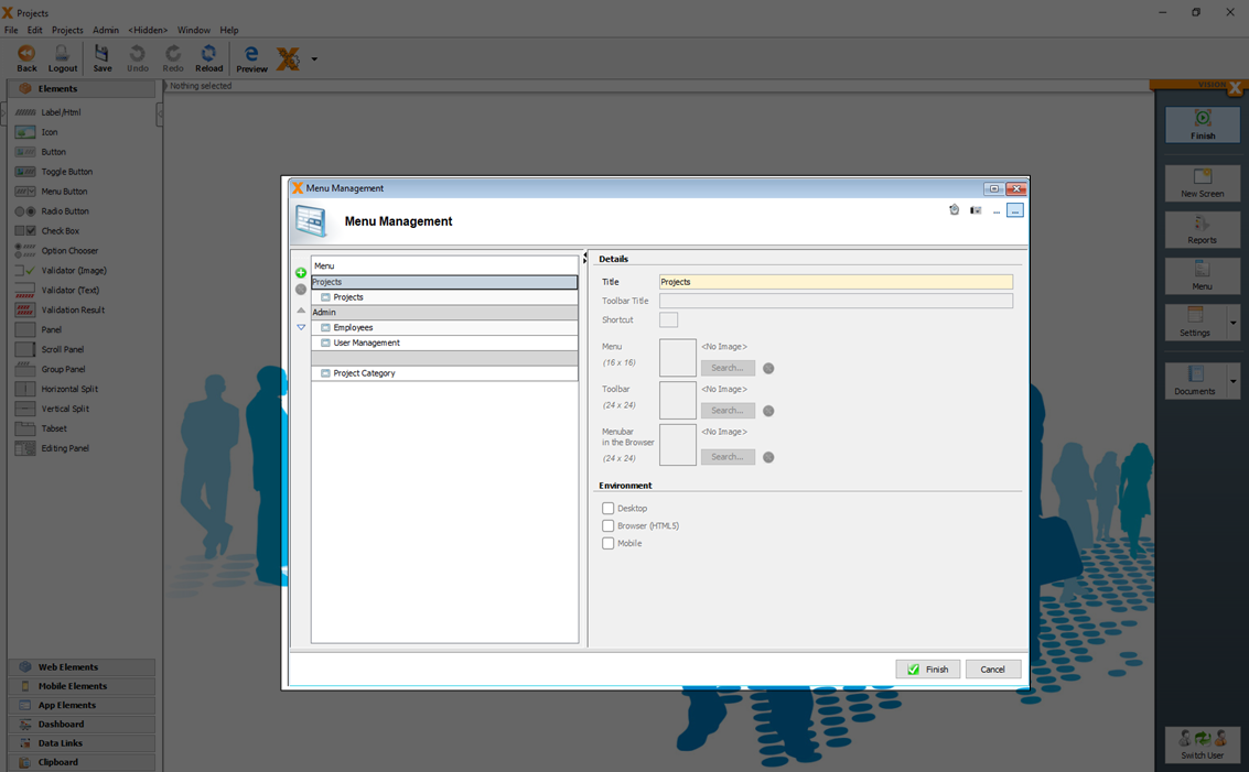
The menu title, and with it the name of the screen, can be changed in the panel on the right. If a toolbar title and icon are added, the menu entry is also displayed in the application's toolbar. A shortcut key can be defined to quickly open the menu items.
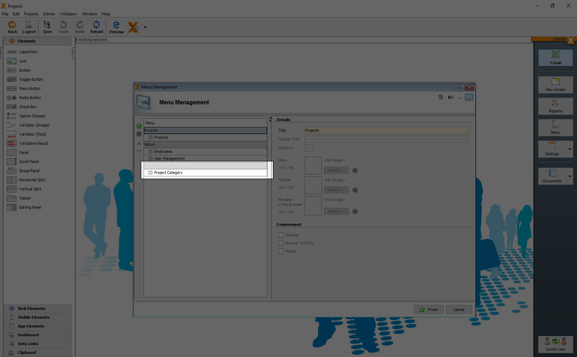
To categorize screens which should be not visible in the menu, a menu entry with an empty name can be created. Move all screens which should be not visible in the menu to the empty entry.
For more details see the video:
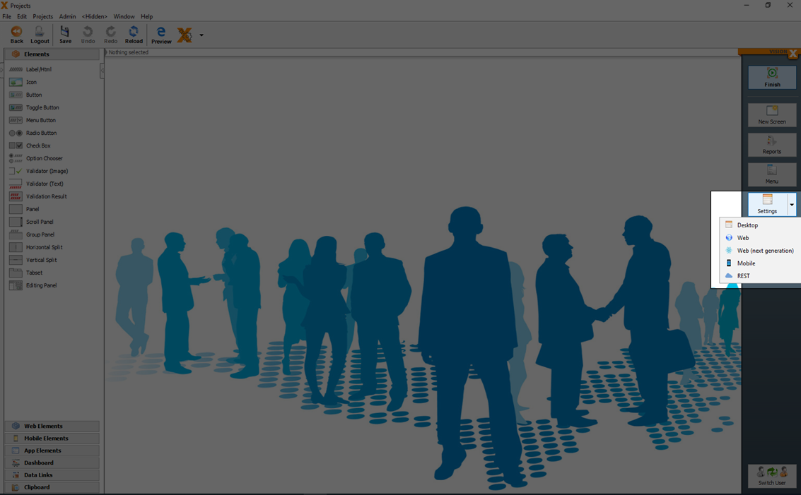
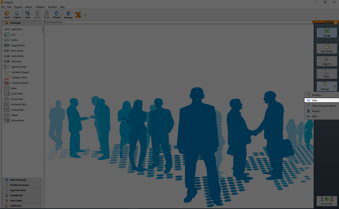
Settings
A number of application settings (like 'Automatic Login', 'Welcome Screen', 'Background Images', 'Roles', …) can be edited in the Application Settings menu.
To open the technology specific (Web, Mobile and Rest) settings you have to click the arrow in the settings menu.
Application Settings
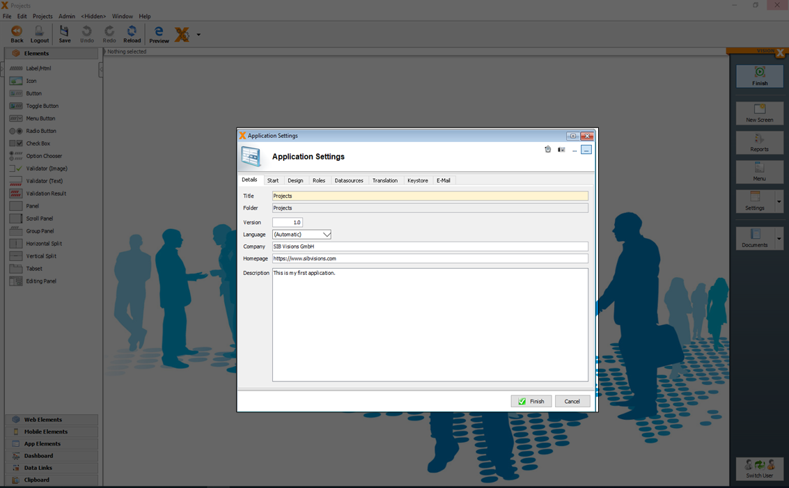
In the 'Application Settings' dialog specific preferences for the application can be configured.
On the 'Details' tab, the application's title, version, language, and additional information can be entered and edited. The default setting for the language is 'Automatic'. This means that the application is opened using the client PC's language. If desired, a specific language can be selected in which the application is to run (e.g., English). If no translation is available for the selected/determined language, the respective text is not translated and remains unchanged.
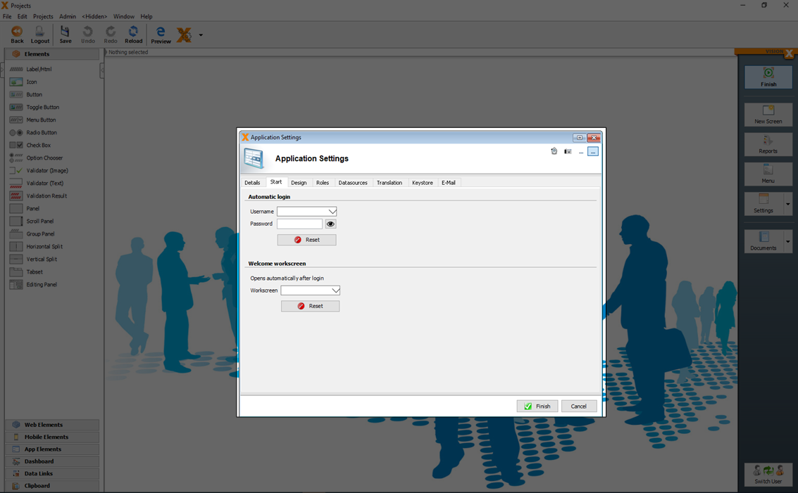
On the 'Start' tab, a standard user can be defined for automatic authentication. This can be used for public applications without registered users. In addition, a welcome screen can be selected that is displayed automatically when the application is opened.
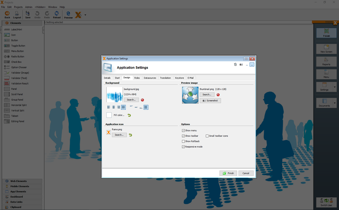
On the 'Design' tab, the background, application icon (the icon on the top left of the screen), as well as the preview image for the VisionX application overview can be selected.
Additional options for the design are:
| Setting | Description |
|---|---|
| Show menu | If this option is deactivated, no menu is displayed in the application. |
| Show toolbar | If this option is deactivated, no toolbar is displayed in the application. |
| Small toolbar icons | If this option is selected, the toolbar title is not displayed additionally to the icon. |
| Show Rollback | If this option is selected, the rollback button is displayed. |
| Responsive mode | If the responsive mode (see Responsive Design) is active or not. |
On the 'Roles' tab, new roles can be created, and assigned to the available screens.
Role-specific functionality can also be managed on the screens directly, e.g., actions can be used to show/hide certain fields or buttons. For details see User and role management.
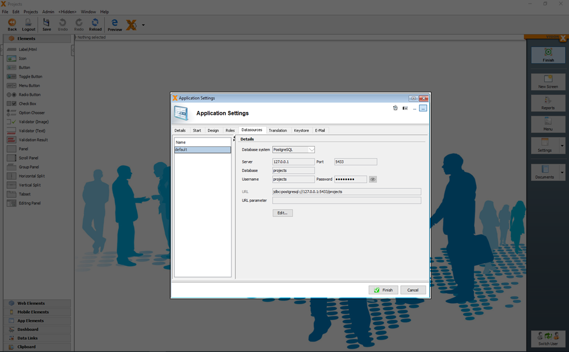
The 'Datasources' tab shows all data sources that are used in the application. They can be edited on this tab if a database/database user was changed or moved to a different server. 'Default' refers to the main database connection, which also contains the users, roles, screens, etc. that are required by VisionX. For details about datasources see Administration.

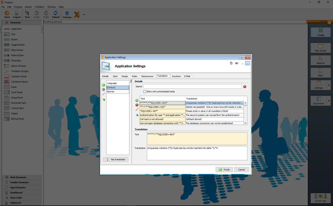
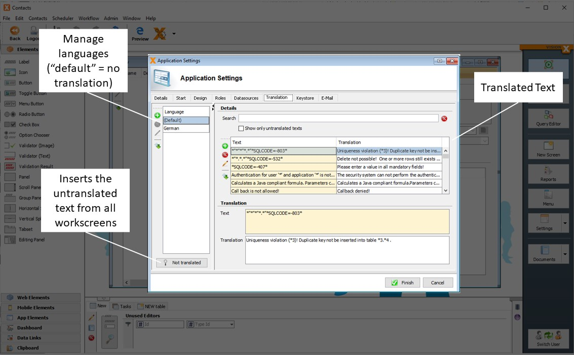
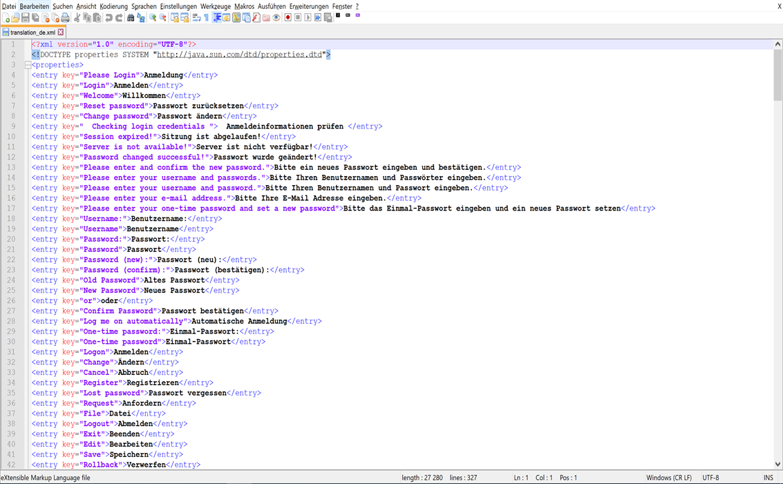
On the 'Translation' tab, the application's languages and the corresponding translations are edited.
For more details see Multiple Languages
On the 'E-Mail' tab, the mail server configuration can be added which should be used when e-mails are sent.
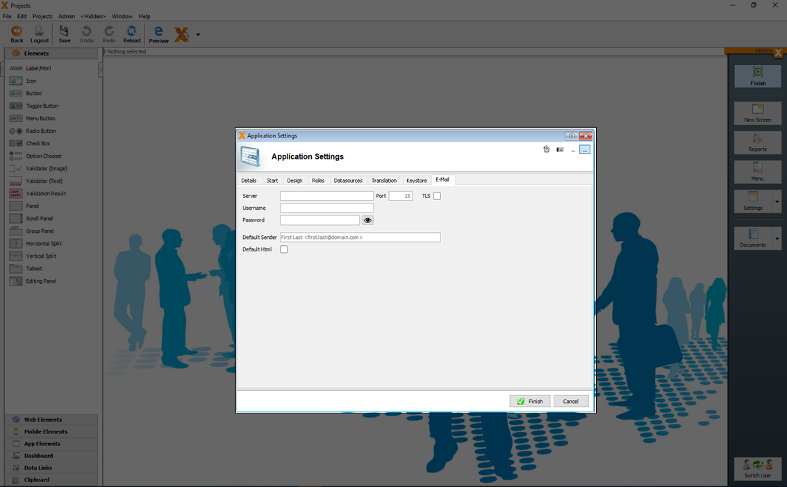
| Setting | Description |
|---|---|
| Server | The IP address or domain name of the mail server. |
| Port | The http / https port which should be used. |
| TLS | If TLS for encryption of the e-mail is active. |
| Username | The username to access the mail server. |
| Password | The password to access the mail server. |
| Default Sender | E-Mail address which is the default sender of the e-mail. |
| Default Html | If the e-mail body is default HTML formatted. |
For more details see the video:
Multiple Languages
When the application is created, all screens, menus, labels, etc. should be in the same language (default language). This can be English, German, etc.. Additional languages and their translations can be created and managed on this tab.
All possible text elements are listed and can be translated directly in this tab. The 'Not translated' button is used to transfer all recognized text for which no translation exists to the translation list. On this list, a translation can be entered for each message. This allows the user to add missing translations for new screens or functions at any time.
For each language a separate translation_[ISO_CODE].xml is created in the folder
[VisionX-Installation-Folder]/rad/apps/[Application-Folder]/src.client/app/visionx/apps/[application-name]/.
You can also translate the text elements directly in the xml files.
For more details see the video:
Place Holders
In addition to simple text, placeholders can be used for error messages.
Text | ORA-01400: *(“*”.*.“*”)* |
Translation | Please enter a value in field '*3' (*1.*2)! |
* can be used to define placeholders.
The translation can include a reference to the placeholder themselves. This is done with the * followed by a number,. e.g., *1 for the first placeholder.
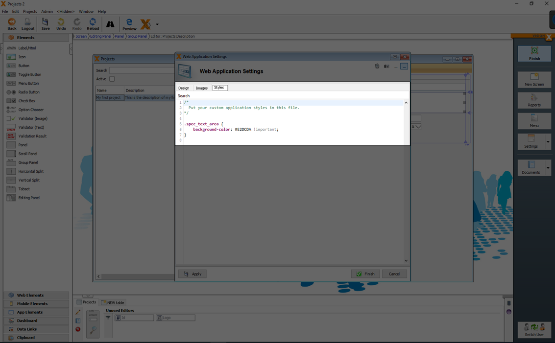
Web Application Settings
You can open the 'Web Application Settings' dialog in the sub menu of Settings.
In the 'Web Application Settings' dialog specific web preferences for the design and behaviour can be configured.
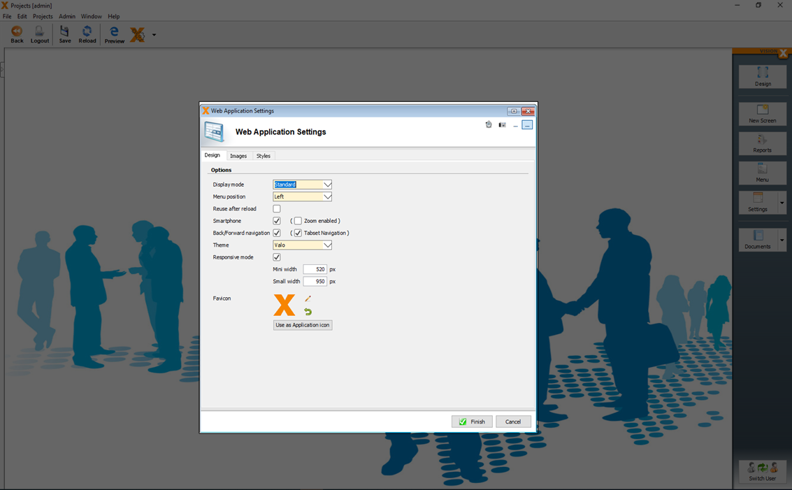
In the 'Design' tab you can set the following options.
| Setting | Description |
|---|---|
| Display mode | The display mode defines the behavior of the surrounding environment and how the menu and the screens are displayed. |
| Menu position | If the menu is displayed on the right or left side. |
| Reuse after reload | If this setting is activated, the client state is not new initialized, if reload in the browser is clicked. This is useful if you redirect to the application after a call of a other service. |
| Back/Forward navigation | If this setting is activated, you can use the back and forward buttons of the browser to navigate between the last opened screens. |
| Theme | The theme option has impact to the design of the application and the UI elements. |
| Responsive mode | If this setting is activated, responsive design (Responsive Design) is supported. |
| Responsive mode (Mini width) | If the screen size is smaller than this setting, the responsive design is optimized to a smaller screen size (e.g. for Tablets) |
| Responsive mode (Small width) | If the screen size is smaller than this setting, the responsive design is optimized to mobile screen. |
| Favicon | The icon which is used in the browser tab of the application. |
In the 'Styles' tab you can add specific web CSS styles. For more details see: Style your application
Web Application (next generation) Settings
You can open the 'Web Application (next generation) Settings' dialog in the sub menu of Settings.
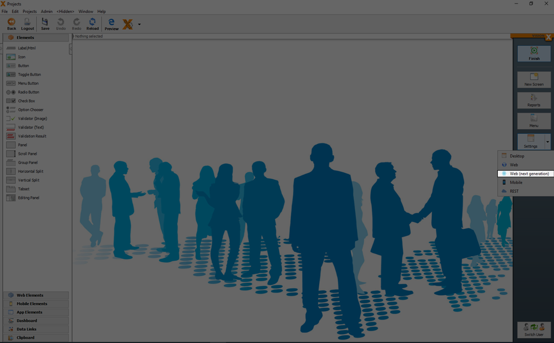
In the 'Web Application (next generation) Settings' dialog specific web preferences for the design and behavior can be configured.
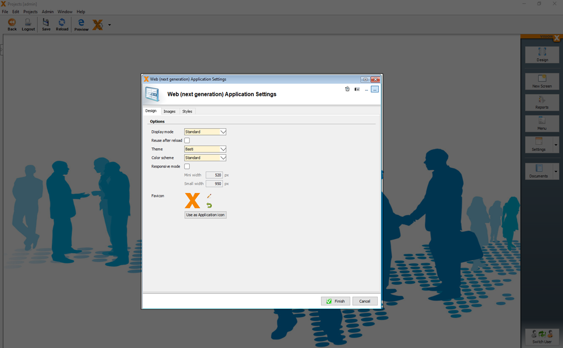
In the 'Design' tab you can set the following options.
| Setting | Description |
|---|---|
| Display mode | The display mode defines the behavior of the surrounding environment and how the menu and the screens are displayed. |
| Reuse after reload | If this setting is activated, the client state is not new initialized, if reload in the browser is clicked. This is useful if you redirect to the application after a call of a other service. |
| Theme | The theme option has impact to the design of the application and the UI elements. |
| Color scheme | The color scheme has impact to the primary and secondary colors which are used. |
| Responsive mode | If this setting is activated, responsive design (Responsive Design) is supported. |
| Responsive mode (Mini width) | If the screen size is smaller than this setting, the responsive design is optimized to a smaller screen size (e.g. for Tablets) |
| Responsive mode (Small width) | If the screen size is smaller than this setting, the responsive design is optimized to mobile screen. |
| Favicon | The icon which is used in the browser tab of the application. |
In the 'Styles' tab you can add specific web CSS styles. For more details see: Style Your Application
Mobile Settings
You can open the 'Mobile Settings' dialog in the sub menu of Settings.

In the 'Mobile Settings' dialog specific web preferences for the design and behavior can be configured.
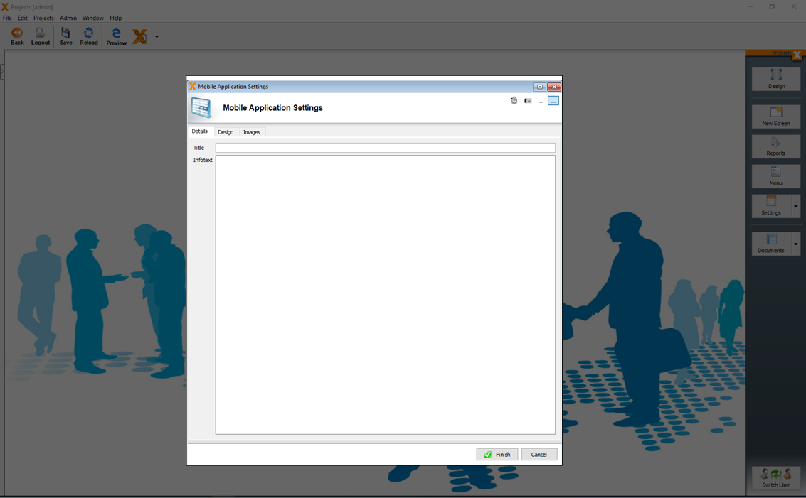
In the 'Details' tab you can and a specific 'Title' and 'Infotext' which is used in the mobile application.
In the 'Design' tab you can set the following options.
| Setting | Description |
|---|---|
| Menu mode | Defines how the menu in the app is grouped. |
| Theme color | The primary color of the app. |
| Opacity (Menu) | The opacity value of the menu. |
| Opacity (Fade-in menu) | The opacity value of the menu. |
| Opacity (Elements) | The opacity value of the used UI elements. |
| Login Logo | The image which is used in the login screen. |
| Login Background | The image and background color which is used in the login screen. |
| Application Background | The image and background color which is used in the application after the login. |
REST Settings
You can open the 'REST Settings' dialog in the sub menu of Settings.
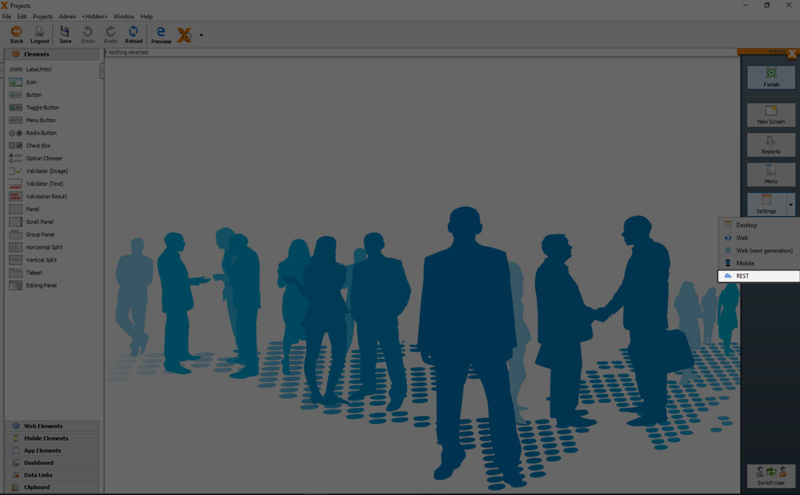
Each VisionX application can use different REST APIs as datasources. You can configure the application specific datasources when you click 'Service configuration'.
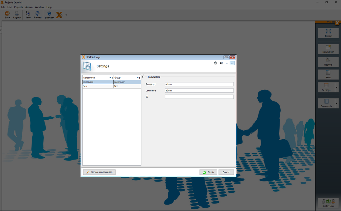
How to configure a REST service see the documentation of our [REST] module add on.
Reports
The VisionX reports module allows the user to create reports in the following formats: Word RTF (documents), Excel (spreadsheets), XML and PDF. Reports are used to provide selected data for the user to download. For certain report types, this data can then be edited locally and uploaded back into the application.
For more details see: VisionX Reports
Style Your Application
You can style your application with different design settings (see Settings) or specific CSS definitions.
Style A Web Application
The standard styling of an application is timeless and looks like one of the following.
But the standard styling is not always what you want because you have some special colors in mind.
You can easy use one of our existing templates, or you design it on your own with pure CSS.
For more details how you can import already well prepared CSS templates see: Style Templates
If you need a specific styling for UI elements, you can add a 'Style' class each element.
Each web application has an 'application.css' file in the WebContent folder, which can be used to add application specific CSS classes. The 'application.css' can be updated in the web specific settings (Web Application Settings) in the tab 'Styles'.
Here you can add your css class with your specific design.
Style A Mobile App
The styling of a mobile app is very limited. You can set some design specific options in the Mobile Settings.
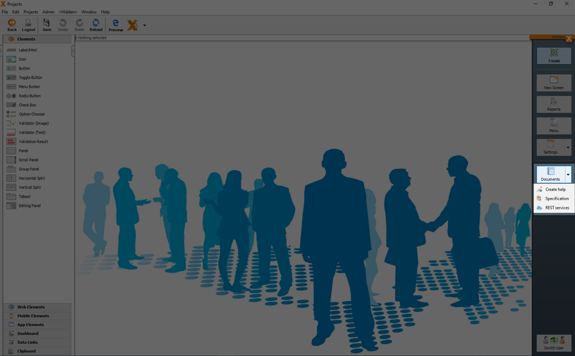
Documentation
In the 'Documents' menu a base documentation of the screens and database can be automatically generated.
With a click on the arrow in the 'Documents' menu, additionally an online help (see Generate REST Documentation) can be generated.
Generate Specification
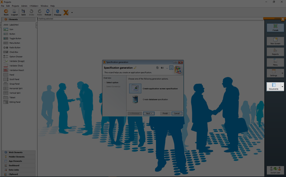
The 'Specification generation' dialog in the application's menu is used to create specification documents.
In the first step, the user can choose between a specification document for the application's screens or the documentation for the database.
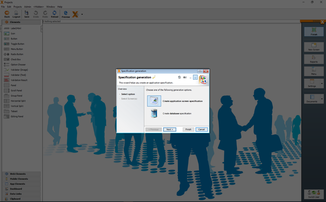
For the application screen documentation, a Word document is created containing a description of the application, screens (including a screen shot), and all fields with their respective actions.
For the database documentation, a Word document is created showing all database tables including columns, primary keys, foreign-, and unique keys.
Both options are created based on a template, which is downloaded in the next wizard step and edited using Microsoft Word. The template system is the same as the one used for the VisionX reports (see Reports).
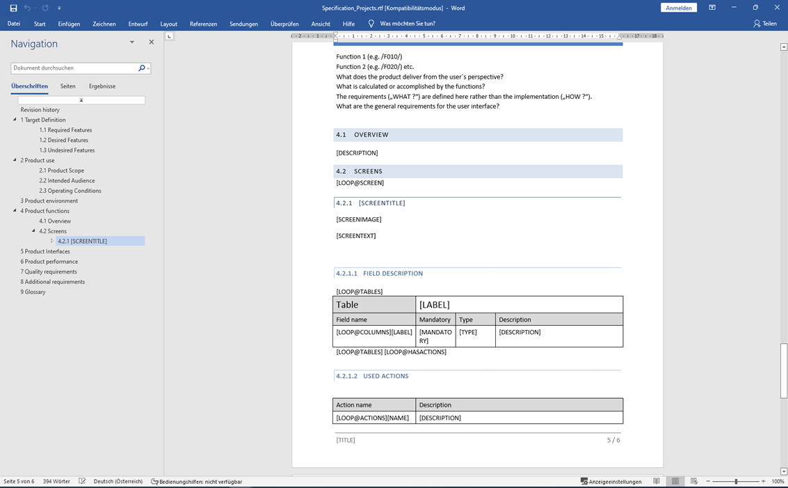
You can select the screens, which should be included in the documentation.
With 'Get Template' you can download the template and adjust the design of the template directly in Word.
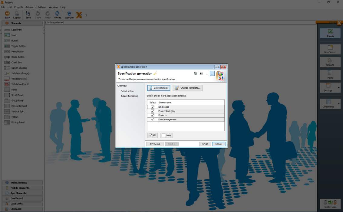
With 'Change Template…' you can upload the changed template.
Generate Help
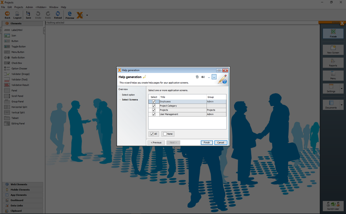
The 'Help generation' dialog in the documents menu is used to create an online help as HTML.
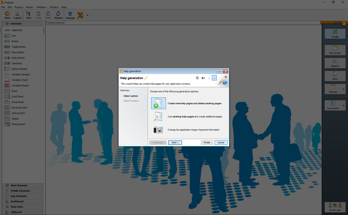
The help function in VisionX is HTML based, can be opened in the browser and including indexed full-text search.
Create New Help Pages And Delete Existing Pages
With the option 'Create new help pages and delete existing pages' a online help as HTML can be generated.
In the second step you can select the screens which should be part of the help.
You will find the generated HTML files and images in your projects directory in your VisionX installation folder:
[VisionX-Installation-Folder]/rad/apps/[Application-Folder]/WebContent/help
Use Existing Help Pages And Create Additional Pages
With the option 'Use existing help pages and create additional pages' additional screens to existing sections can be added.
In the second step you can select the screens which should be part of the help.
Change The Application Image Of General Information
With the option 'Change the application image of general information' images can be added to the help.
With 'Use an existing image' an image from the file system can be added.
With 'Make a Screenshot' a screen shot can be created and added to the help.
With 'Use application login image' the login screen can be added to the help as image.
You will find the images of the help in:
[VisionX-Installation-Folder]/rad/apps/[Application-Folder]/WebContent/help/structure/.images
Generate REST Documentation
The 'REST service' dialog in the application's menu is used to create a documentation for the application specific REST services. All data endpoints of the VisionX application are exposed as REST JSON services and can be used from other applications to read, update ore delete date if they have access.
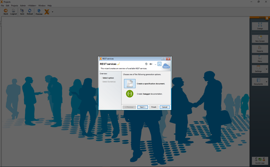
Create A Specification Document
With the option 'Create a specification document' all URL data endpoints, possible methodes and field names are generated in a Word document.
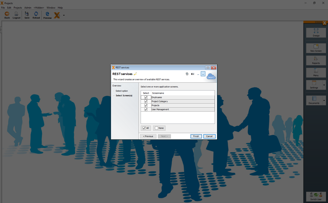
In the second step you can select the screens which should be part of REST specification
Create Swagger Documentation
With the option 'Create Swagger documentation' an API developer Swagger (swagger.io) documentation can be generated.
In the second step you can select the screens which should be part of REST specification.
Swagger is an interactive developer REST documentation which can be used from developers to test the available services.
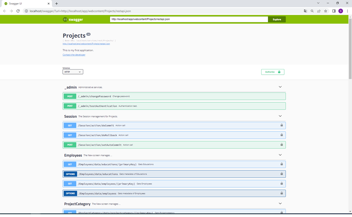
For more details about REST Services see: REST Services
Installation
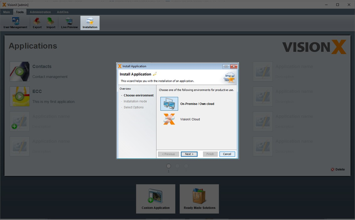
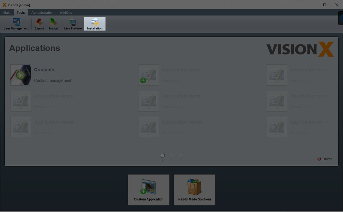
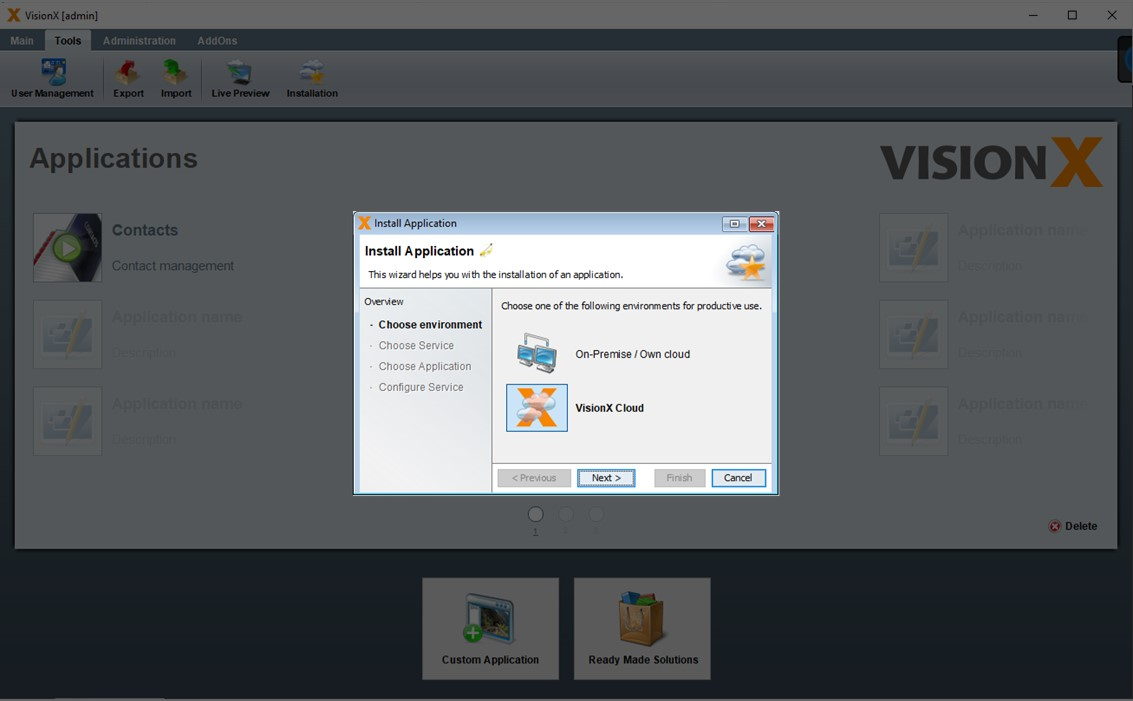
To install the application on an application server, the 'Installation' button on the 'Tools' menu is used.
In the first step, you can chose whether to install the application on-premise/in your own cloud or in the VisionX Cloud. The VisionX Cloud is a fully hosted solution that allows for one-click installation of an application. You can find more details in the VisionX Cloud documentation.
Own Infrastructure
After selecting the 'On-Premise/Own Cloud' option in the first step and clicking 'Next', we then make a selection whether only the application, the database, or both should be installed.
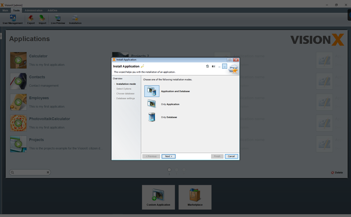
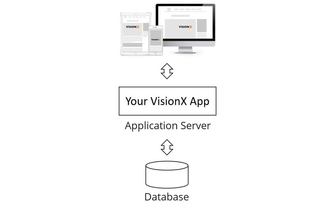
Each VisionX application consists of an application and a database. The application contains screens, actions, reports, and functions. The database contains the tables, views, and data.
The application is installed on an application server, while the database is installed on a database server.
In the following step, the application server for the installation of the application is selected.
The following figure shows an overview of the application's system architecture.
Requirements for the application server:
- OpenJDK / OracleJDK 8 >=
- Any Java Application server / Servlet Container (e.g. Apache Tomcat 8 >

- Any 64bit Linux or Windows >=7
- Any VM / Container – Docker/Kubernetes
Database
- Oracle, PostgreSQL / EDB, MS SQL, DB2, My SQL, Informix
You can select one of the application server or you create a 'Web Application Archive' ( WAR file) instead. This file can then be installed manually via the application server's configuration interface.
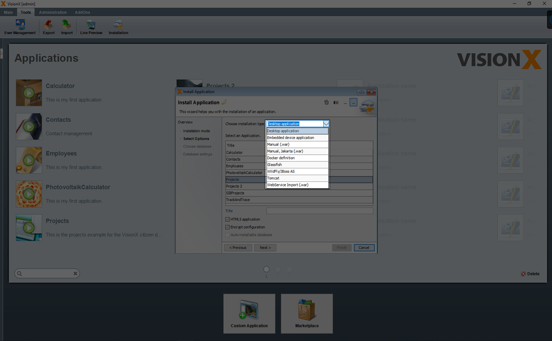
You can select one of the listed application servers and deploy the application directly via VisionX.
| Application Server | Description |
|---|---|
| Tomcat | Apache Tomcat Application Server: (https://tomcat.apache.org/) |
| Glassfish | Glassfish Application Server: (https://glassfish.org/) |
| WildFly/JBoss AS | WildFly Application ServeR: (https://www.wildfly.org/) |
If one of the possible application server is selected, the relevant parameters are entered in the next step. In addition to a name, the version, server (name/IP), port, user name, password, and manager path need to be entered. The application path can also be edited.
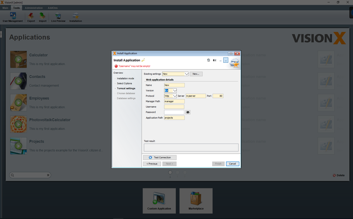
The application can only be deployed, if you have install/activate the Tomcat Management Console
The database is installed in the next step, where either a new or existing database user is selected.
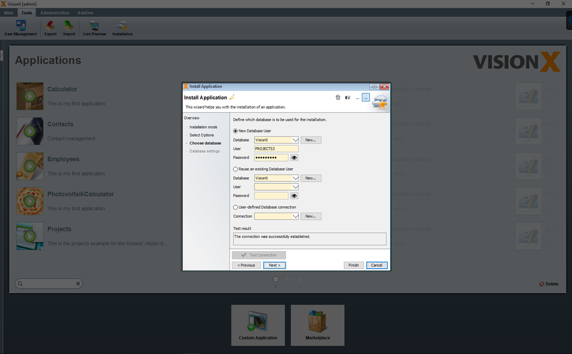
In the 4th step you can specify how the database will be imported. (See Choose Database).
If you selected an existing database user during import, the following options are available.
The checked 'Delete and recreate database objects' option performs the following steps. - All existing tables and data are deleted - All tables are recreated - Only users and roles are imported
Note - This option is not checked for existing database users and should be checked only if you are sure that you want to delete the existing tables with all their data.
The checked 'Merge database objects' option performs the following steps. - Merge existing tables with new tables structure - No data changes are performed in this step
Note - This option merges the table structure from the export with the table structure of the existing data user. Therefore, this is very useful especially when installing/importing a new version of your application.
The checked 'Import data' option performs the following steps. - All existing data except users is deleted - All data except users is imported
Note - This option is not checked for existing database users and should be checked only if you are sure that you want to delete all existing data and import then the data from the export.
If 'New Database User' was selected during import, then only the option 'Import data' is available, because the database objects are newly created and therefore cannot be merged. If in this case the option 'Import data' is unchecked, then only the table structures without data will be taken over. In addition, the users and roles are taken over from the export.
VisionX Cloud
VisionX Cloud provides a simple and convenient way to deploy your applications in an external runtime environment. The application can be up and running in just a few minutes.
Installing The VisionX Cloud Add-On
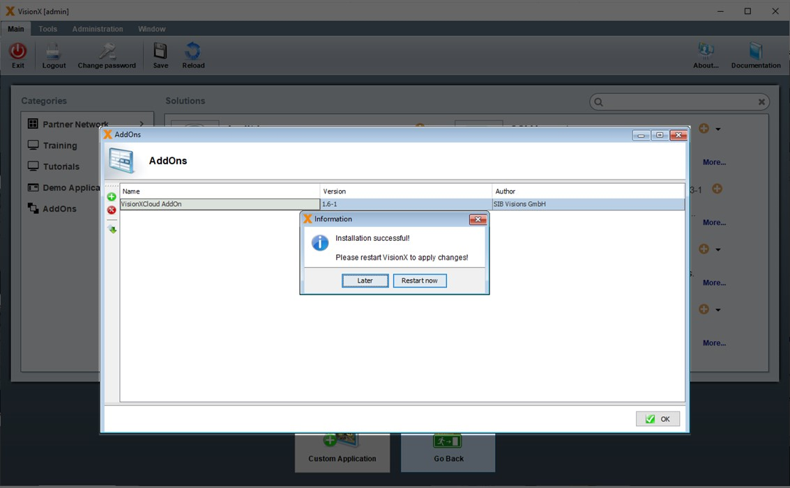
Before we can install an application in the VisionX Cloud, we first have to install the add-on in VisionX. Open the solutions store on the VisionX main menu.
Select 'Add-ons' on the left side.
And click the '+' icon next to the VisionX Cloud menu item.
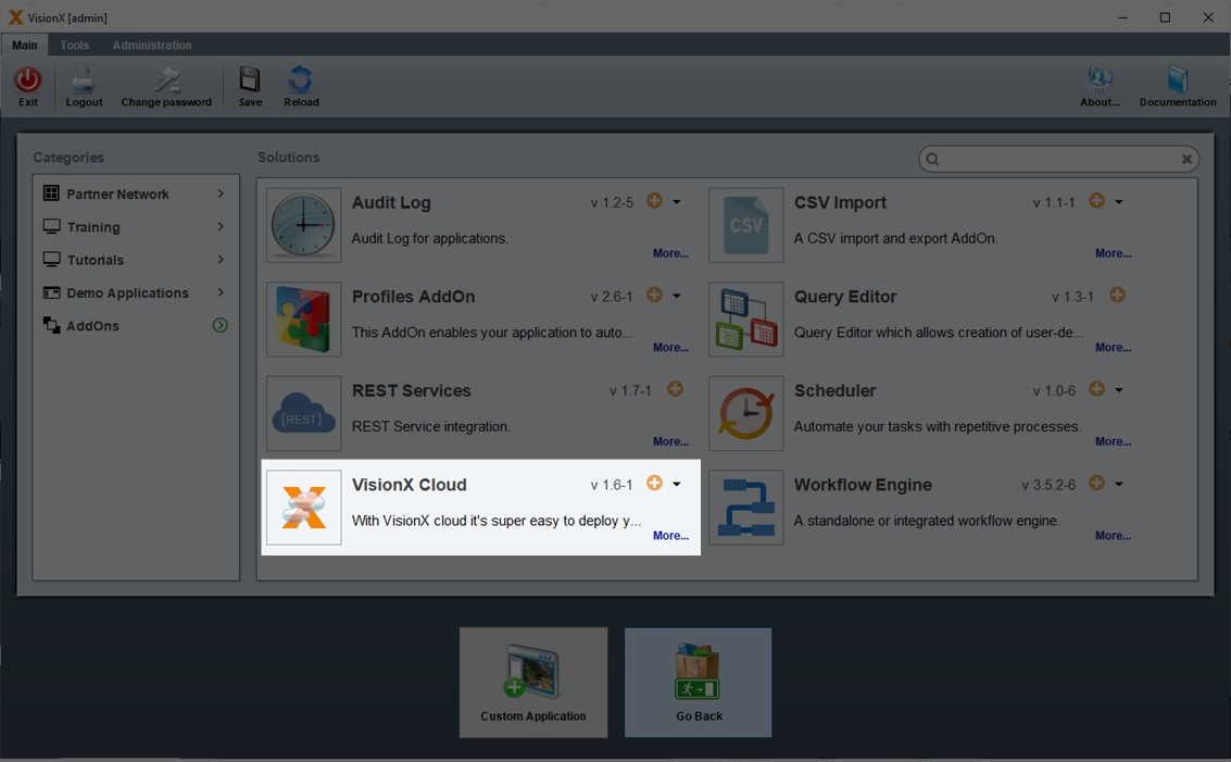
The Add-on will now be installed. Please restart VisionX after the installation is complete.
Installing An Application In The VisionX Cloud
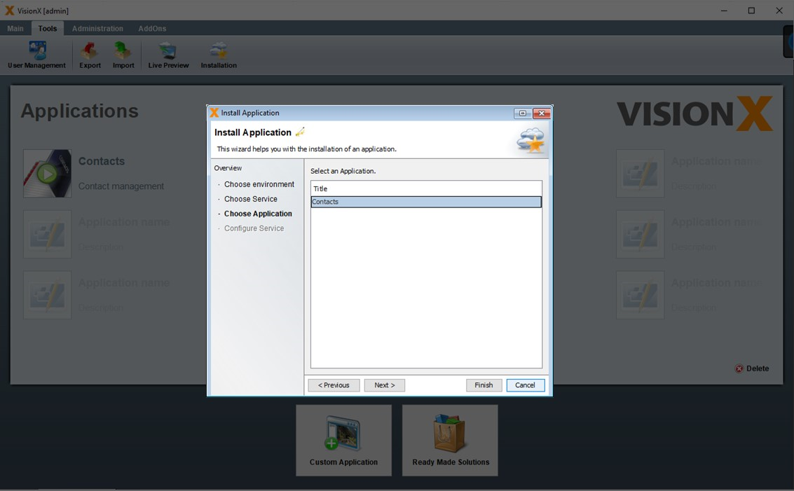
After the VisionX Cloud add-on has been installed, we can select it as an option during the installation process. Let’s install the VisionX 'Contacts' demo application. Click on 'Installation' in the main VisionX menu.
Select the 'VisionX Cloud' option and click 'Next.
Select 'New Service' and click 'Next'.

Select the 'Contacts' application and click 'Next'.
On the next screen, we can change the URL for the application, and select one of three options for the runtime environment:
- Small: used for applications with few concurrent users (up to 5), lower amounts of data (mostly text, with few images and files) and small to medium sized reports (up to about 20 pages).
- Medium: used for applications with more concurrent users (up to 30), medium amounts of data (including images and files) and medium to large sized reports (up to about 20 pages).
- Large: used for applications with many concurrent users (up to 100), large amounts of data (including images and files) and large sized reports (up to about 20 pages).
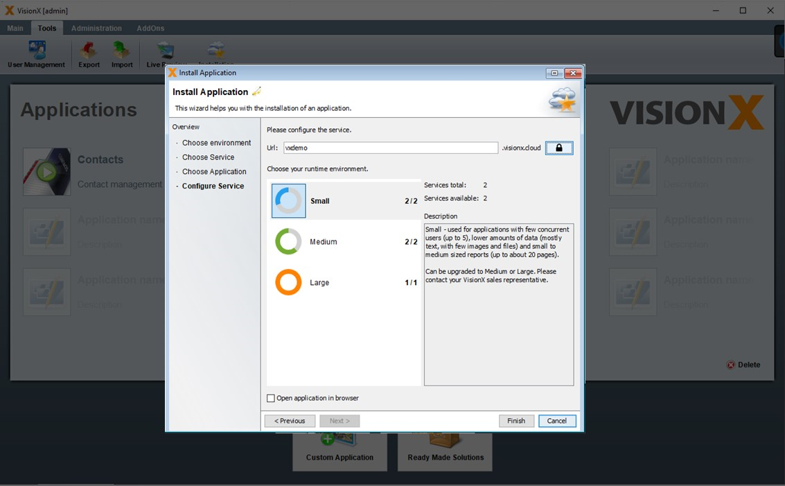
After selecting the environment, we click 'Finish' to start the installation. This process may take a few minutes.
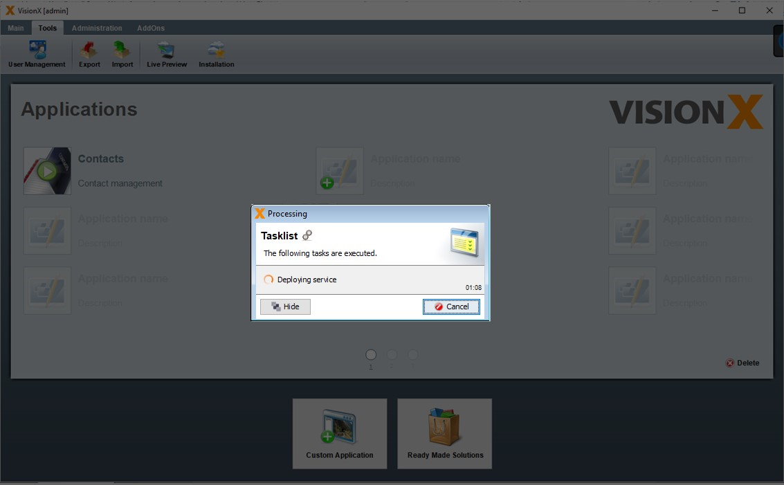
The application is now installed in the VisionX cloud. We can start it in a browser by navigating to the URL specified during the installation process (in this case: vxdemo.visionx.cloud)
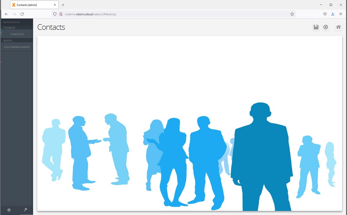
Monitoring The Application Status
We can check the status of the application by selecting 'Add-Ons' and then 'VisionX Cloud' in the VisionX main menu.
This will bring up the VisionX Cloud service management screen. Here you can see the status of all your applications that were installed in the VisionX Cloud.
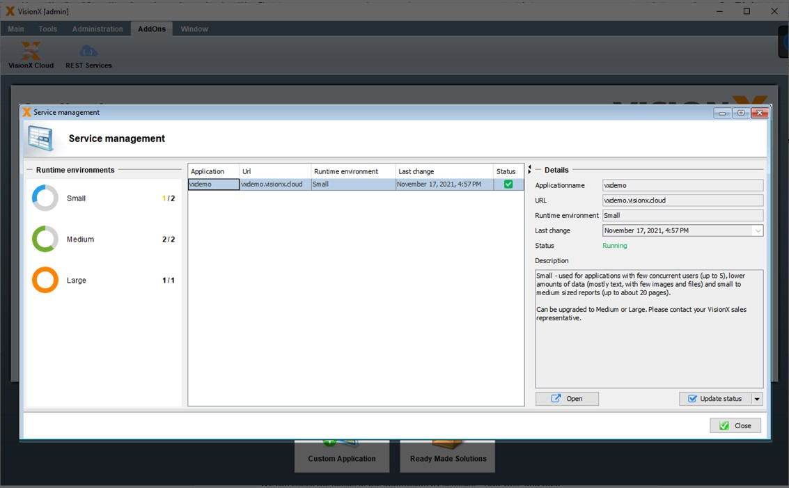
Clicking on the down arrow on the 'Update Status' button will open a menu with options.
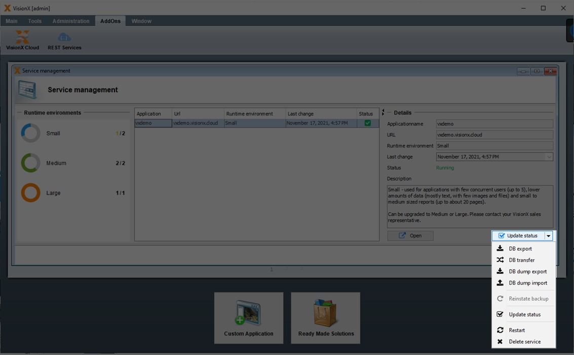
| Action | Description |
|---|---|
| DB Export | TBD |
| DB Transfer | TBD |
| DB Dump Export | Exports a DB dump from the selected application. |
| DB Dump Import | Imports a DB dump to the selected applicattion. |
| Reinstate backup | The opacity value of the used UI elements. |
| Update Status | The image which is used in the login screen. |
| Restart | Restarts the VisionX Cloud service for the selected application. |
| Delete service | Deletes the VisionX Cloud installation for the selected application. |
Add Ons
Query Editor
The VisionX Query Editor helps Citizen Developers to link data from multiple tables, group data or create SQL statements. The resulting queries can be used in any VisionX screen, for example, on dashboards, reports or specific reporting screens.
For more details see the Query Editor documentation.
Scheduler
The VisionX scheduler allows us to automate recurring activities. We can call workflows, server actions/functions and any Java code periodically.
For more details see the Scheduler documentation.
Audit Log
The Audit Log Add-on offers historization for database tables. Therefore, all data changes are completely logged according to auditability including time, user and the data that has been changed.
For more details see the Audit Log documentation.
CSV Import
The CSV import modul offers a possiblity to import data from a CSV file into an existing data model.
For more details see the CSV Import documentation.
Filter And User Profiles
The User Profile AddOn saves your screen layout if you close a screen and restores everything if you open the same screen again.
For more details see the User Profiles and Filters documentation.
Workflow
VisionX includes a complete workflow engine for automating business processes such as approval workflows.
For more details see the Workflow Engine documentation.
SSO over Windows AD
The Single Sign On over Microsoft AD Add On enables authentication via Windows AD. For more information, please refer to the Add On documentation.
REST Services
VisionX offers more than a simple REST integration of simple services. We also integrate other services as CRUD REST to access any REST service very easily - like tables.
For more details see the REST Services documentation.