
Trace: • UI elements
Table of Contents
Version: 1.0 / 2022-06-01
VisionX offers you a wide selection of user interface elements.
UI elements are for example buttons, input fields or panels that are placed in the screen using drag and drop. Each element can be changed using the Customizer. In addition, actions can be created for many elements, which are executed after a user activity.
The following chapters describe all the elements that VisionX contains and explains the settings.
Elements
Genaral Properties
These properties are the same for all elements and can be set individually for each one.
| Property | Description |
|---|---|
| Name | Automatically assigned name. Can also be renamed, but must be unique. |
| Style | CSS-style information to be applied in web. |
| Focus Order | Sets the order in which elements are focused in sequence when the Tab key is pressed. |
| Margins | Amount of empty space around the control. |
| Font | Font name, size and style of the control's text. |
| Image | Choose an image or Font Awesome icon to display on the control. |
| Foreground | Color of the control's text and Font Awesome icon. For changing the color you can use the matrix to specify a color or select a predefined color. Another possibility is to define the color via the RGB code. |
| Background | The control's background color. For changing the color you can use the matrix to specify a color or select a predefined color. Another possibility is to define the color via the RGB code. |
| Popup menu | Assign an existing Popup Menu or specify a new one by choosing the plus symbol. If a Popup Menu is selected, it can be edited with the edit button. Use the delete button to delete the selected Popup Menu. |
| Events | Events that are executed on the table after certain user activities. |
| Property | Description |
|---|---|
| Pencil Button (1) | Opens and closes the customizer of the element. |
| Eclipse Button (2) | Jumps in the sourcecode to the position of the implementation of the element. |
| Delete Button (3) | Deletes the selected element. |

For some properties there is an additional button. This will reset the property to the default value.

Label/Html
Label for input fields, etc.

| Property | Description |
|---|---|
| Text | Text that is displayed. It can be modified by using the HTML Editor. |
| Tooltip | Informational text that is displayed when the cursor is over this control. It can be modified by using the HTML Editor. |

Icon
Displays an Image or FontAwsome Icon.
| Property | Description |
|---|---|
| Tooltip | Informational text that is displayed when the cursor is over this control. It can be modified by using the HTML Editor. |
| Preserve Aspect Ratio | Preserves the Aspect Ratio, when image is stretched. |
Checkbox
Checkbox for the selection of an option.

| Property | Description |
|---|---|
| Text | Text that is displayed. It can be modified by using the HTML Editor. |
| Image Gap | Defines the gap between the image and the text. |
| Image Alignment | Specifies the alignment of the image and text on the button. |
| Border on Mouseover | Displays the border when the curser is over this button. |
| Show Border | Displays the borders of this button. |

Option Chooser
This element is a panel containing radio buttons. This GUI element has to be associated with a combo box table column. A radio button is created on the panel for each possible value on the dropdown list. Only one value can be selected. This element allows for the effortless creation of data-related radio groups.

| Property | Description |
|---|---|
| Layout | Sets the Layout of the buttons (horizontal or vertical). |
| Gap | Defines the gap between the buttons |
| Binding | Table column that refers to the option chooser. |

Validators
Validator (Image)
Checks the input of an input field. If the input is correct, a green mark appears, otherwise a red cross.
| Property | Description |
|---|---|
| Tooltip | Informational text that is displayed when the cursor is over this control. It can be modified by using the HTML Editor. |
| Binding | Table column that refers to the validator. |
| Automatic validate | Executes the validation automatically, no further user activity is necessary. |
| Hide until first validate | Validation becomes visible after the first execution. |
| Create Validation | Creates an action to be able to perform the validation. Note: Every validator needs an action! |

Validator (Text)
Checks the input of an input field. If the input is wrong, an error message appears as red text at the desired position.
| Property | Description |
|---|---|
| Tooltip | Informational text that is displayed when the cursor is over this control. It can be modified by using the HTML Editor. |
| Binding | Table column that refers to the validator. |
| Automatic validate | Executes the validation automatically, no further user activity is necessary. |
| Hide until first validate | Validation becomes visible after the first execution. |
| Create Validation | Creates an action to be able to perform the validation. Note: Every validator needs an action! |

Validation Result
The Validation Result is used primarily as a summary of incorrect entries of a complete form. The individual fields which should be verified must be provided with text or image validations.
| Property | Description |
|---|---|
| Tooltip | Informational text that is displayed when the cursor is over this control. It can be modified by using the HTML Editor. |
| Binding | Panel or action that refers to the validator. If you select a panel, the result applies to all validators in this panel. |
| Ignore Invisible Components | Executes the validation automatically, no further user activity is necessary. |
| Automatic validate | Validation becomes visible after the first execution. |
| Show as Popup | Shows the error message as a popup. Otherwise as a list at the position of the validator result. |


Buttons
Button
Buttons usually trigger certain actions when it is pressed. It consists of a text, an image or both.

| Property | Description |
|---|---|
| Text | Text that is displayed. It can be modified by using the HTML Editor. |
| Image Gap | Defines the gap between the image and the text. |
| Image Alignment | Specifies the alignment of the image and text on the button. |
| Border on Mouseover | Displays the border when the curser is over this button. |
| Show Border | Displays the borders of this button. |

Toggle Button
A toggle button is a button with two states (clicked, not clicked).

| Property | Description |
|---|---|
| Text | Text that is displayed. It can be modified by using the HTML Editor. |
| Image Gap | Defines the gap between the image and the text. |
| Image Alignment | Specifies the alignment of the image and text on the button. |
| Border on Mouseover | Displays the border when the curser is over this button. |
| Show Border | Displays the borders of this button. |

Radio Button
Radio button for the selection of an option.

| Property | Description |
|---|---|
| Text | Text that is displayed. It can be modified by using the HTML Editor. |
| Image Gap | Defines the gap between the image and the text. |
| Image Alignment | Specifies the alignment of the image and text on the button. |
| Border on Mouseover | Displays the border when the curser is over this button. |
| Show Border | Displays the borders of this button. |

Insert Button
Adds a new row and selects the row.

| Property | Description |
|---|---|
| Text | Text that is displayed. It can be modified by using the HTML Editor. |
| Image Gap | Defines the gap between the image and the text. |
| Image Alignment | Specifies the alignment of the image and text on the button. |
| Border on Mouseover | Displays the border when the curser is over this button. |
| Show Border | Displays the borders of this button. |
| Tabset Navigation | Navigates to the second tab when the editing panel mode is Tabset. |
| Binding | Table that refers to the button |

Delete Button
Deletes the selected row.

| Property | Description |
|---|---|
| Text | Text that is displayed. It can be modified by using the HTML Editor. |
| Image Gap | Defines the gap between the image and the text. |
| Image Alignment | Specifies the alignment of the image and text on the button. |
| Border on Mouseover | Displays the border when the curser is over this button. |
| Show Border | Displays the borders of this button. |
| Tabset Navigation | Navigates to the first tab when the editing panel mode is Tabset. |
| Binding | Table that refers to the button |

Export Button
Creates a CSV Export.

| Property | Description |
|---|---|
| Text | Text that is displayed. It can be modified by using the HTML Editor. |
| Image Gap | Defines the gap between the image and the text. |
| Image Alignment | Specifies the alignment of the image and text on the button. |
| Border on Mouseover | Displays the border when the curser is over this button. |
| Show Border | Displays the borders of this button. |
| Binding | Table that refers to the button |

Save Button
Saves the selected datarow.

| Property | Description |
|---|---|
| Text | Text that is displayed. It can be modified by using the HTML Editor. |
| Image Gap | Defines the gap between the image and the text. |
| Image Alignment | Specifies the alignment of the image and text on the button. |
| Border on Mouseover | Displays the border when the curser is over this button. |
| Show Border | Displays the borders of this button. |
| Always enabled | Button is always enabled. Otherwise the button is only enabled after a datarow is changed. |
| Tabset Navigation | Navigates to the first tab when the editing panel mode is Tabset. |
| Binding | Table that refers to the button |

Cancel Button
Undoes the current changes.

| Property | Description |
|---|---|
| Text | Text that is displayed. It can be modified by using the HTML Editor. |
| Image Gap | Defines the gap between the image and the text. |
| Image Alignment | Specifies the alignment of the image and text on the button. |
| Border on Mouseover | Displays the border when the curser is over this button. |
| Show Border | Displays the borders of this button. |
| Tabset Navigation | Navigates to the first tab when the editing panel mode is Tabset. |
| Binding | Table that refers to the button |

Table Menu Button
Table Menu Button When pressed, the Menu Button reveals the table's toolbar items in a menu that “drops down” from the location of the button.

| Property | Description |
|---|---|
| Tabset Navigation | Navigates to the first tab when the editing panel mode is Tabset. |
| Binding | Table that refers to the button |

Previous Button
Selects the previous row.

| Property | Description |
|---|---|
| Text | Text that is displayed. It can be modified by using the HTML Editor. |
| Image Gap | Defines the gap between the image and the text. |
| Image Alignment | Specifies the alignment of the image and text on the button. |
| Border on Mouseover | Displays the border when the curser is over this button. |
| Show Border | Displays the borders of this button. |
| Binding | Table that refers to the button. |

Next Button
Selects the next row.

| Property | Description |
|---|---|
| Text | Text that is displayed. It can be modified by using the HTML Editor. |
| Image Gap | Defines the gap between the image and the text. |
| Image Alignment | Specifies the alignment of the image and text on the button. |
| Border on Mouseover | Displays the border when the curser is over this button. |
| Show Border | Displays the borders of this button. |
| Binding | Table that refers to the button. |

Selection Button
Opens a popup window with data of the linked table column. After selecting the value, it will be saved for the corresponding record.

| Property | Description |
|---|---|
| Text | Text that is displayed. It can be modified by using the HTML Editor. |
| Image Gap | Defines the gap between the image and the text. |
| Image Alignment | Specifies the alignment of the image and text on the button. |
| Border on Mouseover | Displays the border when the curser is over this button. |
| Show Border | Displays the borders of this button. |
| Binding | Column that refers to the button. |

Search Button
Executes the search for the desired record in the linked table.

| Property | Description |
|---|---|
| Tooltip | Informational text that is displayed when the cursor is over this control. It can be modified by using the HTML Editor. |
| Text | Text that is displayed. It can be modified by using the HTML Editor. |
| Image Gap | Defines the gap between the image and the text. |
| Image Alignment | Specifies the alignment of the image and text on the button. |
| Border on Mouseover | Displays the border when the curser is over this button. |
| Show Border | Displays the borders of this button. |
| Binding | Table that refers to the button. |

Clear Search Button
Resets the search to show all records in the table again. Not applicable in combination with the search button.

| Property | Description |
|---|---|
| Tooltip | Informational text that is displayed when the cursor is over this control. It can be modified by using the HTML Editor. |
| Text | Text that is displayed. It can be modified by using the HTML Editor. |
| Image Gap | Defines the gap between the image and the text. |
| Image Alignment | Specifies the alignment of the image and text on the button. |
| Border on Mouseover | Displays the border when the curser is over this button. |
| Show Border | Displays the borders of this button. |
| Binding | Table that refers to the button. |

Save all
Saves all data that has been changed in the current screen or for all opened screens.

| Property | Description |
|---|---|
| Text | Text that is displayed. It can be modified by using the HTML Editor. |
| Image Gap | Defines the gap between the image and the text. |
| Image Alignment | Specifies the alignment of the image and text on the button. |
| Border on Mouseover | Displays the border when the curser is over this button. |
| Show Border | Displays the borders of this button. |
| Save for | Screen: Saves all changes for the current screen. |
| Application: Saves all changes of all opened screens of the application. |

Reload all
Reloads all data for the current screen or for all opened screens.

| Property | Description |
|---|---|
| Text | Text that is displayed. It can be modified by using the HTML Editor. |
| Image Gap | Defines the gap between the image and the text. |
| Image Alignment | Specifies the alignment of the image and text on the button. |
| Border on Mouseover | Displays the border when the curser is over this button. |
| Show Border | Displays the borders of this button. |
| Reload for | Screen: Saves all changes for the current screen. |
| Application: Saves all changes of all opened screens of the application. |

Upload
Stores the file/image to be uploaded in the database. Two table columns are needed, which have file/image and text defined as data type.

| Property | Description |
|---|---|
| Label | Creates a label with the entered Text for this button. |
| Tooltip | Informational text that is displayed when the cursor is over this control. It can be modified by using the HTML Editor. |
| Text | Text that is displayed. It can be modified by using the HTML Editor. |
| Image Gap | Defines the gap between the image and the text. |
| Image Alignment | Specifies the alignment of the image and text on the button. |
| Border on Mouseover | Displays the border when the curser is over this button. |
| Show Border | Displays the borders of this button. |
| Databinding | Image/File: Column in which the file/image is saved (Datatype file/image). |
| Filename: Column in which the filename is saved (Datatype text). |

Popup Menu/Menu Buttons
Menu Button
Menu Button is a button that toggles a menu. If a popup menu has been assigned to the Menu Button, a dropdown menu with top triangle is displayed on the button. By clicking the menu button, the popup menu drops down.

| Property | Description |
|---|---|
| Text | Text that is displayed. It can be modified by using the HTML Editor. |

Container
Panel
Panel is the simplest container. A panel provides space in which an application can attach any other component, including other panels.

| Property | Description |
|---|---|
| Label | Selection of different types of a group panel. |
| Tooltip | Informational text that is displayed when the cursor is over this control. |
| Convert Panel | Left/Top: Label is displayed on the left/above the Cell Editor. Placeholder: Label name is displayed in the Cell Editor, but only if it is empty. None: No labels displayed. |
| Responsive Layout | Changes padding/margin/font size and menu position dynamically - based on the current browser or device size. |
| Convert to Advanced Form Layout | VisionX automatically adds the corresponding labels of cell editors. |
Scroll Panel
Users have the possibility to scroll inside this panel if the displayed elements do not have enough space. A scrollbar appears for horizontal or vertical scrolling automatically when the panel becomes too small.

| Property | Description |
|---|---|
| Convert Panel | Selection of different types of panels. |
| Responsive Layout | Changes padding/margin/font size and menu position dynamically - based on the current browser or device size. |
| Convert to Advanced Form Layout | VisionX automatically adds the corresponding labels of the cell editors. |

Group Panel
With a Group Panel you can make your workscreens more clearly arranged. You can add a heading to the top of each Group Panel and configure the panel as collapsible.

| Property | Description |
|---|---|
| Convert Group Panel | Selection of different types of a group panel. |
| Responsive Layout | Changes padding/margin/font size and menu position dynamically - based on the current browser or device size. |
| Convert to Advanced Form Layout | VisionX automatically adds the corresponding labels of the cell editors. |
| Label position | Left/Top: Label is displayed on the left/above the Cell Editor. Placeholder: Label name is displayed in the Cell Editor, but only if it is empty. None: No labels displayed. |
| Horizontal gap | Distance between elements in different columns. |
| Label gap (Horizontal) | Horizontal distance from label to cell editor. |
| Vertical gap | Distance between elements in different rows. |
| Label gap (Vertical) | Vertical distance between label and cell editor. |

Horizontal Split
The horizontal split panel, is divided into two sections, which are aligned horizontally.

| Property | Description |
|---|---|
| Convert Panel | Selection of different types of a panel. |
| Split Position | Position where the panel is split. |

Vertical Split
The vertical split panel, is divided into two sections, which are aligned vertically.

| Property | Description |
|---|---|
| Convert Panel | Selection of different types of a panel. |
| Split Position | Position where the panel is split. |

Tabset
Any number of tab sets can be added to this panel. Each tab set contains its own panel, which can be configured individually.

| Property | Description |
|---|---|
| Convert Panel | Selection of different types of a panel. |
| Responsive Layout | Changes padding/margin/font size and menu position dynamically - based on the current browser or device size. |
| Convert to Advanced Form Layout | VisionX automatically adds the corresponding labels of the cell editors. |
| Label position | Left/Top: Label is displayed on the left/above the Cell Editor. Placeholder: Label name is displayed in the Cell Editor, but only if it is empty. None: No labels displayed. |
| Horizontal gap | Distance between elements in different columns. |
| Label gap (Horizontal) | Horizontal distance from label to cell editor. |
| Vertical gap | Distance between elements in different rows. |
| Label gap (Vertical) | Vertical distance between label and cell editor. |

Editing Panel

| Property | Description |
|---|---|
| Navigationtabs | Selection of different types of a panel. |
| Tabposition | Changes padding/margin/font size and menu position dynamically - based on the current browser or device size. |
| Display mode | VisionX automatically adds the corresponding labels of the cell editors. |
| Navigation mode | Left/Top: Label is displayed on the left/above the Cell Editor. Placeholder: Label name is displayed in the Cell Editor, but only if it is empty. None: No labels displayed. |
| Show Navigation | Distance between elements in different columns. |
| Show Save and Back | Horizontal distance from label to cell editor. |
| Split Position | Distance between elements in different rows. |


Fold Group Panel
A grouppanel which is configurable as foldable.

| Property | Description |
|---|---|
| Convert Panel | Selection of different types of a group panel. |
| Collapsible | Sets the panel collapsible. |
| Collapsed | Sets the panel collapsed by default. |
| Responsive Layout | Changes padding/margin/font size and menu position dynamically - based on the current browser or device size. |
| Convert to Advanced Form Layout | VisionX automatically adds the corresponding labels of the cell editors. |

Advanced Panel
A panel where labels are automatically added when adding editors.

| Property | Description |
|---|---|
| Label | Creates a label with the entered Text for this button. |
| Tooltip | Informational text that is displayed when the cursor is over this control. |
| Convert Panel | Selection of different types of a panel. |
| Responsive Layout | Changes padding/margin/font size and menu position dynamically - based on the current browser or device size. |
| Convert to Form Layout | VisionX automatically removes the corresponding labels of the cell editors. |
| Label position | Left/Top: Label is displayed on the left/above the Cell Editor. Placeholder: Label name is displayed in the Cell Editor, but only if it is empty. None: No labels displayed. |
| Horizontal gap | Distance between elements in different columns. |
| Label gap (Horizontal) | Horizontal distance from label to cell editor. |
| Vertical gap | Distance between elements in different rows. |
| Label gap (Vertical) | Vertical distance between label and cell editor. |

Advanced Group Panel
A group panel where labels are automatically added when adding editors.

| Property | Description |
|---|---|
| Label | Creates a label with the entered Text for this button. |
| Tooltip | Informational text that is displayed when the cursor is over this control. |
| Convert Panel | Selection of different types of a panel. |
| Responsive Layout | Changes padding/margin/font size and menu position dynamically - based on the current browser or device size. |
| Convert to Form Layout | VisionX automatically removes the corresponding labels of the cell editors. |
| Label position | Left/Top: Label is displayed on the left/above the Cell Editor. Placeholder: Label name is displayed in the Cell Editor, but only if it is empty. None: No labels displayed. |
| Horizontal gap | Distance between elements in different columns. |
| Label gap (Horizontal) | Horizontal distance from label to cell editor. |
| Vertical gap | Distance between elements in different rows. |
| Label gap (Vertical) | Vertical distance between label and cell editor. |

Component Table

| Property | Description |
|---|---|
| Responsive Layout | Changes padding/margin/font size and menu position dynamically - based on the current browser or device size. |
| Convert to Advanced Form Layout | VisionX automatically adds the corresponding labels of the cell editors. |
| Binding | Table that refers to the component table. |
| Show Horizontal Lines | Display the horizontal gridlines of the component table. |
| Show Border | Displays the borders of this table. |
| Line | Colour of the gridlines. |
| Repeat Count | Number of rows displayed in the component table. Note: 0 displays all entries |

Mobile Elements
Offline

| Property | Description |
|---|---|
| Text | Text that is displayed. It can be modified by using the HTML Editor. |
| Image Gap | Defines the gap between the image and the text. |
| Image Alignment | Specifies the alignment of the image and text on the button. |
| Border on Mouseover | Displays the border when the curser is over this button. |
| Show Border | Displays the borders of this button. |

QR Scanner

| Property | Description |
|---|---|
| Label | Creates a label with the entered Text for this button. |
| Tooltip | Informational text that is displayed when the cursor is over this control. It can be modified by using the HTML Editor. |
| Text | Text that is displayed. It can be modified by using the HTML Editor. |
| Image Gap | Defines the gap between the image and the text. |
| Image Alignment | Specifies the alignment of the image and text on the button. |
| Border on Mouseover | Displays the border when the curser is over this button. |
| Show Border | Displays the borders of this button. |
| Binding | Table column that refers to the QR scanner button. |

Call number
Button that can be used to call a phone number stored in the database.
| Property | Description |
|---|---|
| Text | Text that is displayed. It can be modified by using the HTML Editor. |
| Tooltip | Informational text that is displayed when the cursor is over this control. It can be modified by using the HTML Editor. |
| Image Gap | Defines the gap between the image and the text. |
| Image Alignment | Specifies the alignment of the image and text on the button. |
| Border on Mouseover | Displays the border when the curser is over this button. |
| Show Border | Displays the borders of this button. |
| Binding | Table column that refers to the Call number button. |

Signature
Element for saving a signature as an image in the database.

| Property | Description |
|---|---|
| Data binding | Table column where the signature is stored as an image. |

Dashboard
Panel (Gridline Panel)
A panel that shows your screen grid lines in design mode when dragging elements in order to better place and size them.
| Property | Description |
|---|---|
| Grid Layout | Number for columns and rows. |
| Convert Panel | Selection of different types of a panel. |
KPI
Key Performence Indicator is an element that shows you the currently selected value.
| Property | Description |
|---|---|
| Tooltip | Informational text that is displayed when the cursor is over this control. |
| Binding | Table column that refers to the KPI. |
Table
The table can be used to display and edit your corresponding data in the screen.

| Property | Description |
|---|---|
| Show Header | Displays column names in the first row. |
| Show Export Button | Sets the export button to visible, which allows you to download the data as a CSV file. |
| Show Gridlines | Displays the grid lines of your table. |
| Auto Size | Column width changes when the window is reduced or enlarged, so that all columns are always visible without scrolling. |
| Record Buttons | Record buttons (add, delete, edit) become visible on the left side of the table. |
| Enable Search | Displays a search bar for the table. |
| Allow data modification | New: allows to create a new record, Update: allows to edit records, Delete: allows to delete a record. |
| Binding | Database table which refers to the table. |
| Show Export Button Settings | Here you can specify which columns from the table will be used for exporting your data. |
| All columns: All columns will be selected | |
| All visible columns: All columns that are visible in the table and also all cell editors that are displayed on the screen | |
| Visible columns of this table: Only columns that are displayed in the table on the screen | |
| Custom selection: Individual selection of columns by selecting the corresponding export checkboxes. With the All checkbox , in the lower left corner of the window, all columns can be selected. | |
| Use column name as labels: The column names of the database are used as column names in the CSV file. | |
| Forbidden: Checkboxes for deselecting columns. | |
| Standard: Sets the selection to the default settings - Visible columns of this table |
The selection of checkboxes configures the columns that will be displayed in the table on the screen. Also the order can be changed with the arrow keys and column names can be renamed with the pencil icon.

Chart
Selection of different charts to visualize data.
| Property | Description |
|---|---|
| Binding | Database table which refers to the table. |
| Style | A list with all availible chart types |
| Title | Title that is displayed at the top of the control. |
| X-Axis | Name of the X-Axis |
| Y-Axis | Name of the Y-Axis |
| X-Column | Table column used for the X-values |
| Y-Columns | Checkboxes to select the table columns to be displayed in the chart. Also the order can be changed with the arrow keys and column names can be renamed with the pencil icon. |

Ring

| Property | Description |
|---|---|
| Binding | Database table which refers to the table. |
| Style | A list with all availible chart types |
| Title | Title that is displayed at the top of the control. |
| X-Axis | Name of the X-Axis |
| Y-Axis | Name of the Y-Axis |
| X-Column | Table column used for the X-values |
| Y-Columns | Checkboxes to select the table columns to be displayed in the chart. Also the order can be changed with the arrow keys and column names can be renamed with the pencil icon. |

Data Elements
Assignment Elements
Assignment Table

| Property | Description |
|---|---|
| Change Assignment Element | Selection of all assignment elements for changing. |
| Show Search Area | Displays a search bar for the table. |
| Binding | Table that refers to the Assignment Element. |

Assignment Editor

| Property | Description |
|---|---|
| Change Assignment Element | Selection of all assignment elements for changing. |
| Binding | Table that refers to the Assignment Element. |

Assignment Boxes

| Property | Description |
|---|---|
| Change Assignment Element | Selection of all assignment elements for changing. |
| Binding | Table that refers to the Assignment Element. |

Assignment Matrix

| Property | Description |
|---|---|
| Change Assignment Element | Selection of all assignment elements for changing. |
| Table Columns | . |
| Binding | Table that refers to the Assignment Element. |

Label Control
A label that can be bound to a database column and display these values from the selected row in the label.

| Property | Description |
|---|---|
| Tooltip | Informational text that is displayed when the cursor is over this control. It can be modified by using the HTML Editor. |
| Binding | Table column that refers to the chart |

Record Counter
The record counter counts the entries of a table, even if they are filtered.

| Property | Description |
|---|---|
| Binding | Table that refers to the record counter. |

Tree
For displaying linked data in a hierarchical data structure.

| Property | Description |
|---|---|
| Tooltip | Informational text that is displayed when the cursor is over this control. It can be modified by using the HTML Editor. |
| Detect Endnode | Detects the endnode of tree. |
| Binding | Tables that refer to the record counter. |

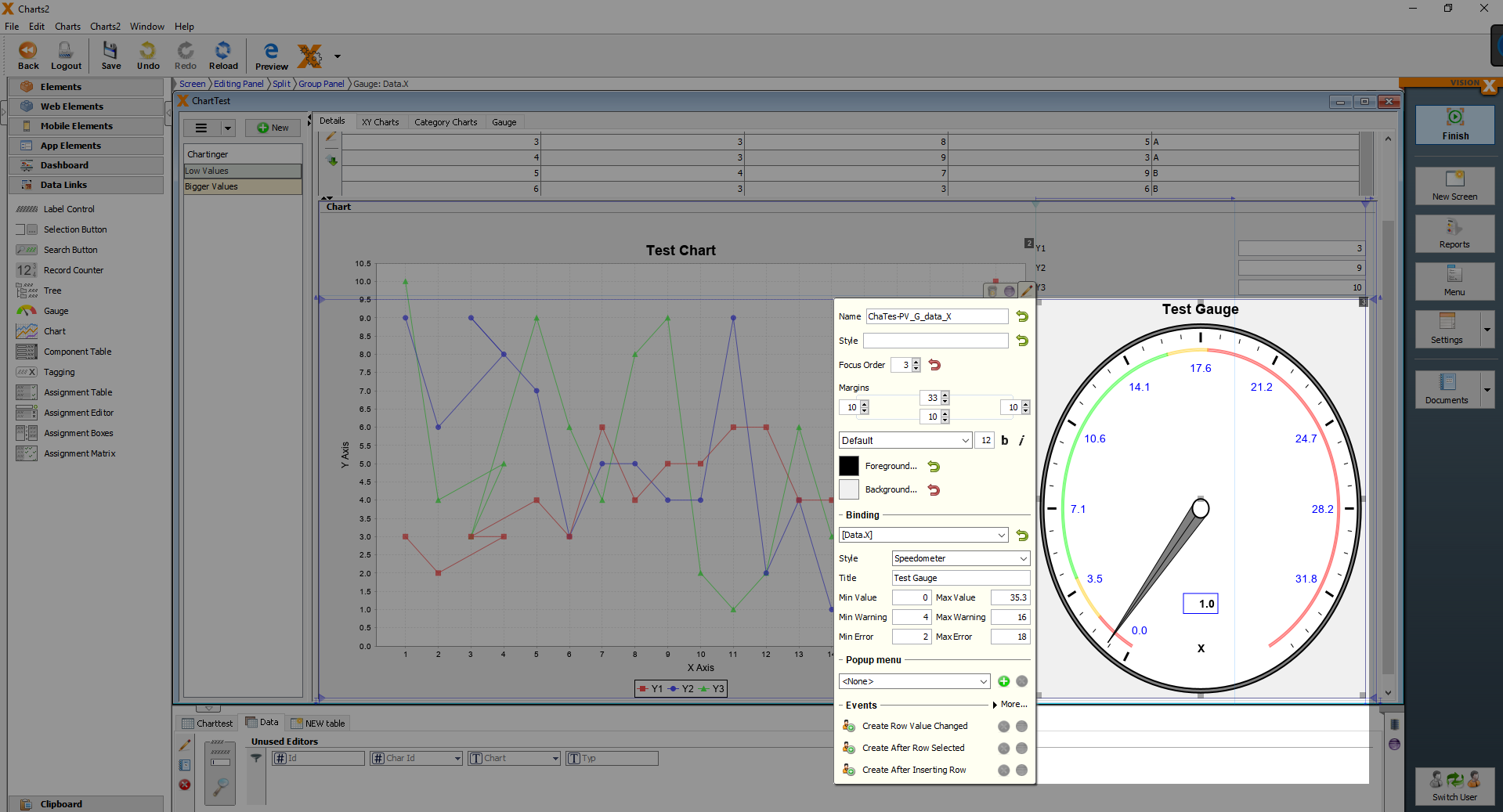
Gauge
A gauge chart, whose shape looks like a tachometer, is a type of chart used to display a single data value in a quantitative context. For example, you can use it to visualize the number of pieces produced per day or the sales of a period of time.
| Property | Description |
|---|---|
| Binding | Table column that refers to the chart |
| Style | Selecting the gauge variant |
| Title | Titel of the chart |
| Min Value | Minimum value displayed in the diagram |
| Max Value | Maximum value displayed in the diagram |
| Min Warning | Range between minimum Value and minimum Warning ( highlighted in color) |
| Max Warning | Range between maximum value and maximum warning ( highlighted in color) |
| Min Error | Minimum value that should not be undercut |
| Max Error | Maximum value that should not be reached |
Tagging
Element with the possibility to store several values of a master data table as a concatenation.

| Property | Description |
|---|---|
| Label | Creates a label with the entered Text for this element. |
| Tooltip | Informational text that is displayed when the cursor is over this control. It can be modified by using the HTML Editor. |
| Binding | Table column that refers to this element. |
| Input Position | Position where the selection list is displayed. |
| Tag validation enabled | !!!!! |
| Adding new tag enabled | !!!!! |

Filter Control
Web Elements
Hyperlink

| Property | Description |
|---|---|
| Text | Text that is displayed. It can be modified by using the HTML Editor. |
| Focus Order | Sets the order in which elements are focused in sequence when the Tab key is pressed. |
| Target | Specifies if the link is open in a new tab or the current content. |
| URL | Specifies the URL. |
| Show URL as Tooltip | Shows the URL as Tooltip |
| Binding | Column that refers to the link. |
| Text | Column that refers to the text. |
