Trace: • Style Invoice Application
Table of Contents
Version: 1.1 / 2019-07-01
Introduction
The objective of this tutorial is changing the look and feel of the invoice web application (from a former example) with VisionX. You can download the example from the VisionX Solution Store. Refer to the VisionX documentation "Create an Invoice Application" where the example and its purpose are described in detail.
Start Live Preview
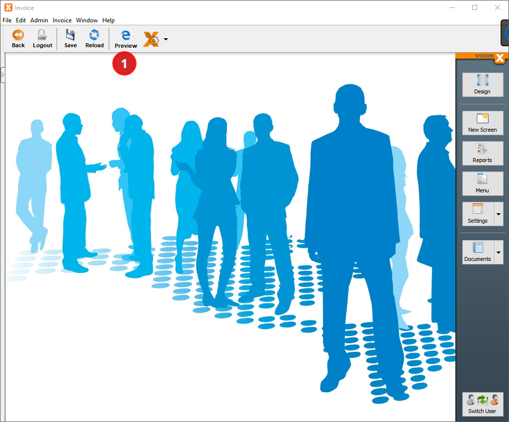
VisionX has some comfortable features that enable you to easily adapt the style and appearance of your application in the web. One of these features is the Live Preview: all changes made in the visual designer are immediately displayed in the browser window. To start the Live Preview, press the “Preview” button (1).
Open the Style Sheet From Within VisionX
The appearance of your web application is mainly controlled by cascading style sheets (.css-files). We can override existing styles and create new ones by editing an external style sheet, which resides as /WebContent/application.css per default.
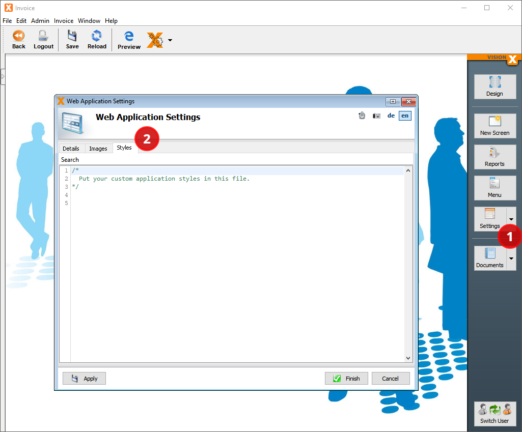
You can open the style sheet from within VisionX by pressing the arrow beside the “Settings” button (1) and selecting “Web”.
In the following wizard, select the tab page “Styles” (2).
Style the Header of Your Web Application
Let's start with the header. We want the look and feel to match our VisionX corporate design: it should look light, modern, and with an orange touch.
Let's specify the color scheme we want to use:
#FFFFFF“white” for the background#C5C5C5a light grey for control borders#464646a dark grey for text and buttons#FF8C00“darkOrange” for highlighted buttons and items#FFD199a light orange for current selections
To achieve that, we simply override some of the default styles of our Valo theme in VisionX.
Color the Background
Our first step is to color the background of the top area and its menu bar. We also move the border from the top of the menu bar to the bottom. Copy the following styles into your “Web Application Settings / Styles” window:
/* Header:  Top-Area */
.jvx_valo .corporation .toparea {
    background-color: white;
    box-shadow: none;
}

/* Header: Top-Menubar */
.jvx_valo .v-menubar.jvxmenubar.topmenubar {
    background-color: white;
    background-image: none;
    border-bottom: solid 1px #C5C5C5;
    border-top: none;
}
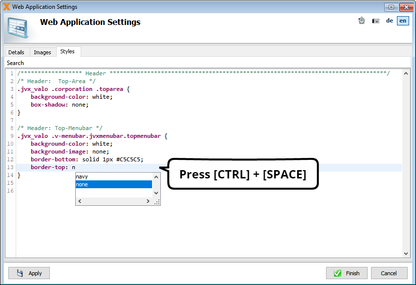
The editor supports code completion. Just enter [CTRL] + [SPACE] to open the suggestion pop-up.
Press the “Apply” button to review the result in the live preview window:

Color the Menu Items and Buttons
As the background is light now, we have to darken the items and buttons. We want them to change color on mouse hover:
/* Header: Menu Items */
.jvx_valo .corporate .v-menubar-topusermenu.jvxmenubar .v-menubar-menuitem .v-menubar-menuitem-caption,
.jvx_valo .corporate .v-menubar-topusermenu.jvxmenubar .v-menubar-menuitem .v-menubar-menuitem-caption .v-icon,
.jvx_valo .v-menubar.jvxmenubar > .v-menubar-menuitem {
    color: #464646;
    text-shadow: none;
}

/* Header: Menu Items on Hover */
.jvx_valo .v-menubar-topusermenu.jvxmenubar .v-menubar-menuitem:hover:not(.v-menubar-menuitem-selected) .v-menubar-menuitem-caption,
.jvx_valo .v-menubar-topusermenu.jvxmenubar .v-menubar-menuitem:hover:not(.v-menubar-menuitem-selected) .v-menubar-menuitem-caption .v-icon,
.jvx_valo .v-menubar.jvxmenubar > .v-menubar-menuitem:hover:not(.active):not(.v-menubar-menuitem-selected) {
    color: darkOrange;
}

/* Header: Buttons */
.jvx_valo .corporation .toparea .topbutton {
    background-color: #464646;
}

/* Header: Buttons on Hover */
.jvx_valo .corporation .toparea .topbutton:hover {
    background-color: darkOrange;
}
To review the result of that modification, press the “Apply” button again:

Change the Logo
To change the logo in the header's top left corner, we have to create a folder /WebContent/images and copy the new logo into it. We append the name of the logo and its position as a small addition to the style sheet:
/* Header: Logo */
.jvx_valo .corporation #companylogolink a {
    background-image: url("./images/logo.png");
    background-position: left center;
}
And voilà:

Color the Menu Pop-Ups
Looks good so far, but what if we click on a menu item? We have to change that color, too, according to our scheme:
/* Header: Menu Items Popup */
.jvx_valo .v-menubar-popup.jvxmenubarpopup:not(.usedefault) {
    background-color: white;
}

/* Header: Menu Items Popup Items */
.jvx_valo .popupContent .jvxmenubar .v-menubar-menuitem {
    color: #464646;
    text-shadow: none;
}

/* Header: Active Menu Items */
.jvx_valo .v-menubar.jvxmenubar > .v-menubar-menuitem:active:before,
.jvx_valo .v-menubar.jvxmenubar > .v-menubar-menuitem:hover:before {
    background-color: transparent;
    background-image: none;
    box-shadow: none;
}

/* Header: Selected Menu Items and Menu Popup Items */
.jvx_valo .v-menubar-popup.jvxmenubarpopup:not(.usedefault) .v-menubar-menuitem-selected,
.jvx_valo .v-menubar > .v-menubar-menuitem-selected,
.jvx_valo .v-menubar > .v-menubar-menuitem-selected:hover,
.jvx_valo .appmenu .v-button.jvxbutton.selected,
.jvx_valo .appmenu .v-button.jvxbutton.v-button-noborder.selected {
    color: #464646;
    box-shadow: none;
    background-image: none;
    background-color: #FFD199;
    text-shadow: none;
}
Press “Apply” to update the Live Preview in your browser window:

Styling the Invoice Workscreen
Unfortunately, the original styling of the invoice workscreen does not match our new requirements. Let's improve the layout and apply our color scheme using the built-in VisionX tools.
Compact the List of Invoice Items
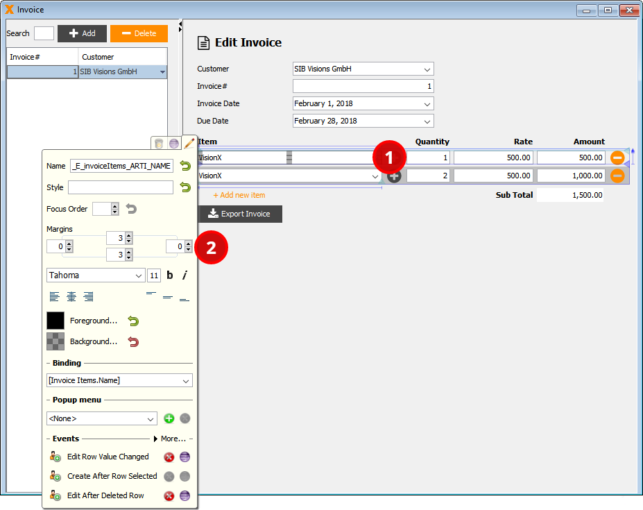
First, we will reduce the margins of the invoice items in the component table to give it a more compact look: open the workscreen “Invoice” in design mode and right click on any of the editors in the component table, such as the “Article” combobox (1). Reduce the surrounding margins in the properties-popup to “Left=0, Top=3, Right=0, Bottom=3” (2).
Color Buttons With VisionX
Let's change the button's colors next. Right click the “Export Invoice” button (1) and click on “Background…” (2) to open the color picker. Enter the RGB code #464646 (dark grey) of and press the “Finish” button (3) to apply the new color of the button.
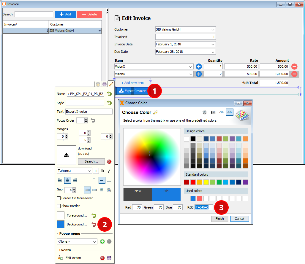
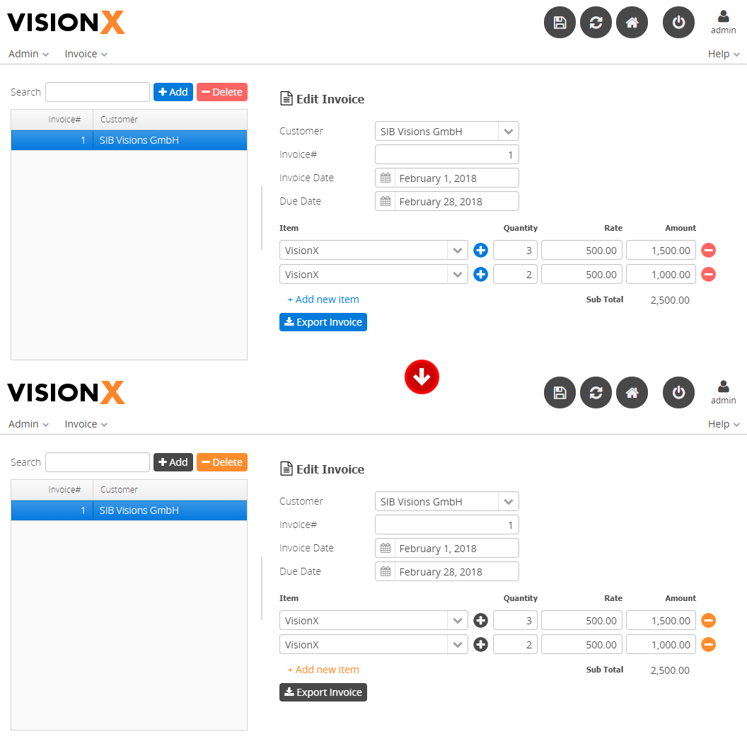
Now apply the same steps for the “Add” buttons. Set the background color of the “Delete” button to #FF8C00 (dark orange). Finally, change the foreground color of the “Add new item” and the “Delete Item” buttons to #FF8C00 (dark orange).
All changes are immediately displayed in your Live Preview browser window:
Style the Table
Next, we address the table. We want the selected row to be highlighted in light orange and without the blue border. Moreover, the selected row's text as well as the header's text shall be bold.
Let's open the “Web Application Settings / Styles” window again and append the following styles to our application's style sheet:
/* Table: Selected row color */
.jvx_valo .v-table .v-selected td {
    background: #FFD199 repeat-x !important;
    color: #464646;
    font-weight: bold;
}

/* Table: Selected row outer border */
.jvx_valo .v-table-focus {
    outline: none !important;
}

/* Table: Selected row inner border */
.jvx_valo .v-table [class*="-row"].v-selected .v-table-cell-content {
    border-left-color: #C5C5C5;
}

/* Table: Header */
.jvx_valo .v-table-header {
    font-weight: bold;
}
Let's verify the change:

Style the Editors
Finally, the border and highlight color of all focused editors and their currently selected content must be adapted to the new color scheme:
/* Editors: Border Focus */
.jvx_valo .v-textfield:focus,
.jvx_valo .v-filterselect [class*="input"]:focus,
.jvx_valo .v-datefield [class*="textfield"]:focus,
.jvx_valo .v-textarea:focus {
    border-color: darkOrange;
    -webkit-box-shadow: none;
    box-shadow: none;
    outline: none;
}

/* Editors: Selected value */
.jvx_valo .v-filterselect-suggestpopup .gwt-MenuItem-selected {
    background-color: #FFD199;
    background-image: none;
    color: black;
    text-shadow: none;
    outline: none;
}

/* Editors: Selection */
.jvx_valo .v-label::selection,
.jvx_valo .v-textfield::selection,
.jvx_valo .v-filterselect [class*="input"]::selection,
.jvx_valo .v-datefield [class*="textfield"]::selection,
.jvx_valo .v-textarea::selection {
    background: #FFD199;
}
Press “Apply” to review the change in the Live Preview in your browser window:

The new style not only applies to textboxes but to other editors as well (such as comboboxes, textareas, datefields).
Continue Styling the Application
Of course, to apply the new look and feel to the entire application and all its workscreens, further style adaptations are necessary.
To identify the .css selectors you need to overwrite, inspect the underlying style sheet using your browser's developer tools. Press [F12] in your browser window to open the developer tools. You can find more detailed information here:
Apply User-Defined Styles to Individual Controls
Moreover, VisionX also offers you the possibility to define you own styles and apply them to individual controls. Let's give an example: we want the “Export Invoice” button to blink twice when we hover over it with the mouse. To achieve that, copy the following style information to your “Web Application Settings / Styles” window:
@keyframes blinker {
    50% { opacity: 0.3; }
}

.jvx_valo .blinker:hover {
    animation-name: blinker;
    animation-duration: 0.3s;
    animation-iteration-count: 2;
}
We use VisionX to apply the new style “blinker” on our button. Open the workscreen “Invoice” in design mode, right click the “Export Invoice” button (1), and enter the class name “blinker” in the “Style” textbox (2). You can also add multiple style classes separated by a blank.
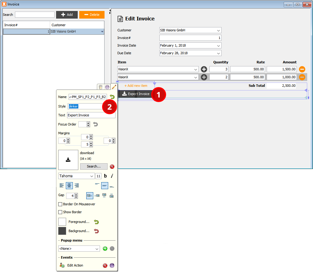
The change is immediately visible in the Live Preview; just move your mouse over the button to see the animation.
The Styled Application
With just a view clicks and some style sheet additions, we gave our invoice application a new look and feel. Let's see the result of our effort:
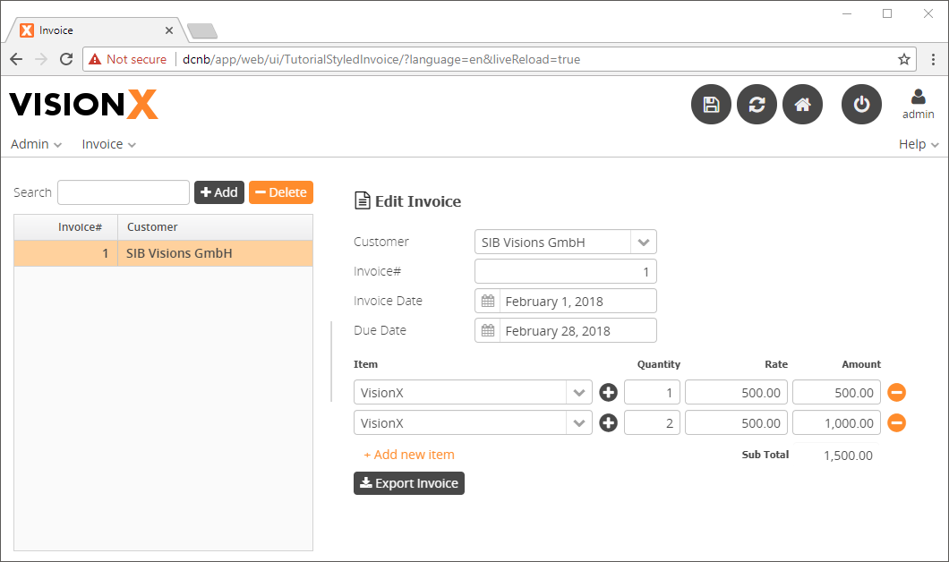
You may not like the grey and orange color scheme nor blinking buttons, but you will definitely like the straightforward styling features of VisionX.
Download
You can download the entire example application from the VisionX Solution Store. The style sheet we created during this tutorial is available in the application.css.

