Trace: • UI elements
Table of Contents
This is an old revision of the document!
Version: 1.0 / 2022-06-01
VisionX offers you a wide selection of user interface elements. UI elements are for example buttons, input fields or panels that are placed in the screen using drag and drop. Each element can be changed using the Customizer. In addition, actions can be created for many elements, which are executed after a user activity. The following chapters describe all the elements that VisionX contains and explains the settings.
Elements
Genaral Properties
These properties are the same for all elements and can be set individually for each one.
| Property | Description |
|---|---|
| Name | Automatically assigned name. Can also be renamed, but must be unique. |
| Style | CSS-style information to be applied in web. |
| Focus Order | Sets the order in which elements are focused in sequence when the Tab key is pressed. |
| Margins | Amount of empty space around the control. |
| Font | Font name, size and style of the control's text. |
| Image | Choose an image or Font Awesome icon to display on the control. |
| Foreground | Color of the control's text and Font Awesome icon. For changing the color you can use the matrix to specify a color or select a predefined color. Another possibility is to define the color via the RGB code. |
| Background | The control's background color. For changing the color you can use the matrix to specify a color or select a predefined color. Another possibility is to define the color via the RGB code. |
| Popup menu | Assign an existing Popup Menu or specify a new one by choosing the plus symbol. If a Popup Menu is selected, it can be edited with the edit button. Use the delete button to delete the selected Popup Menu. |
| Events | Events that are executed on the table after certain user activities. |
| Property | Description |
|---|---|
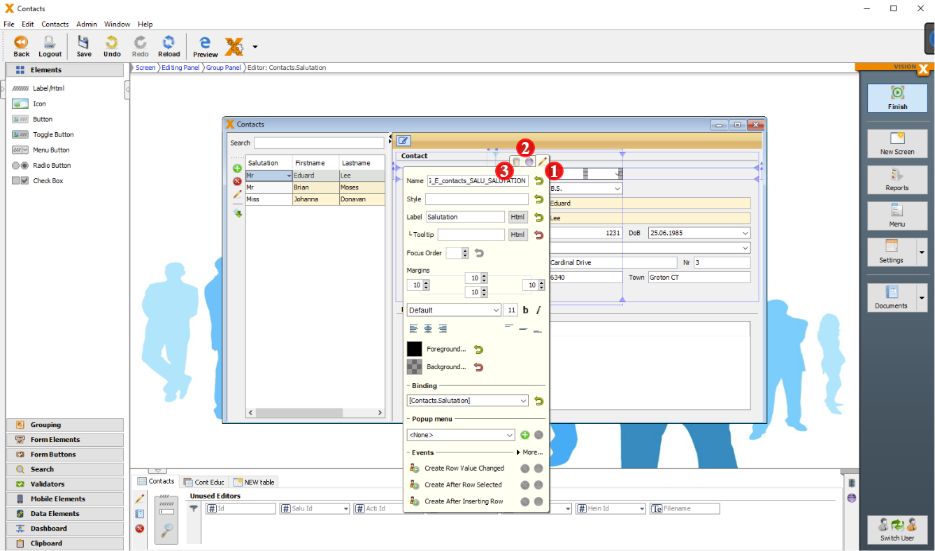
| Pencil Button (1) | Opens and closes the customizer of the element. |
| Eclipse Button (2) | Jumps in the sourcecode to the position of the implementation of the element. |
| Delete Button (3) | Deletes the selected element. |
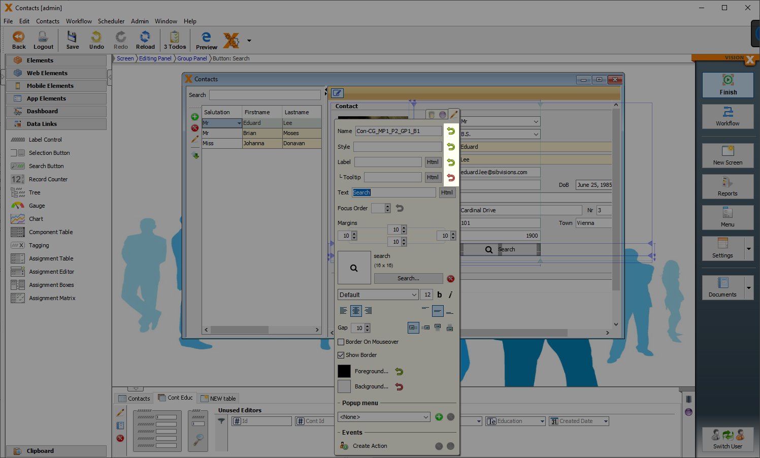
For some properties there is an additional button. This will reset the property to the default value.
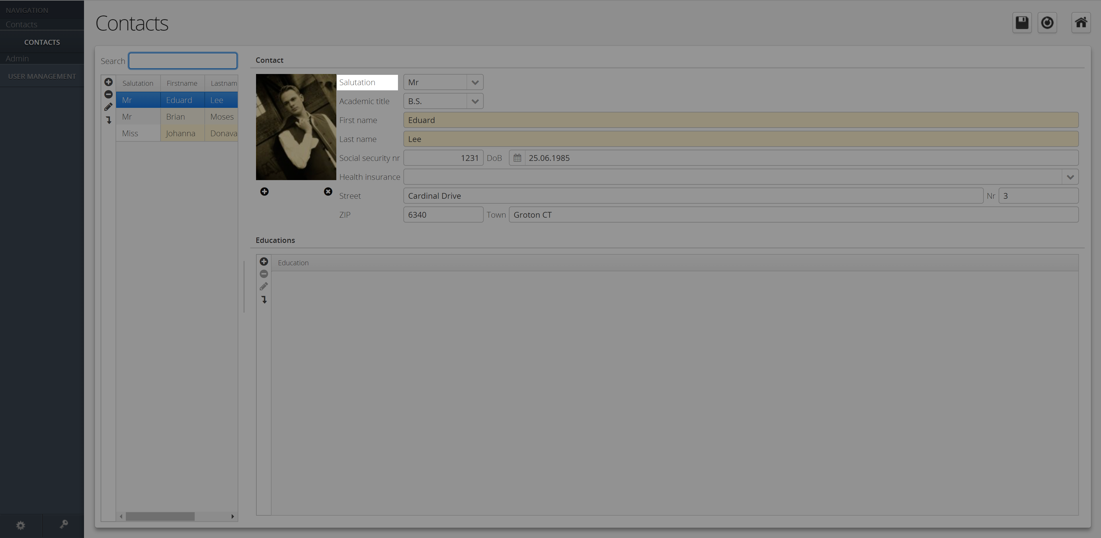
Label/Html
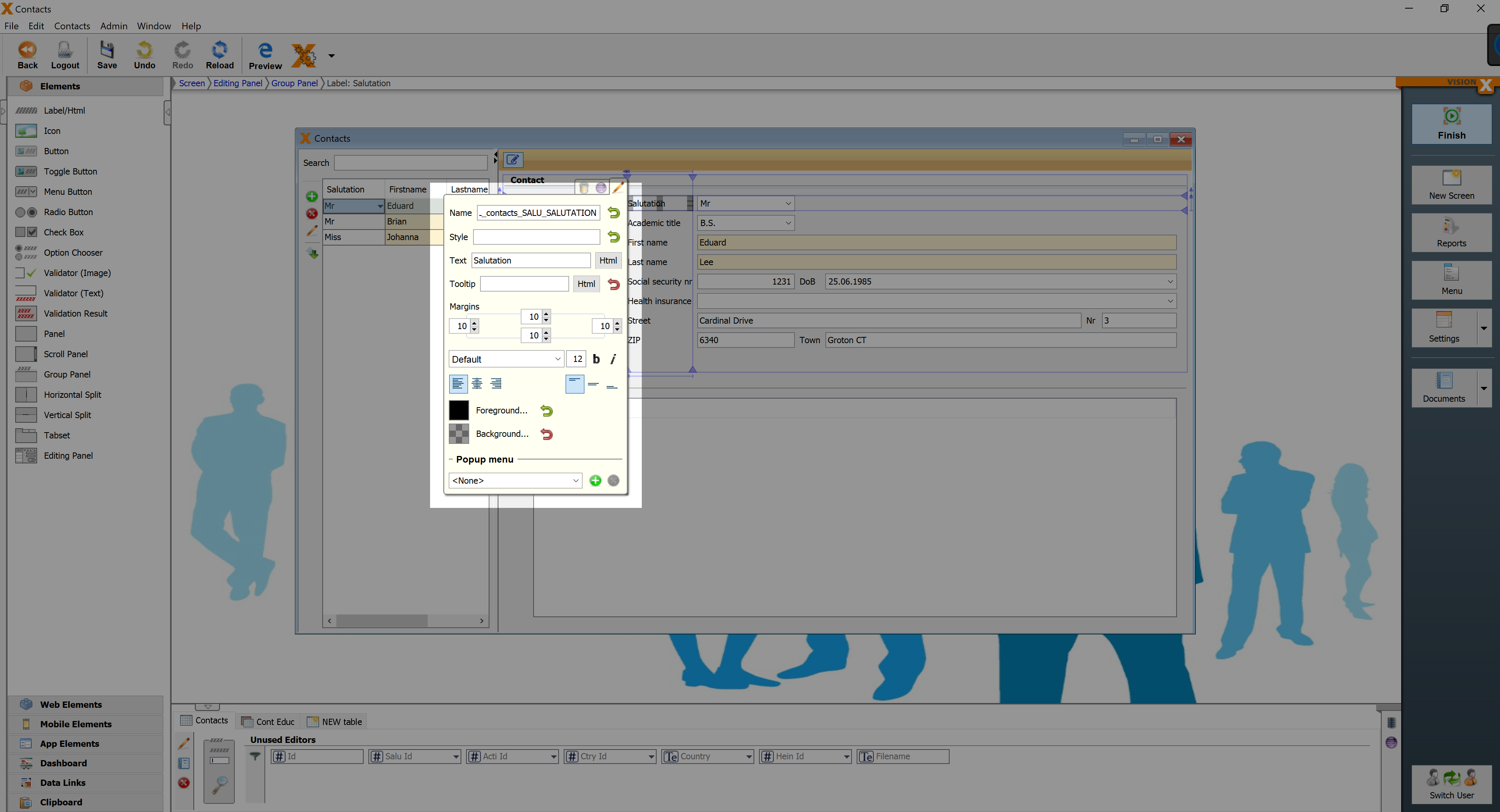
Label for input fields, etc.
| Property | Description |
|---|---|
| Text | Text that is displayed. It can be modified by using the HTML Editor. |
| Tooltip | Informational text that is displayed when the cursor is over this control. It can be modified by using the HTML Editor. |
Icon
Displays an Image or FontAwsome Icon.
![]()
| Property | Description |
|---|---|
| Tooltip | Informational text that is displayed when the cursor is over this control. It can be modified by using the HTML Editor. |
| Preserve Aspect Ratio | Preserves the Aspect Ratio, when image is stretched. |
![]()
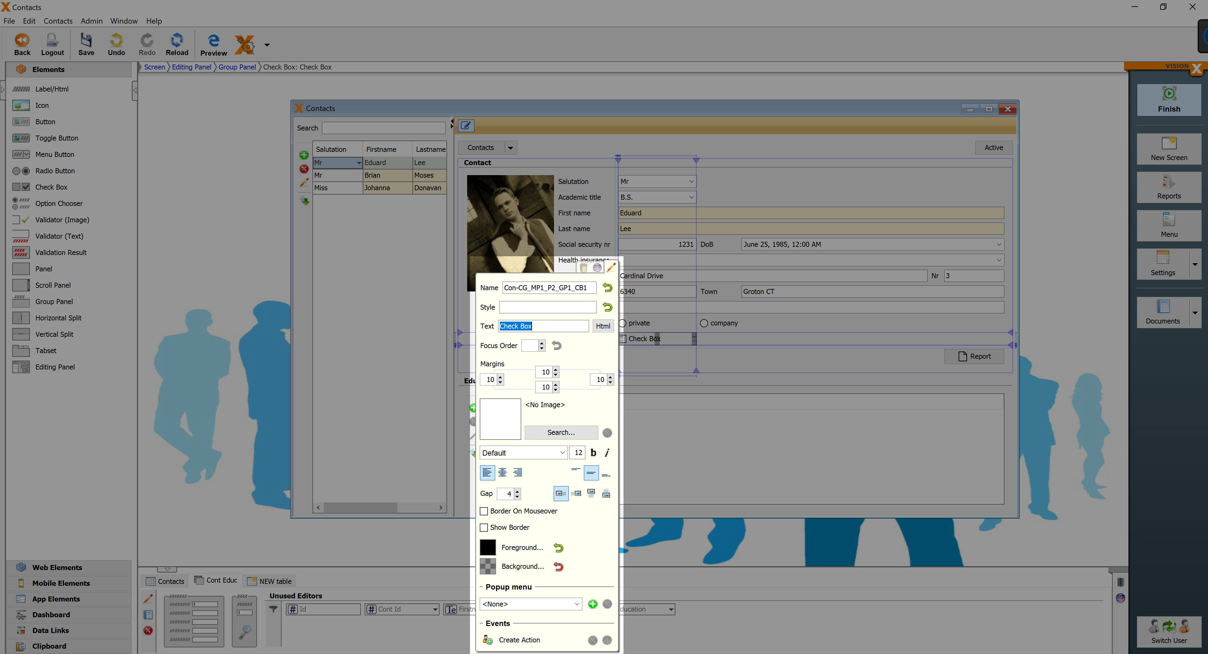
Checkbox
Checkbox for the selection of an option.
| Property | Description |
|---|---|
| Text | Text that is displayed. It can be modified by using the HTML Editor. |
| Image Gap | Defines the gap between the image and the text. |
| Image Alignment | Specifies the alignment of the image and text on the button. |
| Border on Mouseover | Displays the border when the curser is over this button. |
| Show Border | Displays the borders of this button. |
