Table of Contents
Version: 5.6 / 2022-06-01
Introduction
This tutorial contains step-by-step instructions for creating the “Renewing Oil Application” that is available in the VisionX solutions store in the “Demo Applications” category. It is assumed that a VisionX project is already available. If you have not created an application yet, please refer to the VisionX documentation "Getting Started" for details.
You should install the CSV Import AddOn, which will be later needed.
Creating Customers, Suppliers and Producers screens
We will create the Customers screen together and you can make the other screens, Suppliers and Producers with this steps on your own.
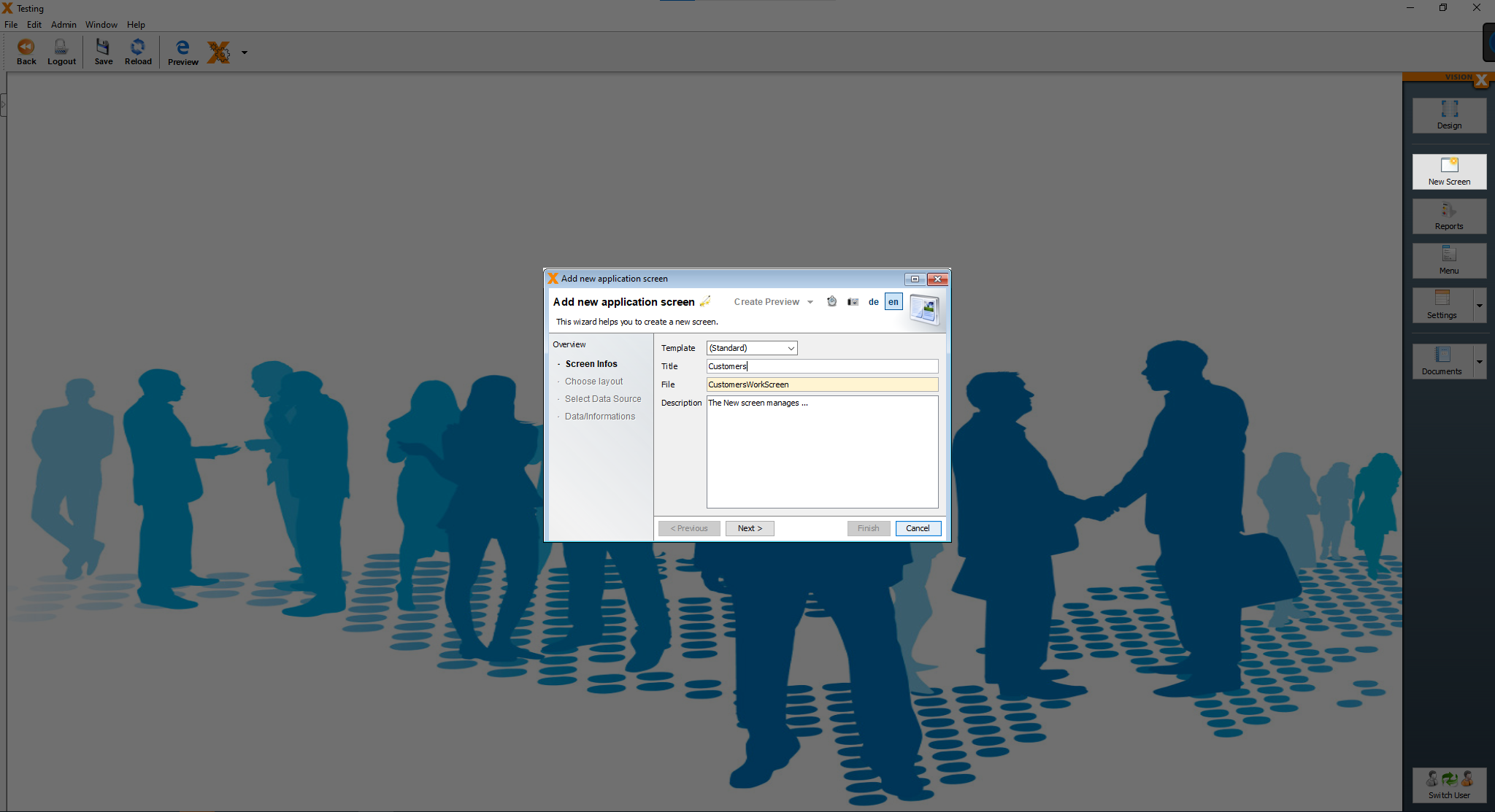
First we need to create a screen in VisionX. Press the “New Screen” button, enter a title for the screen and click “Next”.
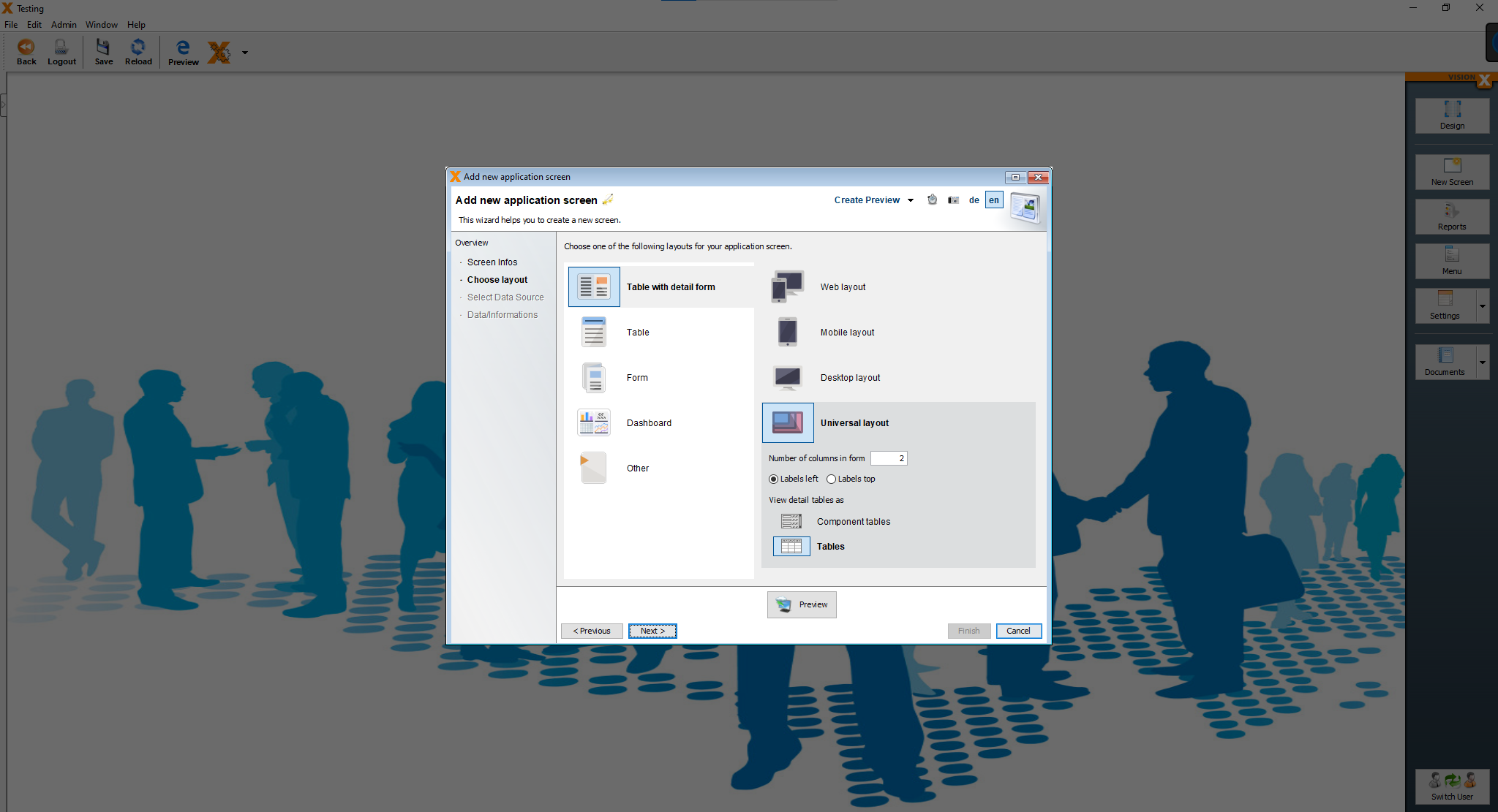
On the next step, select “Table with detail form” and “Universal layout”. Click “Next”.
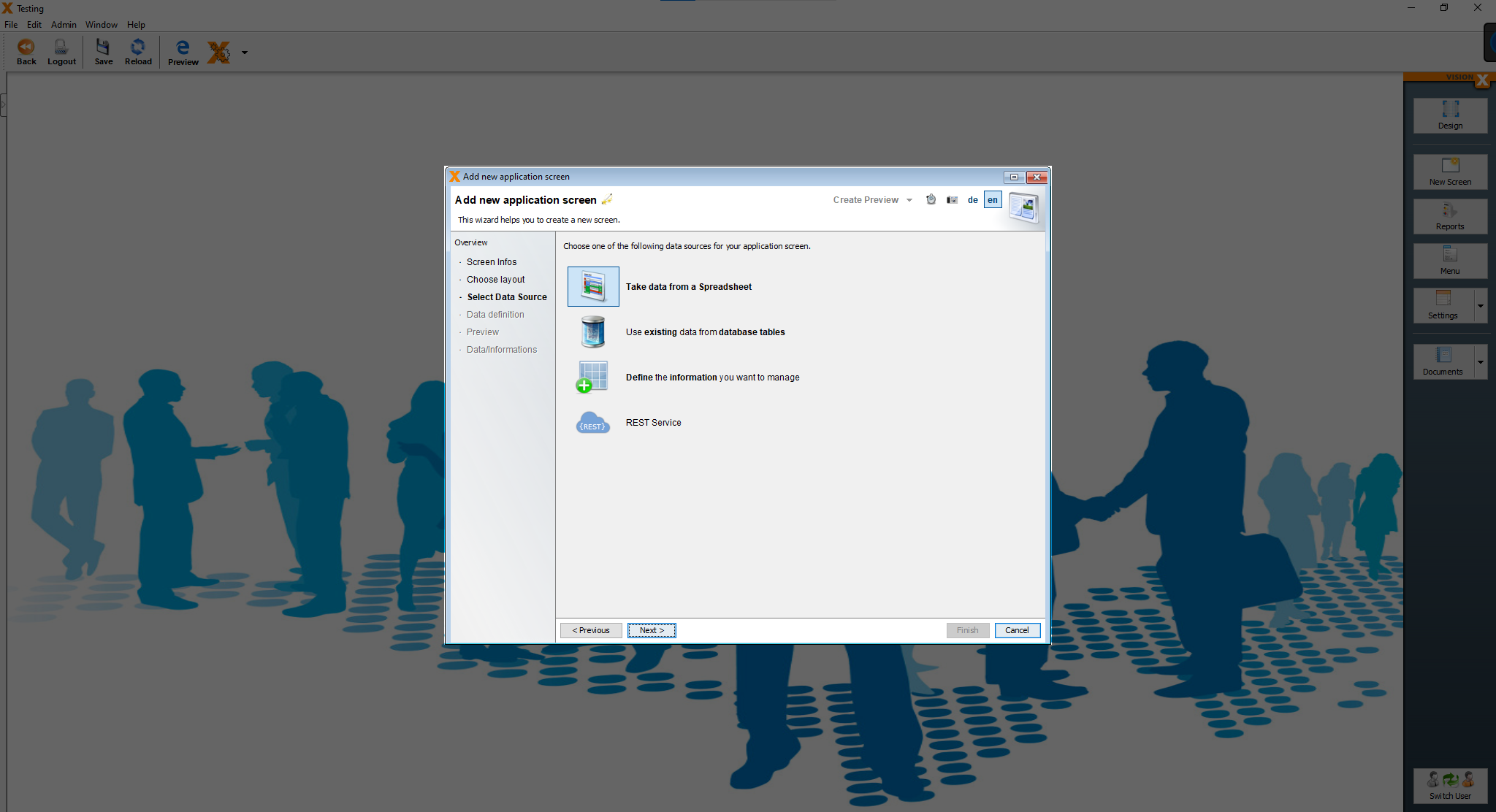
On the next step, select “Take data from a spreadsheet” and click “Next”.
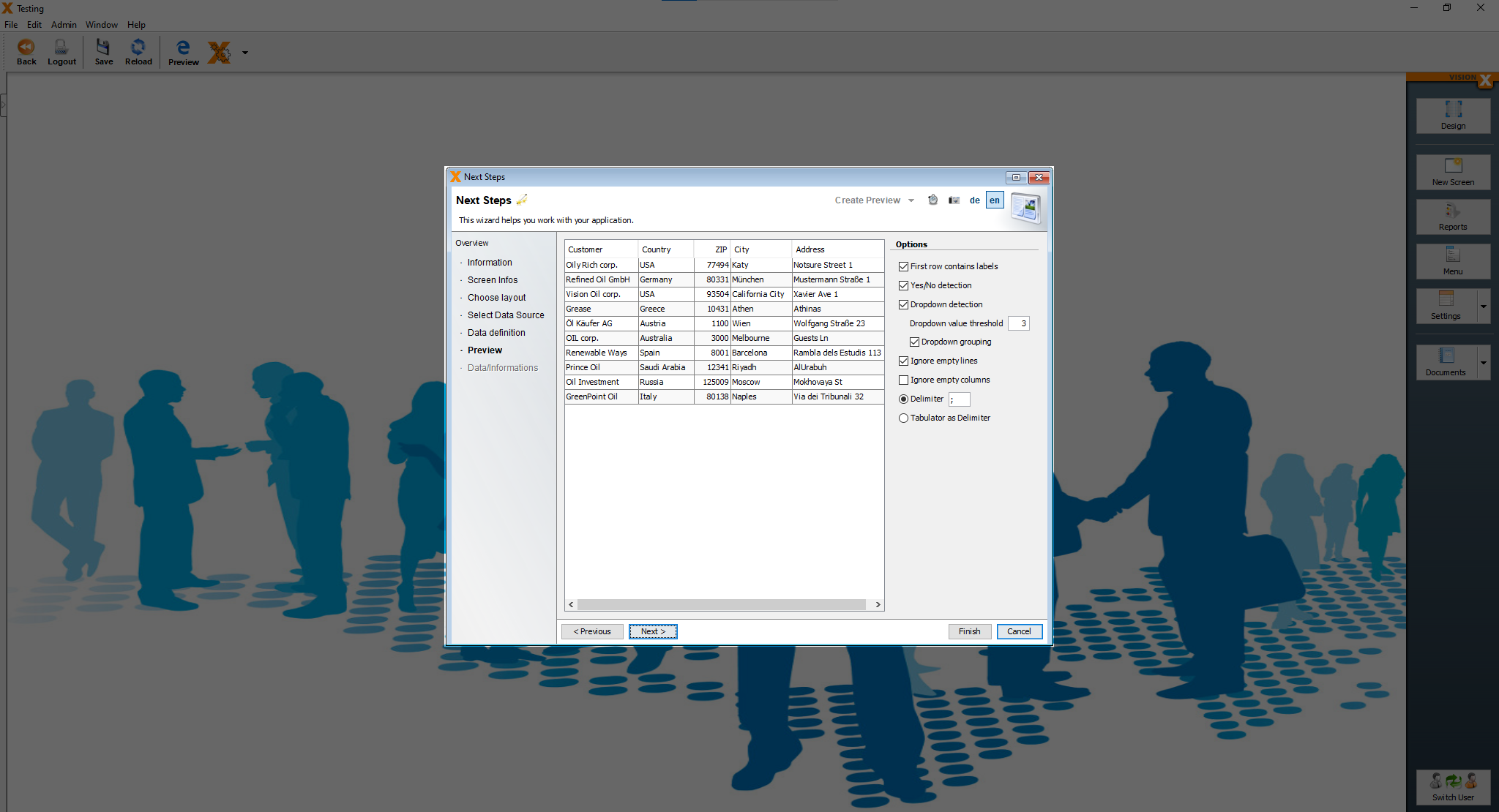
In this screen, we paste the following string of data to create the table and press “Next”. This list could be copied from an existing customers, suppliers or producers list as well.
Customer;Country;ZIP;City;Address
Oily Rich corp.;USA;77494;Katy;Notsure Street 1
Refined Oil GmbH;Germany;80331;München;Mustermann Straße 1
Vision Oil corp.;USA;93504;California City;Xavier Ave 1
Grease;Greece;10431;Athen;Athinas
Öl Käufer AG;Austria;1100;Wien;Wolfgang Straße 23
OIL corp.;Australia;3000;Melbourne;Guests Ln
Renewable Ways;Spain;8001;Barcelona;Rambla dels Estudis 113
Prince Oil;Saudi Arabia;12341;Riyadh;AlUrabuh
Oil Investment;Russia;125009;Moscow;Mokhovaya St
GreenPoint Oil;Italy;80138;Naples;Via dei Tribunali 32
On the next screen, under “Options” on the right side, we select “First row contains labels” and choose “;” as the delimiter for our data.
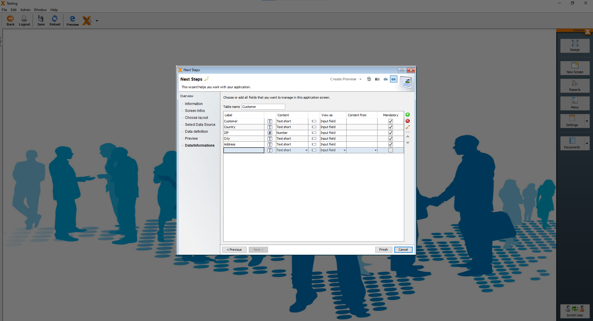
For the last step, we just change the table name to “Customer” and leave everything else as it is. After pressing “Finish” our customer table is created and already has data in it. Click “Finish” to finalize creating the screen.
We are now greeted by our screen.
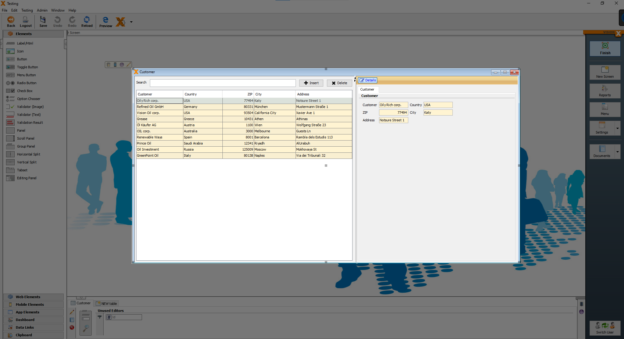
Creating a screen for the customers, suppliers and producers tables requires the same steps the only difference is importing a different spreadsheet and changing the table name. Now we have to do the same steps for the suppliers and producers screens.
Here are the .csv files for the suppliers, producers and customers tables:
- Customer.csv file
- Producer.csv file
- Supplier.csv file
Creating Production, Sales and Deliveries screens
We will make the “Deliveries” screen together and then you can create the other screens, “Production” and “Sales” on your own with the exact same steps.
The first two steps are just like the first steps for the previous screens. Press the “New Screen” button, enter a title for the screen and click “Next”.
On the next step, select “Table with detail form” and “Universal layout”. Click “Next”.
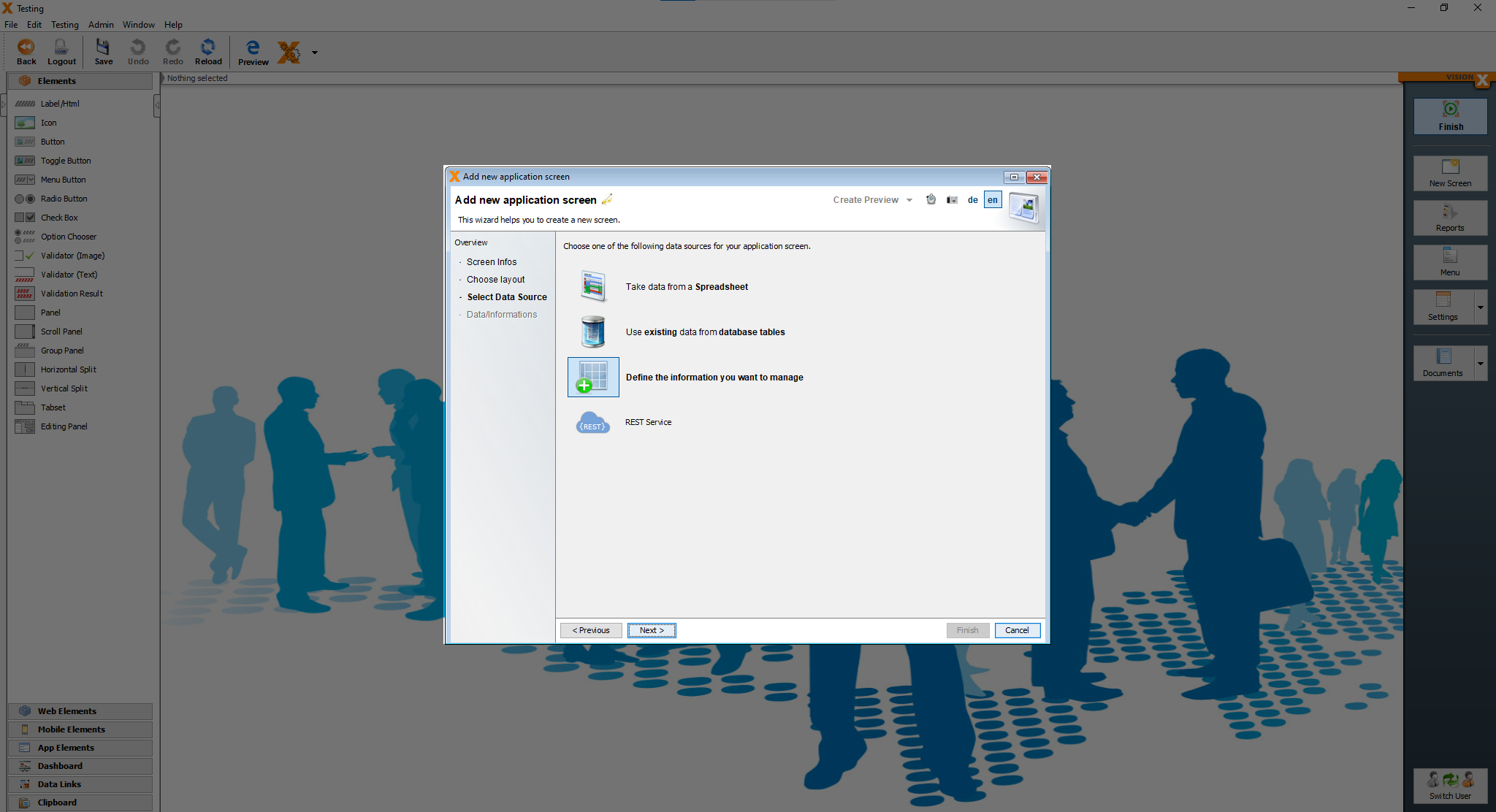
After that, select “Define the information you want to manage” and click “Next”.
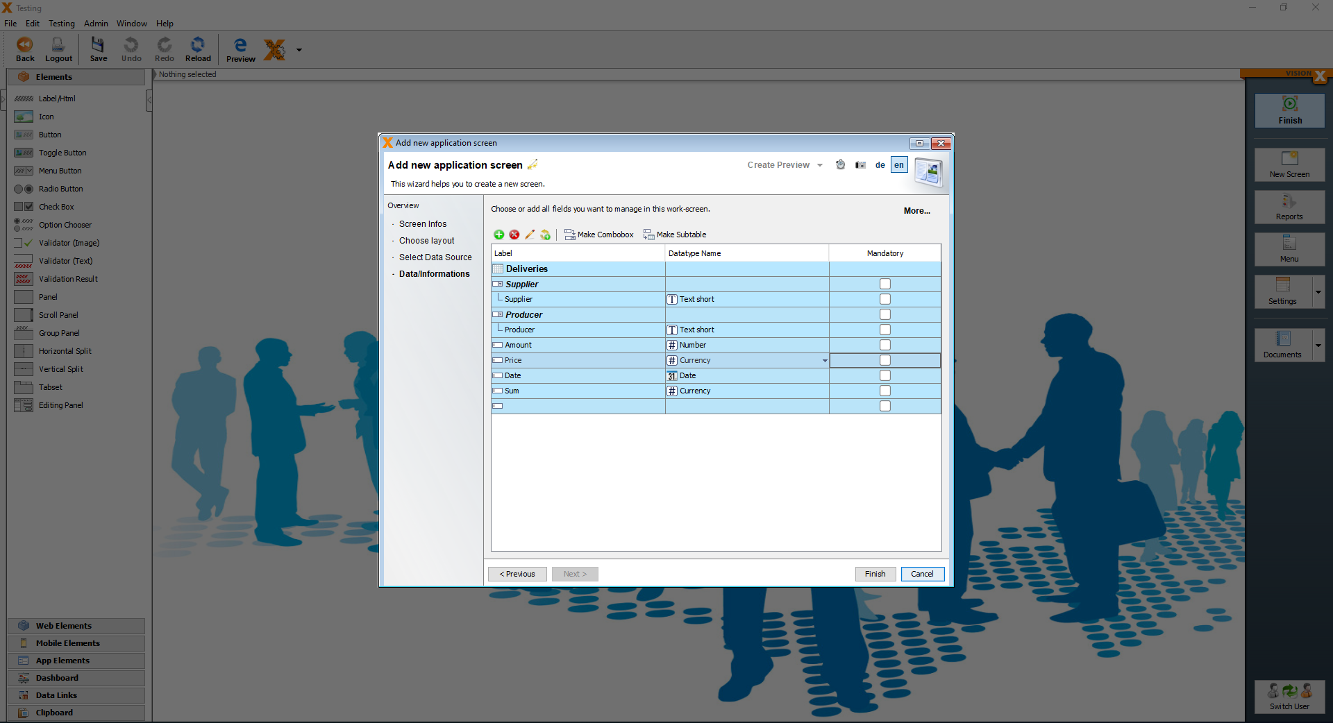
We can now define the table for our deliveries. We are going to create six columns: supplier, producer, amout, price, date and sum.
The columns supplier and producer are comboboxes and we are using the tables supplier and producer. This two tables should be imported by now, after the Supplier and Producer screen was created.
The labels of the comboboxes must have the same name as the column name in the spreadsheet. For example, in the spreadsheet the columnname is “Supplier” and the label of the combobox should be “Supplier” as well.
Note that VisionX guesses the datatype for each column based on the column label, but we can always adjust it using the dropdown in the “Datatype Name” column. Click “Finish” to finalize creating the screen.
We are now greeted by our screen.
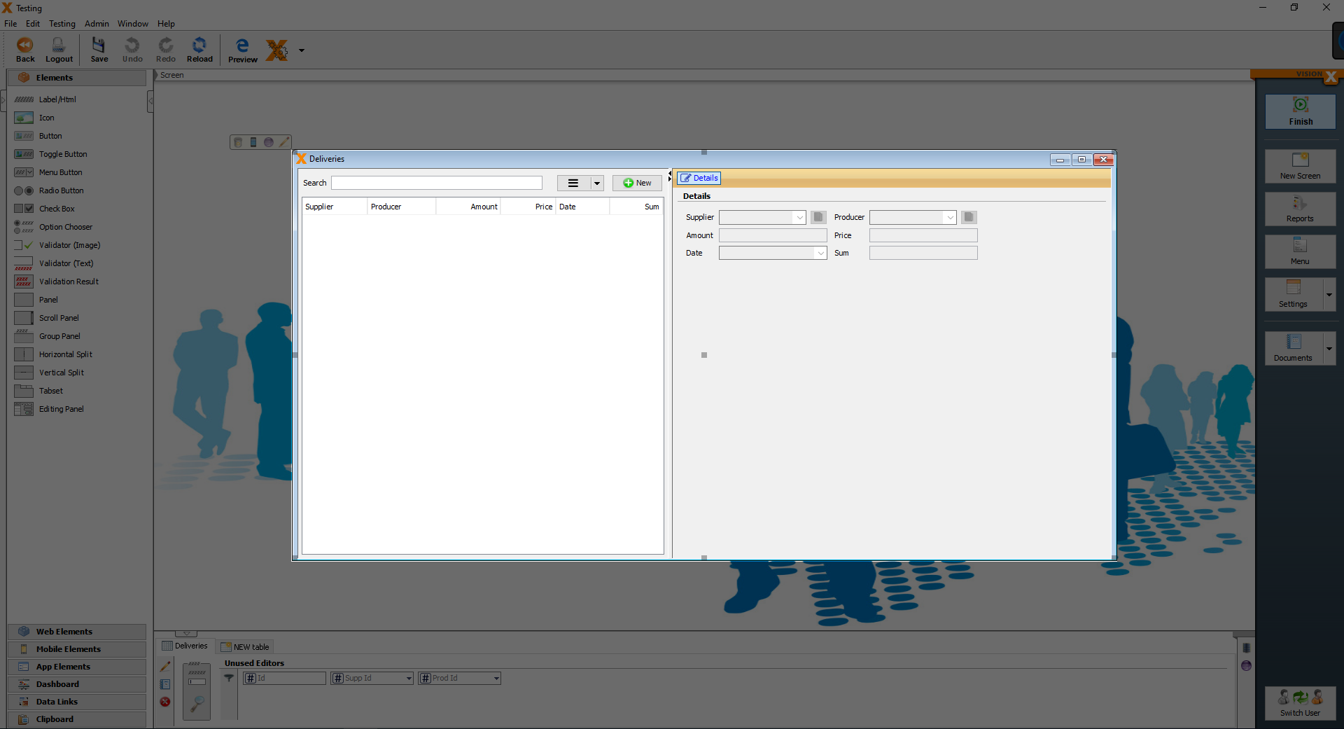
In this case the table is empty, because we only defined the table and haven't imported any data yet.
First create the other two screens as well, the Production and Sales screens, the same way as the Deliveries screen was created.
Then the data can be entered manually or imported using the CSV Import Add-On.
Here are the csv files with the production, sales and deliveries data.
- Sales.csv file
- Production.csv file
- Deliveries.csv file
Importing Production, Sales, Deliveries data
You should see one of the screens, Production, Sales or Deliveries and open the screen in preview mode. To do that click on “Preview”.
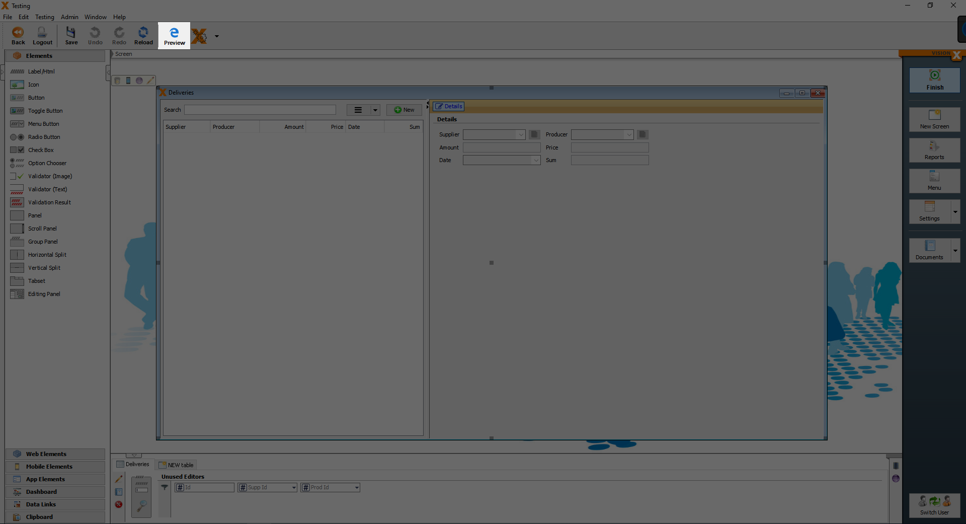
After clicking the “Preview” button, a new page should have oppened itself in your browser and you should see the login page.
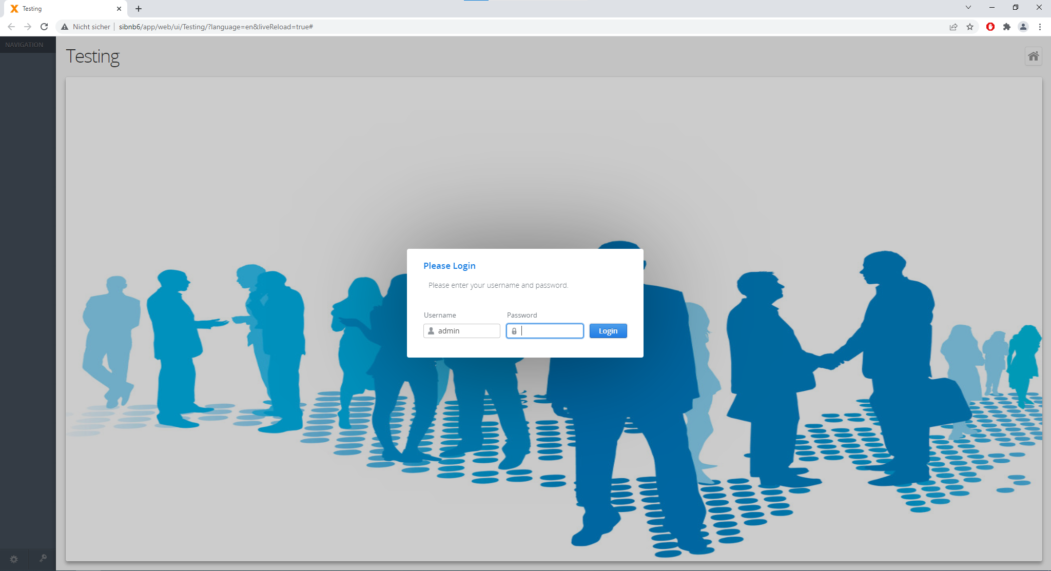
Next login with your username and password, if you haven't changed the default user, then the username and password should be admin and admin. Then open the “Deliveries” screen and next to the search bar there is a button with 3 lines, click on the button and you can see 3 options, Delete, Import and Export.
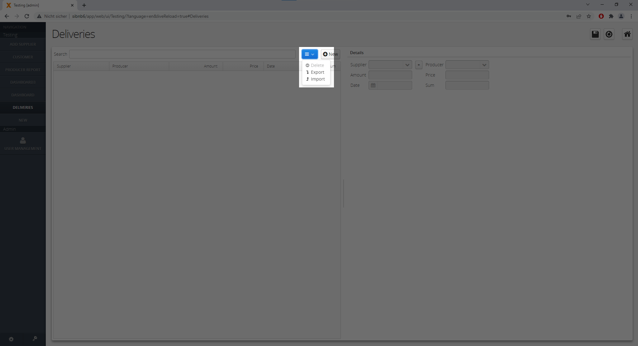
Click on the Import option and you should see this pop-up screen.
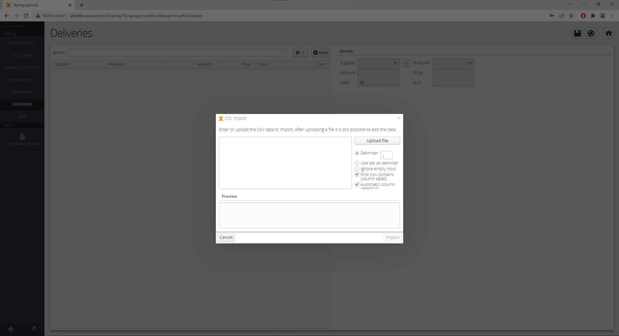
Depending on the screen, which you have open, you should choose the corresponding csv file. I have the deliveries screen open, that is why, I am importing the Deliveries data and copy, paste the following string of data:
Supplier;Producer;Amount;Price;Date;Sum
Planet Express;Oil Refinery;1243000;15,34;28.05.2019;19067620
Fake Restaurant;Fine Oil;11030888;8,34;23.01.2019;91997605,92
Transport Company;New Oil;1560000;23,87;12.07.2017;37237200
Quick Meals;New Oil;1900000;34,89;11.10.2017;66291000
Supa Delivery;Produktion Öl;3942000;7,45;23.09.2020;29367900
Mate Shipping;Make Oil Fine Again;1000000;8,12;08.02.2020;8120000
Rainforest Express;Oil Refinery;886200;9,56;19.02.2020;8472072
Rainforest Express;New Oil;2000000;4,23;14.03.2021;8460000
Pharaoh Delivery;Oil Refinery;8953000;17,89;12.07.2021;160169170
Beer and Sausages;Oil Refinery;923400;67,34;12.01.2022;62181756
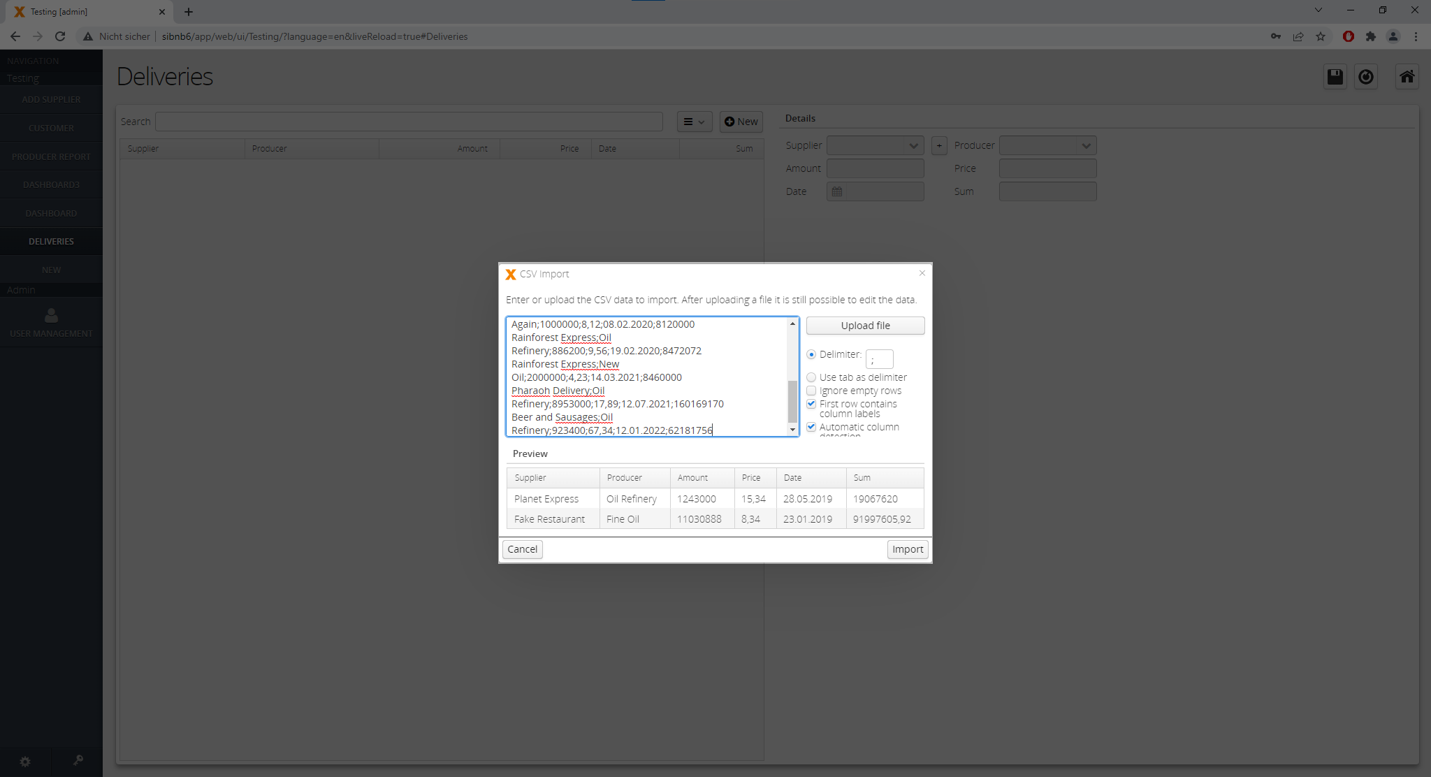
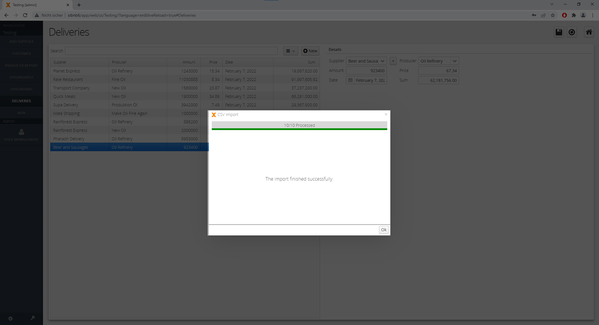
After clicking the Import button, you should see the following screen with the message “The import finished successfully”.
After the import finished, click on the OK button.
This steps should be repeated with the other two screens.
Creating the Dashboard screen
Starting point is the same, you click on the “New Screen” button, give it a title. And we choose “Dashboard” as the layout and click on the “Finish” button.
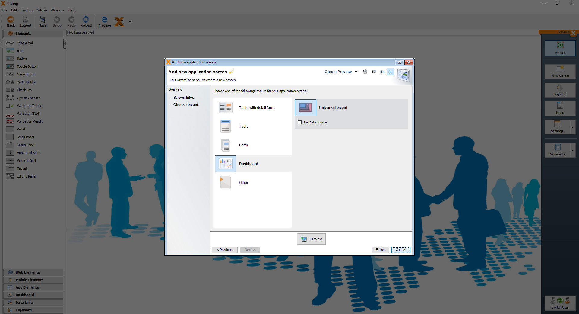
After clicking the “Finish”, you should see the following screen. The screen only shows default values.
The default dashboard contains a table, a bar chart, a line chart, two KPIs and a ring chart.
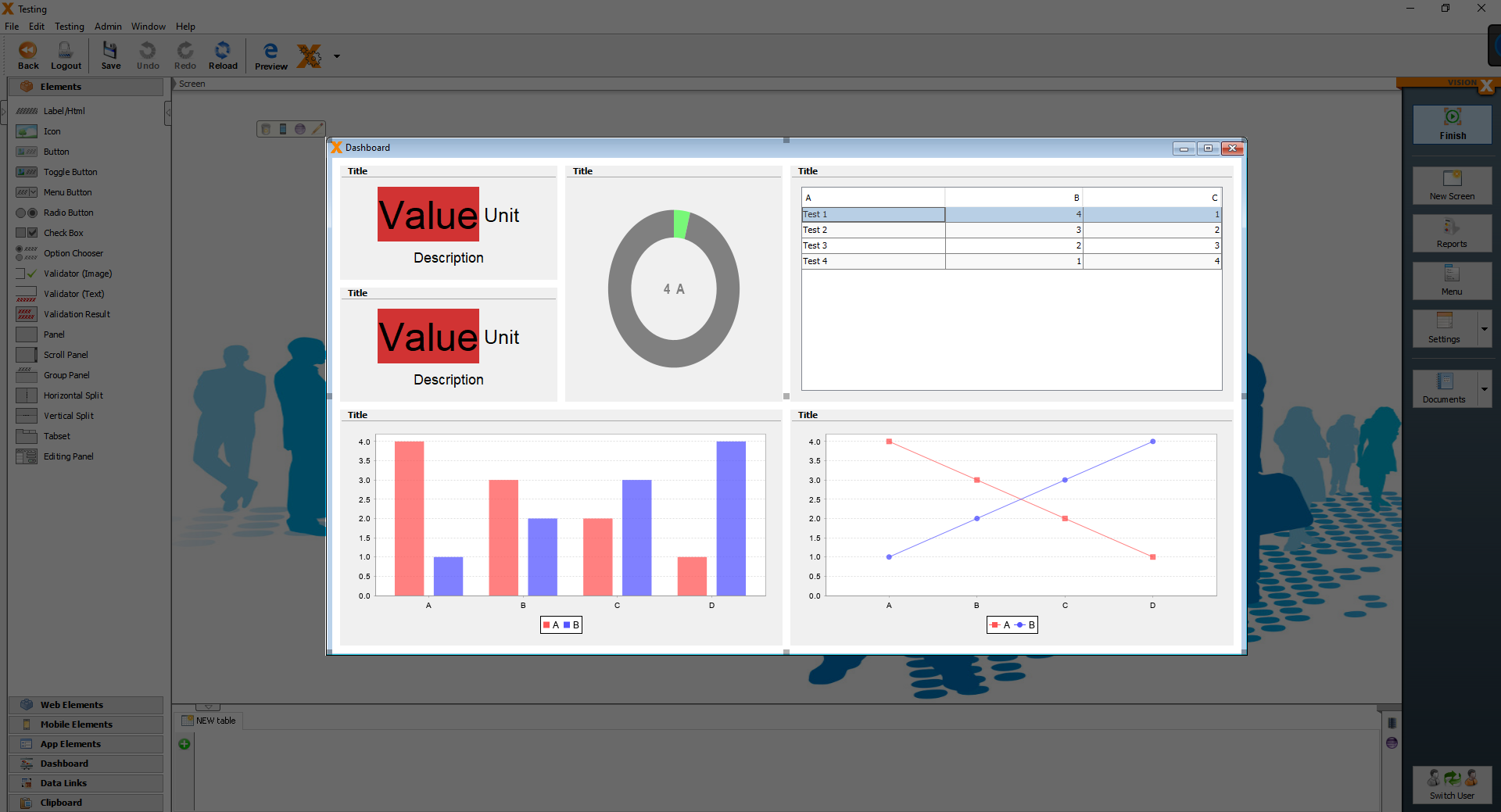
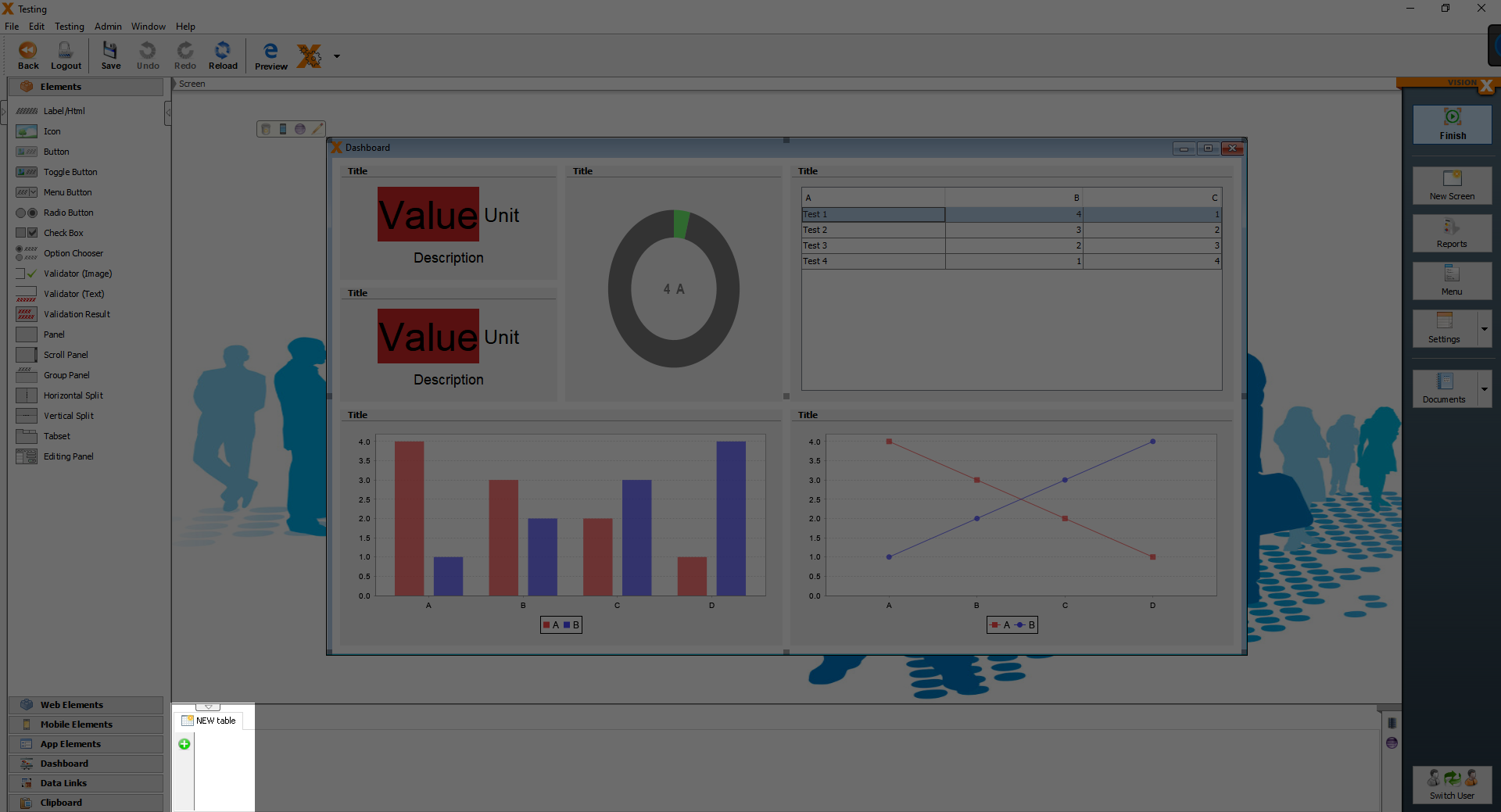
First we have to add the tables, so that we can bind data to the elements. We will add the first table together and other tables can be added using the same steps. To add the first table, click on the green plus button in the bottom area.
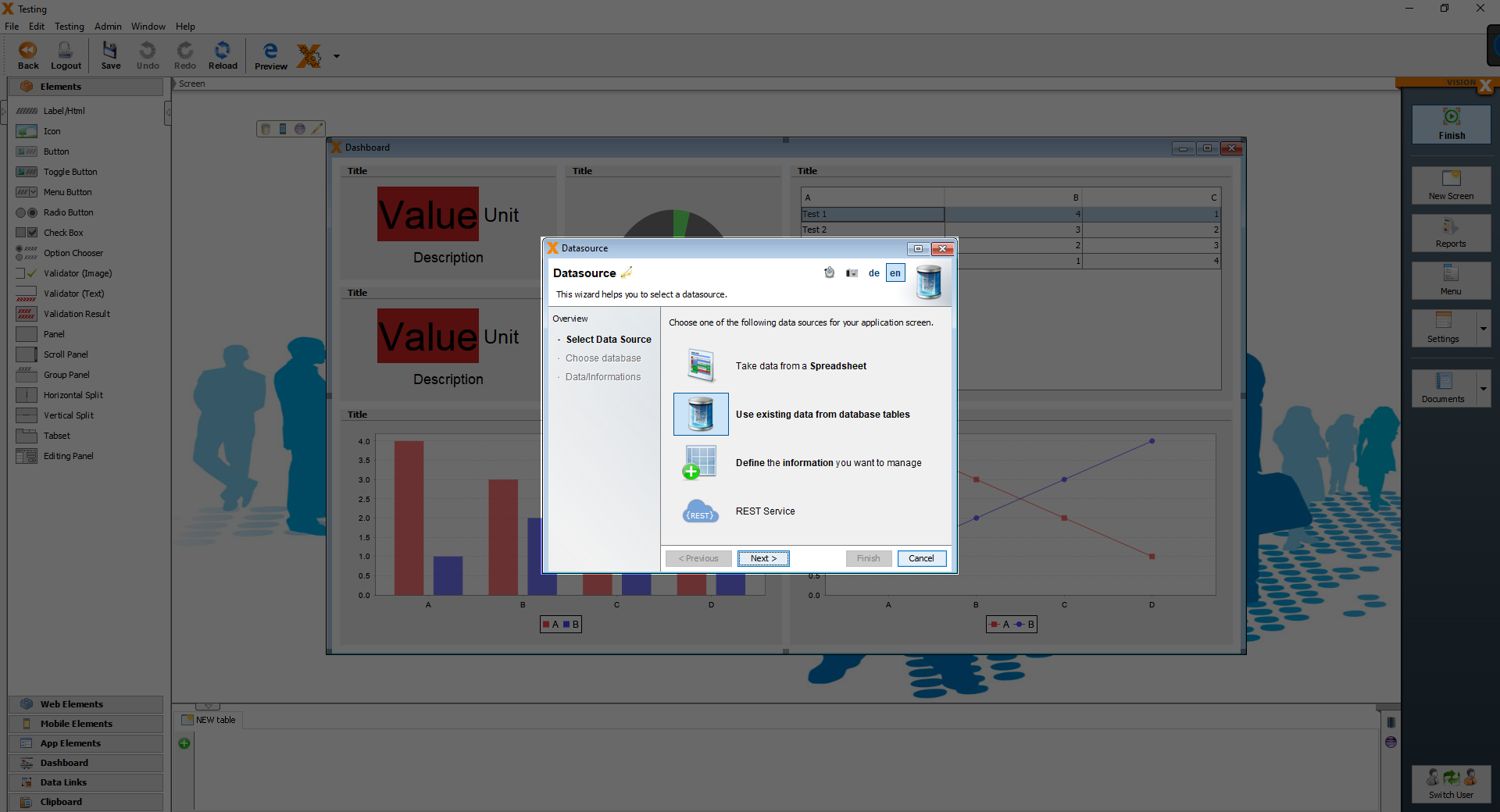
On the next screen choose “Use existing data from database tables”.
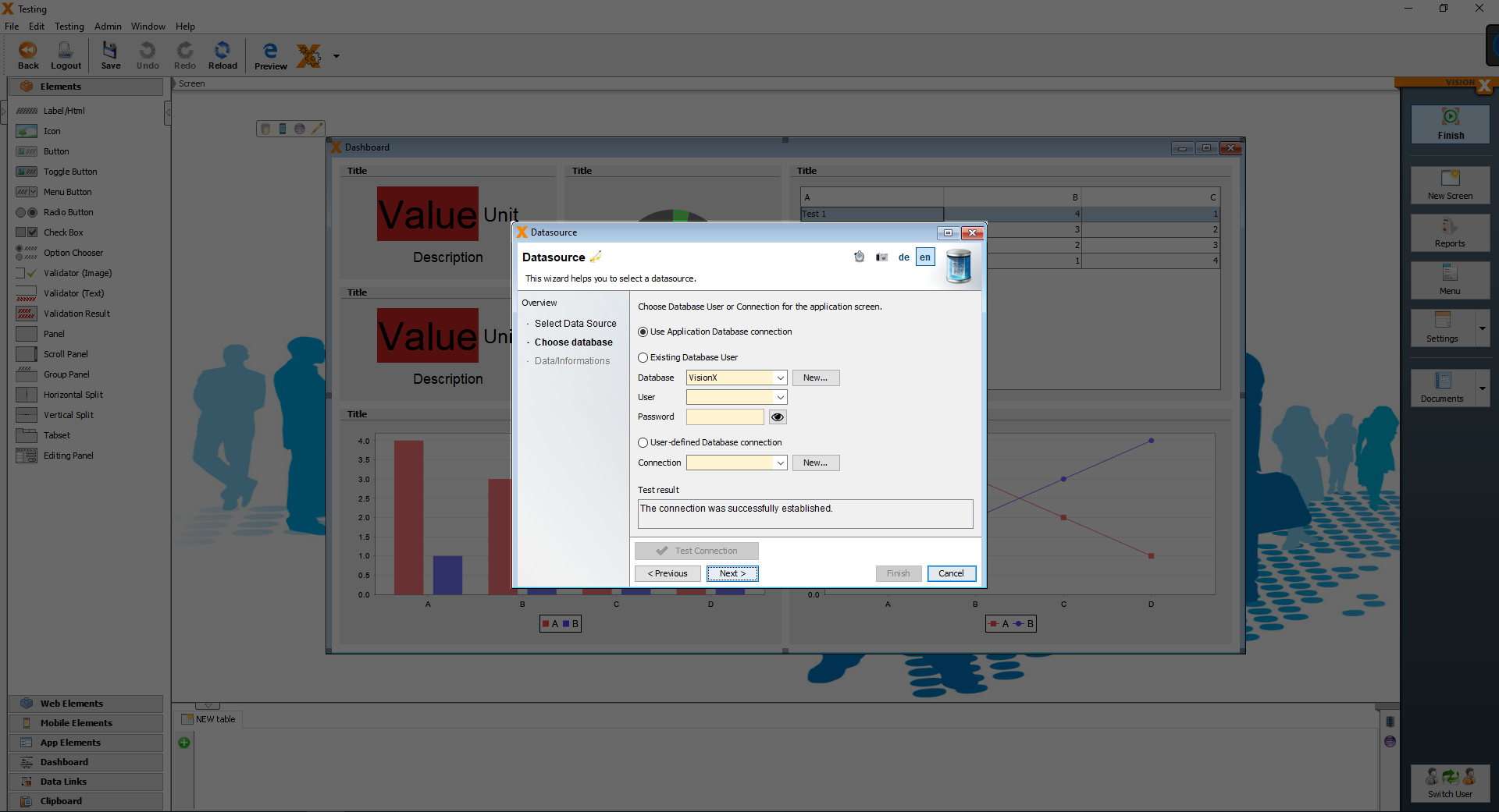
On the next screen choose “Use application Database Connection”.
Finally, we choose the database table, which should be added and then click “Finish”
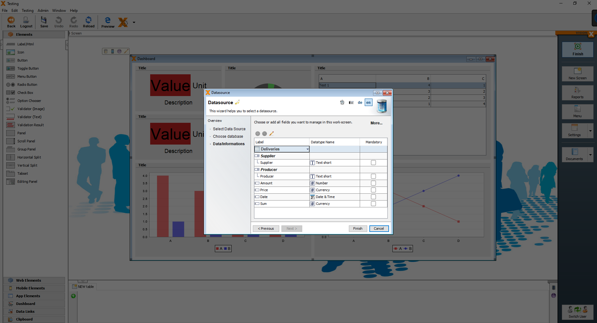
For the dashboard, we have to add the Deliveries, Sales and Production tables.
After adding all the necessary tables, we can bind data to the charts, table, KPIs.
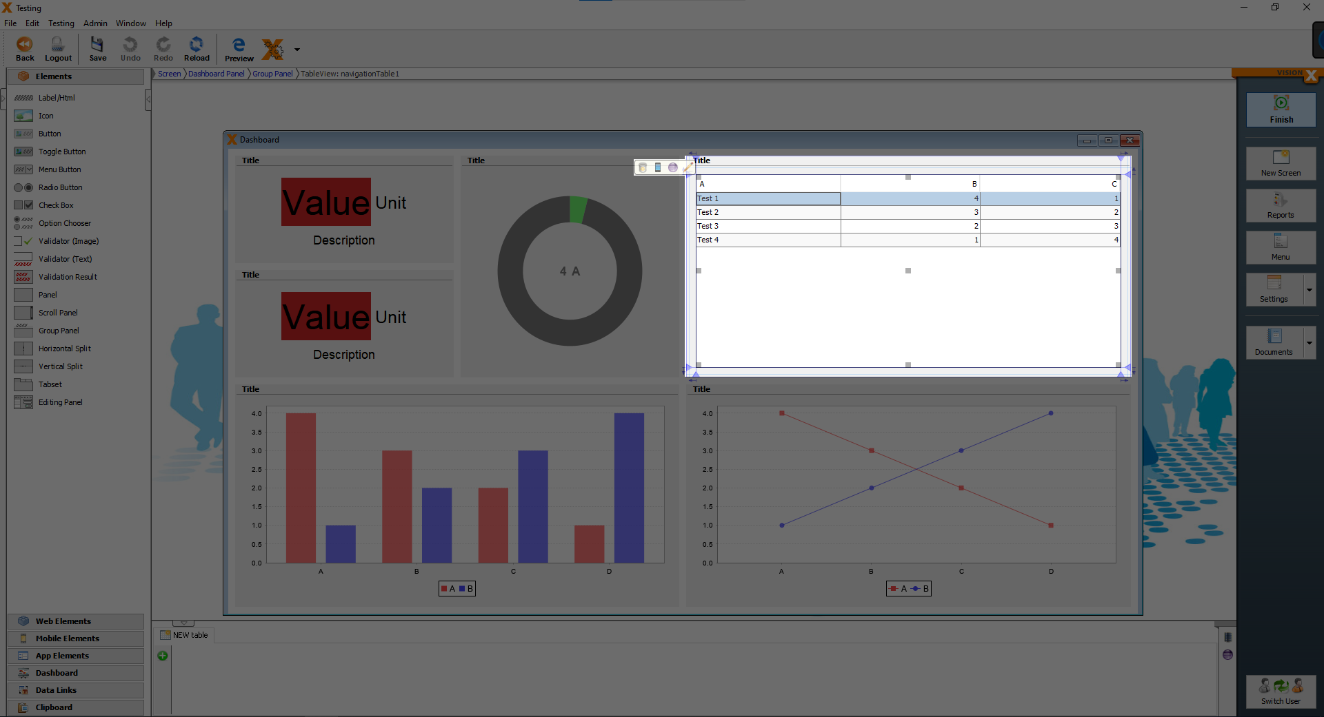
We beginn with the table element in the top right area.
Open the customizer of the table element.
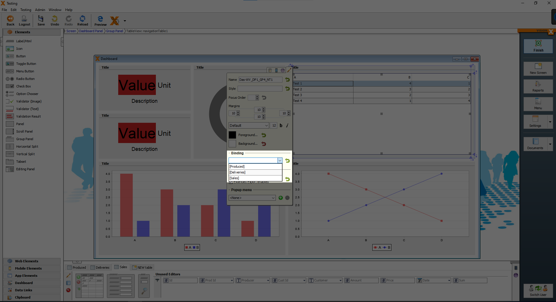
Under “Binding” you see a combobox, from the combobox choose “[Sales]” and the table element shows the data from the Sales table.
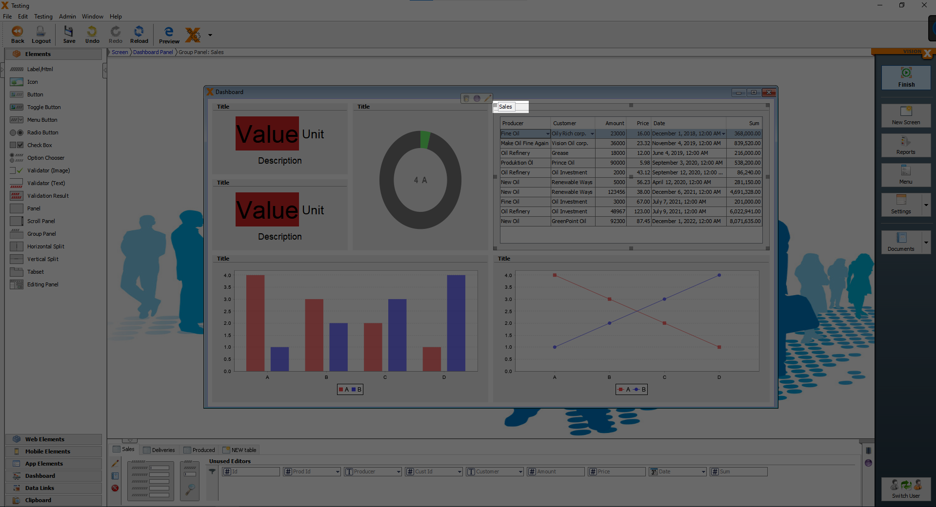
After binding the Sales table to the table element, we change the title.
Double click on the text “Title” above the table element and write “Sales” instead.
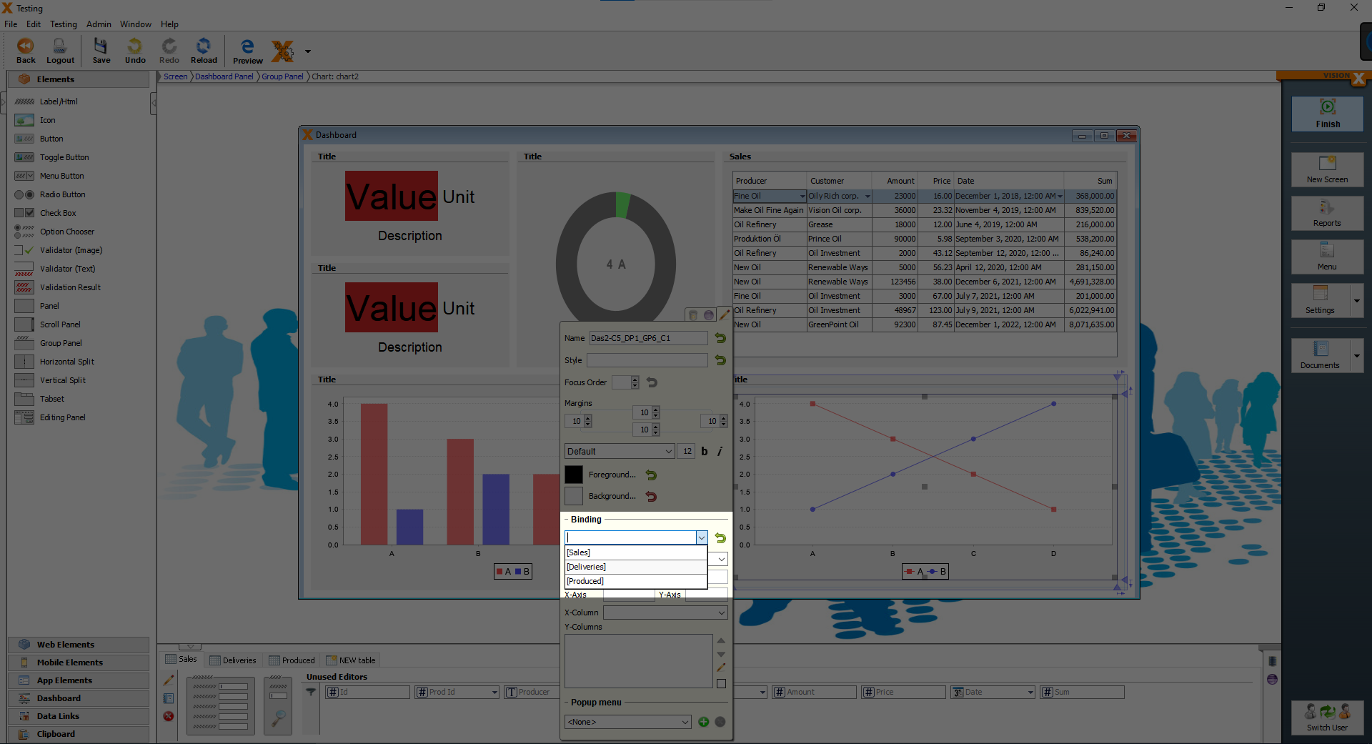
Now we will change the line chart under the table element. Open the customizer of the line chart and set the “Binding” to “[Produced]”, then close the customizer.
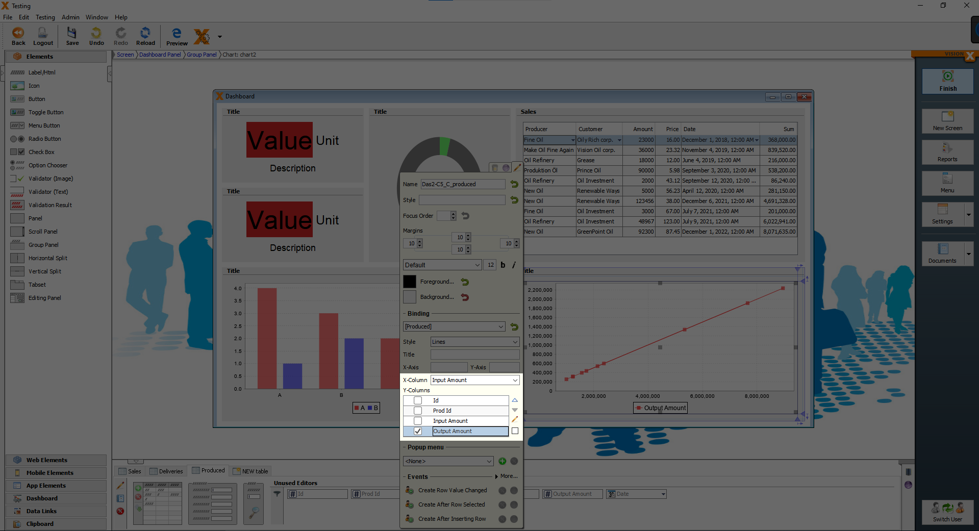
Reopen the customizer of the line chart and set “Output Amount” as the Y-Columns and set “Input Amount” as the X-Column.
Now we have a nice line chart, which shows us, how much fuel was produced from X amount of used oil.
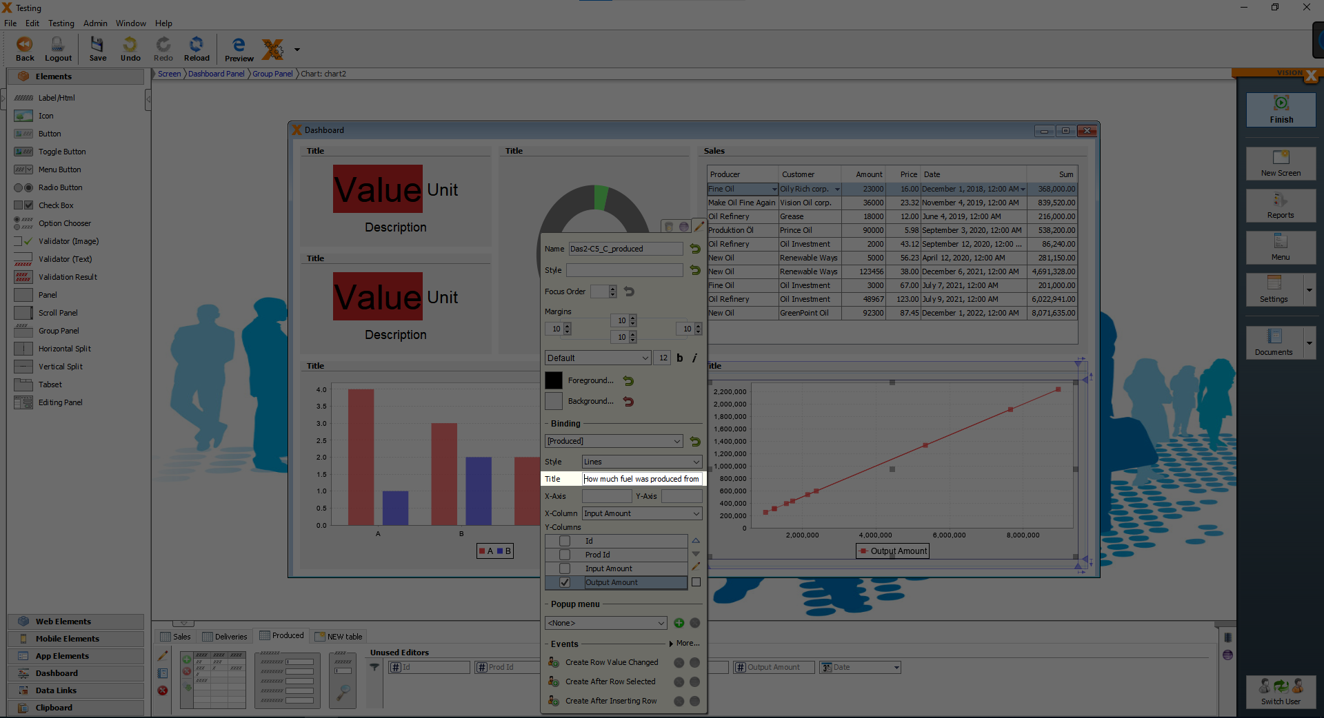
That is what we are going to set as our title for our line chart. If you closed the customizer, please open it again and copy/paste this text “How much fuel was produced from X amount of used oil” into the title.
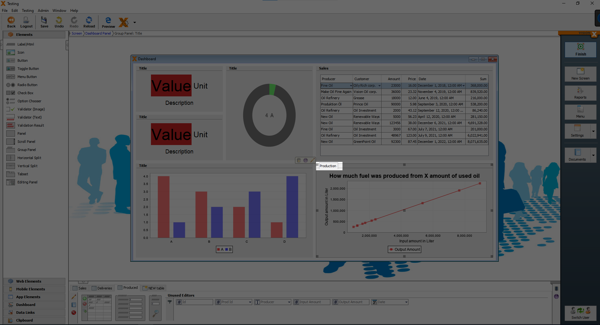
And finally we will set the labels of the X-Axis and the Y-Axis. In the customizer write into the X-Axis field “Output amount in Liter” and into the Y-Axis field “Input amount in Liter”.

As the last step, change the text “Title” above the line chart to “Production”.
We are finished with the line chart, now we are going to setup the bar chart. First, we are binding the Deliveries data to the bar chart.
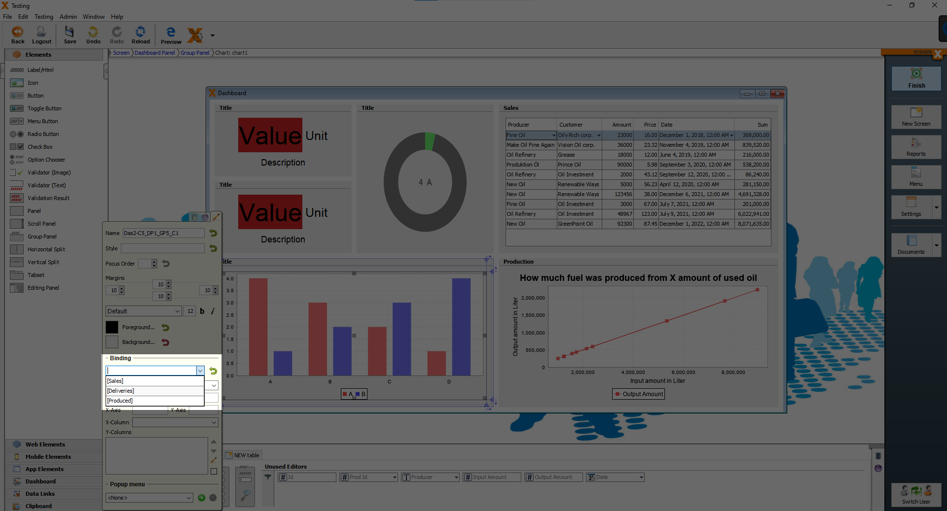
After setting the “Binding”, close and reopen the customizer, and as the X-Columns set the “Supplier” and as the Y-Columns the “Amount”.
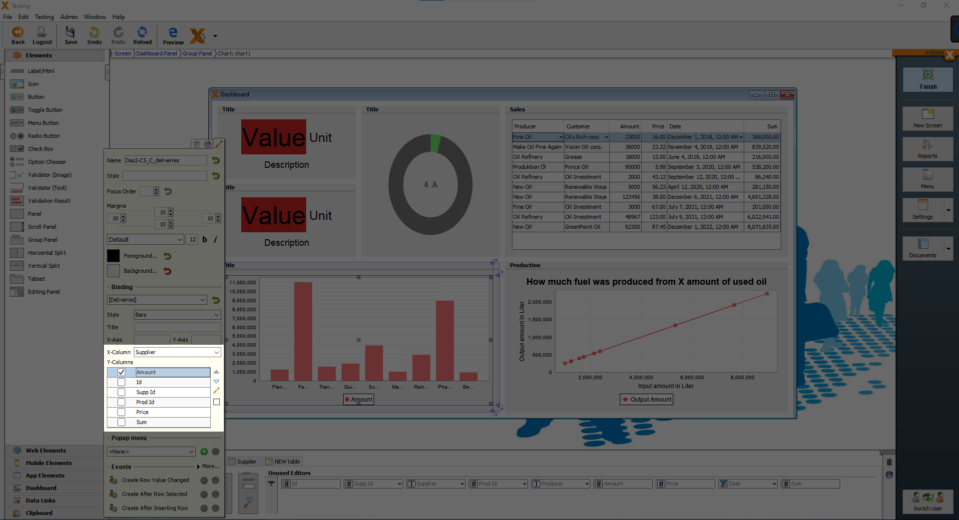
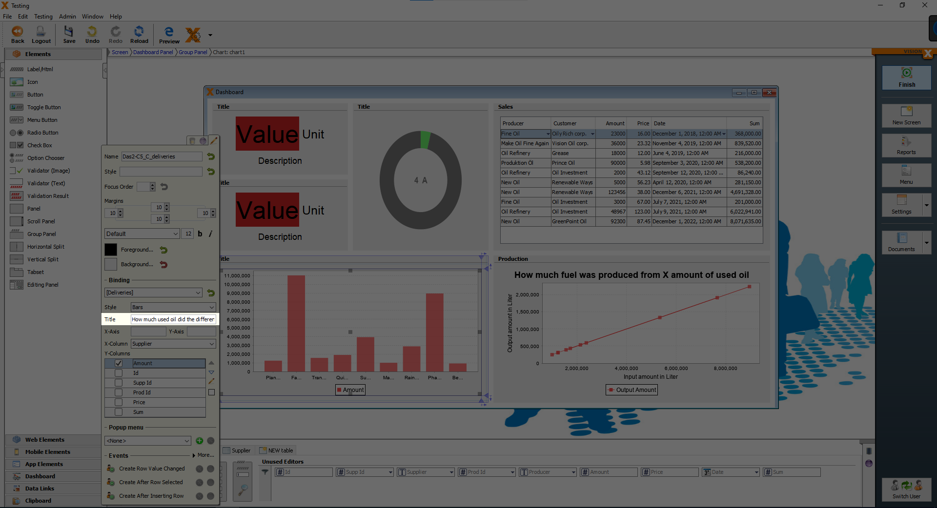
The bar chart shows us now, how much used oil the different suppliers delivered, that is why, we are going to set the title of the bar chart to “How much used oil did the different suppliers deliver”.
Now we set the labels of the X and Y Axis, the X-Axis is the “Suppliers” and the Y-Axis is the “Amount in Liter”.
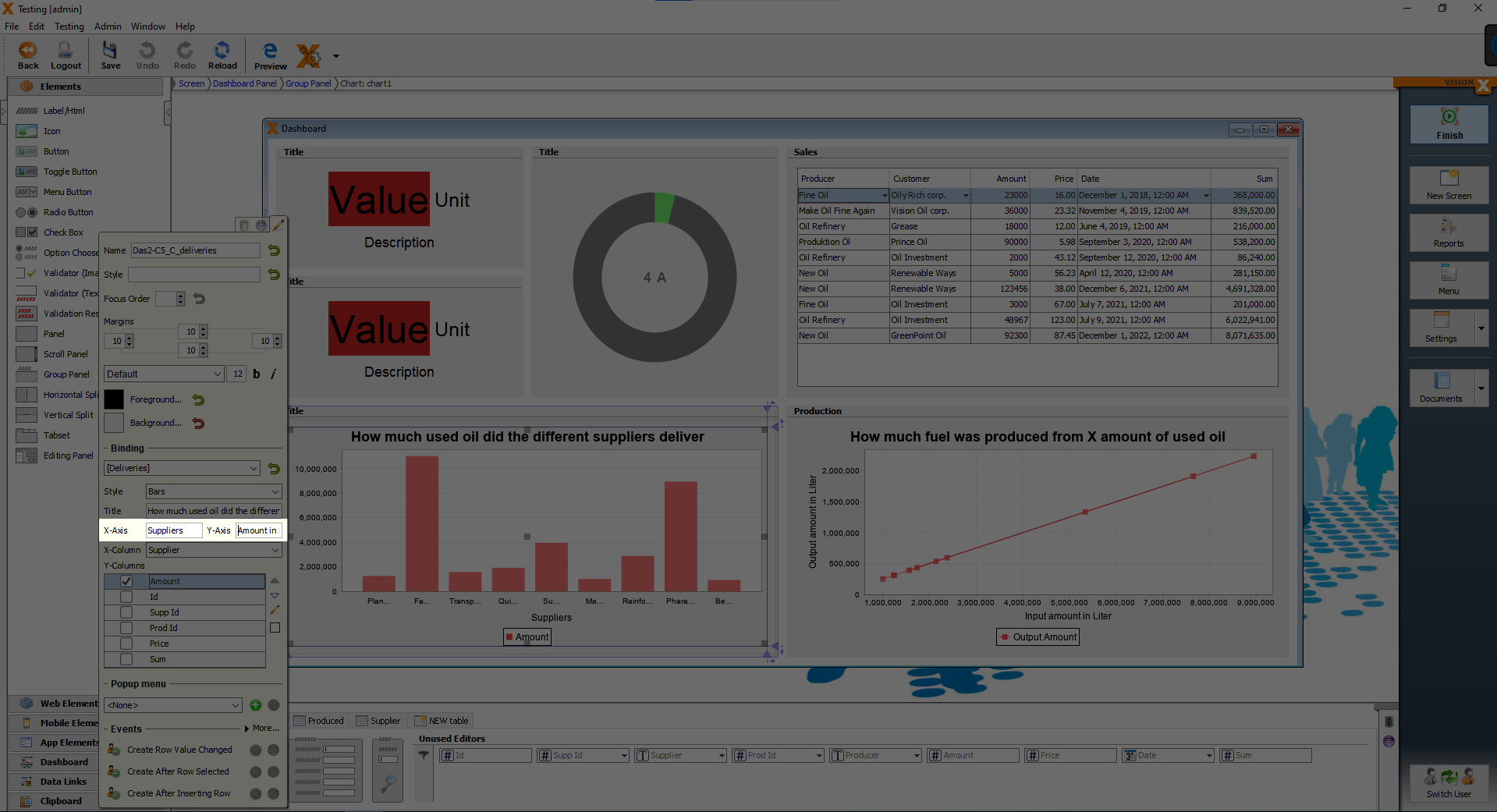
Finally we change the text “Title” above our bar chart to “Deliveries”.
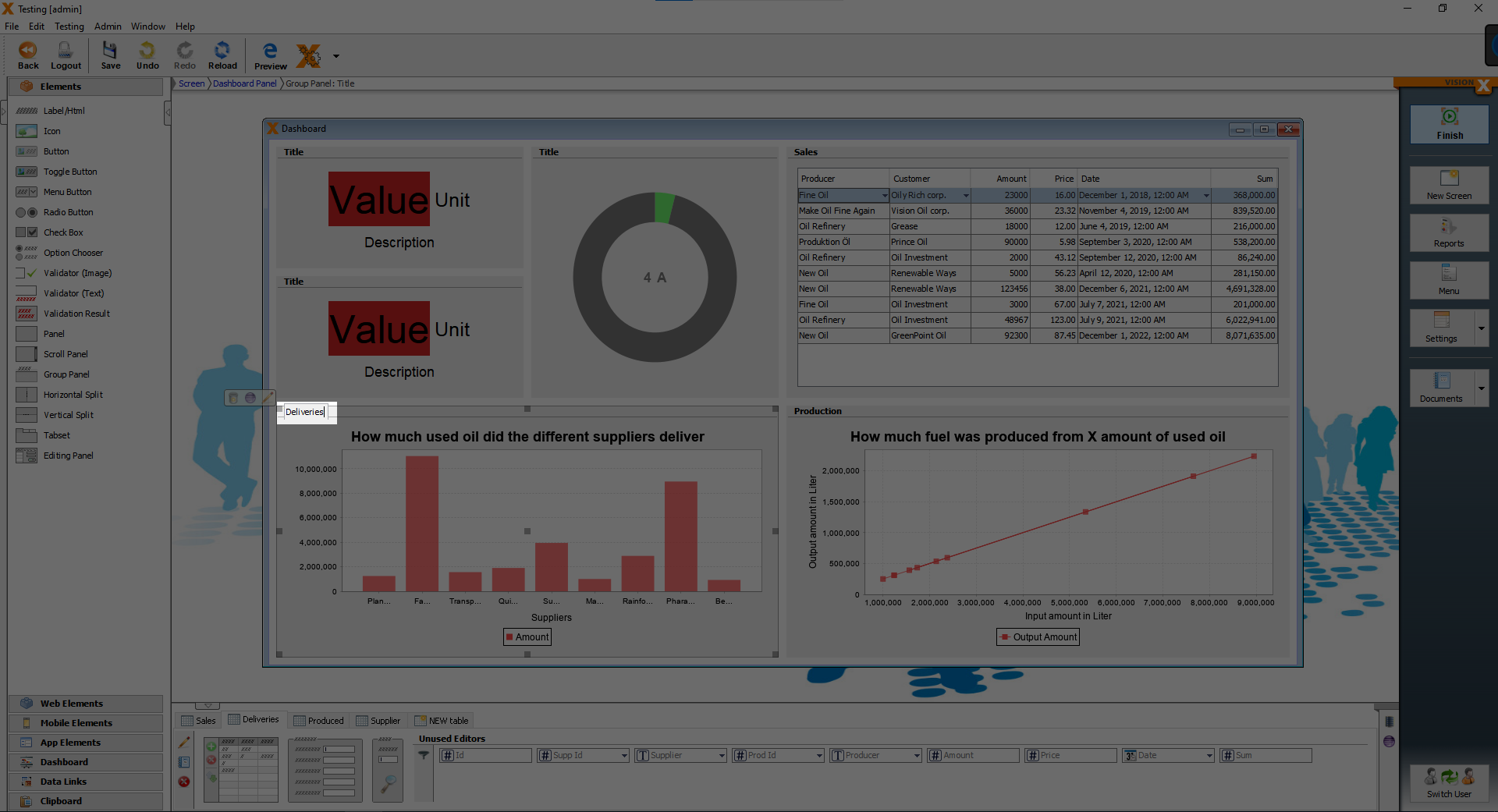
We are finished with the bar chart.
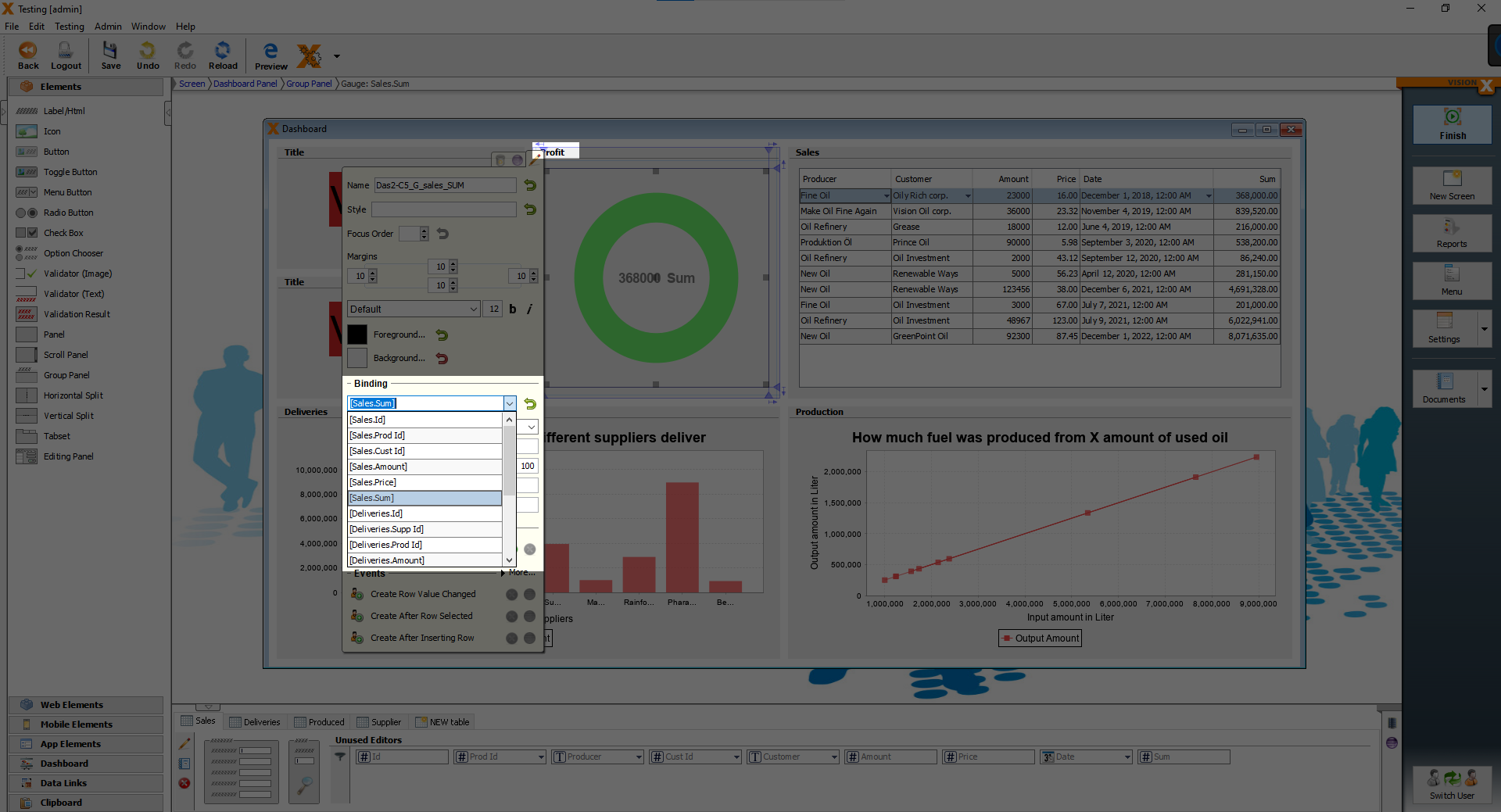
Now we start working on the ring chart, first we bind the Sum column from the Sales table to the ring chart, the same way as we bound the Sales table to the table element and change the title to “Profit”.
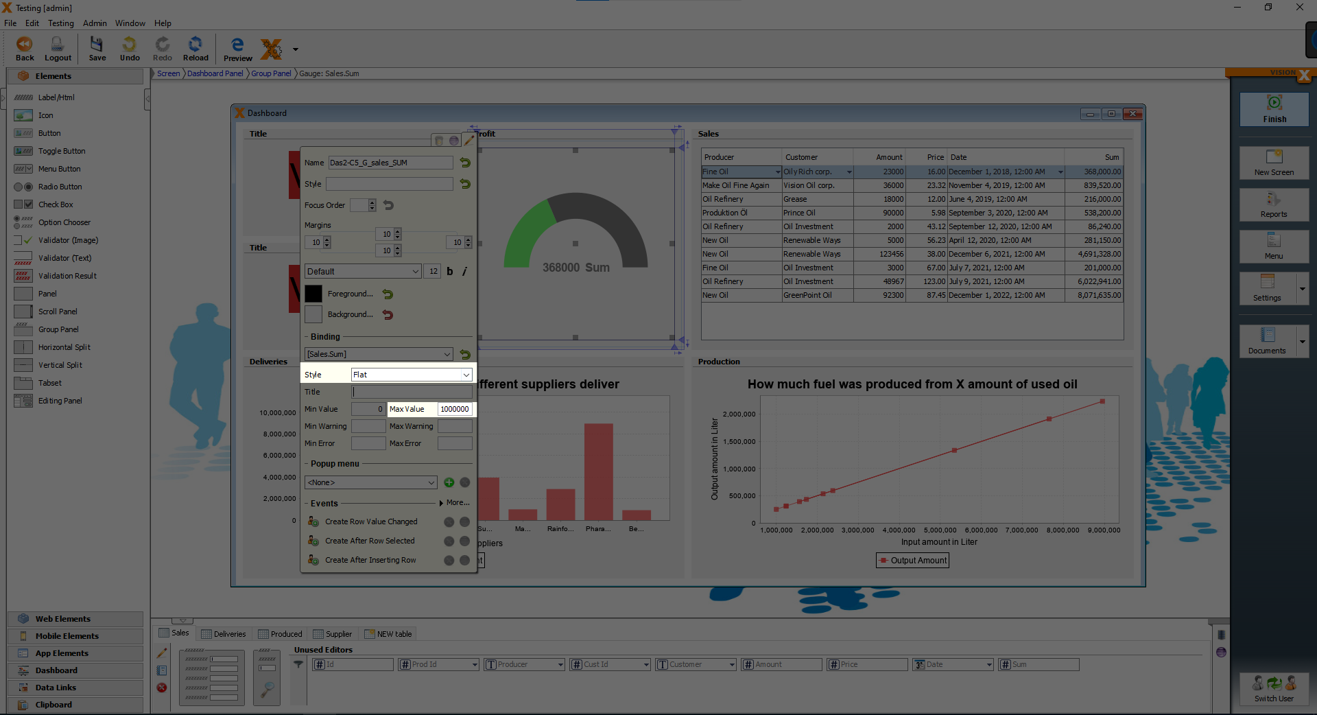
We change a few other things on the ring chart, open the customizer and change the “Style” to “Flat” and set “Max Value” to 1000000.
We change the last two elements, the two KPIs next to the ring.
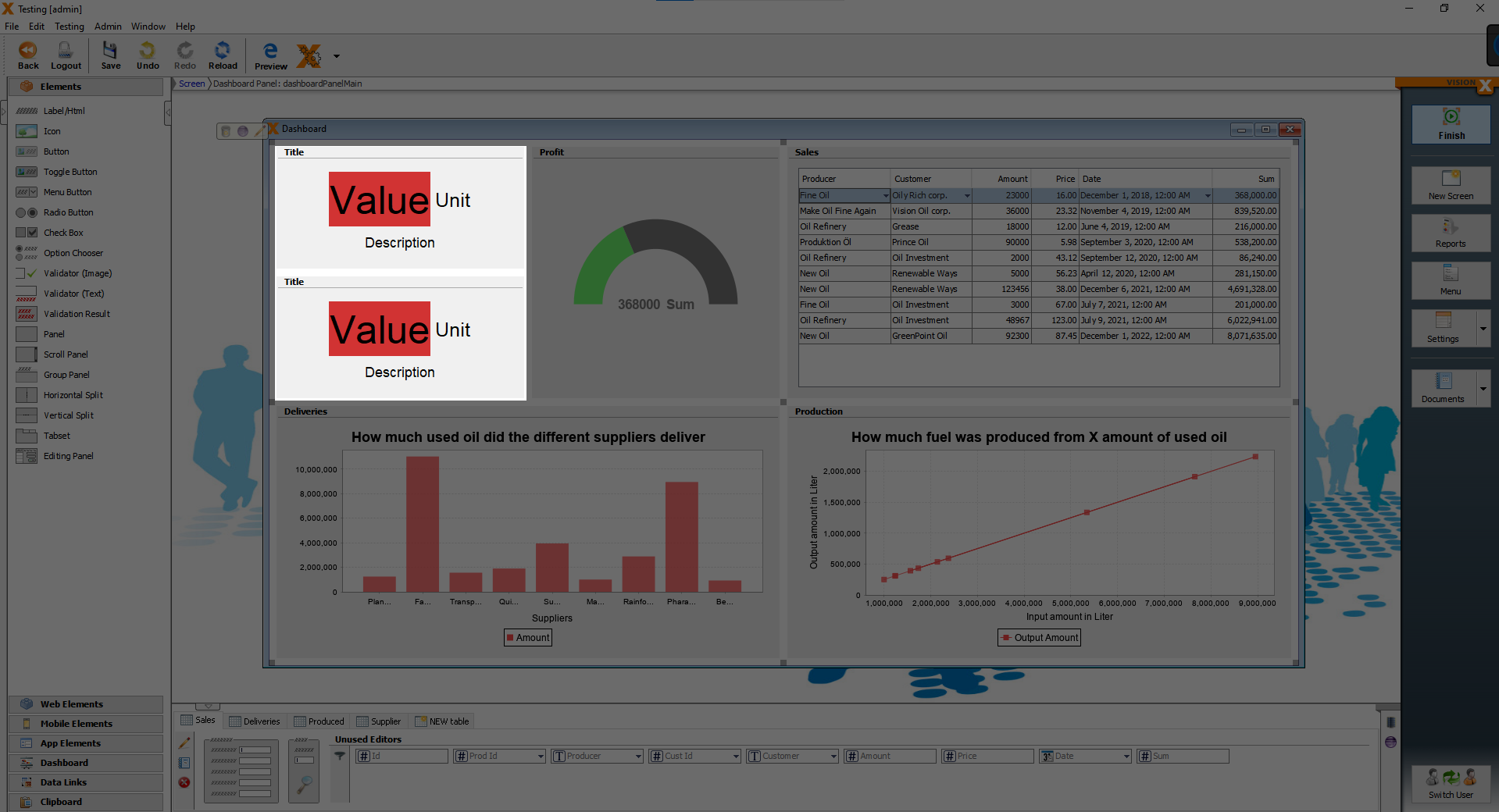
First we change the upper KPI, we set the title to “Sales volume”, change the text “Unit” to “Liter” and “Description” to “Amount of sold fuel”.
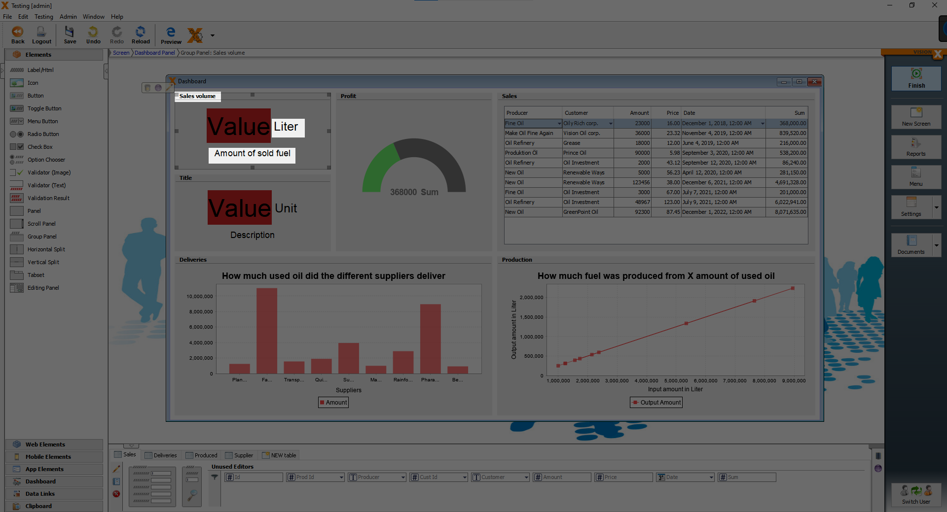
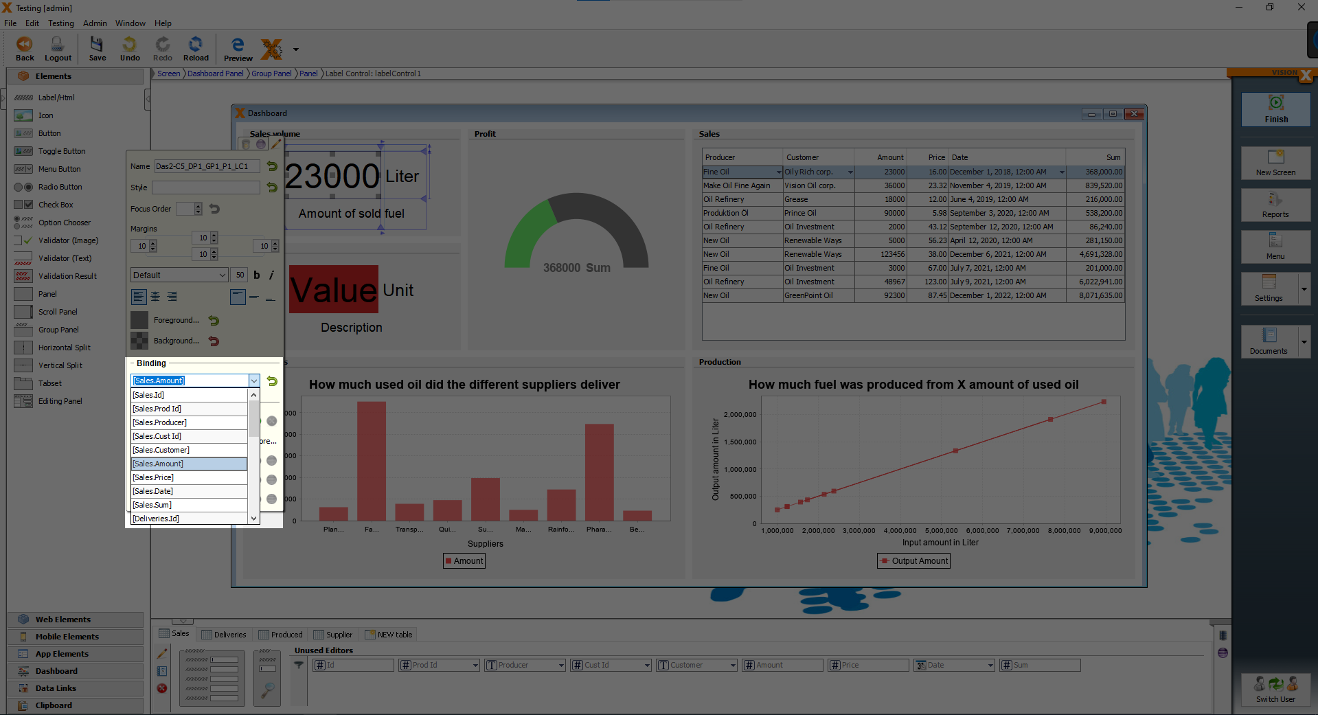
After that we bind the “Value” to “Sales.Amount”.
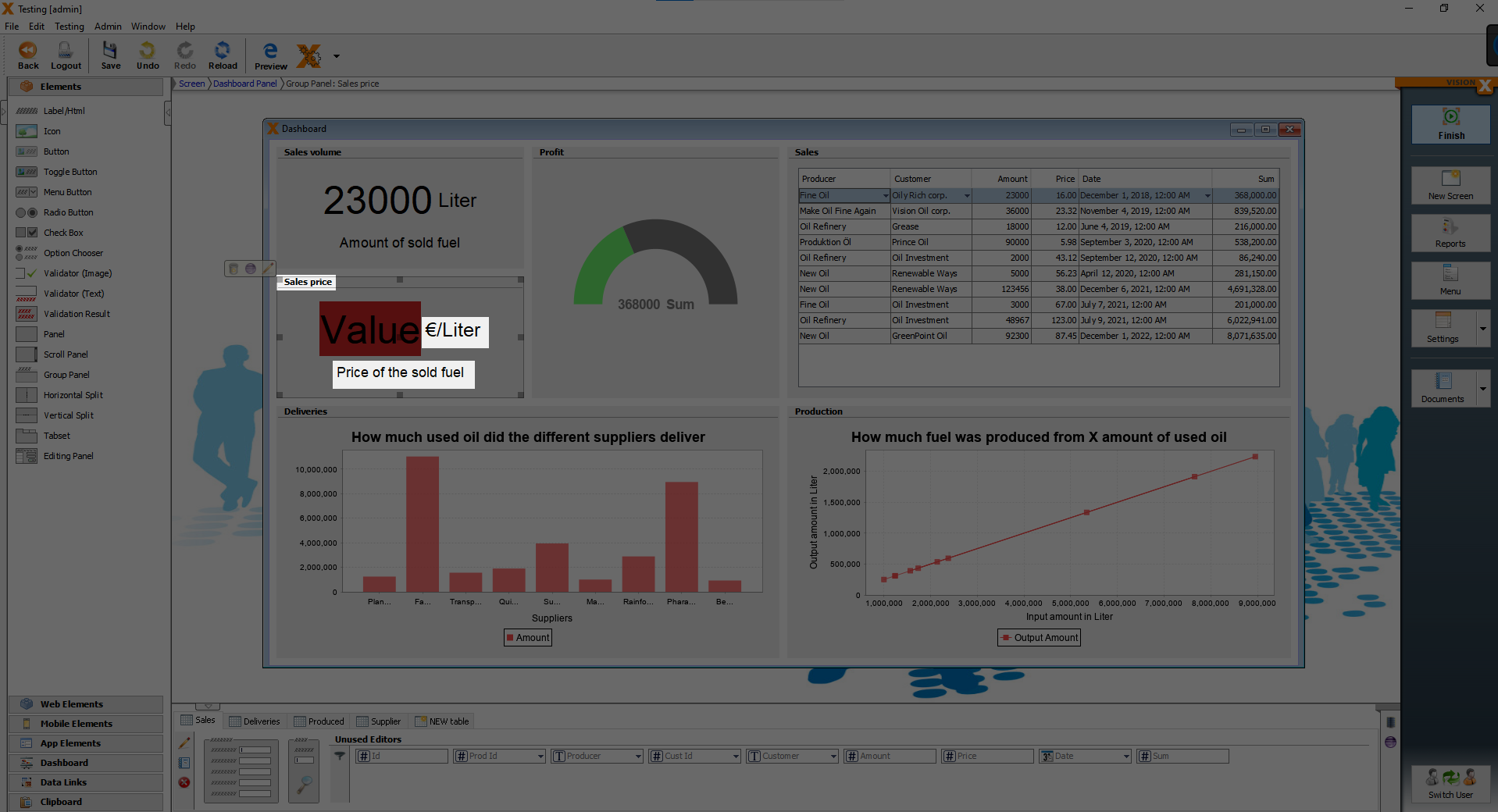
Then we change the lower KPI, we change the title to “Sales price”, set the “Unit” text to “€/Liter” and “Description” to “Price of the sold fuel”.
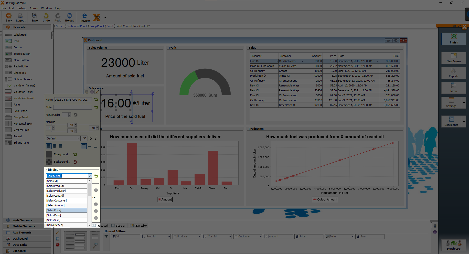
Finally we bind the “Value” to “Sales.Price” and our dashboard is finished.
Creating the form screens for adding Suppliers, Producers and Customers
We create one screen together and you will make the other two screens on your own.
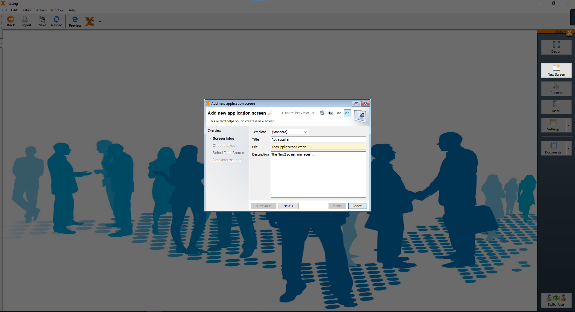
It is really easy to make a screen with a form. You start with clicking on the “New Screen” button and enter a title for the screen, we will call the screen “Add supplier”. Then click on “Next”.
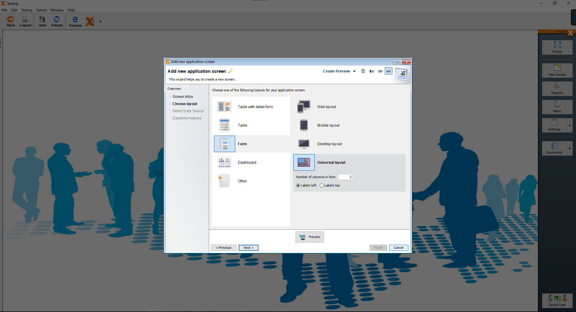
On the next page, choose the “Form” layout and click on “Next”.
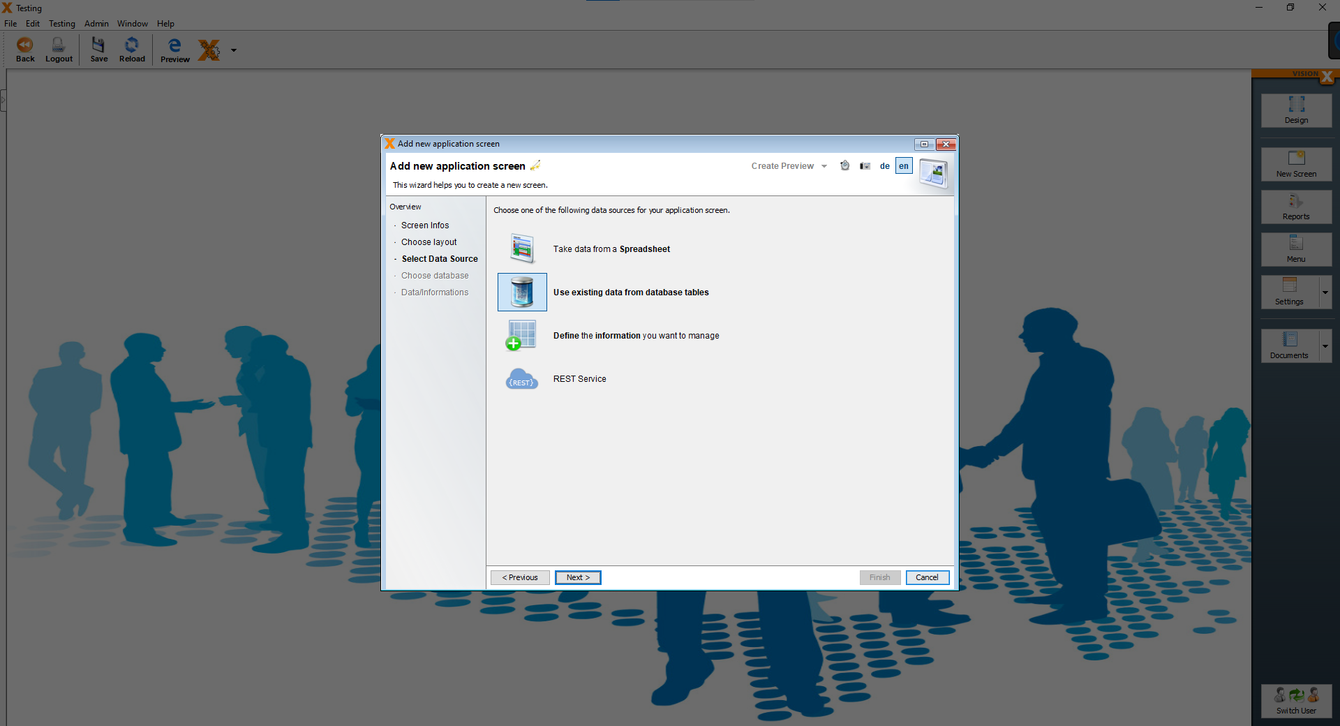
On the next page, we will choose our data source. We will use an existing data from database tables.
Choose the option “Use existing data from database tables” and then click “Next”.
On the next page leave the settings as they are and click on “Next”.
On the last page, choose the “Supplier” table as our data source and click on “Finish”.
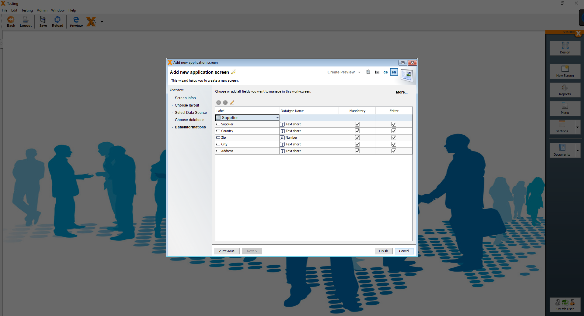
We are now greeted by our form screen.
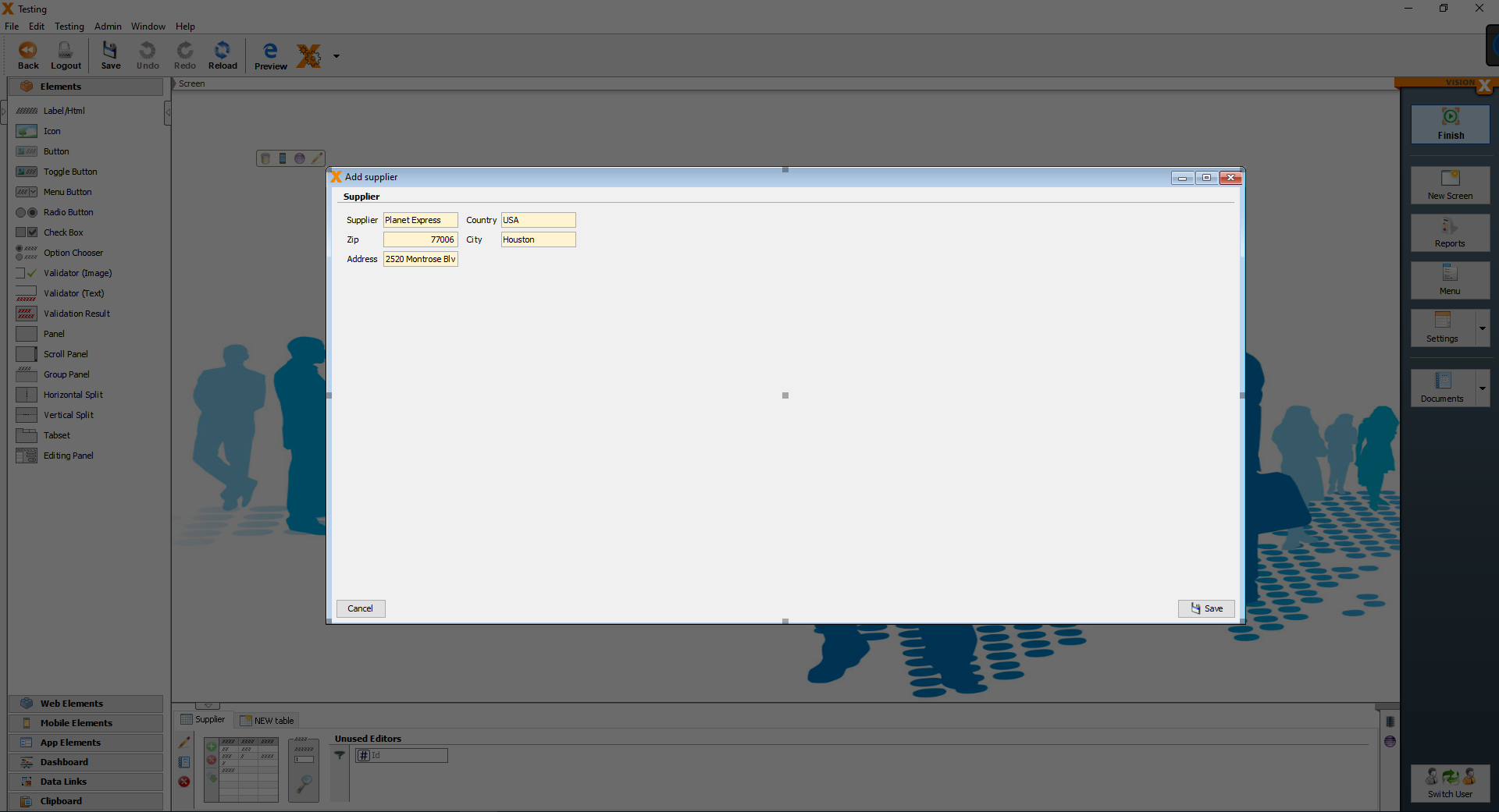
We are finished with the screen, but there are some changes that we want to make.
We want the screen to open as a pop-up screen. To do that, we have to open the customizer of the screen and there is an option “Show as Popup”. We have to enable it.
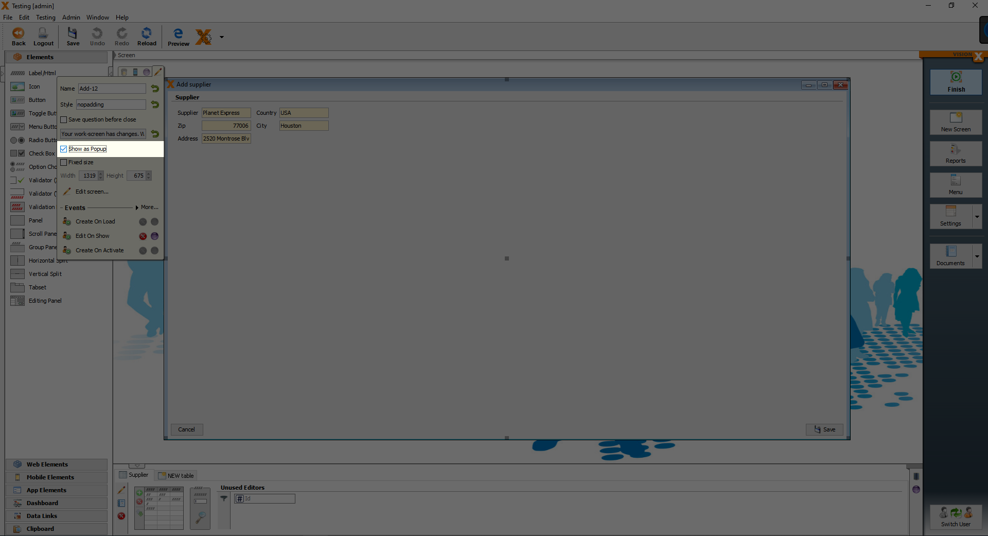
Now we are finished with the “Supplier” form screen.
To create the “Customer” and the “Producer” form screens, the same steps are required, the only differences is the title of the screen and the data source table.
Creating the report page and a report
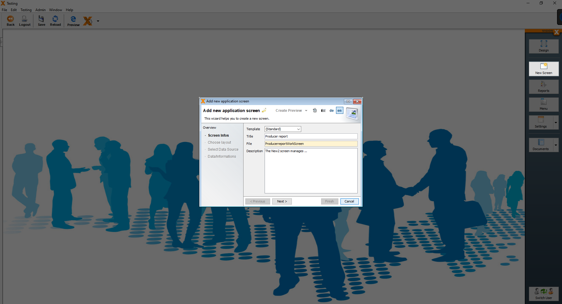
We will now create the last screen for our application. Same beginning as before, click on “New Screen” and enter the title of the screen.
We will call this screen “Producer report” and then click “Next”.
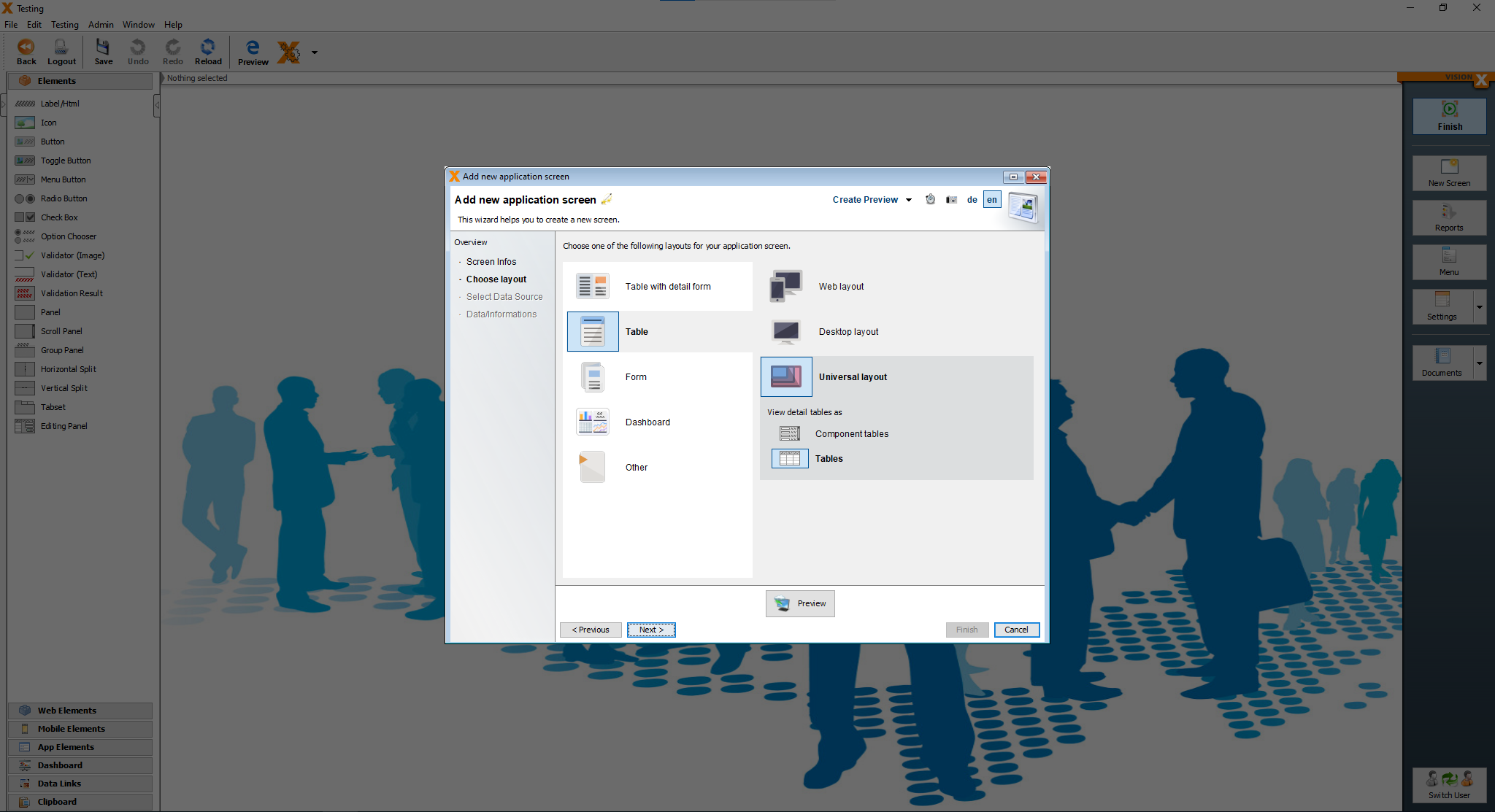
On the next page, we choose the “Table” layout and then click on “Next”.
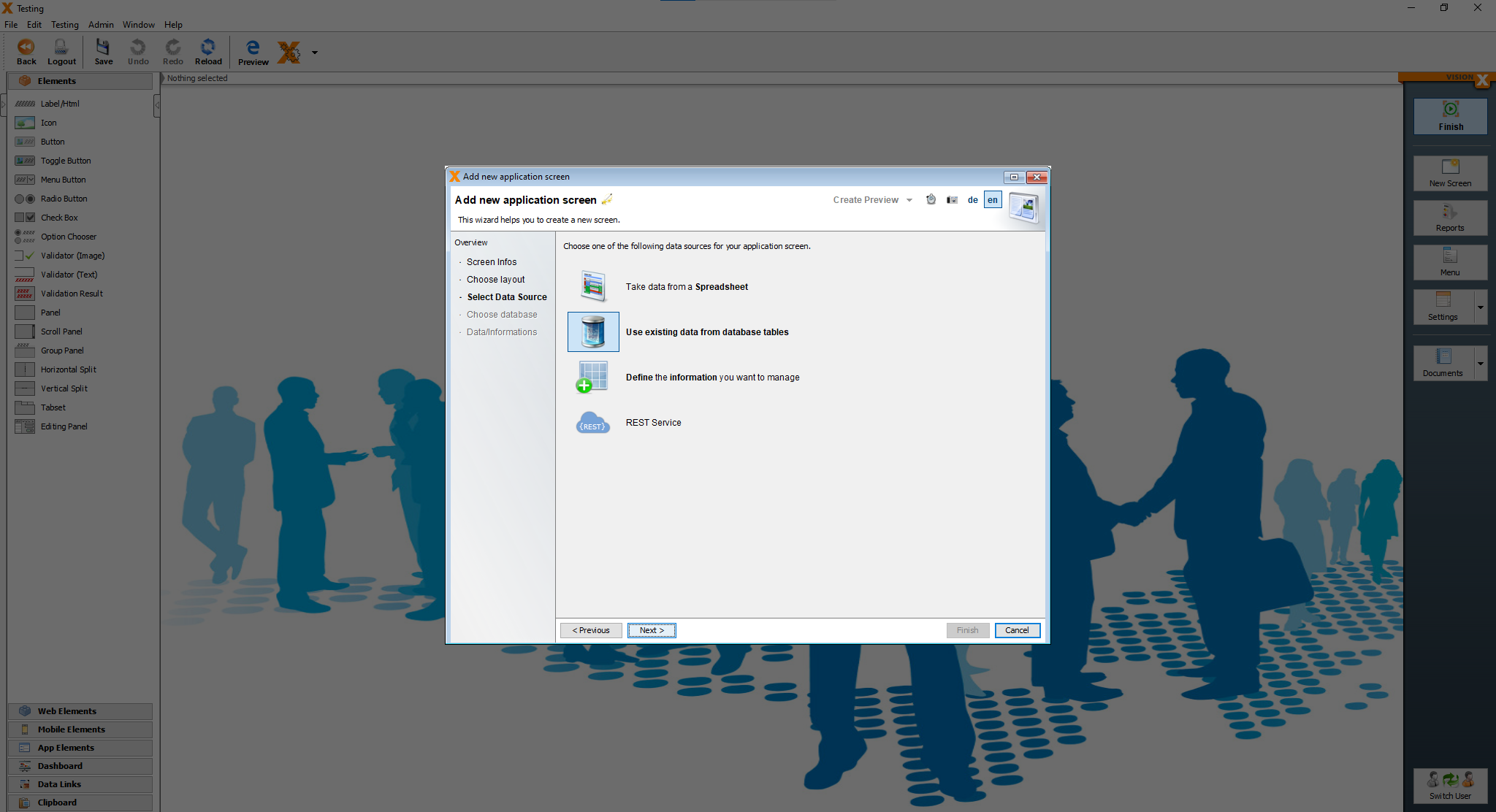
For the report, we use the already existing tables, so choose the option “Use existing data from database tables” and click on “Next”.
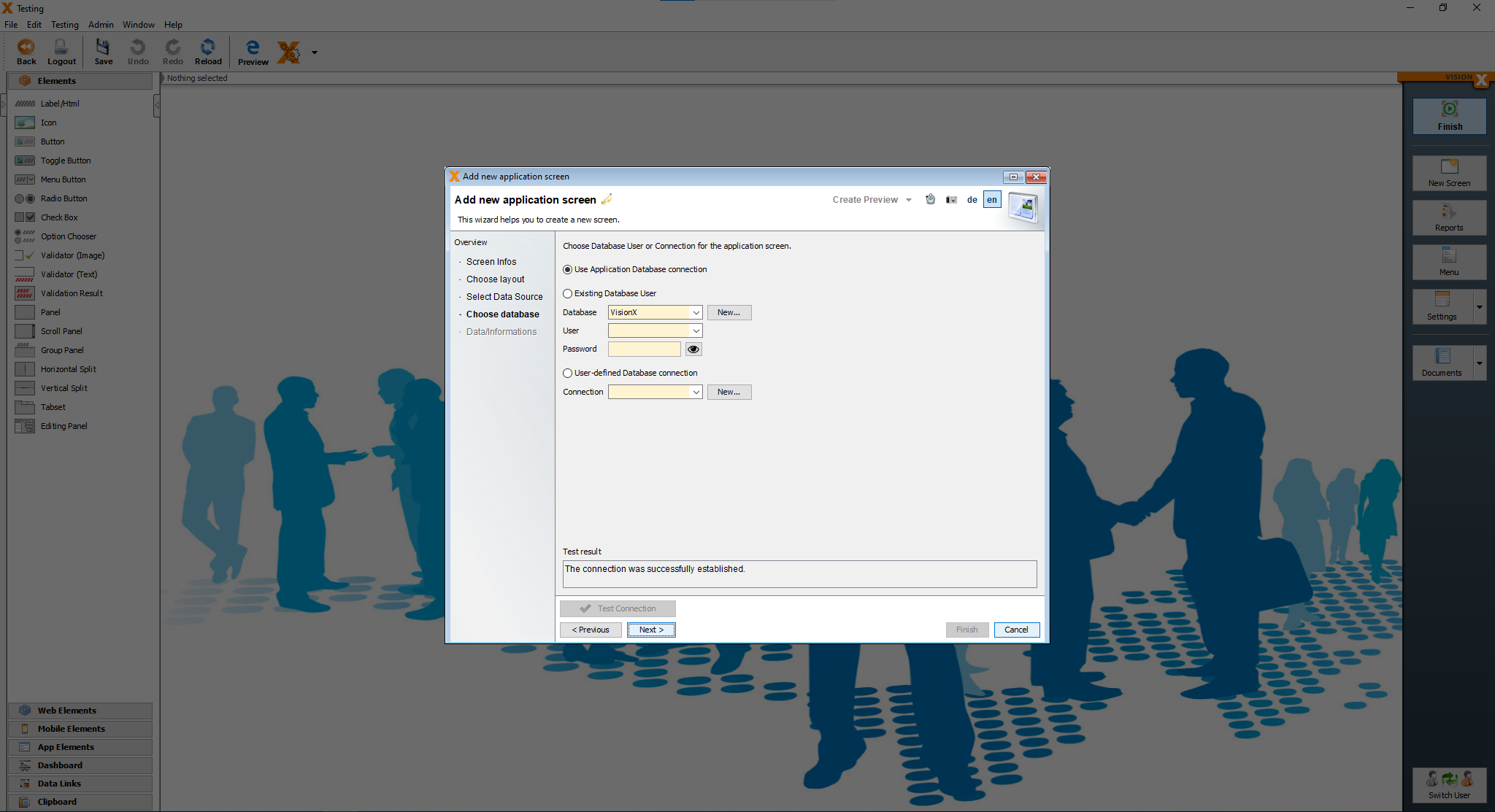
On the next page just click “Next”.
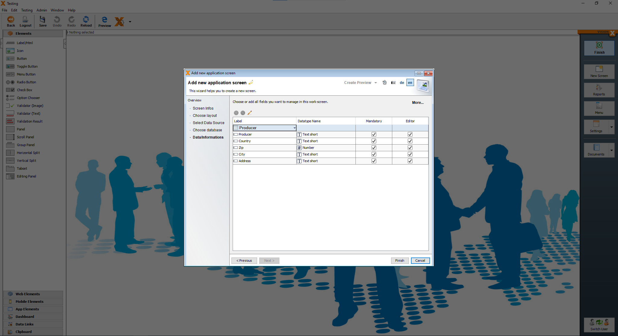
For the report screen, we add the “Producer” table as our first one and click on “Finish”.
After clicking “Finish” we are greeted by our screen for the report, which we have to adjust a bit to our needs.
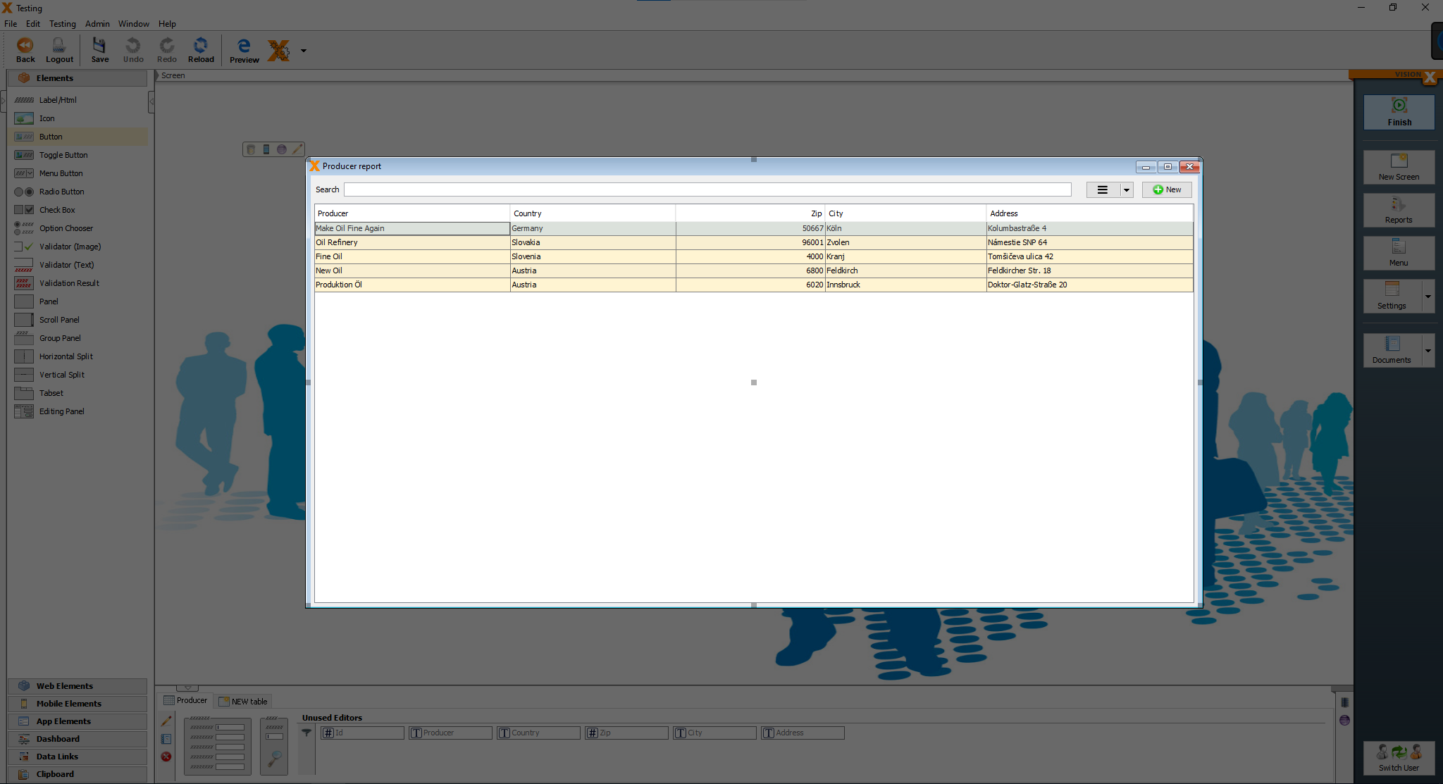
First we delete the two buttons next to the search bar.
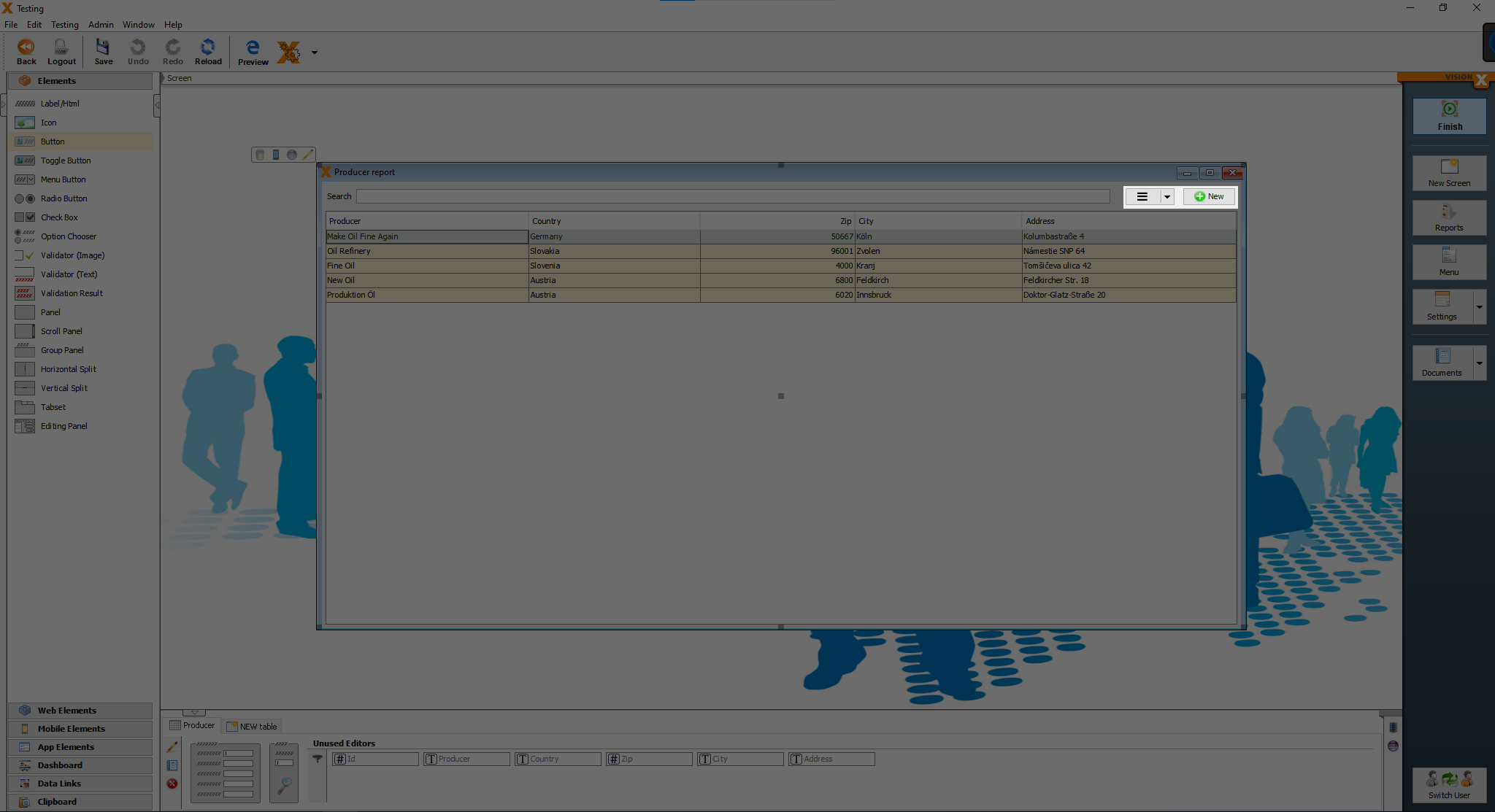
After deleting those two buttons, we add a new button and change the text to “Get producer report”.

Now we add all the other necessary tables, “Produced”, “Deliveries” and “Sales”.
We add them the same ways, as we did it at the dashboard screen.
Click on “New Table”, then on the green plus.
After adding the other 3 tables, you should see all thise 4 tables at the bottom.
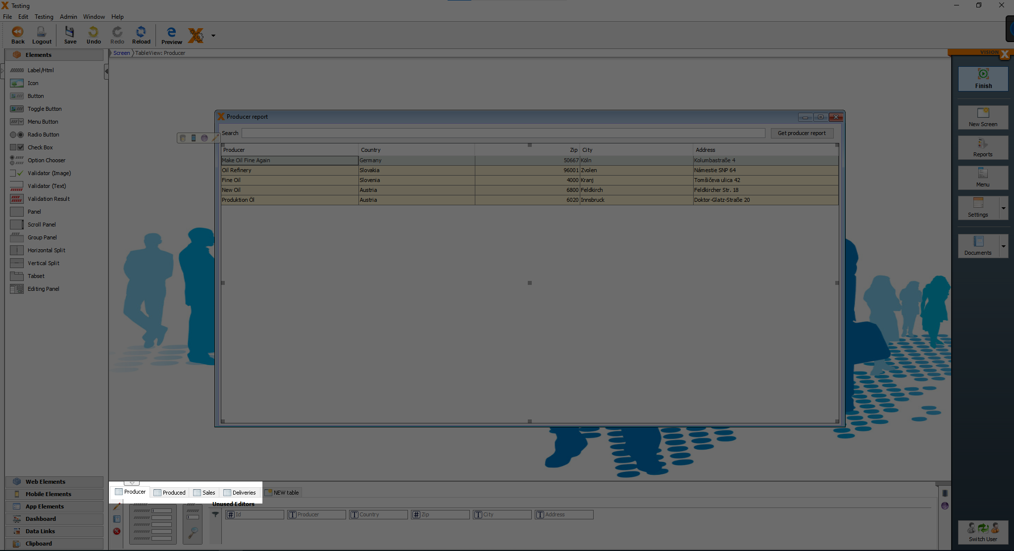
We have to set the master table of the 3 tables, “Produced”, “Deliveries” and “Sales”. Click on the tab “Produced” and then on the pencil icon.
![]()
After clicking on the pencil icon, you should see this screen.
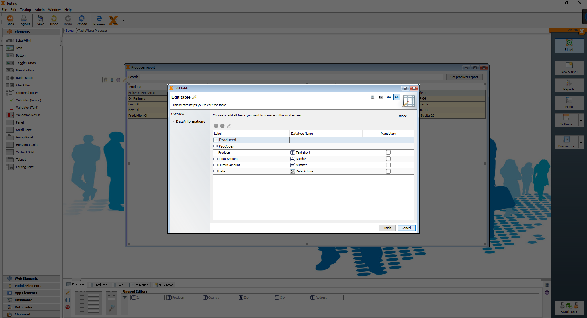
Click on “More…” to see more editing functions.
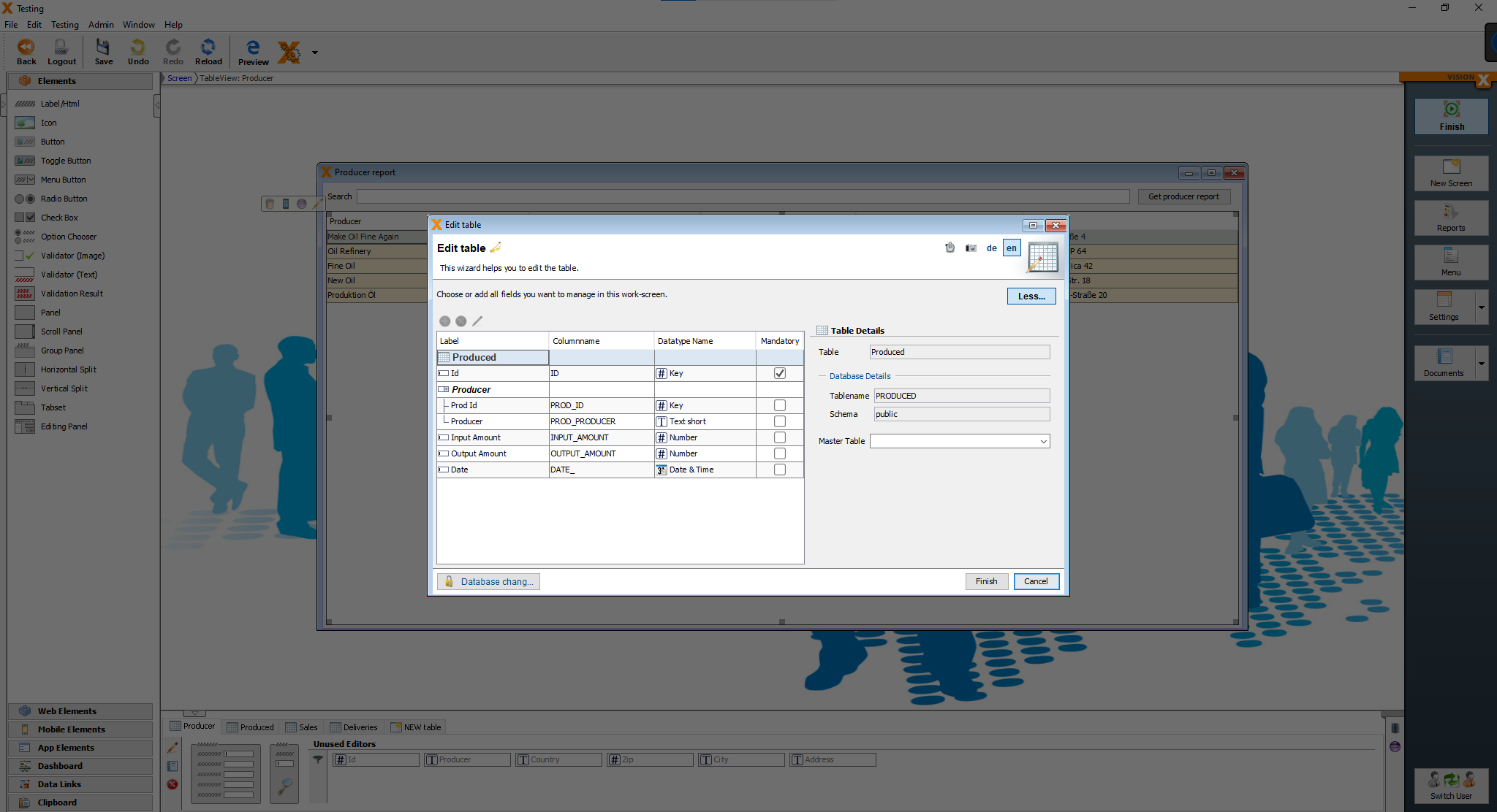
We are going to set the “Master Table” to the “Producer” table and then click on “Finish”.
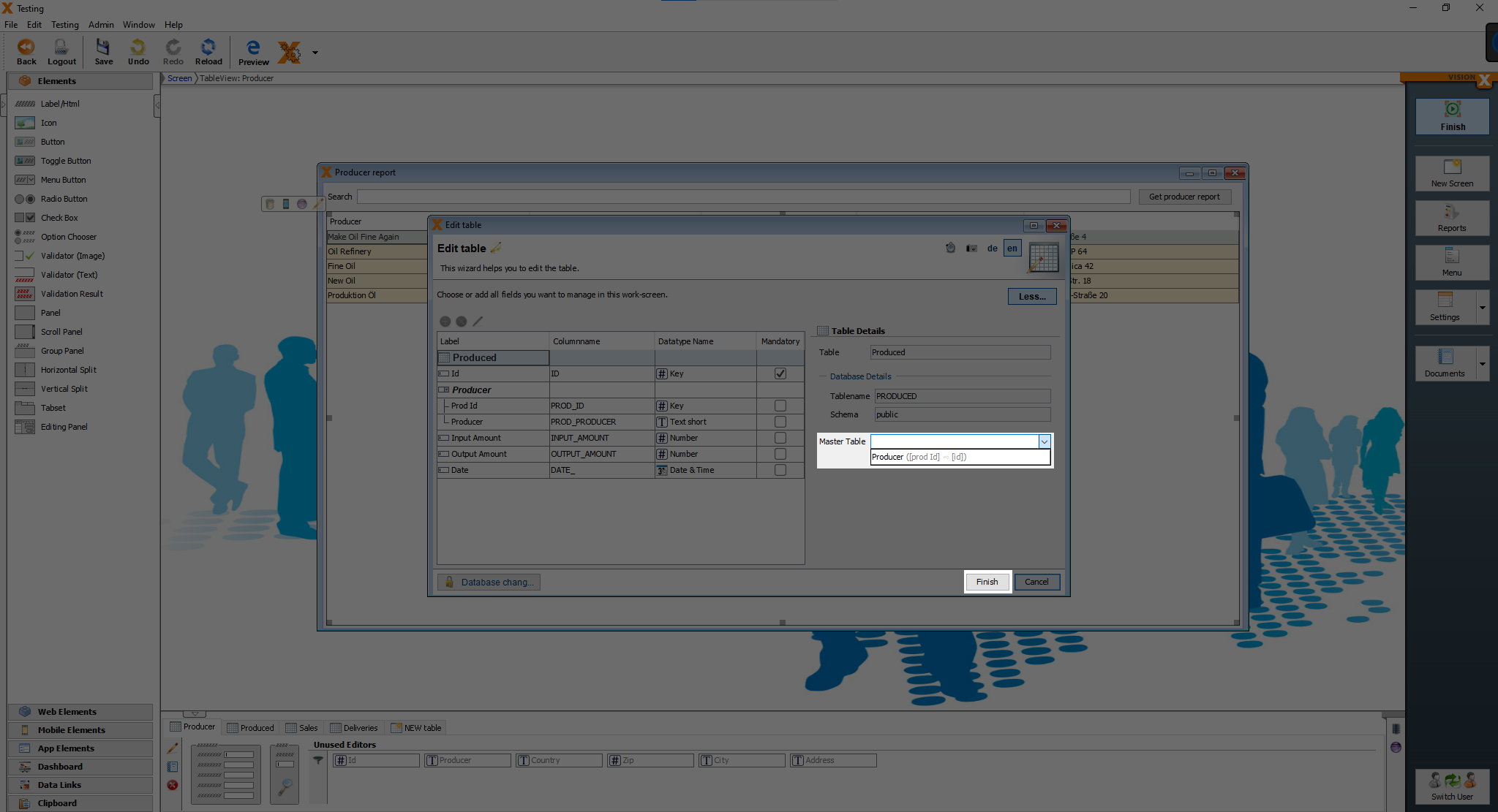
We have to set the Master table for the “Sales” and “Deliveries” table.
Adding functionality
After creating all the screens and adding data to the screens, we are going to add some extra functions.
Setting current date and calculating sum automatically
We begin with a simple calculation and how to set a default date.
I will show it on the “Deliveries” screen and the changes can be made on the “Production” and “Sales” screen later.
Open the “Deliveries” screen and open the customizer of any input field and at the bottom, you can see some pre-defined events.
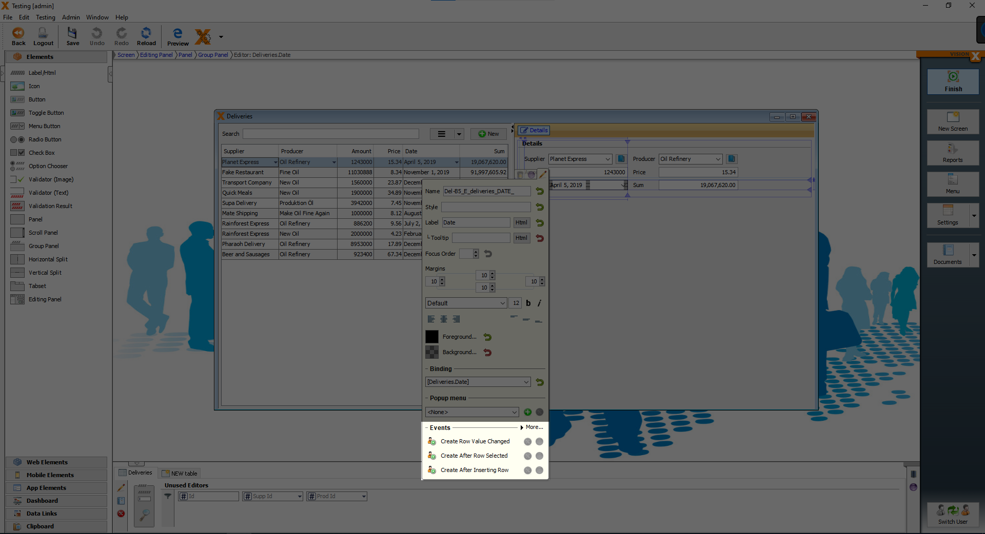
Click on “Create Row Value Changed”, because we want the event to take place, when the value has changed.
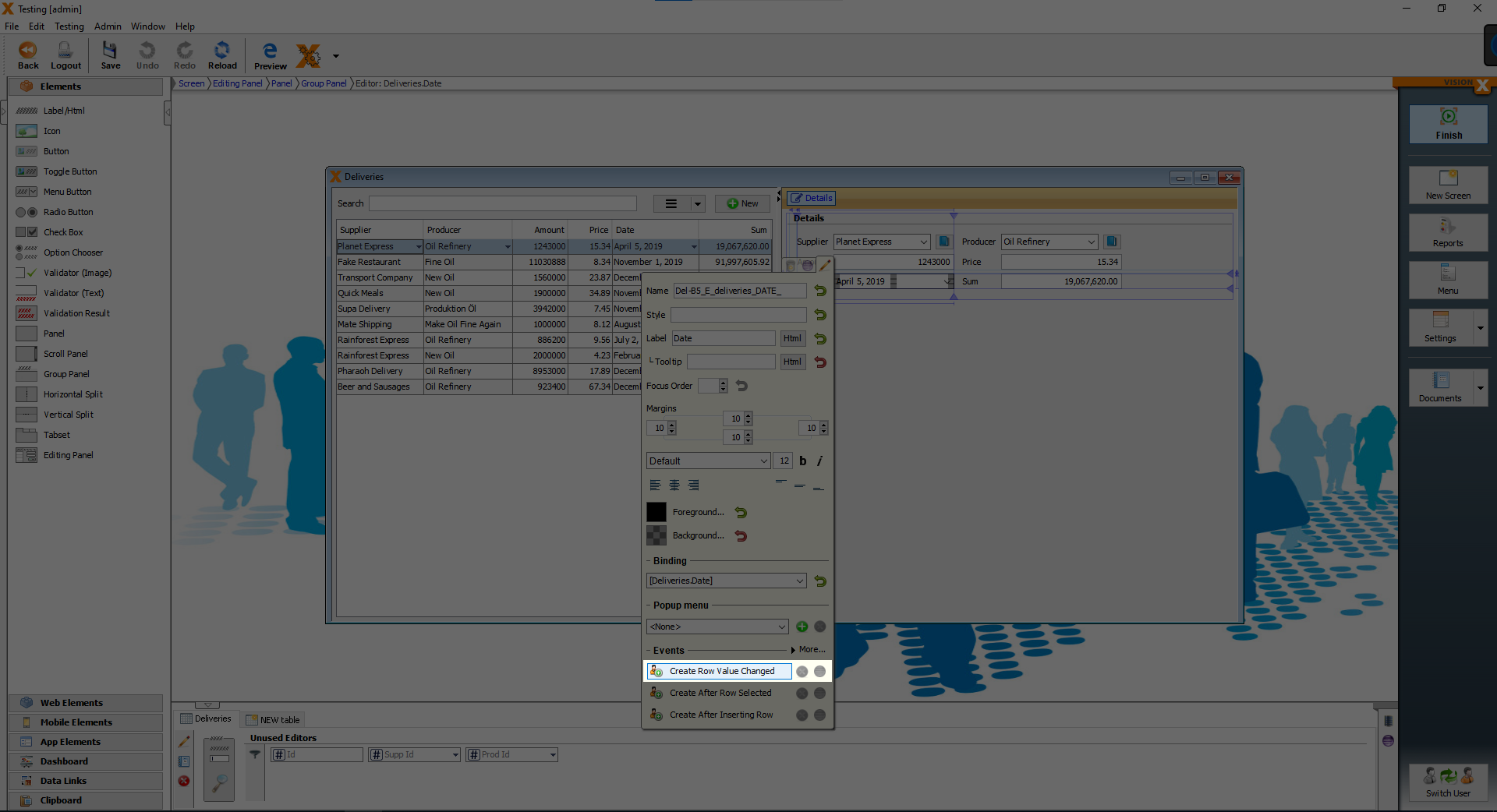
After clicking on the button, you should see the following screen.
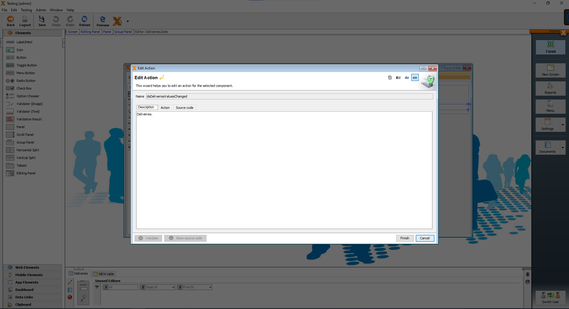
We want to add some actions, so click on the “Action” tab, then you can see a combobox with pre-defined actions. We can add conditions and there is even a repeat option.
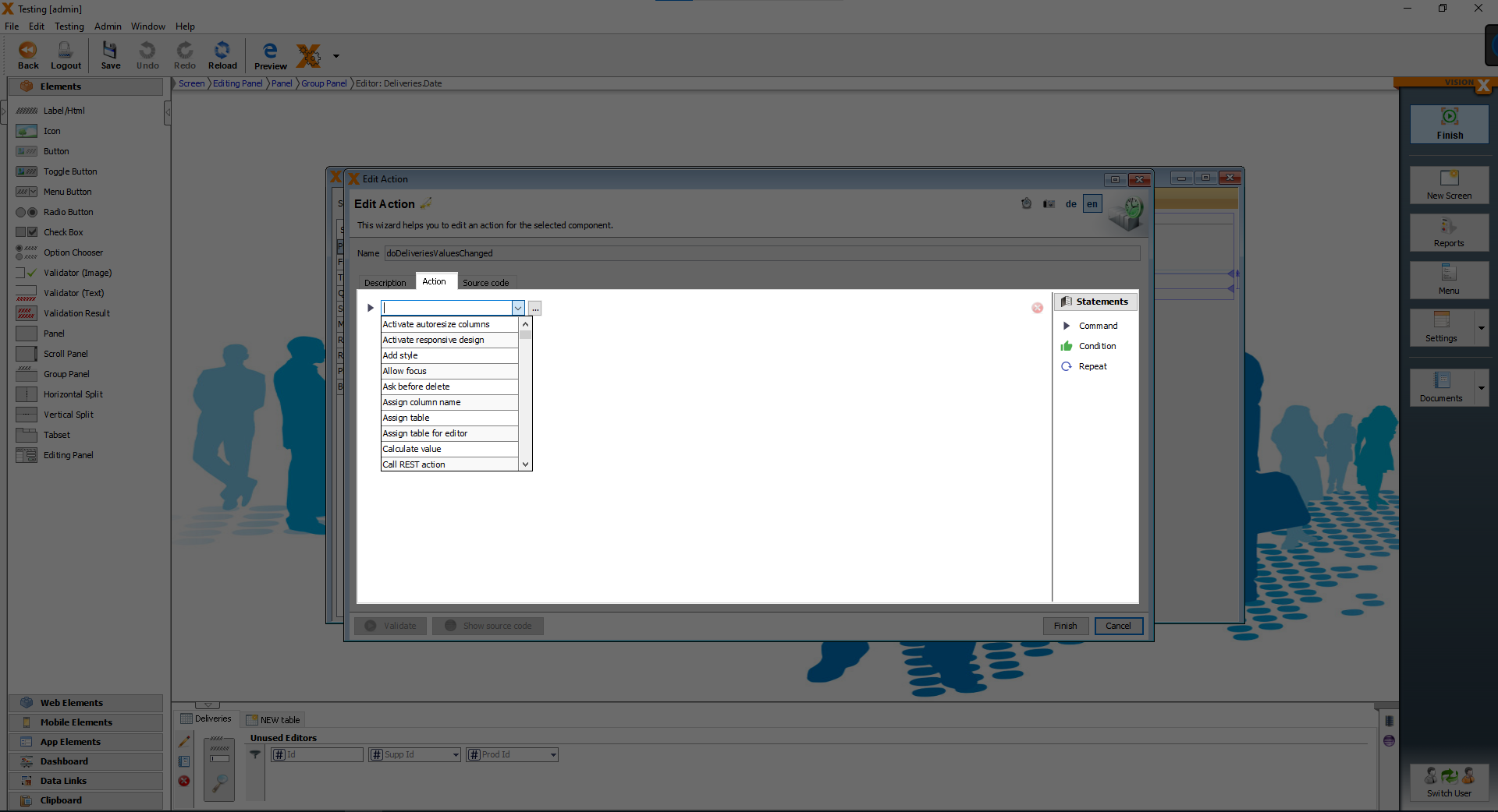
From the combobox choose the action “Set current date” and we want to write the current date into “Deliveries.Date”.
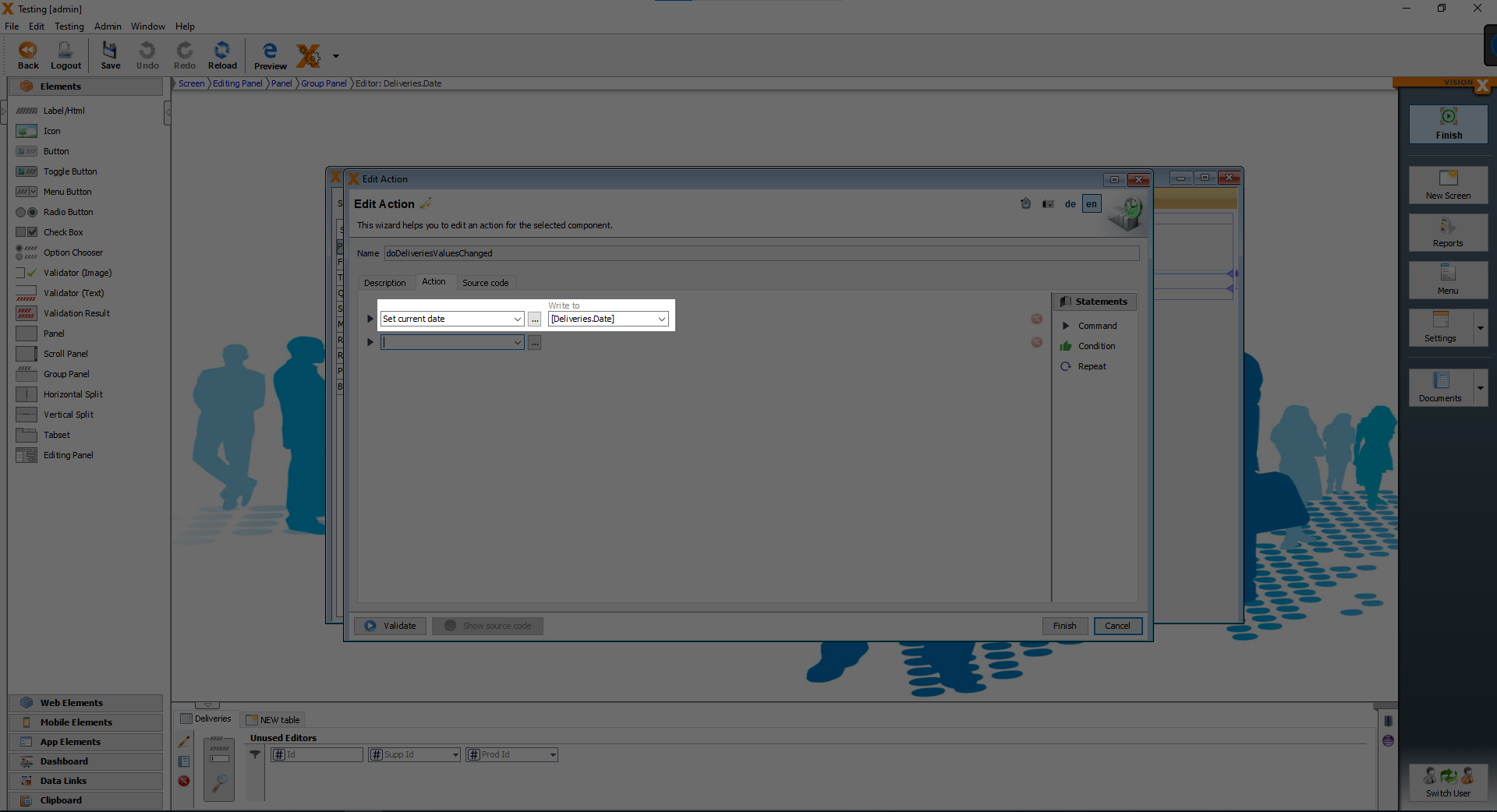
From the lower combobox, which was just added after, choose “Calculate value”, we want to write the result to “Deliveries.Sum” and the formula is “[Deliveries.Price]*[Deliveries.Amount]”.
With this action the Sum is automatically calculated, this can only be done with the “Deliveries” and “Sales” data.
Finally click on the “Finish” button.
Replacing the button with the notebook with a button and form screen
You might have noticed the small notebook icon next to the “Supplier” field and the “Producer” field“. We want to replace it with a button, which opens a screen with a form.
![]()
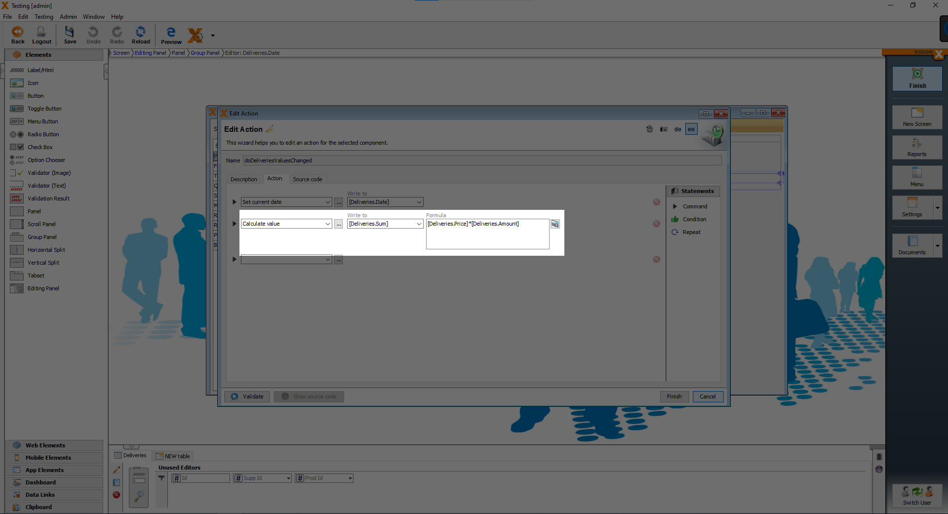
To hide the button with the notebook icon, open the customizer of the Supplier input field and you will see the option “Show Edit button”, we have to uncheck the box.
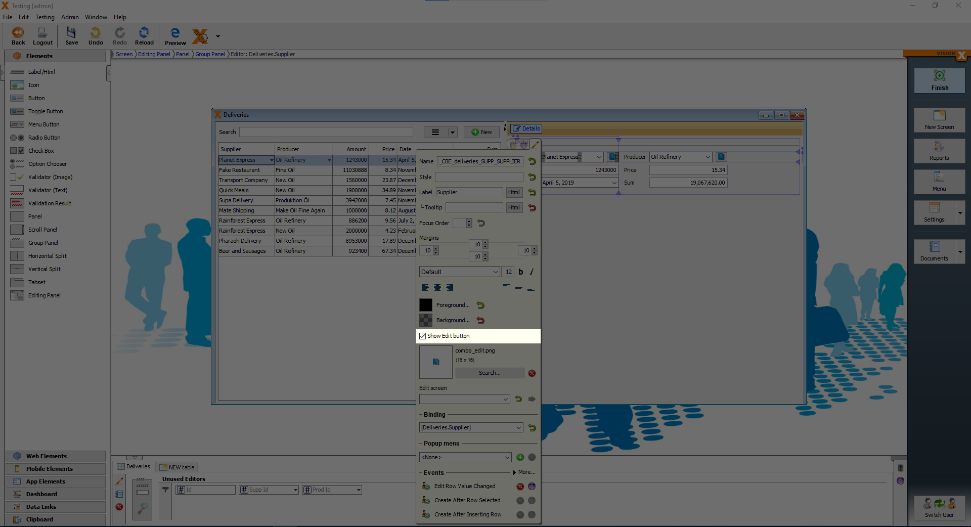
After hiding the button with the notebook, we want to add a button from the elements and place it between the Supplier field and the Producer label and change the text to a plus sign.
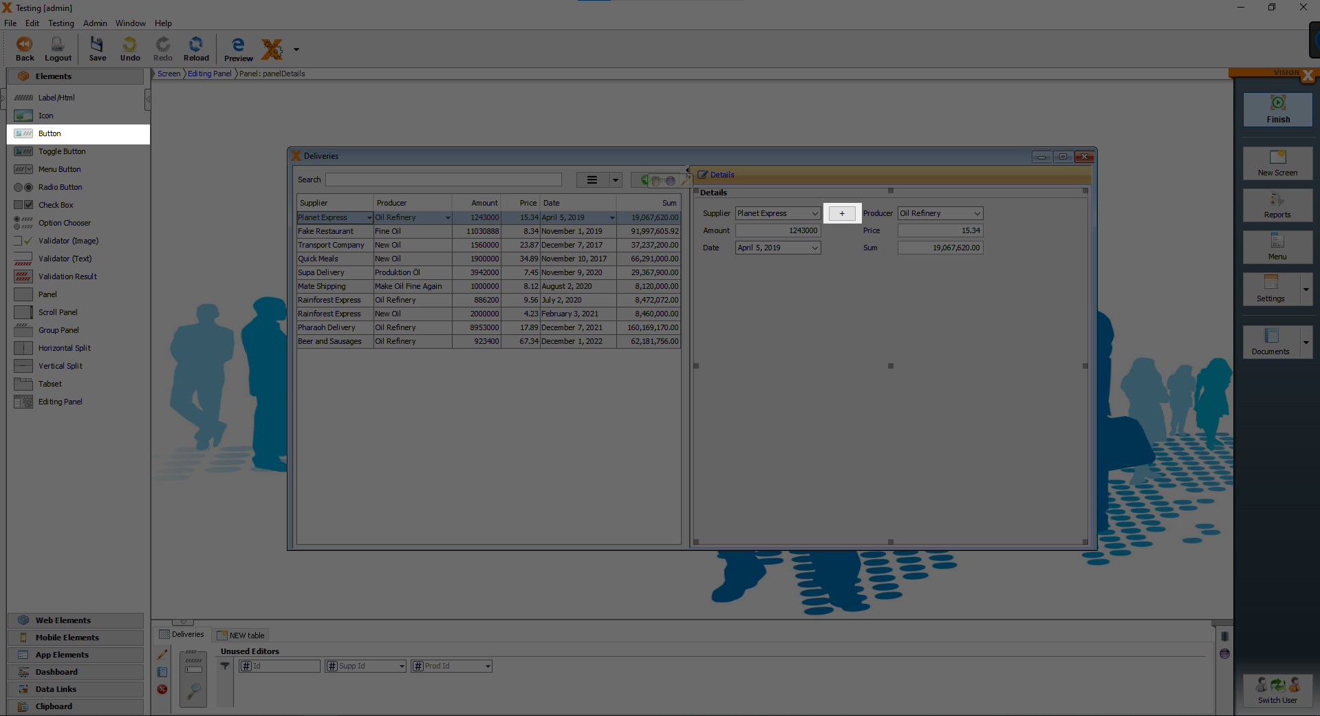
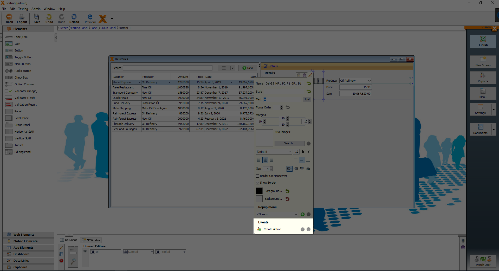
Now we want to add an action, that happens, when the button is clicked. Open the customizer of the button and click on “Create Action”.
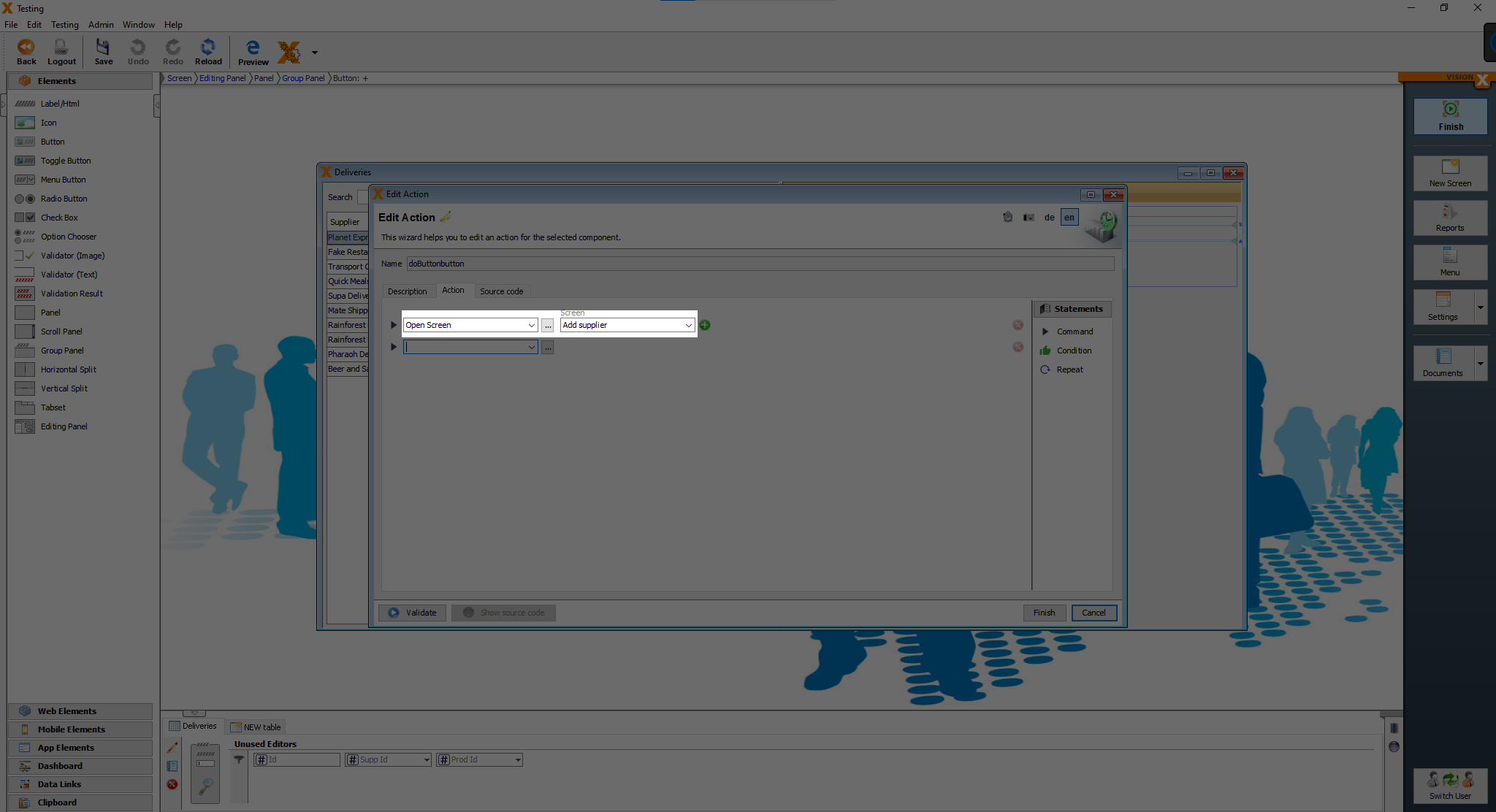
You will see the same screen as before. The action we need in this case, is called “Open Screen” and the screen, which we want to open, is the “Add supplier” screen, then click on “Finish”.
We are going to reapet this steps on the “Deliveries” screen for the “Producers”, on the “Sales” screen and on the “Production” screen.
Defining the report file and adding the "Show report" function to a button
Now open the “Report” screen to add the report function. Click on the “Report” button.
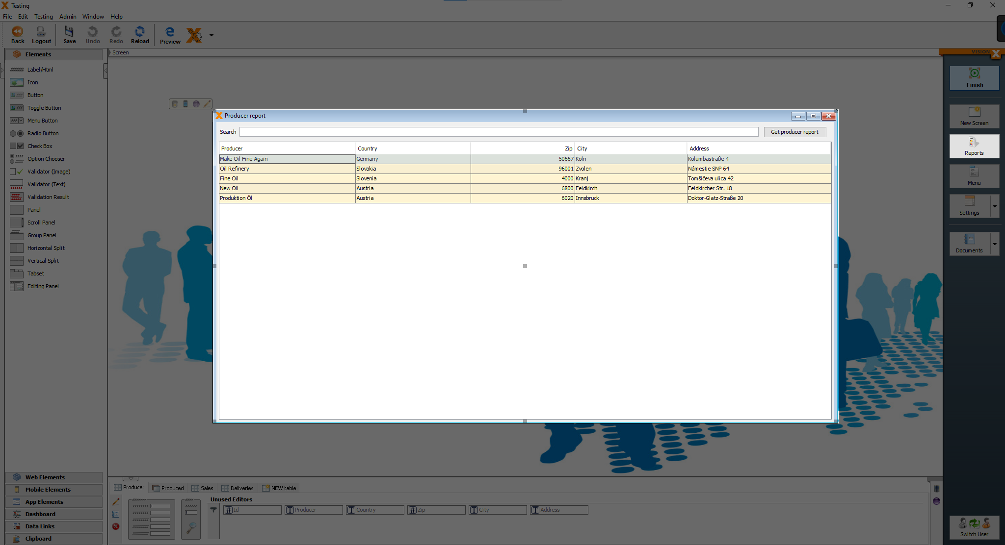
You should see a wizard screen called “Manager Reports”. We want to integrate the report on the current screen “Producer report”, so we don't change anything, we just click on “Next”.
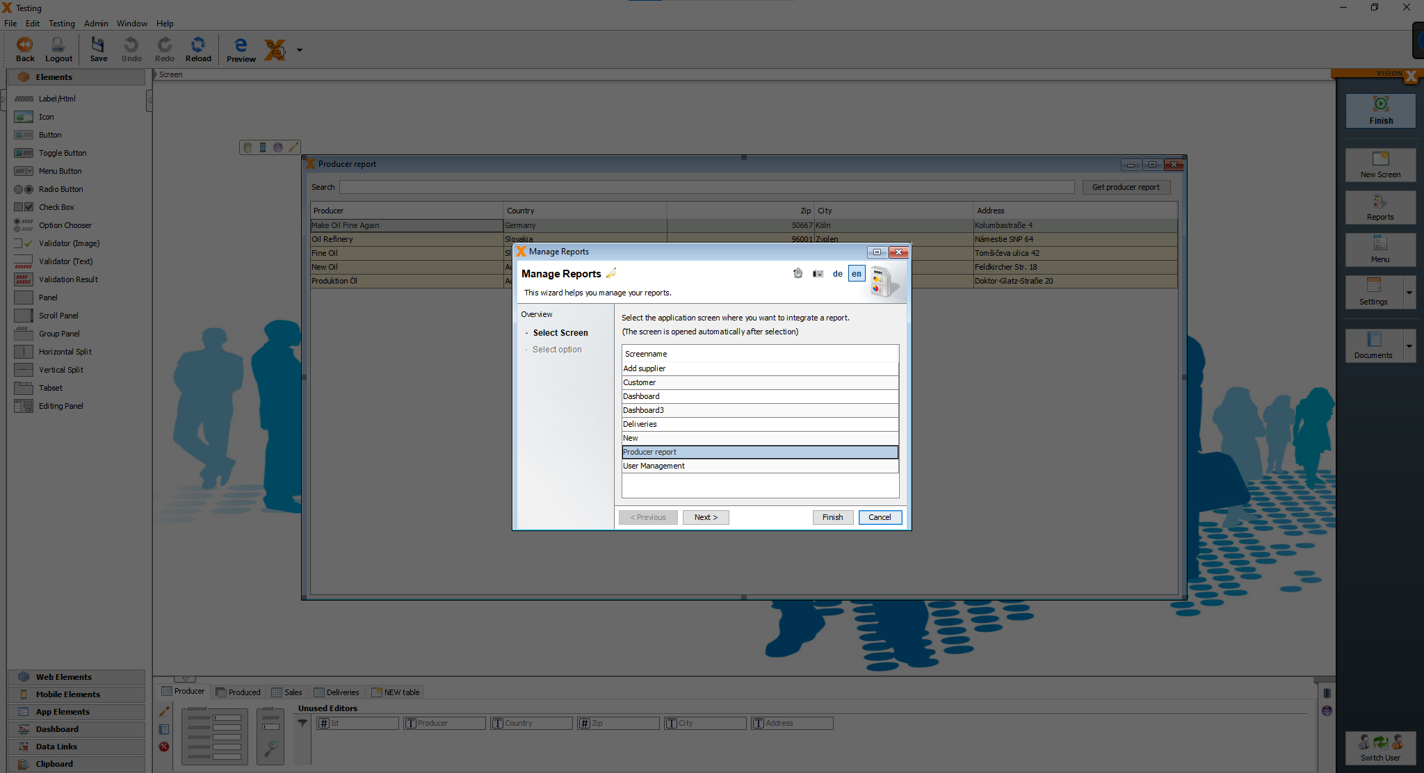
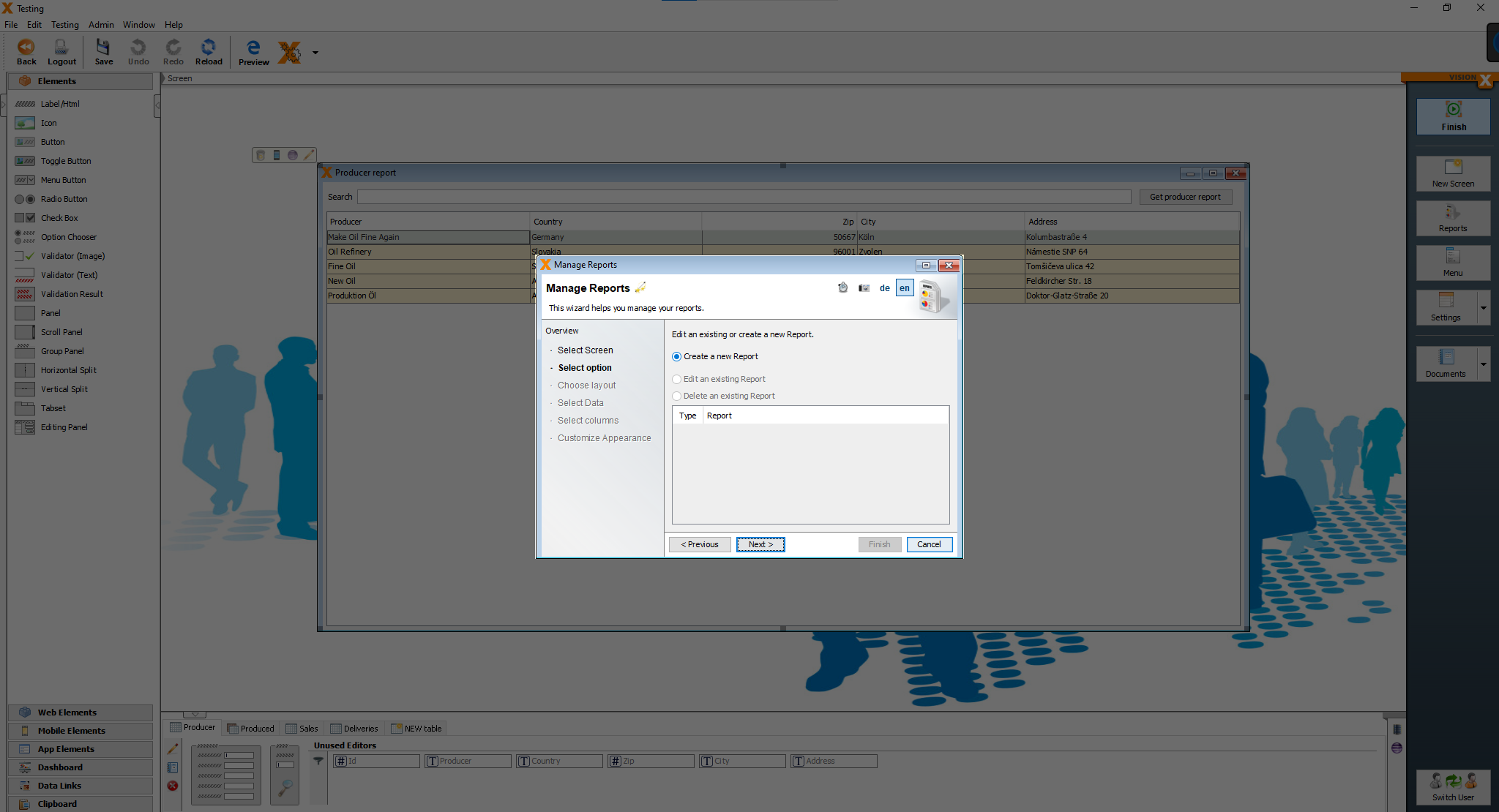
We haven't create any report yet, so we have to create a new one. Click on “Next”.
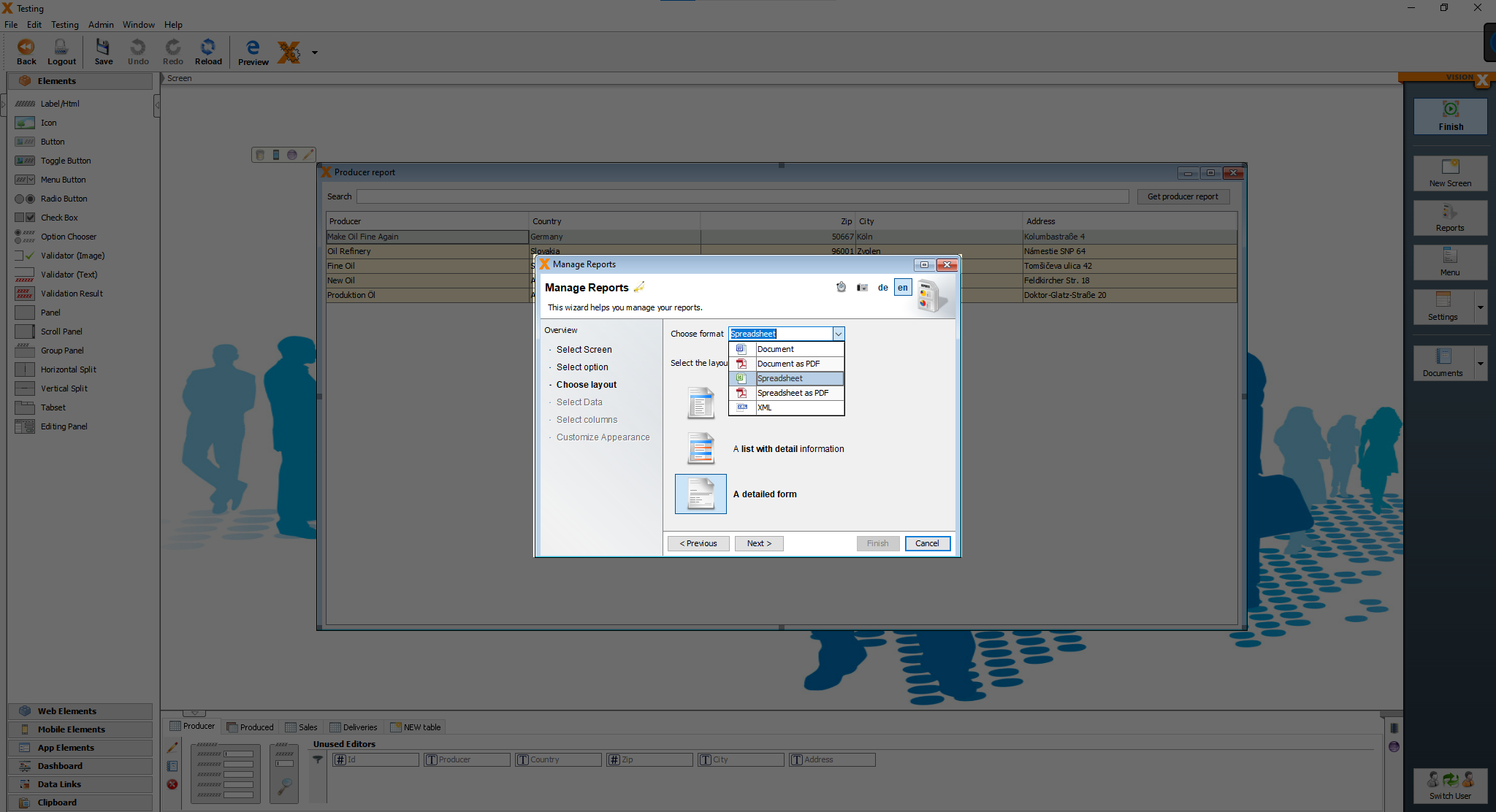
On the next page, we choose spreadsheet as our format and as the layout the detailed form, then click on “Next”.
Now we can choose, which table is our master table. We choose the “Producer” table and then click on “Next”.
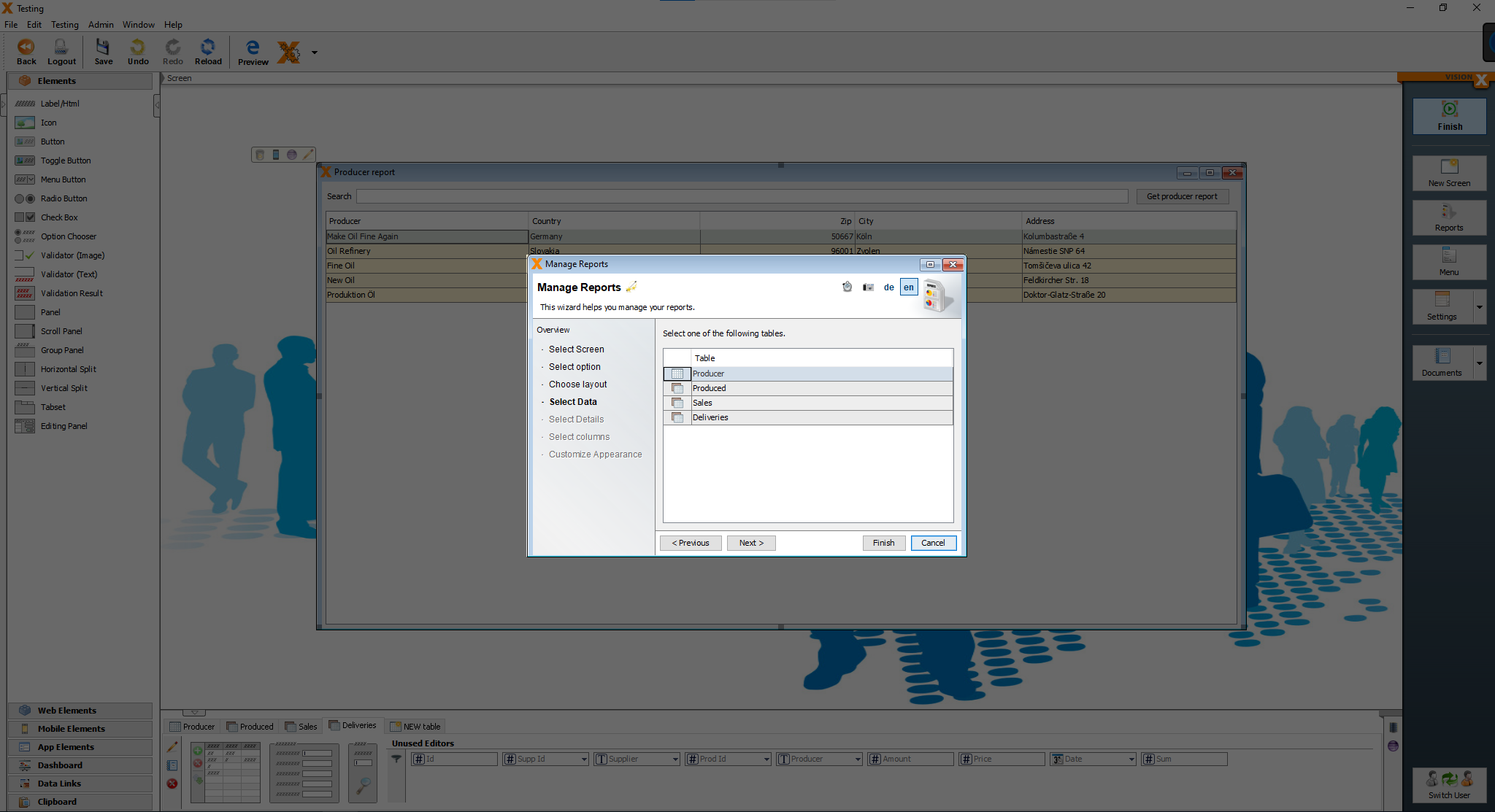
After we chose the master table, we can add details tables. We add all three of them, “Produced” “Sales” and “Deliveries” and then click on “Next”.
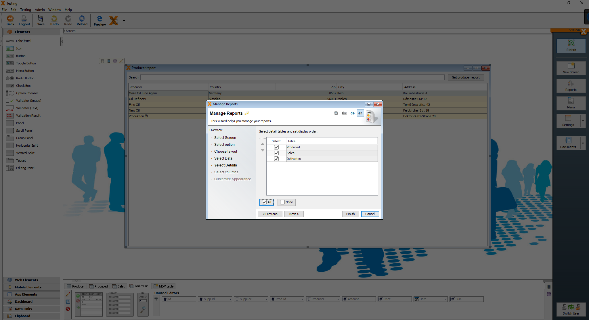
Next step is to choose, which columns are included in the report. We don't change anything and leave the default settings, then click on “Next”.

We want every detail table to have its own seperate sheet, so we enable the option “Start a new sheet for every detail table” and then click on “Finish”.
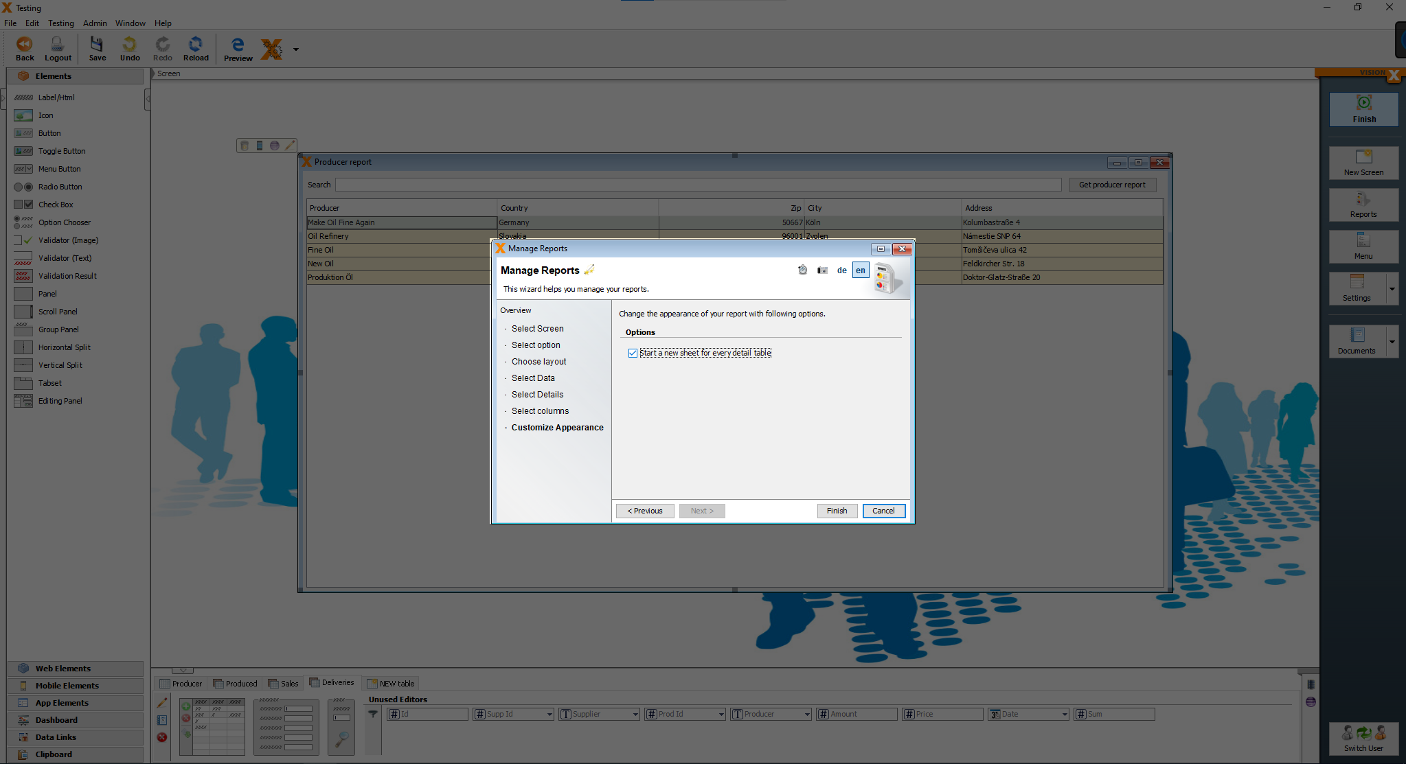
After defining our report, we have the option to automatically add the action “Show report” to an already existing button. In this case we choose the button “Get producer report” and then click on “Finish”.

Styling the application
Hide the menu elements
We don't want to user to see the “Add supplier”, “Add customer” and “Add producer” screens, so we have to hide them.
We can hide the menus in the “Menu” settings, click on the “Menu” button.
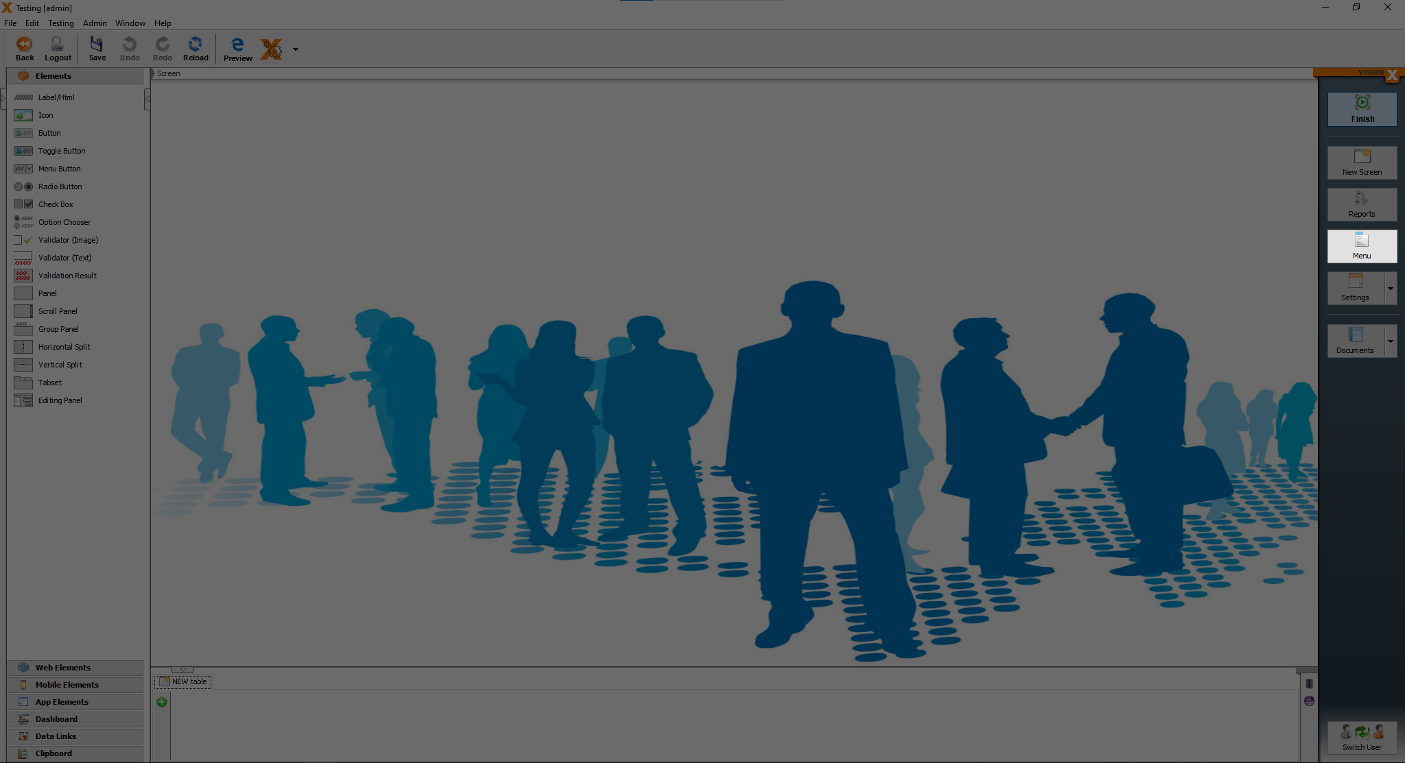
You should see the screen called “Menu Management”.
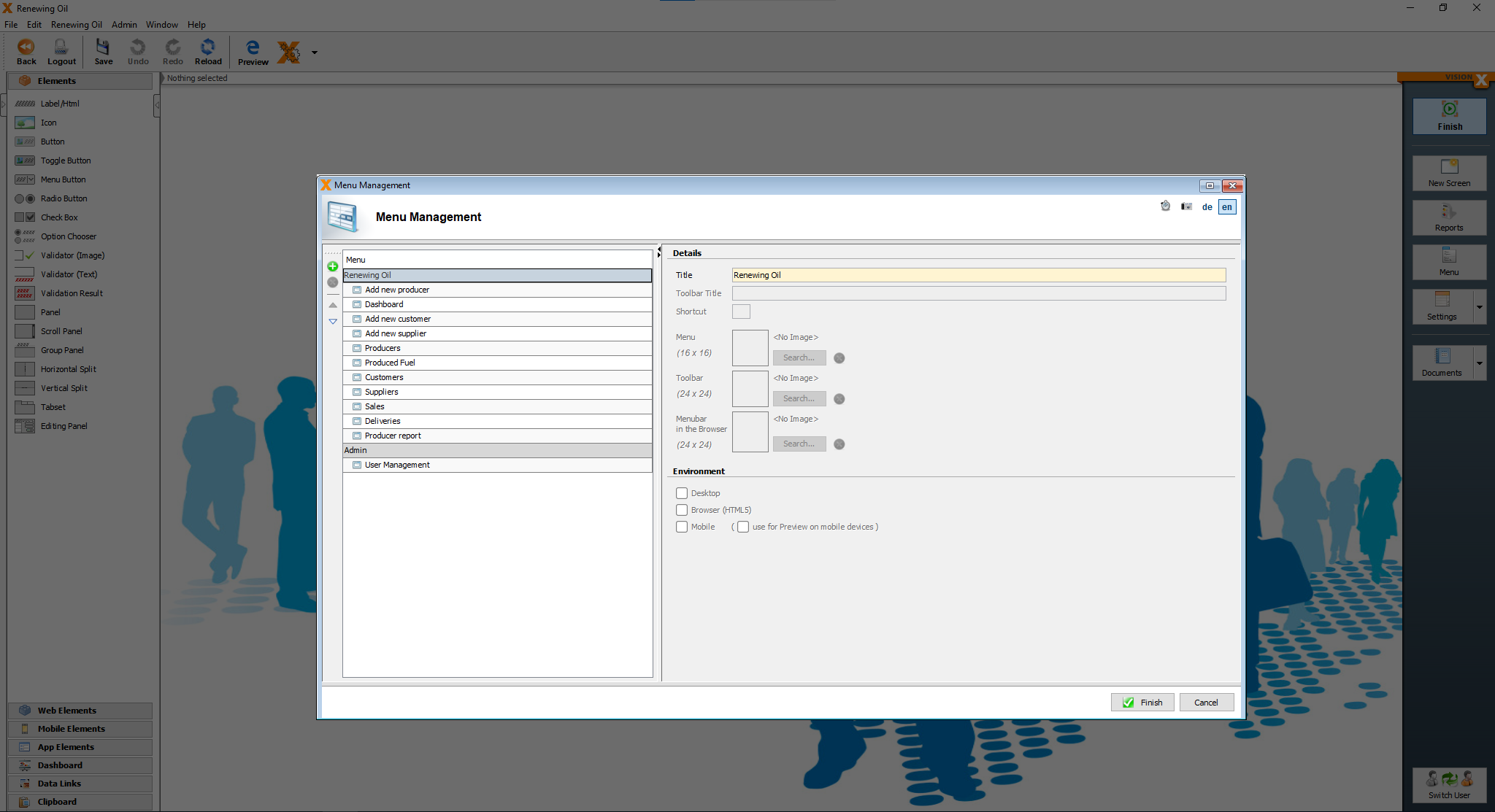
To add a new menu, click on the green plus button and you should see a new menu with an arrow.
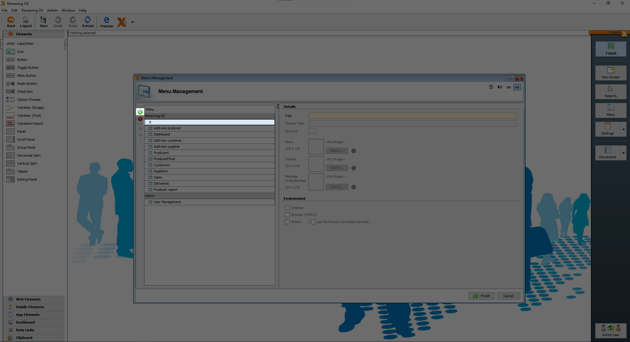
Now we have to move the new menu item to the top with the up arrow on the left side of the menu element.
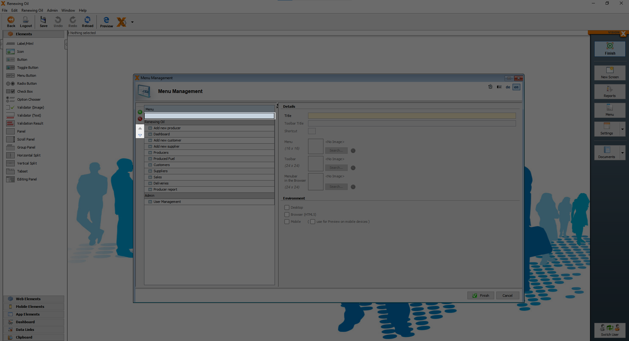
After the new menu is at the top the arrow on the left side of the menu element is gone. Now we have to move the “Add supplier”, “Add producer” and “Add customer” under the new element. The result should look like this.
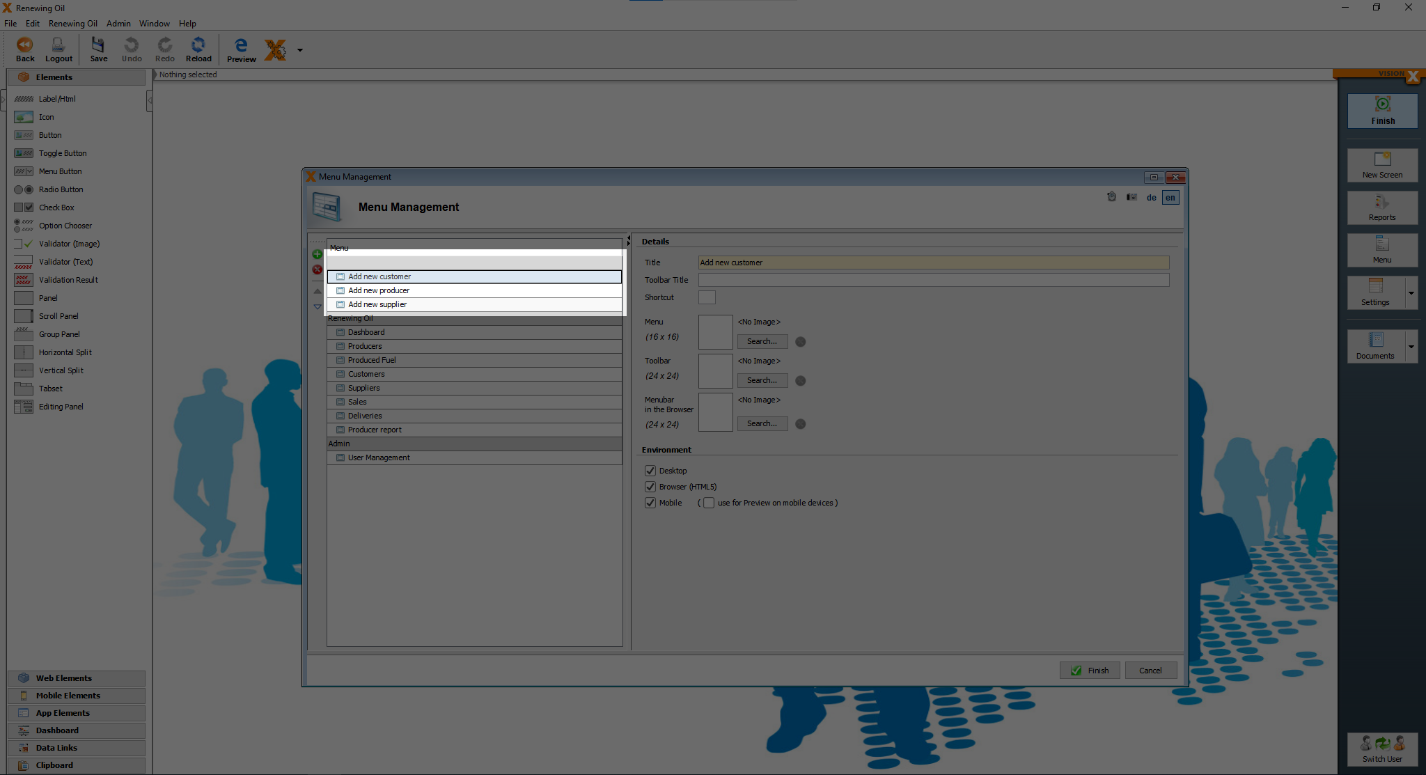
Now we just have to click on “Finish” and those 3 screens are hidden, we are not allowed to set the title, because the menu gets hidden, when there is no title.
Style the application using stylesheets
There are already pre-defined stylesheets, which can be used.
On the webpage follow the instructions, how to use the style templates.
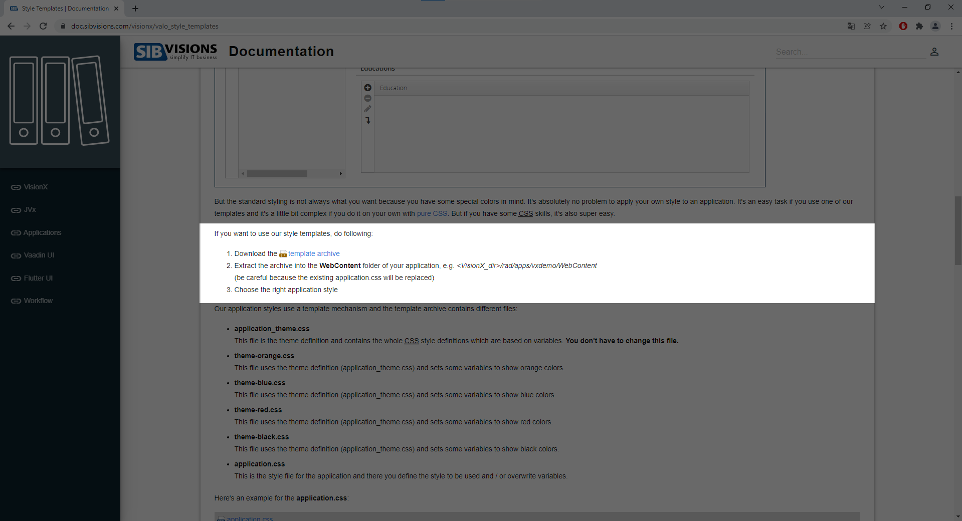
After “installing” the style templates, click on the arrow next to the “settings”.
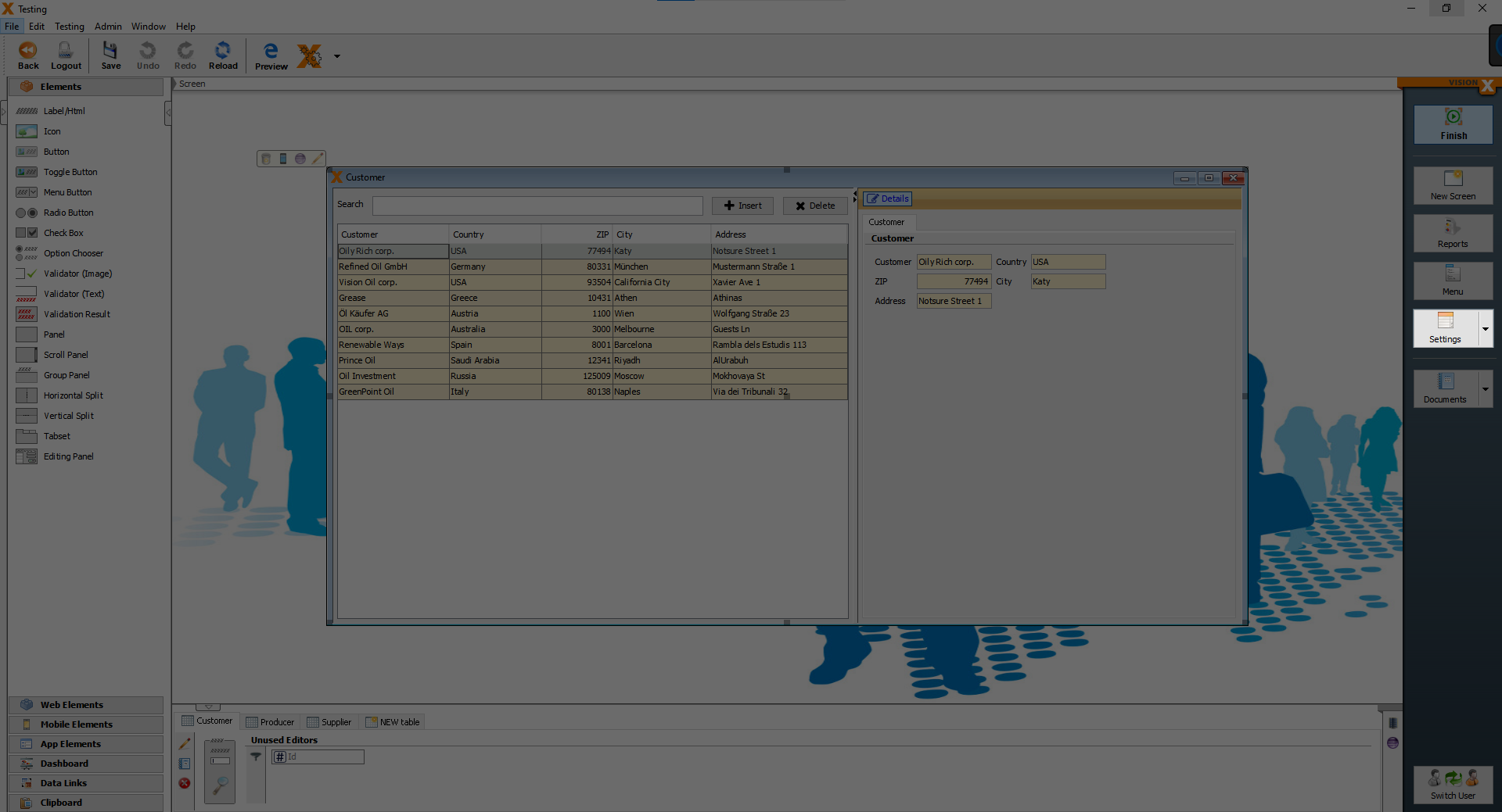
You should see 5 options, “Desktop”, “Web”, “Web (next generation)”, “Mobile” and “REST”, click on “Web”.
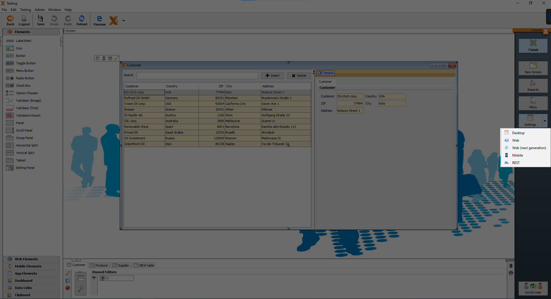
After clicking on “Web”, you should see the following screen.
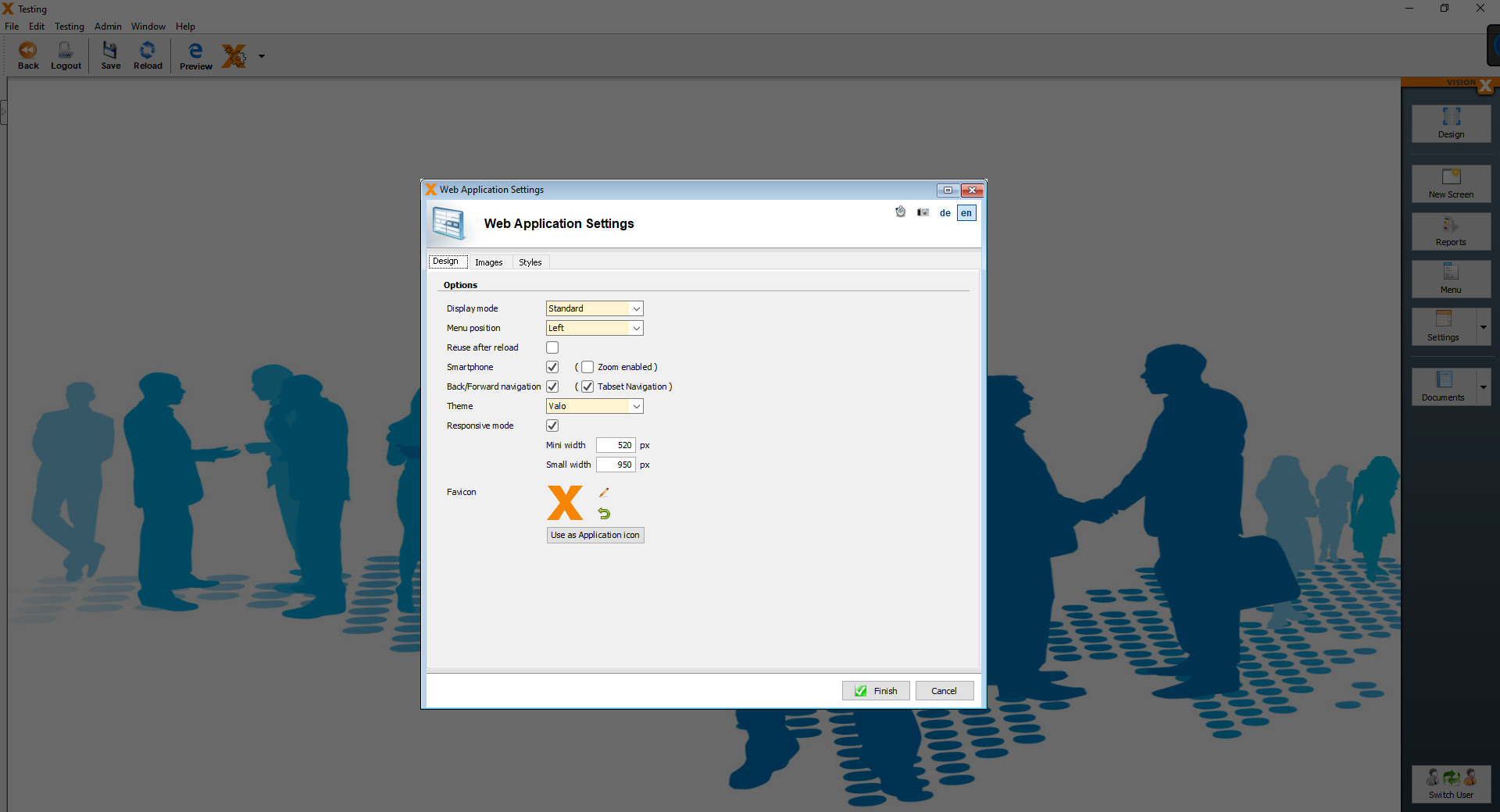
On the “Design” page, change the Display mode from “Standard” to “Corporation”.
After that, click on the “Styles” tab and you can see an editor, where you can put your own css code, but after “installing” the stylesheets, you should see some text.
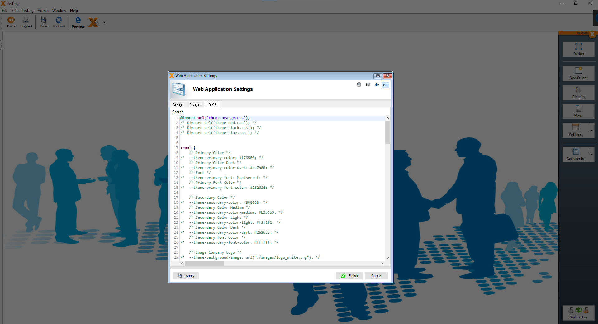
We only change the primary color, remove the ”/“ at the beginning of line 9 and the ”/“ at the end of line 9. Then we replace the text ”#f78500“ with the following text ”#6fb15a“.
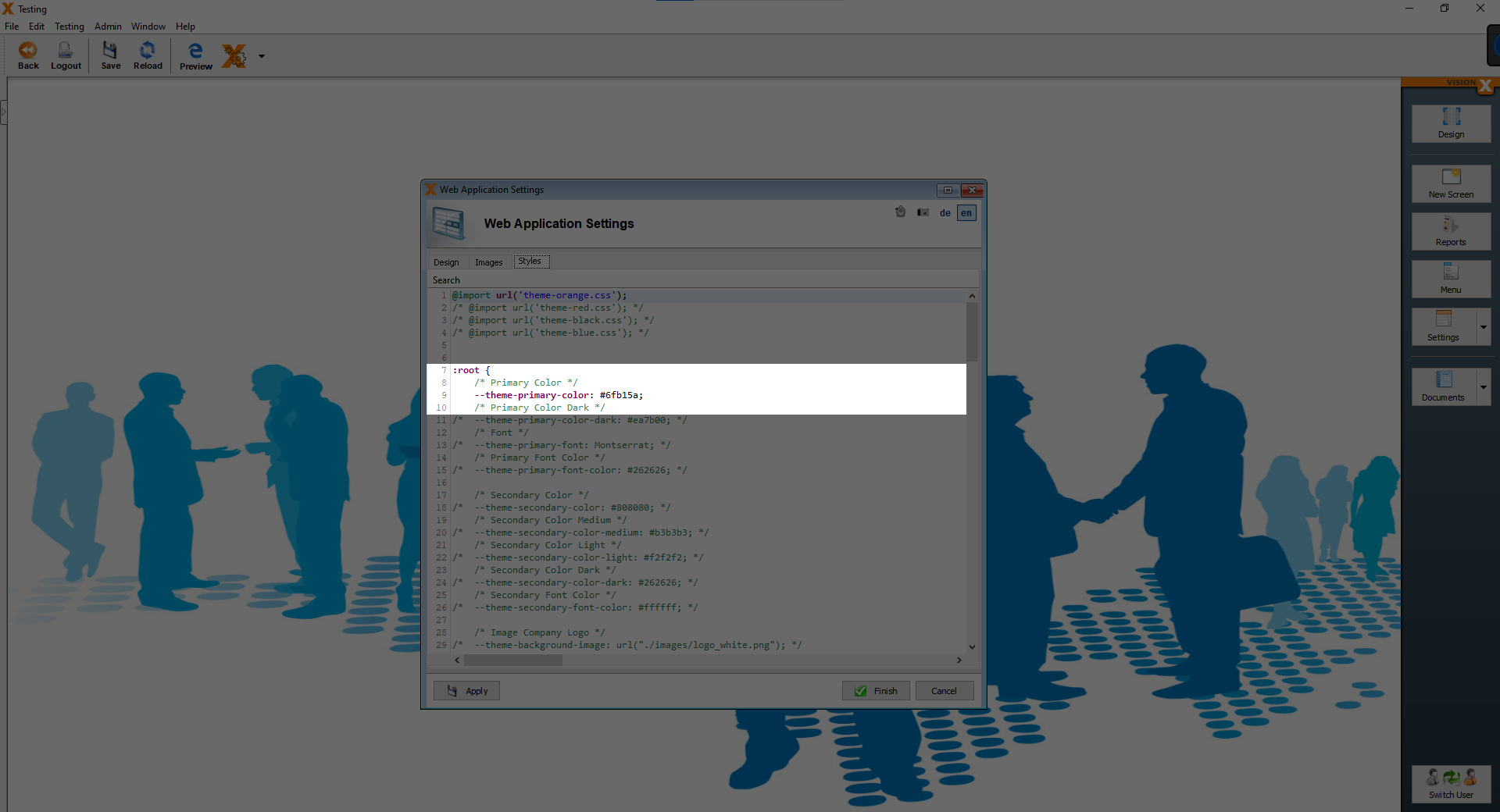
Finally click on “Finish”, the changes, wich we made, can be seen only in web mode. We should change the background to something more fitting. To do that, click on the “Settings” button.

After clicking the button, you should see the following pop-up screen.
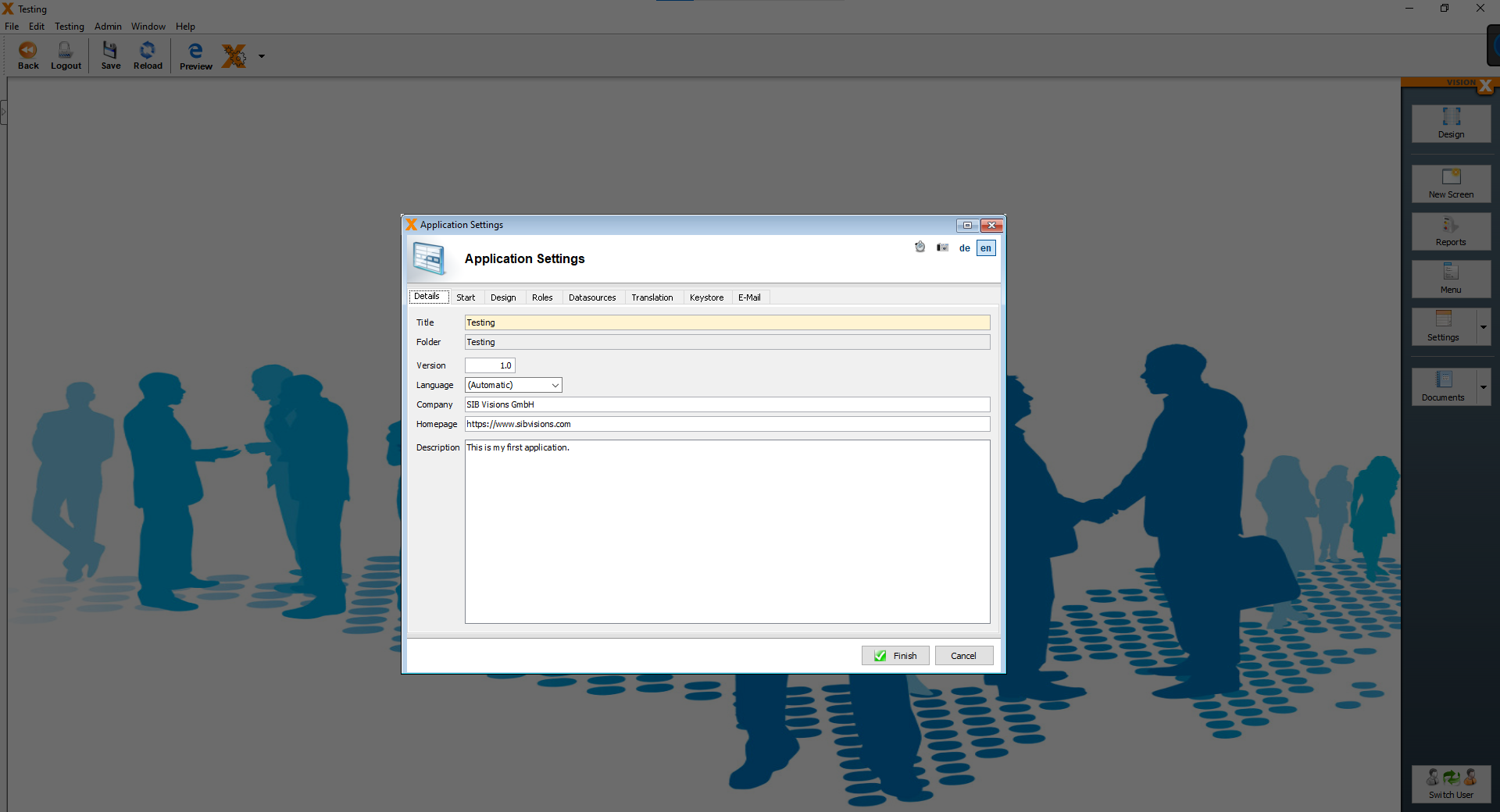
Now click on the “Design” tab, here you can change the background image.
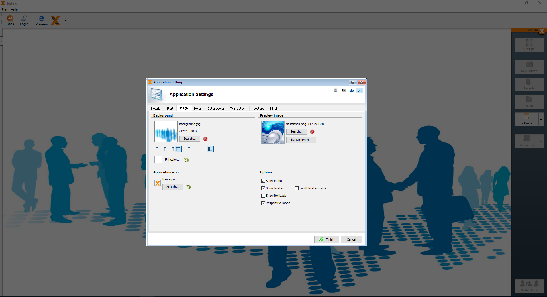
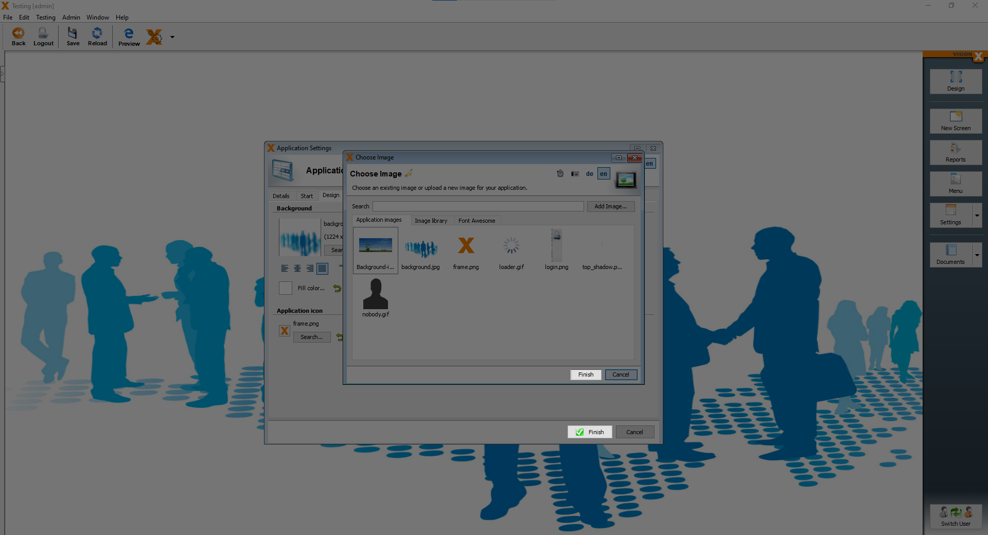
Under “Background”, click on the “Search” button, then you can choose from the “Application images”, “Image library”, “Font Awesome” or you can add an image.
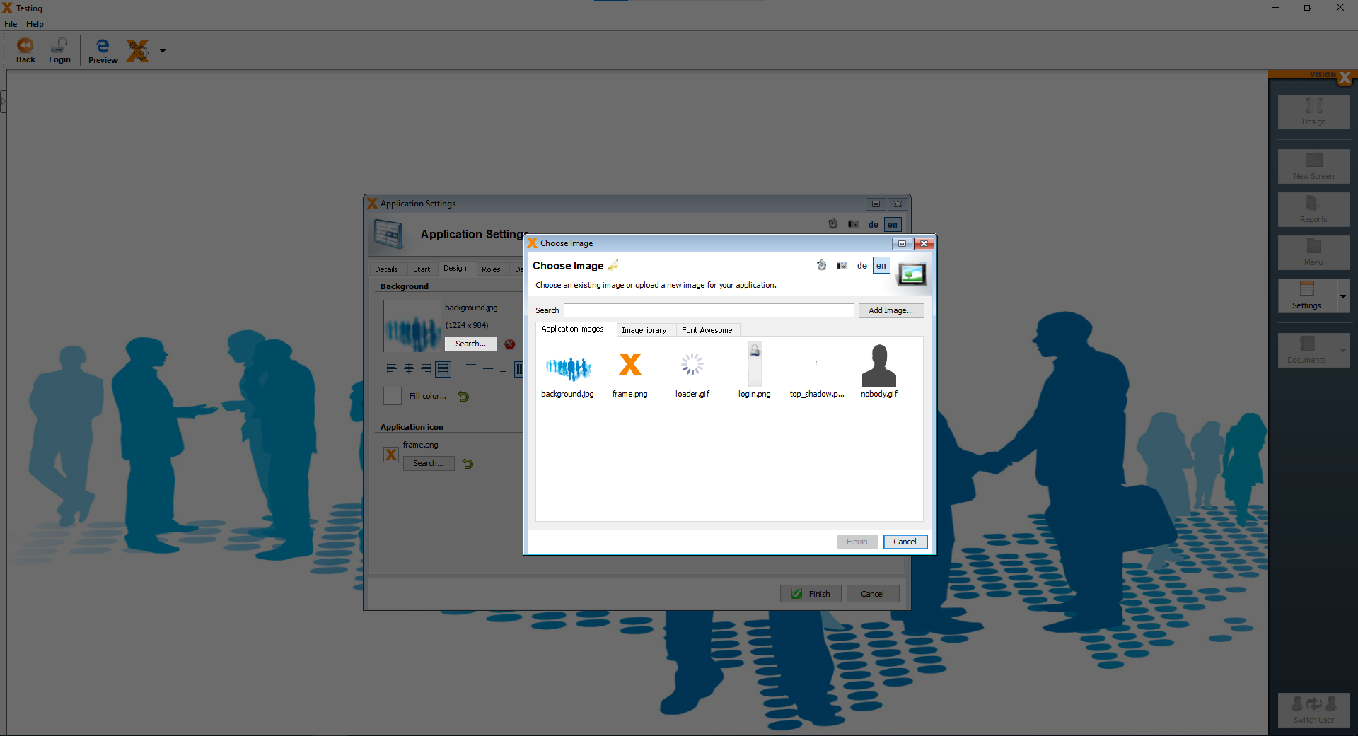
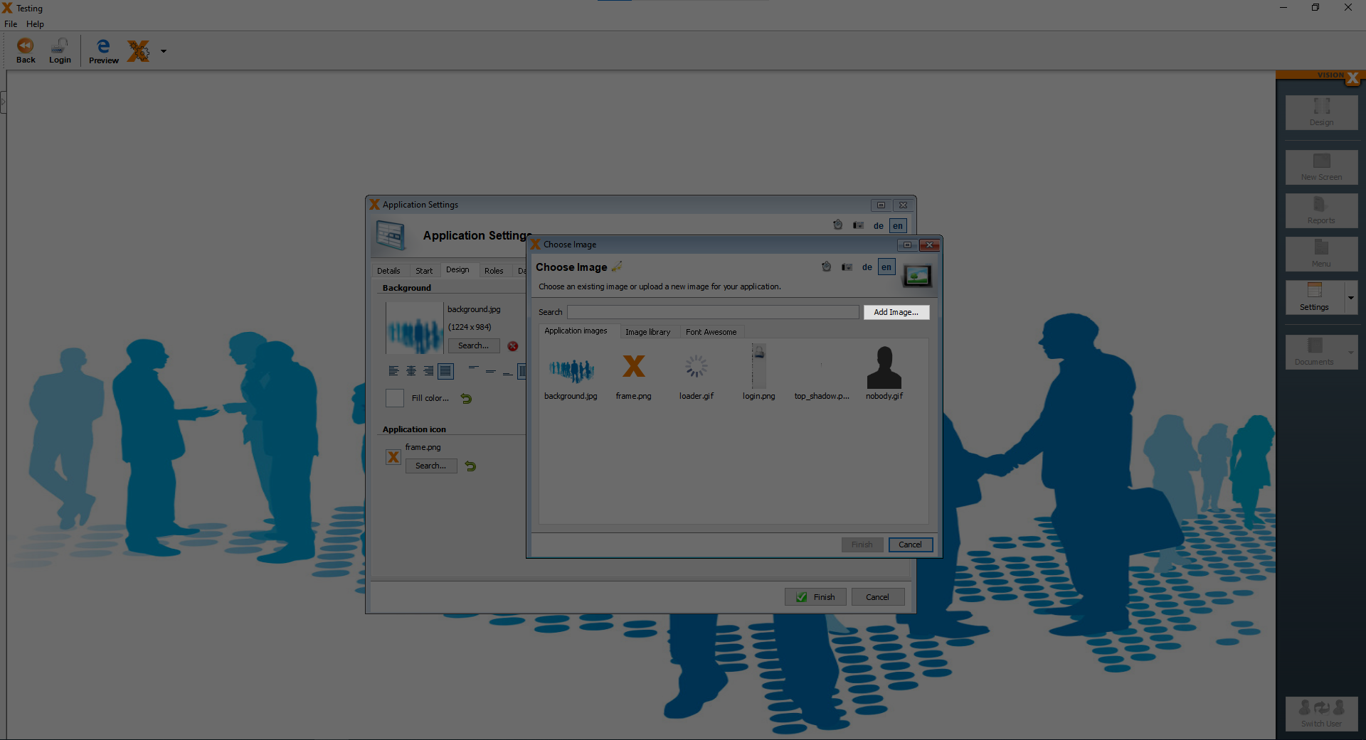
We want to add our own background image, so we click on “Add Image…”.
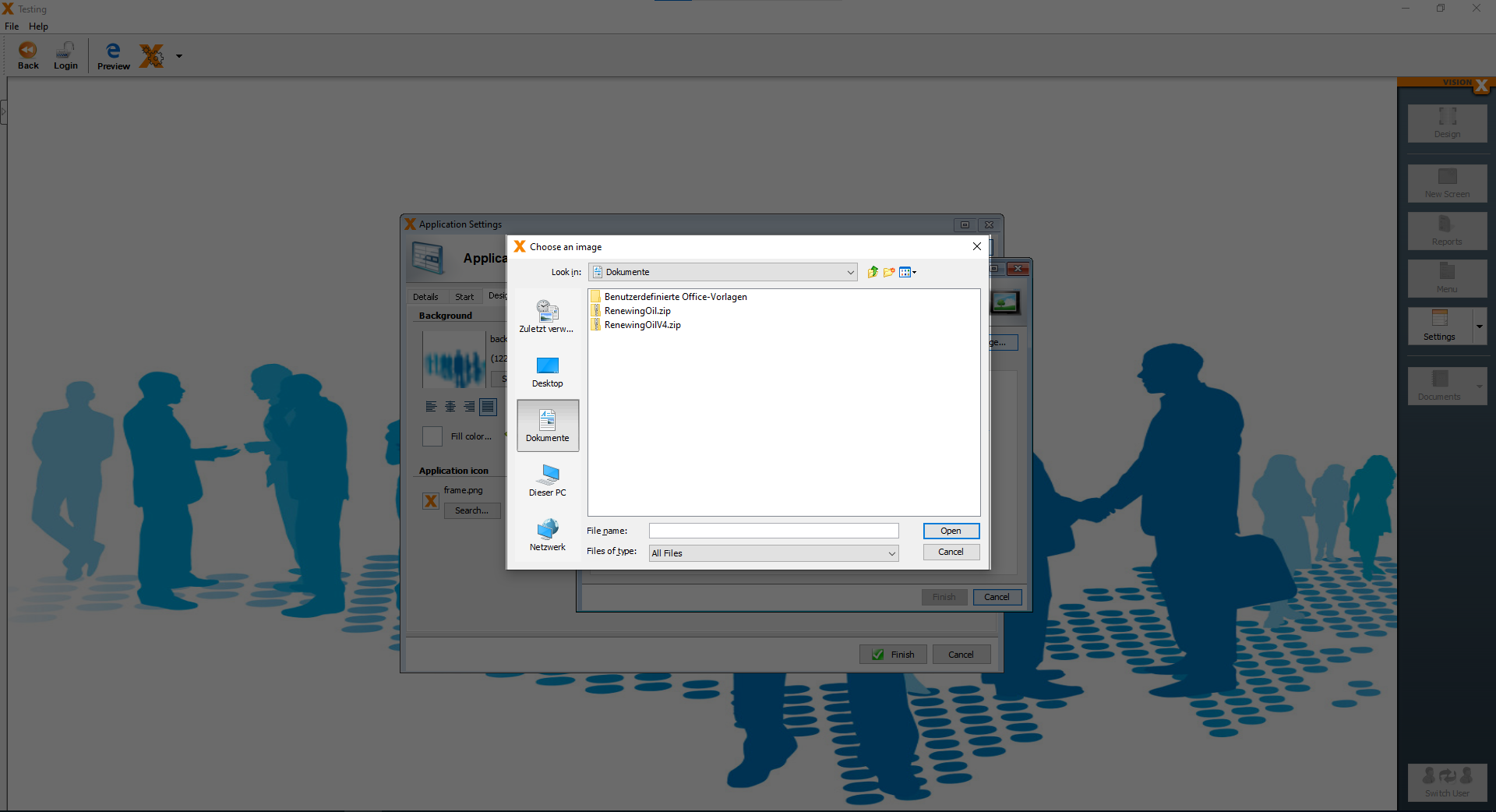
Next we see the basic file explorer, where we can choose the image, which we want to use as our background.
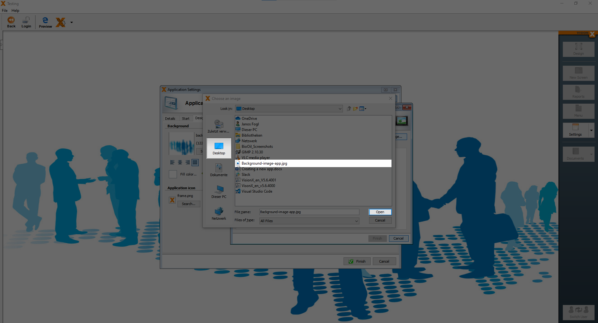
I have the background image saved on my destkop, so I click on “Desktop” and choose the file called “Background-image-app.jpg” and then click “Open”.
After the “Open” button was clicked, you are back at the “Choose Image” screen, here you just have to click “Finish” and then again click “Finish” at the “Application Settings” screen.
Now you can see our new background image.
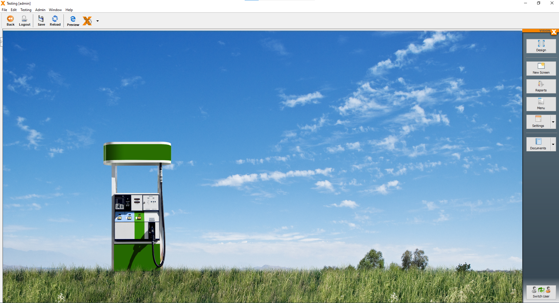
And with the new background image, the styling of our application is finished. You can add and change many other things, but for this application, the changes we made are sufficient.